by Corey A. Harper
Introduction
Metadata quality, metadata completeness, and metadata assessment. These are topics that have been discussed at length on and off for many years. Recently, the Digital Library Federation’s Assessment Community formed a Metadata Assessment Working Group, which has begun a bibliography of articles related to Metadata Quality and Metadata Assessment. [1] Many of these articles contain very useful best practices and recommendations gleaned from years of experience aggregating metadata from diverse digital library projects.
Some of these articles date back almost 15 years. In 2002, Jewel Ward conducted a quantitative analysis of Dublin Core Element usage in registered OAI-PMH endpoints. [2] A year later, in 2003, Naomi Dushay and Diane Hillmann used early commercial data visualization tools to identify patterns in metadata submitted to the National Science Digital Library and discussed the use of these visualizations to prioritize and manage remediation efforts. [3] In many ways, these studies were ahead of their time. Data visualization tools were in their infancy at the turn of the century — there was no D3 or Tableau, and tools that might help with the quantitative measurement of metadata impact were non-existent. Although completed shortly after the term “data science” was coined in 2002 [4], these early quantitative analyses and data visualization efforts foreshadowed the application of data science techniques to library data.
In the past few years, there have been some very preliminary conversations about the relationships between data science and libraries. In a recent CNI presentation, Eric Mitchell, Vicky Steeves, and Jenny Muilenburg discussed the application of data science to the library field. [5] Their talk touched on a variety of areas, including data science education and outreach to scholars and on the idea of bringing machine learning, probabilistic modeling, and related techniques to bear on library problems and library decision making. All three presenters are librarians, some embedded in Data Science projects and research institutes, and all are involved in the Moore-Sloan Data Science Environment. Some Library and Information Science programs are now offering Data Science certificates, and the Harvard Library has recently started offering “Data Scientist Training for Librarians“.
In a recent Computers in Libraries article, Dan Chudnov introduces librarians to the underlying notions and techniques utilized by practitioners of data science. [6] Chudnov notes that the goal of Data Science programs is “to make better decisions, based on data, despite uncertainty.” This goal exactly summarizes the topic of the research conducted for this article. There are decades worth of recommendations and best practices around metadata quality and shareable metadata, but the tools to precisely measure the impact of “quality” metadata — to assess the outcomes afforded by our metadata, and make better decisions based on these data — are brand new. This decision-making component is essential, and it is telling that the preliminary planning for the project discussed here fulfilled the requirements of an assignment for a Fall 2014 MBA course titled “Data Driven Decision Making.”
This paper presents the concepts of metadata assessment and “quantification”, provides a technical outline of data pre-processing, and proposes some visualization techniques that can help us understand metadata characteristics in a given context. Additionally, the closing sections introduce the concept of metadata optimization and explore the use of machine learning techniques to optimize metadata in the context of large-scale metadata aggregators like DPLA. Finally, the article considers the broad potential for machine learning and data science in libraries, academic institutions, and cultural heritage.
Quantifying Metadata — Project Proposal & Data Preparation
The project proposal set out to provide some initial analysis of DPLA metadata and its impact on collection usage. The proposal introduction read,
The intention is to explore distribution of metadata field population across DPLA partners and identify some initial data visualization techniques to understand these patterns. Distributions of metadata usage across different collections and resource types, as well as correlations between fields will be analyzed. Additionally, if relevant information can be generated from Google Analytics, analysis will be conducted to ascertain relationships between metadata terms and user queries, as well as to build regression models using metadata field use and content as predictors of item usage statistics.
According to a recent survey by CrowdFlower, in data science, data preparation is 80% of the work. [7] This project was no exception. DPLA publishes a bulk download of their data in JSON. Effective visualization and quantitative analysis of these data first required counting field occurrences. Python code was developed for this research to parse the “sourceResource” of the DPLA data and count occurrences of each field in the DPLA Metadata Application Profile (MAP). The sourceResource section of the MAP contains 19 fields drawn primarily from Dublin Core, Dublin Core Terms, and the Europeana Data Model. The output of this script is a pipe delimited file with one row per record, where each column contains the count of occurrences of a specific field.
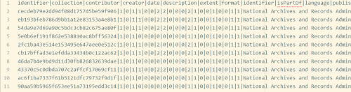
Figure 1. Wide Data, 1 Record per Row
In addition to this “wide” data format, some analyses are more effective with data in a “long” format, that is effectively de-normalized. The long format for DPLA data, shown in Figure 2, puts each field on its own row and adds a column to indicate which field is shown. This pattern is so common that many data management tools (such as R, and the “Pandas” Python module) offer tools for reshaping and converting between these formats. Utilities to convert data from wide to long are often called “melt” functions, though rather than melting the data here, the data creation script has been modified to support both the wide and long formats. The long format also has the advantage of adding a “binary” column, which contains a binary value of whether or not that field appears in that record. We will see later how this additional data point can be useful, though it is worth noting that this binary data can also be added after the fact.
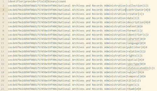
Figure 2. Long Data, 1 Field per Row, 21 Rows per Record
It is also worth noting that this data probably doesn’t qualify as “big data,” but could almost certainly be called “medium data.” The wide data format is only 1.5 GB, but as of December 2015 contained 11,557,180 rows. The “molten” format is 25 GB and contains 242,477,520 rows. The original, raw JSON format is a 59 GB file.
Metadata Visualization
Once our data is in these formats, we can easily start doing visualizations of field counts, distributions, and variation across providers. Unless noted otherwise, all of the following charts and graphics are produced using Tableau 9.2. Figure 3 shows the average number of subject fields per record, broken down by provider.

Figure 3. Average Subject Count by Provider
Another view of this data, shown in Figure 4, highlights the binary values mentioned earlier. Rather than average count of subjects per record, we can graph the percentage of records for each provider that have at least one subject. Notice how the US Government Publishing Office and the University of Virginia jump from the middle of the pack to the top three. This tells us that these providers have on average fewer subjects per record than many other providers, but are much more consistent in having at least one subject.
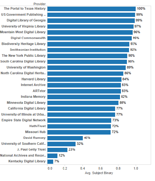
Figure 4. Percentage of Records having Subjects
It is also possible to look at the distribution of outliers — records with exorbitantly large numbers of occurrences of particular fields. Figure 5, below, looks at the distribution of subjects in our New York State hubs: the New York Public Library and the Empire State Digital Network.
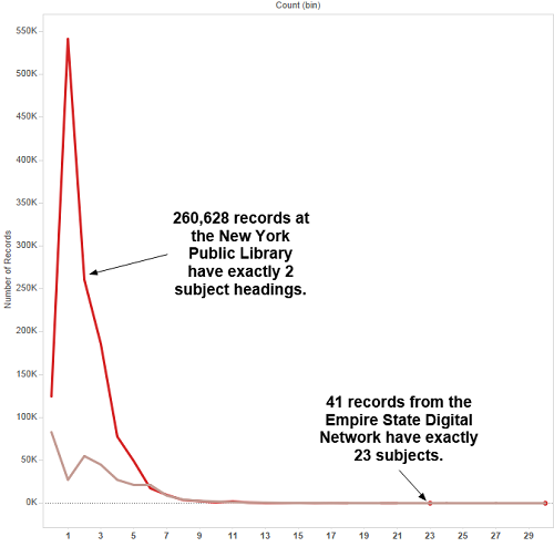
Figure 5. Distribution of NYPL and ESDN Subject Counts
Looking at these outliers has already identified mapping problems that DPLA has since fixed, such as a record with 1,476 subject headings. A record with 3,800 identifiers, one with 480 occurrences of the “Spatial” metadata element, and one with 24 languages also appear in the dataset.
Initial versions of these visualizations, and the work to report these outliers, was conducted shortly prior to DPLA 2015. At almost exactly the same time, Mark Phillips from University of North Texas was blogging the same findings, though using a completely different toolkit. His work involved loading the complete JSON data into Solr and using Solr’s built-in analytics to determine means, standard deviations, outliers, and other summary statistics of metadata to field distributions, with an initial focus on subject. [8] It was fascinating to note the parallels between the Phillips analysis and the findings reported here, with both processes even finding the same subject heading count outlier. However, this shouldn’t be a surprise given that Phillips’ earlier post on “Metadata Quality, Completeness, and Minimally Viable Records” were a partial inspiration for this work. [9]
Bar graphs, and to an extent line charts are useful mechanisms for viewing single metadata fields, but are poorly suited for looking at variance across multiple fields and across multiple providers. This is too much information to try to put on a single chart, and using “small multiples” of bar graphs is a bit cluttered in this context. It also does not allow at-a-glance comparison of multiple characteristics across providers, or some other differentiating feature.
This kind of comparison can be effective when viewed in a table, as shown in Figure 6 below, but the significant differentiating features aren’t as eye-catching or readily apparent when shown as tabular data.
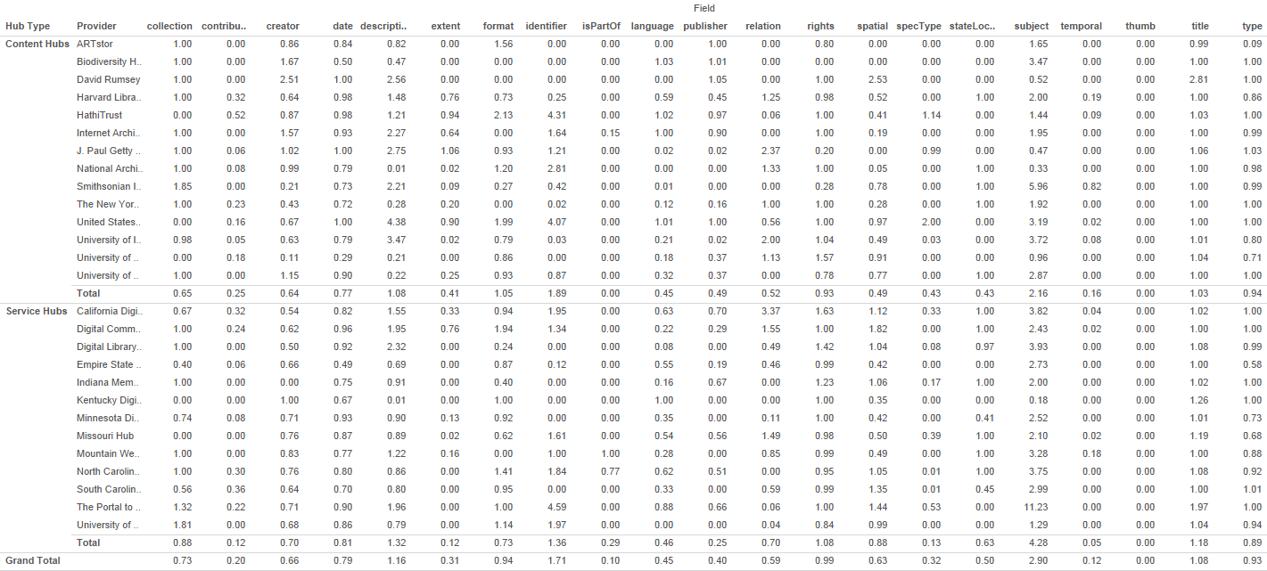
Figure 6. Tabular view of cross-field statistics
This paper introduces the concept of “Metadata Fingerprints” as a mechanism to provide an easy to read, quick visualization of multiple quantitative characteristics of arbitrary sets of metadata records. Figure 7 provides an example, comparing average “field counts” for multiple fields for Content Hubs (CH), Service Hubs (SH), and the overall averages for DPLA as a whole. Content Hubs were the original DPLA contributors, and represent cases where the Hub is a single organization and owns all of its content. Service Hubs have since become much more common, and represent mini-aggregators of their own, helping funnel the content of smaller libraries, archives, and museums into the DPLA. Figure 8 shows fingerprints for a selection of DPLA Providers.
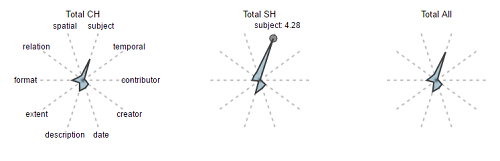
Figure 7. Metadata Fingerprints: Content Hubs, Service Hubs, All DPLA
These are simple D3 Star Plots, rendered using NodeJS and a “reusable chart generator” provided by Kevin Schaul of the Washington Post. [10] In these plots, each radius represents a metadata field, and the extent of the spike on that radius represents the average count of occurrences for that field for the given subset. It’s important to note that the relative shaded area of these fingerprints is not meaningful, but much information can be gleaned quickly from comparing the overall shape and the length of the spikes.
In Figure 7, you can clearly see multiple characteristics of the target datasets in one glance. For example, you can see that Service Hubs overall have almost twice as many subjects per record as Content Hubs. This data may be skewed slightly, since there is an uneven distribution of content hub vs service hub data, but for the sake of a rough comparison, the visualization should be sufficient because it is an average per record.
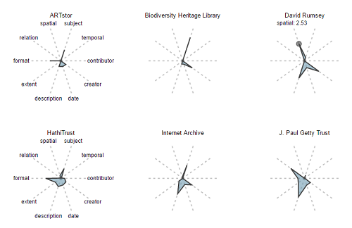
Figure 8. Metadata Fingerprints: Selected Hubs
Similarly, Figure 8 makes it very easy to see that the David Rumsey collection has far more “Spatial” metadata than other collections, and more than the hub-level aggregations in Figure 7. This makes sense, given that the Rumsey collection represents resources digitized from a map library.
Figure 9, which compares the binary occurrences rather than the average numbers, presents even more stark contrasts. This is because the scale is flattened out to percentages rather than representing counts. In the ‘averages’ prints, the length of each axis (radius) represents a range of 0-5, whereas in the binary version, the range is 0-1.
Here, you can still definitely see the disproportionate representation of spatial data in the David Rumsey collection. It is also clear here that Getty and Rumsey records are both far more likely to have “description” elements than many other data sets. Again, this makes intuitive sense, since both of these collections are largely image based and image metadata often has more free-text description than other data formats. It is still useful to be able to ascertain this information quickly and visually.
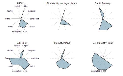
Figure 9. Binary Fingerprints: Selected Hubs
These fingerprints provide a simple and intuitive visualization to quickly compare characteristics of metadata across different levels of aggregation. If it were possible to view these data for sets representing “records that have been viewed in the DPLA User Interface” and “records that have not been viewed,” this might give us information about the metadata qualities that help to make resources discoverable.
Google Analytics
Recall that the initial project proposal noted that, “if relevant information can be generated from Google Analytics, analysis will be conducted to ascertain relationships between metadata terms and user queries, as well as to build regression models using metadata field use and content as predictors of item usage statistics.” Phase two of this research project involved collecting data from the DPLA Google Analytics account and merging it with these statistical descriptions of DPLA metadata.
It is important to note that Google Analytics may not offer a comprehensive view of usage. Users can opt out of Google Analytics, disable JavaScript, or otherwise browse anonymously, and these users are not counted. There are other factors that may result in undercounting, such as link design decisions discussed below and the fact that DPLA does not currently count API usage. Additionally, spam referrers and other bots could inflate these counts, though preliminary analysis shows that these are not a statistically significant component of the hits analyzed for this research.
Google Analytics Dashboards provide a tool to do some preliminary analysis and to browse statistical information about pageviews, searches, and other characteristics of web traffic. For example, Figure 10 shows the top 10 most viewed pages in DPLA, filtered to only show those with the “/item/” pattern that denotes an item record. This is useful, but it does not give us the capacity to visualize these data, sorting and manipulating them in interesting ways. More importantly, it is difficult to combine Analytics data from the dashboards with data from other sources, such as our metadata characteristics. It is also challenging that for some queries the statistics presented are a summary and Google Analytics will perform sampling to reduce the volume of rows returned.
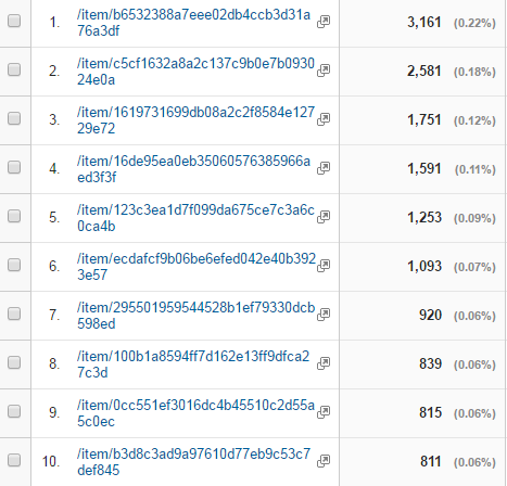
Figure 10. Top 10 Items by Pageview
To overcome some of these limitations, it is possible to harvest data from the Google Analytics API, avoid throttling, and store that data offline for various additional forms of analysis. Figure 11 shows a bar graph representing the same top 10 most viewed items, and makes it far easier to see the difference in scale between the top viewed item and number 10. Note that these counts are based on a query limited to the 2013 Launch of DPLA through Feb 6, 2016. There are now additional page views, including a spike during the lead up to DPLA 2016, but those additional data were not available at the time this analysis was completed.
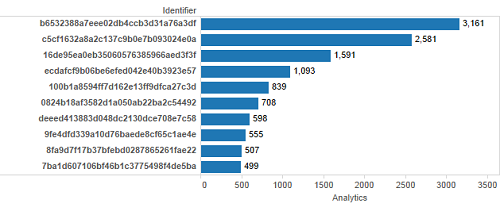
Figure 11. Top 10 Items by Pageview, Bar Graph
Harvesting from Google Analytics was initially completed through one-off harvesting scripts through the Google Analytics API. Those scripts have now been generalized into a simple utility that allows bulk harvesting. This Python Google Analytics utility, Pyganalytics, is available on Github along with straightforward installations instructions. The code takes a yaml configuration file containing a Google Analytics “View” (to which you must have access), a single “metric,” and a set of up to 7 “dimensions.” Additional command line arguments include a start and end date and an output file. The script will retrospectively query the API, using 1 week intervals to avoid sampled data, and output a single pipe delimited csv file. It is also possible to switch harvest intervals to one day if throttling does occur.
Additionally, and perhaps more importantly, harvesting data from Google Analytics allows us to combine these data with other datasets, such as the metadata field counts that drive our “fingerprints.” With this additional data, it becomes possible to examine if, and to what extent, the metadata fingerprints differ for used and not used DPLA items.
Figure 12 shows our average and binary field counts split for approximately 550,000 of the DPLA items that have at least 1 hit registered in Google Analytics and a random sample of 550,000 of those with 0 hits. Note that the shape of these two fingerprints is almost identical, but the records that show evidence of use are just slightly “bigger” than those that are not used. The subject spike for used is 3.65, while the spike for unused is 2.95. This isn’t conclusive, but seems to imply that slightly more metadata is going to slightly increase your likelihood of being seen in the DPLA aggregation. It would be worth looking at how this changes if analyzing fingerprints of items with more than two, or more than five hits. Additionally, it could be interesting to compare used versus not used fingerprints for specific formats or item types.
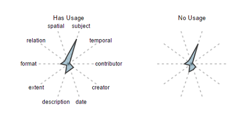
Figure 12. Fingerprints by Usage Status
There is one caveat in the definition of “use” employed by this analysis. This definition is almost certainly under representing use of DPLA items. Anecdotally, many users probably don’t hit the DPLA item page, but instead go directly from the search results list to the source collection via the “View Object” link and therefore never land on the DPLA Item page.

Figure 13. DPLA Search Results
Unfortunately, it is not possible at this time to track outbound links from DPLA to constituent data providers via the DPLA Google Analytics. We can, however, look at referrals from DPLA in those cases where a Hub or other partner institution has its own Google Analytics setup.
Figure 14 shows the distribution of referring page paths for DPLA referrals to one of the Service Hubs for 2015. This shows that there is an additional referral directly from the “search” page for every two referrals from the “item” page. This seems to support the hypothesis that our research methodology under-reports the usage of materials in the DPLA.
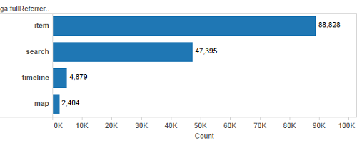
Figure 14. DPLA Referring Page Paths
Nonetheless, the question of whether this usage is influenced by the shape and other characteristics of an item’s metadata in general bears further exploration, and could be used to inform policies and recommendations about metadata assessment. During DPLAFest 2016, Gretchen Gueguen made the very important point that “[metadata] quality is contextual.” [11] In the subsequent discussion, an audience member suggested that the concept of metadata assessment might be better described as metadata optimization. This conversation was the source of the title of this article, and these findings apply to optimization in the context of discoverability in the DPLA.
Word Counts
Another phase of this research project looked closely at word counts, Natural Language Processing, Topic Models, Bi-Gram and Tri-Gram Frequency Analysis, and a variety of other aspects of the language of metadata in the DPLA. Findings in these areas are out of scope for this article, though hopefully future articles or blog posts will address some of these topics. However, raw word counts per field are in scope, and inform some of the final steps of this preliminary analysis.
Another long format data set was generated containing all the words per field per record in all of the DPLA. This is a 25 GB file, containing some 150 million rows of textual data. This allows us to easily segment data by field and provider and analyze word counts.
Once again, Mark Phillips’ work in the weeks before DPLA Fest 2016 paralleled this research almost exactly. Figure 15 shows the average total number of words in all description fields for a given record, broken down by provider. As was true with description binary field presence percentages, we can see that our primarily image-based providers have generally more verbose description fields than any other hubs. The same weekend that this figure was generated, Phillips posted “DPLA Descriptive Metadata Lengths: By Provider/Hub,” which performs a very similar analysis, only by character length rather than word count. [12]
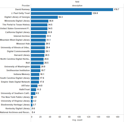
Figure 15. Average Word Count for Descriptions
As before, with field occurrences, we can generate fingerprints based on word counts and compare the general shape of our metadata across different providers. Figure 16, below, shows the log of average word count for selected fields for selected providers. Logs are taken in order to flatten out the ranges and allow us to see more of the differentiation between hubs. Without taking logs, we have fields like description, which could average as many as 150 words, and other fields like type, which might average one word. Given these uneven distributions, fingerprints of raw word counts, shown in Figure 17, don’t allow us to differentiate between providers at all.
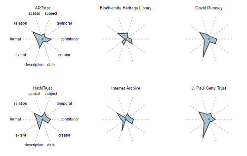
Figure 16. Log Word Count Fingerprints
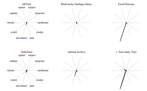
Figure 17. Word Count Fingerprints
Machine Learning and Predictive Analytics
The stretch goal of the initial project proposal was to determine whether these metadata characteristics presented any capacity as predictors of usage as counted by DPLA’s Google Analytics. A variety of regression analysis and machine learning techniques were tested, with varying degrees of success. The remainder of this paper focuses on the most promising set of techniques: variations on decision tree induction. For an excellent visual introduction to decision trees, and to machine learning in general, read the blog post by Stephanie Jyee and Tony Hschu. [13] Additional techniques that showed less promise included linear regression, logit regression, support vector machines, and Gaussian naive Bayes classification. An analysis of the results of experiments with these techniques can be found in a Jupyter Notebook published concurrently with this article. For a more comprehensive look at all of these approaches, Provost and Fawcett’s Data Science for Business provides both an excellent overview of many machine learning and data science techniques for both technical and non-technical audiences. [14].
Please note: all of the following results are preliminary and should be validated by independent application of similar techniques before being taken as indicative of any predictive ability of these models.
Using scikit-learn and Pandas, a number of classification algorithms were run to try to predict a binary analytics target variable, representing used or not used. The classifiers built their model from a feature vector composed of the following fields:
featurelist = ['collection_x', 'contributor_x', 'creator_x', 'date_x',

'description_x', 'extent_x', 'format_x', 'identifier.1', 'isPartOf_x',

'language_x', 'publisher_x', 'relation_x', 'rights_x', 'spatial_x',

'subject_x', 'temporal_x', 'title_x','type_x',

'collection_y', 'contributor_y', 'creator_y', 'date_y',

'description_y', 'extent_y', 'format_y', 'identifier_y', 'isPartOf_y',

'language_y', 'publisher_y', 'relation_y', 'rights_y', 'spatial_y',

'subject_y', 'temporal_y', 'title_y', 'type_y', 'total']
All fields with an “x” suffix represent occurrence counts of that field, while “y” fields are word counts per field, and total is the total word count of the record. Initially, models were trained on a sample dataset of 1.1 million rows, 550k used and 550k not used items. Models were trained on 70% of those records and evaluated on 30% which were held out and not used when training the model. The use of holdout evaluation provides a more accurate picture of how well the model performance generalizes.
The first non-linear model tested was a Gaussian Naive Bayes classifier. A Naive Bayes (NB) classifier is one that naively assumes complete independence between features. The Gaussian NB further assumes that the probability distributions of the features are normal (Gaussian) distributions. That assumption means this is a poor choice here since features are unlikely to be distributed normally, but as a basic starting point it has the benefit of providing a baseline performance to which we can compare other classifiers.
The Gaussian NB gave us an overall prediction accuracy of nearly 90%, but an Area Under Receiver Operating Characteristic (ROC) Curve of under 0.55. The Area Under ROC Curve, often abbreviated AUC, is a slightly more nuanced evaluation metric than straight accuracy. Fawcett and Provost define an ROC Curve as “a two-dimensional plot of a classifier with a false positive rate [fpr] on the x axis against a true positive rate [tpr] on the y axis.” This essentially means that the curve is showing the tradeoffs between recall as measured by true positives, and incorrect false positives. A diagonal line on the plot would show an AUC of 0.5, which is the equivalent of guessing. The top right corner represents classing every point as positive, which means 100% of your true positive instances are predicted as positive, but so are 100% of true negatives. At any given point on the curve, you will have a correspondence. For example, an 80% true positive rate may corresponds to a 40% false positive rate. Figure 18 shows the ROC Curve for the GaussianNB model to help illustrate this concept.
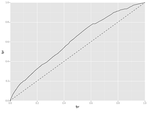
Figure 18. GaussianNB Area Under ROC Curve
Based on these metrics it is clear that, while accurate overall, there are some serious problems with the Gaussian NB. Its precision, which is the ratio of true positive predictions to total predicted positives (TP / (TP+FP)) is skewed. In other words, despite its overall predictive accuracy, it falsely predicts a large number of unused resources as used.
The next non-linear classifier used was a basic decision tree. Simple decision trees are rarely used in production predictive analytics, but its output can give a sense of whether there is potential for predictive modeling via tree induction. It performed surprisingly well on the evaluation data set.
Tree induction is a technique that builds a decision tree to classify data based on the features it is given. The tree building is tuned by a number of criteria about the size and depth of the resulting tree. This preliminary tree was tuned to never have less than 20 data samples in a split and to stop before exceeding 100 leaf nodes (final endpoints on the tree). This tree performed admirably, with AUC of Approximately 0.67. Figure 19 shows the AUC for this initial decision tree. Based on this metric, the decision tree induction used here was significantly better than a coin toss for trying to predict whether a DPLA item had been used or not used.
Figure 19. Decision Tree Area Under ROC Curve
So what decision points was the induction basing these predictions on? Figure 20 shows the full tree, which is a bit daunting. However, Figure 21 shows the first split, and it is informative. This cut splits off approximately 24,000 records containing fewer than 16.5 words total, and tells you that almost none of these records will ever be found. This makes intuitive sense, but it is useful to be able to actually demonstrate it. The only surprise here is that there are so many records in DPLA with so little metadata. The second split is focused specifically on the description field, though the “gini impurity” values tell you that the result of this split is not much better than a coin toss. Gini impurity tells you how often a prediction would be wrong if randomly assigned based on predicted distribution. [15] Still, as you go further down the tree, you eventually end up with a classifying algorithm that predicts with approximately 67% accuracy whether or not a DPLA item has ever been seen by a user through the DPLA interface. These predictions are evaluated on data that has not been seen by the training process.
Figure 20. Full Decision Tree Chart
Figure 21. First Splits
For emphasis, it bears repeating that this decision tree is seldom used in serious predictive analytics, but has the significant advantage of enabling tree visualization. It is far more likely for tree-based predictions to rely on ensemble methods, which take into account multiple classifiers — in this case trees — and average their predictions through a voting procedure. Ensembles tend to be more accurate, but they are also much harder to interpret and understand, since they make their predictions based on the average predictions of a large number of trees. Experimentation with ensemble methods began with a basic bagging classifier that coordinated predictions across 30 randomly generated trees, tuned using a “min_samples_leaf” parameter set to 50. Tests were run using a set of 7 bagging classifiers, with varying parameter settings, but min_samples_leaf=50 turned out to be the most effective. This model was initially trained and tested on balanced data, with a 50/50 split of used and not used items. It performed admirably, with an AUC of over 72. Further evaluation was done using a random sample of unbalanced data — approximately 5% used, resulting in an AUC of almost 73 percent, but with an overall accuracy of only about 70%.
Additional Evaluation Metrics and Ensembles of Trees
These additional details about model performance raised a few questions. Why would this model have a strong AUC, but a relatively low accuracy? What metrics should we be using to evaluate and tune this particular model? Is this result unfavorably influenced by the decision to train on a balanced data sample? To answer these questions, it is necessary to dig into a wider array of evaluation metrics. Figure 22 discusses a range of these model evaluation measures. As noted previously, Accuracy (ACC) gives us a summary of our overall accuracy, but does not provide any information about precision or recall. Looking at AUC adds information about the relationship between the True Positive Rate, which is another name for recall, and the False Positive Rate, which is sometimes called “Fall Out”. AUC doesn’t give us information about precision (the percentage of your predicted positives that are actually positive). There are a few options for getting a sense of both precision and recall in one metric. One approach is to look the precision and recall scores separately. Another is to review the F1 score, or F-Measure, which is the harmonic mean of both precision and recall. Finally, it can be helpful to look directly at the confusion matrix, and interpret the preponderances of True Positives, False Positives, True Negatives, and False Negatives.
Figure 22. Accuracy Measures
There are overall precision, recall, and F-Measure scores as well as scores for each individual class. A useful way of trying to understand all parts of a model’s accuracy is to view the confusion matrix, as well as the complete set of overall and class specific precision, recall, and F-Measure values. Below, you will find those reports for our Bagging Classifier.
Confusion Matrix:
[[334012  141841]  | TN | FP |
 [  5883  18264]]  | FN | TP |

F1 Score:
0.198250222521

Classification Report:
             precision    recall  f1-score   support

          0       0.98      0.70      0.82    475853
          1       0.11      0.76      0.20     24147

avg / total       0.94      0.70      0.79    500000
This confirms our suspicion that this model sacrifices a lot of precision in order to get good recall numbers. It’s able to identify over 75% percent of our used items, as shown by the 18k True Positives vs less than 6k False Negatives in our confusion matrix. However, doing so mislabels a huge number of points — over 141,000 — as positive that are not. The F-measure of 0.2 for our negative class also tells us that the combination of recall and precision here has much room for improvement.
There are many ways to try to adjust, or tune, our modeling to try to account for our strongly unbalanced data and to improve the precision scores of our results. Options include starting with the representative, unbalanced data; using random forests or extra trees rather than bagging classifiers; specifying class-weight when training the model; using grid search to tune parameters; or experimenting with changes to prediction probabilities. The choice depends on the specific question asked and what outcome we are optimizing to achieve.
After a lot of experimenting with these options and tunings, additional models began to offer different and potentially more useful results. Notably, working with deliberately balanced data resulted in models that, while they generalize well, tend to have little precision and overestimate positive cases to a large degree. So instead of a artificially balanced data set, a random sample of approximately 1 million records was produced, and split into 3 groups for training, tuning, and testing.
Using a random forest classifier provided an alternative ensemble method to bagging, which allows control over more useful parameters. Most notably, this approach allows you to set a number of features for each tree in the ensemble to use. Convention in the machine learning community is to limit this number of features to the square root of the number of features available. In this example, we have 37 features so we will work with a max_features per tree of 6. We continued with 30 estimators, though this can also be tuned.
There are also class-weight options that we can use to tell the model to give priority to predicting one class over another. This helps us mitigate for the relative scarcity of our used items. The default behavior is “unweighted”, which could contribute to poor recall when training a model on data that matches the distributions in the data set as a whole. A basic change to this is to use the “balanced” parameter, which “automatically adjusts weights inversely proportional to the class frequencies in the input data as n_samples / (n_classes * np.bincount(y))“. [16] In this data set, since in the holdout data used to evaluate the models we have 475,853 false and 24,147 true, we end up with weights of 0.52 for our false class and 10.35 for our true class. If we wanted to further experiment, we could do hyperparameter tuning to fluctuate these weights, either randomly or using a systematic approach like grid search, and see if we can further tune our model.
Finally, since our default prediction functions are based on whichever class is more probable, it uses a probability estimation threshold of 50%. This means that we predict used if we are more than 50% confident in this prediction. We can further weight our model toward a specific class by looking at different thresholds for prediction and estimating various evaluation metrics for each probability. For example, perhaps we want to optimize our prediction threshold for the best possible F-Measure. We can iterate through possible thresholds to determine where we hit our maximum, and we can graph the results. Figure 23 shows a graph of the F-Measures for every possible prediction threshold for our negative class. This graph shows that our model maximizes the F-Measure at a threshold of 32%.
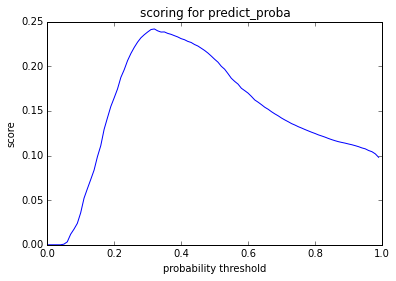
Figure 23. Prediction Threshold F-Measure Optimizations
The threshold indicates that the “best” predictions, where best is measured by F-Measure, come if the model predicts 0 whenever it is 32% or more sure that the value is false. This amounts to a deliberate over-predicting not used, which may seem counter-intuitive, but in the context it makes sense. We know there to be far more false than true values, and we’re telling the predictive function to explicitly compensate for that. It is important to note that this kind of threshold setting should be done on data that is not the data used to train the model, but is also not the model used to evaluate. Otherwise, information will “leak” from phase to phase of the process, and the results will be less generalizable. This is part of why the models here were trained on “training” data, tuned on “tuning” data, and evaluated on “test” data. A 4th random sample of data was used for further evaluation on a larger data set. You can learn more about “leakage” on the Kaggle wiki, which has an excellent discussion of the topic. [17]
As shown in the metrics below, our model is now accurate almost 91% of the time. This is a significant improvement over the previous 70% accuracy. The AUC is slightly lower than the prior model (0.61 as opposed to 0.72), but the F-Measure is up from 0.19 to 0.24. Most notably, we’ve clearly traded a significant amount of recall for precision in our ability to class positives. There are almost 80% fewer false positives, though our false negative rate has tripled.
Accuracy:
0.909846

AUC:
0.619666986052

Confusion Matrix:
[[447716  28137]
 [ 16940   7207]]

F1 Score:
0.242288749559

Classification Report:
             precision    recall  f1-score   support

          0       0.96      0.94      0.95    475853
          1       0.20      0.30      0.24     24147

avg / total       0.93      0.91      0.92    500000
The statistician George Box famously wrote that, “All models are wrong, but some are useful.” [18] In this case, we have a few different models that are “wrong” in distinctive and interesting ways. This raises the question of whether we want to err on the side of precision, recall or somewhere in between? And do we want to focus on more accurate prediction of not used items or used items. Our tendency here is to lean towards optimizing based on F-Measure and precision at the expense of recall in the used (true) cases. This optimization helps us better understand the characteristics of DPLA metadata for items that have been used. For example, it gives more weight to the idea that a used item tends to be one that has at least 16.5 words total. Further discussions of the use case for this information with stakeholders at DPLA or the DPLA Hubs could lead to a refinement of these optimization decisions.
This raises one more caveat in this research. Though the ensemble methods, and especially random forests, performed more accurately in these experiments, they are also much harder to interpret. This is another tradeoff that must be considered when making decisions about what model to use. The simple decision tree had the advantage that the tree could be visualized. Digging into its depths was tedious, but if the goal is to help advise collection curators and metadata experts on best practices for metadata production, interpretability is important. Imagine now trying to interpret the collection of 30, or 50 such trees that inform an ensemble. However, the random forest classifier does offer us a simple list of what features are “most important” across all the constituent trees. In this case, this provides a bit of information and more importantly, it seems to confirm the general split points seen in the initial decision tree classifier.
- Total Words (0.113245)
- Desc Words (0.086540)
- Rights Words (0.063029)
- Title Words (0.057273)
- Subject Words (0.056207)
- Collection Words (0.053083)
- Subject Count (0.052737)
The decimal values across all 37 features add to one and represent relative importance in the forest. The first 7, listed here, add up to almost 50%. The next 20 have values between 0.01 and 0.05 and the remaining 10 show importance of less than 1%. It is notable that “Subject Count” is the only non-word-based feature with an importance greater than 0.05.
Conclusions and next steps
The quantitative metadata visualization described in this paper, as well as in work by Mark Phillips and Péter Király [19], represent a significant contribution to the areas of metadata assessment and optimization. The metadata fingerprints are especially novel, in that they allow digital collection managers, aggregators such as DPLA, and metadata specialists to compare groups of metadata across multiple facets at a quick glance. Fingerprints make it relatively easy to investigate metadata variance across groupings, and also to identify common metadata patterns. The investigations here offer comparisons across DPLA providers and between items that have been used and not used in the DPLA user interface as identified by DPLA’s Google Analytics.
Other segmentations of this data are possible, depending on the question being asked. For example, it is possible to group metadata by format or genre, perhaps to look for differences in the general shape of images, text resources, and audio visual materials. It would also be possible to compare the used and not used fingerprints for a specific format, such as images, to see if some of the variance disappears. If a similar analysis were done on Europeana data, building on Király’s work, a comparison could be conducted on the subset of Europeana Data Model (EDM) properties common to both DPLA and Europeana.
The predictive modeling described here is very preliminary, and there are a number of next steps that could be taken. To begin with, further conversations with DPLA and the DPLA Hubs can help refine the use case for this kind of analysis. While the initial research question was rooted in metadata assessment, recent discussions with DPLA staff have suggested that the word count findings could indicate that Google’s harvesting or search algorithm prefers records with more words. DPLA hypothesized that there are some search engine optimizations that could be applied to increase referrals from Google to DPLA. Additionally, these findings could inform decision making about tuning the indexes on DPLA’s internal search engine. Addressing these new questions could lead to the development of alternate models, with slightly different parameters. Discussions of Google Crawling also led to questions about the potential impact of term uniqueness. There is a possibility that having many records with very similar, template-based or collection-based metadata records may be penalized by search engines. Another possible future development would be to capture some measures of term or phrase uniqueness for each record, either through hapaxes (terms or phrases that appear only once in a corpus) or the average of a measure like TF-IDF, which weights document term frequencies by the relative frequency of the term in a corpus of documents.
This is a good example of “feature engineering,” which is another useful area of continued exploration. The 37 features used in this model include representations of metadata field counts and word counts, but there are a number of other metadata characteristics that could produce a correlation with increased usage. Categorical or factor variables could also be included, such as “collection” or “format.” Thumbnails could also provide information to help predict item usage. Features could be extracted that represent “whether there is a thumbnail,” “whether the thumbnail is unique or generic,” or even “what colors or hues are in the thumbnail.” The last of these could be derived from Chad Nelson’s work on DPLA Color Browsing. [20] These are just a few examples of features that could be engineered from this data set and exposed to predictive models.
Predictive modeling of digital library usage is only one potential application of these techniques to library data and metadata practice. Other possibilities include modeling of cost per use of print, subscription electronic, or local digital collections; comparison of electronic book / journal downloads to print circulation to quantify the effect of electronic materials purchasing on print usage; or use of clustering algorithms and collaborative filtering to build recommendations and suggestions for specific users, topics, or disciplines.
Additionally, collection development or digitization prioritization and decision-making could be informed by probabilistic groupings of latent topic models in metadata, full-text documents, or even user queries. These models, along with other natural language processing techniques, particularly as applied to full text and to query logs, could also help identify emerging areas of research, inform the development of taxonomies and controlled vocabularies, and even contribute to the automated generation of provisional metadata records. These probabilistic, machine learning, and data science techniques are increasingly used in other domains, and are starting to gain traction with library systems vendors. Academic libraries are in a unique position to partner with data science institutes and centers to advance research of this kind, and the profession should be further exploring these areas.
Libraries, archives, and museums should also look more closely at data about the use of our collections, systems and services. This data can be used to inform decisions about staffing, resourcing, strategic directions, and prioritization. This form of data driven decision making has long been employed in other domains, but is only beginning to catch on in our community. There are few examples of the application of predictive modeling to library decision making in the literature. The most notable example is the work of Daniel Coughlin at Penn State University to use linear regression and ANOVA to model the relationship between cost and usage of electronic journal subscriptions. [21] [22].
Additionally, libraries should be using algorithms and probabilistic modeling to deliver appropriate and timely resources and services to the researchers we serve. Vendors like Elsevier are already engaged in this space, and we run the risk of being left out of the conversation if we don’t develop core competencies in these areas. Elsevier, for example, has a Research Intelligence division, and it has been suggested that Elsevier’s purchase of the Social Science Research Network (SSRN) was due to SSRN’s value as a repository of data about the value of social science research, whose work influences whom, and what trends exist in particular fields. [23] University Libraries have both the data and the credibility to do this in an open access context, but to do so we must collectively develop the skills and muster the interest in this space.
Libraries need to start applying these data science techniques. Our profession should be experimenting with using natural language processing and machine learning to generate provisional controlled vocabularies and apply them to corpuses of text. This is demonstrated on a specific, targeted domain in a forthcoming article by Raphael Hubain. [24] As these modeling techniques evolve, we should also be able to cluster resources in meaningful ways, build recommender systems, and use data visualization techniques to create new kinds of end-user interfaces. Data science techniques are rapidly maturing in the private sector, where the collection and analysis of data allows for more informed decision-making. Through the adoption of similar techniques, libraries can improve our approach to the management and assessment of metadata practice. The techniques discussed in this article are very preliminary examples of how data science can help transform the role of the library and ensure that our organizations make better decisions to support the communities we serve.
Acknowledgements
I would like to graciously thank Dan Cohen, Gretchen Gueguen, Tom Johnson, and Mark Matienzo of DPLA for making bulk JSON data publicly available, providing me with access to Google Analytics information for this research, and allowing me to use DPLAFest as a forum for feedback on this work. Additionally, I would like to thank Andreas Mueller for offering advice on scikit-learn evaluation metrics and model selection techniques. Finally, I am deeply grateful to Dan Chudnov, Gloria Gonzalez, Tom Johnson, and Reed Shadgett for providing substantive and helpful comments on various drafts of this paper.
References
[1] Digital Library Federation (DLF) Assessment Interest Group (AIG) Metadata Working Group [Internet]. Updated 2016 Jul 06. [cited 2016 Jul 07]. Available from: http://dlfmetadataassessment.github.io/
[2] Ward JH. 2002. A quantitative analysis of Dublin Core Metadata Element Set (DCMES) usage in data providers registered with the Open Archives Initiative (OAI) [thesis]. [Chapel Hill, NC]: University of North Carolina. [cited 2016 Jul 07]. Available from: http://ils.unc.edu/MSpapers/2816.pdf
[3] Dushay N, Hillmann DI 2003 Sep 28. Analyzing Metadata for Effective Use and Re-Use. International Conference on Dublin Core and Metadata Applications. [cited 2016 Jul 07]. Available from: http://dcpapers.dublincore.org/pubs/article/view/744
[4] Press G. 2013 May 28. A very short history of data science [Internet]. Forbes. [cited 2016 Jul 07]. Available from: http://www.forbes.com/sites/gilpress/2013/05/28/a-very-short-history-of-data-science/
[5] Mitchell E, Steeves V, Muilenburg J. 2015 Nov 19. Organizational implications of data science environments in education, research, and Research management in libraries [Internet]. CNI Fall 2015 Membership Briefing. [cited 2016 Jul 07]. Available from: https://www.cni.org/topics/digital-curation/organizational-implications-of-data-science-environments-in-education-research-and-research-management-in-libraries
[6] Chudnov D. 2016 Jun. The intentional data scientist: three ways to get started [Internet]. Computers in Libraries. [cited 2016 Jul 07]. Available from: http://www.infotoday.com/cilmag/jun16/Chudnov–The-Intentional-Data-Scientist–Three-Ways-to-Get-Started.shtml
[7] Press G. 2016 Mar 23. Cleaning big data: most time-consuming, least enjoyable data science task, survey says [Internet]. Forbes. [cited 2016 Jul 08]. Available from: http://www.forbes.com/sites/gilpress/2016/03/23/data-preparation-most-time-consuming-least-enjoyable-data-science-task-survey-says
[8] Phillips, ME. 2015 Feb 24. DPLA metadata analysis: part 1 – basic stats on subjects [Internet]. [cited 2016 Jul 08]. Available from: http://vphill.com/journal/post/5553/
[9] Phillips, ME. 2015 Jan 05. Metadata quality, completeness, and minimally viable records [Internet]. [cited 2016 Jul 08]. Available from: http://vphill.com/journal/post/4075/
[10] Schaul K. 2014 Jan. d3-star-plot [Internet]. [cited 2016 Jul 08]. Available from: https://github.com/kevinschaul/d3-star-plot
[11] Gueguen G. 2016 Data Quality at the Scale of Aggregation [Internet]. [cited 2016 Jul 04]. Available from: https://drive.google.com/folderview?id=0BzpQeSFqkiZKVWRHYnR3UEVJQm8
[12] Phillips, ME. 2016 Apr 12. DPLA descriptive metadata lengths: by provider/hub [Internet]. [cited 2016 Jul 08]. Available from: http://vphill.com/journal/post/5908/
[13] Jyee S, Hschu T. 2015. A visual introduction to machine learning [Internet]. [cited 2016 Jul 04]. Available from: http://www.r2d3.us/visual-intro-to-machine-learning-part-1/
[14] Provost F, Fawcett T. 2013. Data science for business. Cambridge (Ma): O’Reilly Media.
[15] Wikipedia contributors. Decision tree learning [Internet]. Wikipedia, The Free Encyclopedia; 14 May 2016, 07:04. UTC [cited 2016 July 5]. Available from: https://en.wikipedia.org/wiki/Decision_tree_learning#Gini_impurity.
[16] Scikit-learn developers. 2014. sklearn.svm.SVC [Internet]. [cited 2016 July 5]. Available from: http://scikit-learn.org/stable/modules/generated/sklearn.svm.SVC.html
[17] Kaggle contributors. 2013 Dec 04. Leakage [Internet]. [cited 2016 July 8]. Available from: https://www.kaggle.com/wiki/Leakage
[18] Box GEP. 1979. Robustness in the strategy of scientific model building. New York: Academic Press. Launer RL, Wilkinson, GN. Robustness in Statistics; p. 201–236.
[19] Király P. 2016 Apr 09. Report number three (Cassandra, Spark and Solr) [Internet]. [cited 2016 July 8]. Available from: http://pkiraly.github.io/2016/04/09/third-report/
[20] Nelson C. Mar 2015. Color Browse [Internet]. [cited 2016 July 8]. Available from: https://dp.la/apps/33
[21] Coughlin DM. 2016 Mar 03. A web analytics approach for appraising electronic resources in academic libraries. Journal of the Association for Information Science and Technology. 67(3):518-534. DOI: 10.1002/asi.23407
[22] Coughlin DM. 2015 Sep 07. Modeling journal bibliometrics to predict downloads and inform purchase decisions at university research libraries. Journal of the Association for Information Science and Technology [Internet]. [cited 2016 Jul 08]. Available from: http://dx.doi.org/10.1002/asi.23549
[23] Kelty C. 2016. It’s the data, stupid: what Elsevier’s purchase of SSRN also means [Internet]. [cited 2016 Jul 04]. Available from: http://savageminds.org/2016/05/18/its-the-data-stupid-what-elseviers-purchase-of-ssrn-also-means/
[24] Hubain R. 2016. Automated SKOS vocabulary design for the pharmaceutical industry [Internet]. [cited 2016 Jul 04]. Available from: http://hubain.be/lemuridae/index.php/automated-skos-vocabulary-design/
About the Author
For almost 15 years, Corey has built digital libraries, administered library systems, and managed, migrated, and analyzed library metadata. First at the University of Oregon, and then at New York University, Corey led data analysis for an ILS Migration and administered systems including Aleph, ContentDM, DSpace, Hydra, Metalib, Millennium, and Primo. Corey is also deeply involved in the community around linked open data in libraries, co-founding the ALA LITA/ALCTS Linked Library Data Interest Group and leading the IGeLU / ELUNA Linked Data Special Interest Working Group for users of Ex Libris products. Corey recently completed his MBA at NYU’s Stern School of Business, with a focus on business analytics and is now transitioning to a career focused on business intelligence and data science in academic research library and cultural heritage environments.

Subscribe to comments: For this article | For all articles
Leave a Reply