by Shaun Ellis and Maureen Callahan
Introduction
What’s an interface for?
Library software developers and interface experts are often asked to improve the usability of our websites. Yet, all too often, efforts to improve usability don’t go far enough to address the real user experience (UX) challenges libraries must overcome (Mathews, 2012). Since our websites are actually a reflection of a whole ecosystem of tools, practices and attitudes within the library, the authority required for changing the underlying practices is beyond the reach of the technology departments alone. At the same time, senior management is understandably wary of runaway projects, and generally wants to avoid being too disruptive without proof that the risks involved with implementing “paradigm-shifting” ideas are manageable and effective. Moreover, both library developers and senior management are far removed from most of their user base. With such limited interaction, how can developers really know what is right for our users?
Many claim the Agile method of software development avoids delivery-time disappointment and improves user experience by offering a more inclusive and collaborative process with stakeholders. Agile was designed to alleviate anxiety and build trust, but as simple as its proponents claim it is, there can be challenges to its adoption and such dramatic shifts in process are not always feasible. Moreover, Agile assumes that the “client” is a known entity, a stakeholder that will help guide the software toward everyone’s needs. In libraries, it’s hard to involve our patrons and researchers as much as they should be, especially when there’s such diversity among their needs and goals.
In this paper, we discuss how integrating relatively untested, but promising new ideas for online finding aids required us to adopt a development process that would allow us to better understand the goals of both general and staff users, while reassuring stakeholders that a departure from convention would be worth the investment. Our approach used a flexible subset of Agile practices based around measurable goals, iterative prototypes [1], weekly meetings with institutional stakeholders, and “discount usability testing” in an attempt to develop greater empathy with our users, flexibility in our process, and ultimately deliver an innovative and much-improved user experience. [2]
Background
Simply following modern web conventions is the solution to the lion’s share of usability problems (Alexandre et al, 2012), even for archival access systems. At a time when users can expect to find all kinds of content on the web, they are understandably frustrated that most archives offer world-wide online access to metadata, but then subject them to confusing processes to be able to get to the archives, register, request materials and look at them. [3] Perhaps just as frustrating are non-standard local practices, professional jargon, and long, complicated finding aids that make archives sites difficult for the novice researcher to navigate. We went to work imagining an archives access system more in concert with what patrons have come to expect from the web.
Princeton University Libraries holds approximately 2200 archival and manuscript collections, nearly all of which are described in EAD-encoded finding aids. Although these are also described in an abstracted form as collection-level MARC records and available in an OPAC environment, online finding aids are the primary context for user access, and web search is the primary discovery channel.
The previous iteration of finding aid data at Princeton was a straightforward HTML rendering of EAD XML– it treated structured data as a single, often monograph-length document. For the last few years, archivists and library technologists at Princeton have been thinking about what the next generation of archival description might look like, leveraging the potential of structured data.
The Experiment
The idea of making EAD components, not collections, the “atomic unit” of our finding aids site to improve findability and performance was the guiding notion of the site redesign. What does this mean, exactly? Archives are described hierarchically – for instance, a file of correspondence from a writer’s literary agent may belong to a file group of business correspondence, which belongs to a correspondence series (which may also include personal and fan correspondence), which belongs to the collection of all of the writer’s papers. Each level has descriptive metadata, and belongs to what we call a component. When encoding archival description in EAD, the component is a wrapper element that helps denote the beginning and end of an archival unit. What was important to us was to no longer privilege any particular level of description but instead return the part of the collection most relevant to the patron’s search, without losing the place of this component in the context of the collection.
Viewing a single component as a record is a very different experience from the usual practice of viewing it as one line in a long list in a traditional finding aid. But the component-as-record approach is fully acceptable within archival standards. We engineered our rendering of component-level records so that they include all of the descriptive metadata fields necessary to meet single-level minimum requirements as described by DACS (Describing Archives: A Content Standard) and each component record has a unique identifier and a stable URL. In other words, we have URLs that represent every level of the collection hierarchy.
We certainly did not invent these ideas – archivists have been thinking and writing about this idea of breaking up archival components into discrete descriptive records for years. [4] [5] Perhaps the reason that we see so few single-level displays today, despite the long-standing call to action, is because it is a major break in convention for online finding aids. Changing web conventions can confuse expert users who learned how to use the old tools despite their drawbacks, so we needed to proceed with caution. The only way we could know if this approach would make research easier for both basic and expert users was to observe both using it.
Brief Goals Document
Based on an extensive review of the available literature about how users respond to archival description, the Finding Aids Website Redesign Working Group created a list of desirable features for the new finding aids site.
In addition to “atomizing” components, we also wanted to allow users to view any available digitized content they describe. We were already digitizing documents for researchers who couldn’t come to campus at several of the archival divisions and the digital photography studios, and we were interested in making this content available to the general public [6]. Links to some of this content were being added to finding aids, but the interface for viewing these scanned materials was poor, and we had very limited infrastructure for managing and storing the scanned files. We hoped that by providing an intuitive interface for browsing digitized content and a standard workflow, we could offer an easier path toward “user-initiated digitization” for divisions that were not yet recycling this content for public access (See Figure 1).
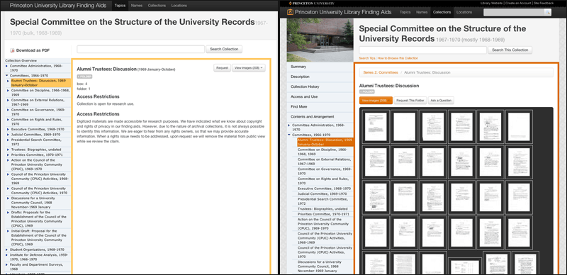
Figure 1. Access to Digitized Content: Side-by-side comparison of component-level views of one collection in prototype (left) and final site (right). Thumbnails of digitized content can be selected from the “View Images” menu for quick scanning of what can sometimes be hundreds of documents (shown on right). Lazy loading of thumbnails (aka, “load as you scroll”) improves performance in such situations. Right-hand example can be seen at http://findingaids.princeton.edu/collections/AC044/c0002.
It also made sense to leverage the EAC-CPF (Encoded Archival Context for Corporate Bodies, Persons, and Families) encoding standard for archival authorities [7]. A CPF record provides another portal to content in a way that may be more intuitive to the user – it starts with the subject of a research inquiry rather than the materials that might describe that subject. For instance, instead of searching the collections for everything that we may have about Woodrow Wilson, an EAC-CPF record provides information about Woodrow Wilson, and then lists the resources available in the repository that relate to Wilson, providing a “browse experience” as an alternative to search.
Finally, we wanted to allow for conversations to take place around our collections. Commenting on every page, which means at every level of description, allows users to provide insights, corrections, comments, transcriptions and explanations of our material that while useful, do not necessarily fall under the realm of archival description. And as an institution, we have made a commitment to read, reply to and follow-up on every comment that we receive.
We presented a short document listing these features to high-level decision-makers at the library. After securing their approval, this goals document became our touchstone for working through the project. It allowed us to measure how close we were to our initial goals and kept us focused on functionality without restricting the process or possible scope of solutions.
The governance and management of this project was limited to seven members [8] — an interface developer, a metadata analyst, and five librarians and archivists, all of whom are responsible for creating and maintaining archival description, and many of whom have daily interactions with the users of archives. Weekly meetings were scheduled among these members throughout the lifecycle of the project, which was essential to success as it provided the developers with the continuous feedback they needed to improve the prototype.
The Prototype in Action
User empathy leads to better design
One of the main challenges to improving UX for libraries and archives is how to cultivate user empathy in both developers and information professionals. The attitude that through online help, training, or brute force, students and researchers are expected to pay their dues and learn how to interact with these systems is a crutch that belies our commitment to patron satisfaction. Programming has traditionally been a rational process where problems are considered “solved” if they meet functional requirements, so developers have little motivation to further improve a system unless they actually witness the frustration and emotional turmoil some users experience with their products.
During the course of our work, as we came to important design decisions, members of the group would express preferences based on perceived user needs. Many of these decisions had to do with vocabulary and labels, which could be changed easily if we could come to a consensus. But others could require significant code changes, such as debates over search results expectations, navigational solutions, and content browsing. One of the best decisions that we made as a group was to focus our tests around these internal debates, so that we could see how our users responded and ask them about their preferences instead of speaking for them.
The right tools for the job
In order to get real screens and real data in front of all our users, our developers had to figure out how to get from goals to prototype as fast as possible, and then gather feedback and respond to it just as quickly. It was important that the prototype was not simply a mock-up, but that users were interacting with real data. Since we already had experience using eXist (http://exist-db.org) as an EAD database and MVC framework for the old finding aids site, getting real data into our prototype involved delivering contextual snippets of EADs in various formats based on HTTP requests. We added Solr to improve overall search performance and quality. And two new tools we adopted helped us enormously when it came to usability testing: Bootstrap (http://twitter.github.com/bootstrap) for prototyping, and Trello (https://trello.com) for tracking feedback and progress.
Up until now, prototyping for the web has been hard. But some prominent designers have recently argued in favor of abandoning graphics software and the extra work that comes with them and go straight to the working prototype (Fried, 2008). We found that Bootstrap, Twitter’s open-source set of reusable front end design patterns, gave us the tools we needed to build our pages with grids, elegant defaults, and a wide variety of instantly interactive web conventions. Best of all, the design is relatively neutral and elegant “out of the box,” and keeps the feedback focused on functionality, not distractions like color, type, and layout choices. Customization and branding decisions can happen later.
What Bootstrap does not do is offer ready-made solutions to domain-specific design problems. We had to create our own solutions to these problems in our prototypes, test them and gather feedback. Building a prototype quickly means nothing however, if gathering, discussing, and acting on feedback is not just as fast.
Trello caught our eye for managing feedback because it is a free workflow tool that takes cues from Agile’s use of index cards [9] to take user stories from idea to finished feature. In Trello, we try to state the problem in a single sentence, with a link if necessary, quickly turning feedback into cards. Further discussions and elaborations can occur easily through Trello’s notifications. The card is “dragged” through a custom-defined workflow until it ends up in the “Done” column. Assigning someone to the ticket is as simple as dragging an avatar onto the card. Moreover, we provide public, read-only access to our Trello board [10] so that anyone can see where their suggestions fall in the development priorities and workflow, building trust through transparency and inclusion (see Figure 2).
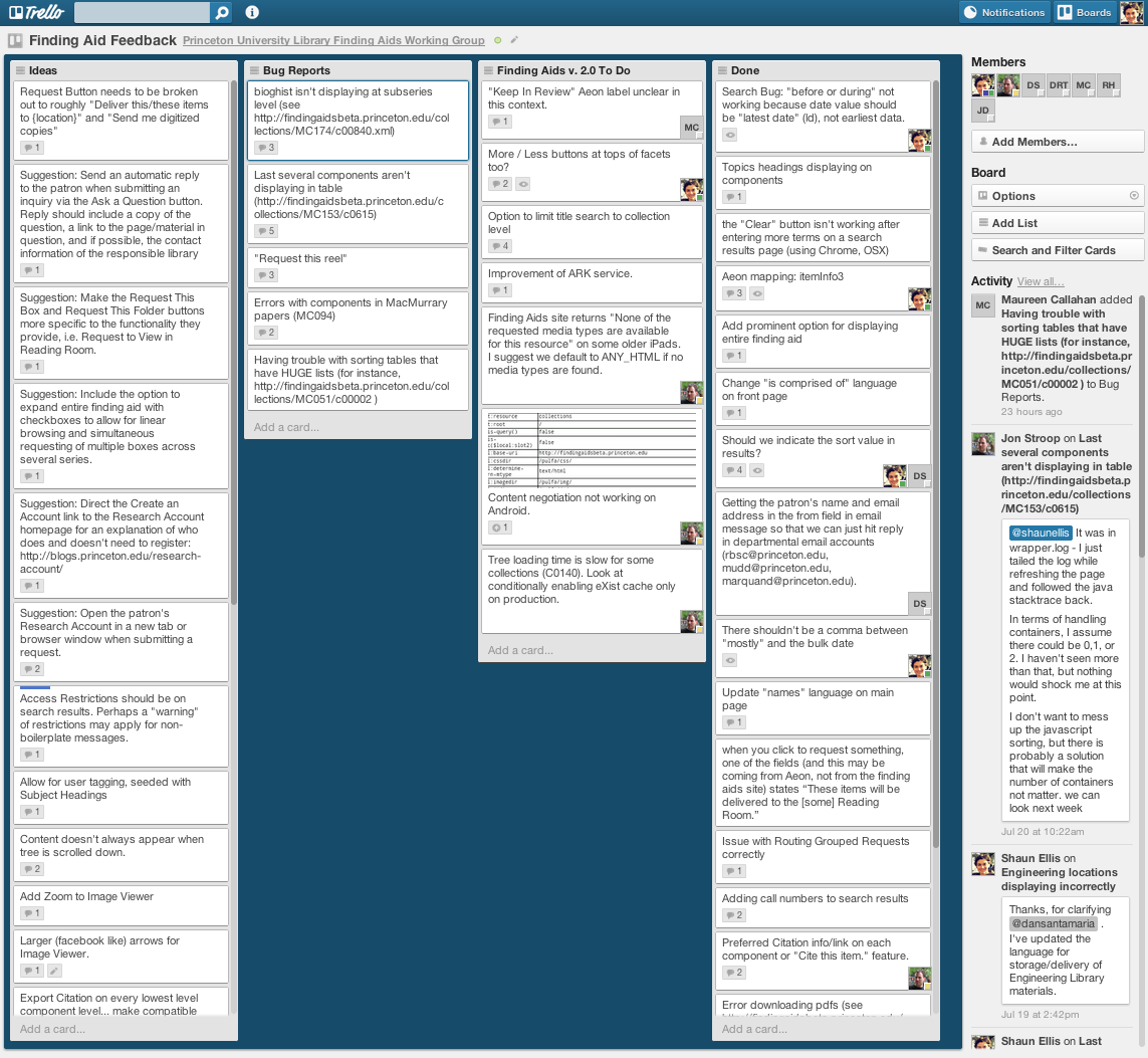
Figure 2. Example Trello board showing our “list-based” workflow for bug, feature and issue tracking.
Discount usability testing strategy
Once we had our prototype built and were ready to gather feedback, we took a page from Steve Krug’s chapter in Don’t Make Me Think, titled “Usability Testing on 10 Cents a Day: Keeping It Simple So You Test Enough”. Krug notes that after a team has worked on a site for even a few weeks, they can’t see it fresh anymore. The only way you can be sure about how well it works is to test (Krug, 2000).
Some stakeholders grow uneasy when a team brings up the topic of testing. The ghosts of past scholarly research projects can haunt those who have taken part in organizing studies on student populations, no matter how small. While they might be necessary for those who need to publish or perish, the administrative requirements, IRB training, and other overhead associated with formal testing place a heavy burden on what should be a simple process for developing user empathy. An alternative testing approach, known as Discount Usability Testing, simplifies the testing process with an emphasis on direct observation of a handful of users (Nielsen, 2000).
Krug also warns that focus groups should not be confused with usability tests. Focus groups can be helpful for encouraging interactive discussion among a group on reactions to design, but because they do not allow us to observe users performing goal-oriented, real-life tasks, they are not as effective in evaluating the usefulness of the site.
We kept these warnings in mind as we thought about how to gather good feedback from our users. We designed our user testing scenarios based on how much time the group could spare, with the understanding that some testing is better than none, and that we could get important information about our system without formal, extensive testing conditions. And we did it at a time when everyone in the project group had been looking at it long enough to know what it was supposed to accomplish, but too long to approach it with fresh eyes.
We wanted to get a quick reality check — do users understand what they’re looking at? Are they able to find, identify, select and obtain objects that meet their research needs efficiently? Are we allowing for serendipity, for researchers to stumble upon collections that may address their subject but don’t necessarily fit their search terms?
Our testing approach and observations
We divided testers into two groups – basic users (those who may have some knowledge of the subject matter or archival research, but have no knowledge of creating archival description) and staff users (archivists and librarians familiar with archival and bibliographic access systems) — with the objective of creating an optimum experience for both groups. We tested basic users individually and (for the sake of time) asked staff users to do testing in groups; each member took turns walking through the research task, which was projected onto a screen for others to see.
We asked each test person to perform five research tasks — two known-item searches, two subject searches, and one search that we hoped would prompt use of an EAC-CPF record to locate the information. Users were encouraged to speak through their process, explain how they chose their search terms, and talk through their clicks. As they performed these tasks, three of us from the development group kept notes on their process. We recorded areas of fluency and areas of hesitation with the system, and interrupted the process periodically with questions about what kinds of responses they expected from the system. We also asked a series of questions that tried to get a sense of not just how well the user was able to interact with the system, but how it felt to do so.
One research prompt illustrated the evolution of our system particularly well — we asked undergraduate students, public services archivists, reference librarians, and a professional researcher whose field of study is the Cold War era in the United States (with a particular emphasis on John Foster Dulles) the following question: “I’m writing a paper about John Foster Dulles, and how his personal religious convictions may have informed his evolving relationship with Ngo Dinh Diem. What do you have?”
In the previous finding aids site, a search for “john dulles diem” would return collection-level information such as the titles of the finding aids, abstracts, creators, and information about how to cite the collection and where it is (see Figure 3). However, since the match might occur anywhere in the finding aid, the actual search terms were not necessarily displayed on the results screen and the exact relationship between the search terms and the search results wasn’t always apparent. In this example, there’s no mention of “Diem” on the results screen. Clicking through, a user looking for information about John Foster Dulles’s religious beliefs would be forced to search (or control+F) through a fifty-thousand-word finding aid for relevant material.
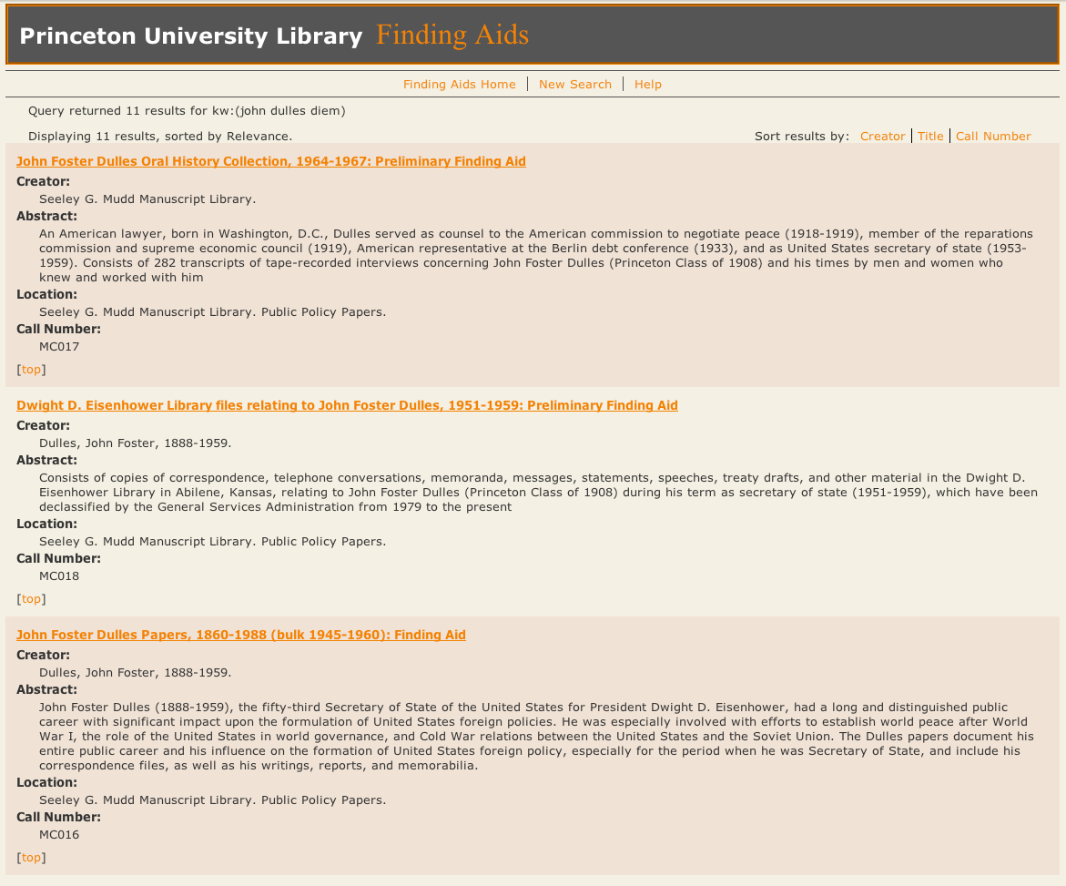
Figure 3. Search results for keywords ‘john dulles diem’ in the old finding aids site. Entire collections are returned, but the relationship with the query is not apparent.
In the prototype, our professional researcher first navigated to the John Foster Dulles papers before unsuccessfully clicking around the finding aid (and finally searching within the collection) for information about Ngo Dinh Diem. Along the way, he discussed very sophisticated strategies about how to approach the kind of interpretive analysis that the prompt required — perhaps reading Dulles’s diaries for mentions of his religious beliefs, or looking through correspondence about or with Diem, or about or with religious groups. This is important to note, because archival description does not necessarily include all the possible keywords that might lead to discovery — the researcher does need to develop a research strategy based on the possibilities of synonymy and aggregate description because an archivist may not have used the exact search term the researcher has in mind to describe materials about that subject.
We found in our testing that experienced archives users have a tendency to assume that the best place to find information on a person is within that person’s records. That is, if a person is looking for material about John Foster Dulles, he typically looks for the John Foster Dulles papers. And considering the search environments that we have been providing, where it is difficult to find records about a person when that person isn’t the collection creator, this search behavior is rational. The flip side of this behavior is that relevant information from unlikely sources tends to stay hidden. As is common, our library holds more than one collection about a historical figure (in this case, an oral history collection, records of other members of the Dulles family, as well as records collected as part of a different institutional context than Dulles’s personal papers). A search across the prototype for terms about both Dulles and Diem clarifies the relevancy of the results because users can immediately see which parts of each collection might be most interesting to them, and the keywords appear in the results to provide some context. An additional search for only Ngo Dinh Diem reveals wondrous possibilities, including political cartoons from an artist’s collection and the records of the Council on Foreign Relations, a public policy group that would probably have an interesting take on what cold warriors thought of the Vietnamese leader (see Figures 4 and 5).
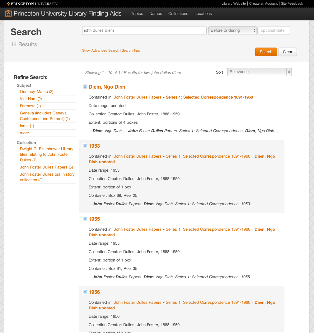
Figure 4. Search results for “john dulles diem” allow the user to go directly to the relevant part of the finding aid while still providing context for where it is located within the finding aid. Though off-screen, relevant components from other collections show up in the search results.
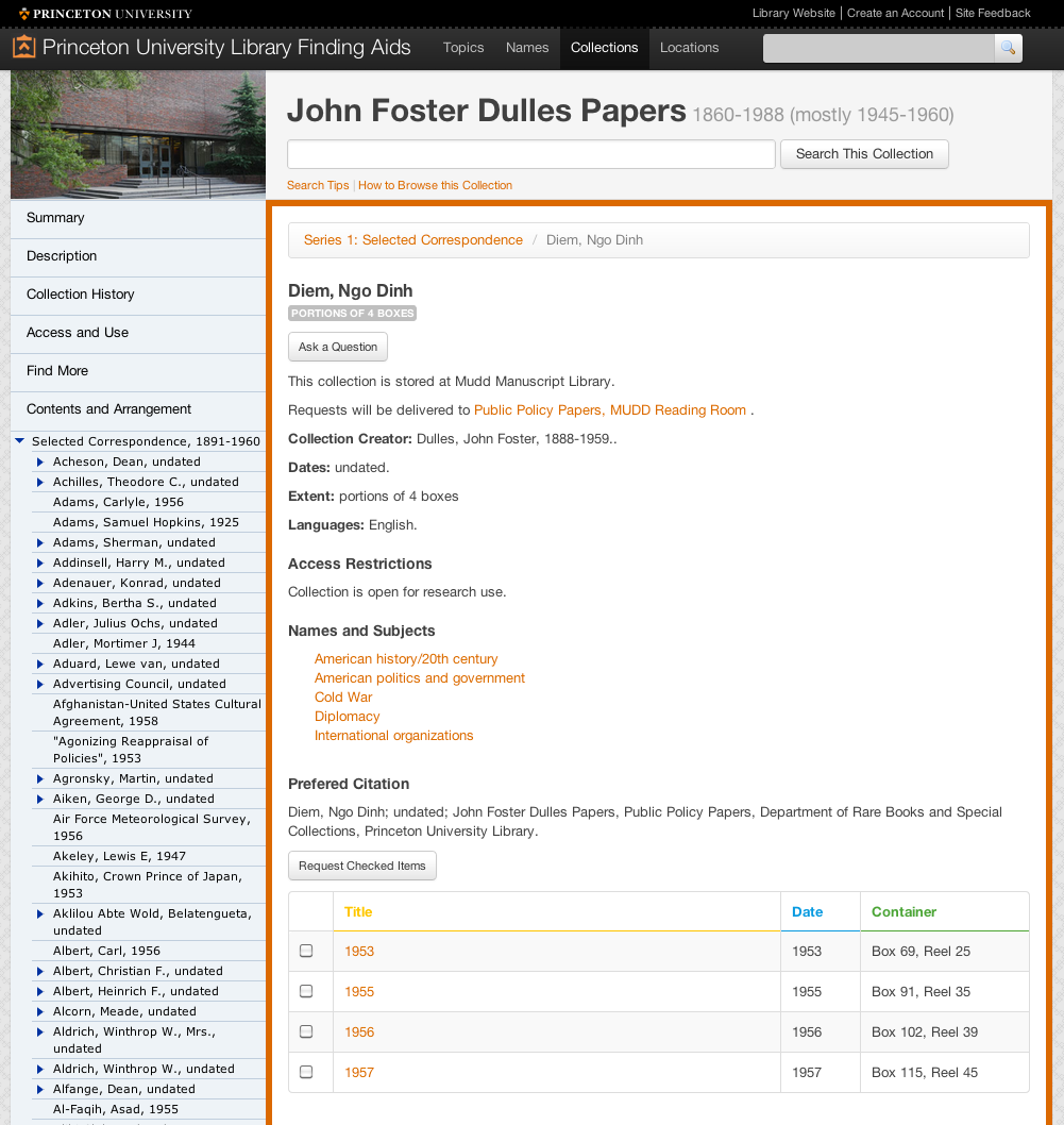
Figure 5. The component-level result. Users can ask a question about this series-level component, which will be sent to the reference archivist, or make a comment for others to see (at bottom of screen, not shown). In this case, the components have children, which can be sorted in the table below. Integration with Aeon, a special collections circulation tool, allows users to request the components directly from this page. The group is discussing a similar feature for digitization-on-demand.
During testing, we were surprised that differences between the prototype and previous site enabled basic users to find and obtain relevant results quickly, with less second-guessing and angst than professional archivists and researchers. We recognize that our staff-users might need to un-learn the strategies that helped them find materials previously, but also that there’s no such thing as a right way to use a system — there are just ways that our users find easy, and ways that they find difficult.
User testing forced us to accept user habits as they are, rather than as we would like them to be. Some users preferred to interact with the system in ways that we would consider inefficient — or at least they didn’t make use of new functionalities. But by regarding feedback as both a reality and a challenge, we were able to re-think design to highlight features that weren’t immediately apparent to users. And we found that even though the major push behind the new architecture of this site was to make the archival component the atomic unit of description, some users really did prefer to see the finding aid as a long document.
We chose to respect these kinds of preferences, understanding that practices would change as users became used to new tools, and made a decision not to remove any existing functionality. We added the option of “single-page” views — HTML and PDF renderings of the entire finding aid — for users who preferred that experience.
Use of analytics to discover usage patterns
Any attempt at improving UX through usability testing should also be supplemented by quantitative data about user behavior. Before this project, there was no record of use outside of Apache logs, from which it was difficult to extract actionable information. One of our goals was to get a better idea of user behaviors and search strategies with Google Analytics. Component atomization allowed us to track user interest at a more granular level because out-of-the-box Google Analytics gathers data based on unique URLs. However, Google Analytics defaults did not allow us to track other new functionality we added, such as in-page, JavaScript-based interactions.
To really understand user behaviors, and ultimately how successful our solutions were, we needed to track clicks in a more strategic way to gather more actionable data, something we could never have done with traditional web logging software. How many users were using the collection-level information tabs? How many used the image viewer? Were they requesting multiple items at a time, or single items? Kirk Hess’ article in Code4Lib Journal, Discovering Digital Library User Behavior with Google Analytics, helped us figure out how to implement “event tracking” and gather the data we need (Hess K, 2012).
Prototypes in production
There’s no reason why we can’t think of some pieces of our production site as an ongoing prototypes, so long as critical functionality is not at risk. For example, we were not able to really test our commenting system due to the low number of users we recruited for discount usability tests and the type of behaviors we were expecting. We could not easily create testing scenarios where the user knows more about the materials than the archivist, and then capture comments, reminisces, interpretations and disagreements in a natural setting.
Making users’ interactions with materials a two-way street was a central goal of this project. Fortunately our solution required little development effort, allowing us the luxury to test it out mostly in production. Building our own commenting system was out of scope of the project, and we did not want users to have to create new logins simply to make a comment. We thought it was more likely that conversations would take place on our users’ own turf, in the social networks where their peers hang out. At the same time, we wanted to maintain a reference to the object of discussion for tracking purposes. To this end, we were able to use Intense Debate (http://intensedebate.com), a cut-and-paste JavaScript commenting system. This system allows users to use a Twitter, Facebook, OpenID or Google credentials, and then share their comments from the finding aid across other systems, increasing visibility of the site. Though the jury is still out on how much of an impact the comments feature will have, within days of releasing the beta site, we received feedback about description errors on components that we might never have discovered otherwise.
Conclusion
When it comes to improving the user experience of our information systems, it is no secret that the library and archive community has a lot of catching up to do with our peers in the private technology sector. Many attribute this problem to shrinking budgets and slim IT staffs. But when most Internet startups are short on both money and staff, it seems hard to make the case that these challenges hinder innovation. What has really slowed us down is the enormous weight of our past, whether it is in the form of third-party software lock-in, domain jargon, or outdated organizational processes that stifle innovation.
Prototypes can be persuasive tools for proposing changes within an organization through “imagine if” scenarios. They give us the freedom to test, fail, and improve along the way — all without damaging a reputation for success that maintains trust. Prototypes not only tell us how to enhance the online experience, but can provide a way to improve the overall organizational environment as well. They take proposals out of the abstract and provide a concrete example of how such changes will improve our quality of service, and how exactly we may need to adapt, making big changes much more palatable to our managers.
We learn about our users by entering their world and seeing how they solve their own research challenges. This opens up our perspective and allows us to question legacy practices that prevent them from reaching their goals. On the other hand, changing those practices can create flux at all levels of our organizations, and empathy with managers and colleagues is just as important as empathy with our “end users”. If we focus on creating a culture of empathy within the organization, we will be more likely to create an environment for innovation in our libraries and archives that thrives on collaboration, iteration, and managed risk.
Notes
[1] What we consider a prototype is based on Eric Reis’ notion of a minimum viable product (MVP), which is that version of a new product which allows a team to collect the maximum amount of validated learning about customers with the least effort. http://www.startuplessonslearned.com/2009/08/minimum-viable-product-guide.html
[2] We encourage browsing the final site at http://findingaids.princeton.edu to supplement the screen shots we have included in the article.
[3] Much of our process was informed by thinking developed by the IFLA’s Functional Requirements for Bibliographic Records report.
[4] Pitti, Daniel V. “Technology and the Transformation of Archival Description.” Journal of Archival Organization 3, no. 2–3 (2006): 9–22. (COinS)
[5] Nimer, Cory. Applying Inheritance: Single-level Displays and Repurposable Metadata. Society of American Archivists 2010 Research Forum. http://www2.archivists.org/sites/all/files/CNFinal.pdf
[6] OCLC’s thoughtful examination of the potential of scanned material in special collections libraries informed our thinking. Schaffner, Jennifer, Francine Snyder, and Shannon Supple. 2011. “Scan and Deliver: Managing User-initiated Digitization in Special Collections and Archives.” Dublin, OH: OCLC Research.
http://www.oclc.org/research/publications/library/2011/2011-05.pdf
[7] http://eac.staatsbibliothek-berlin.de/
[8] Dan Santamaria provided skilled and knowledgeable leadership for this project and was a member of our user testing team. John Delaney, Regine Heberlein and Don Thornbury provided knowledge of archival descriptive practices and user needs; Jon Stroop, our metadata analyst, was responsible for the system architecture.
[9] http://www.agilemodeling.com/artifacts/userStory.htm
[10] https://trello.com/board/finding-aid-feedback/4fe4801276ca124c1029e650
References
Alexandre N. Tuch, Eva Presslaber, Markus Stoecklin, Klaus Opwis, Javier Bargas-Avila. (2012). The role of visual complexity and prototypicality regarding first impression of websites: Working towards understanding aesthetic judgments. International Journal of Human-Computer Studies, vol. 70(11), pp. 794-811
Available at: http://research.google.com/pubs/pub38315.html
Fried, J. (2008). Why we skip photoshop. 37Signals. Available from: http://37signals.com/svn/posts/1061-why-we-skip-photoshop/
Hess, K. (2012). Discovering digital library user behavior with google analytics. Code4Lib Journal. Available from: http://journal.code4lib.org/articles/6942
Hess, W. (2012). User experience is not enough. Available from:
http://whitneyhess.com/blog/2012/04/21/user-experience-is-not-enough/
Krug, S. (2000). Don’t Make Me Think! A Common Sense Approach to Web Usability. Indianapolis, Ind: Macmillan USA;. (COinS)
Mathews, B. (2012). Think like a startup: a white paper to inspire library entrepreneurialism. VTechWorks, Virginia Tech University Library. Available from: http://vtechworks.lib.vt.edu/handle/10919/18649
Nielsen, J. (2000). Why You Only Need to Test with 5 Users. Jakob Nielsen’s Alertbox. Available from: http://www.useit.com/alertbox/20000319.html
About the Authors
Maureen Callahan is the Public Policy Papers Project Archivist at the Mudd Library at Princeton University. Shaun Ellis is the User Interface Developer for Digital Initiatives at Princeton University Library.

Emergency mobile mechanic, 2025-07-18
You made a complicated idea feel approachable and kind. That’s something special. Feel free to explore my website if you’d like more of that calming, thoughtful tone.
Skip Hire Basingstoke, 2025-08-19
This information was very good regarding with ui/ux interfaces, thank you for this one!