by Matt Critchlow, Lia Friedman, and Dan Suchy
Introduction
The UC San Diego Campus (UCSD) is comprised of six colleges and a student body of nearly thirty thousand. Within the nine campus libraries there are over 300 staff across dozens of departments. As is probably common with large, distributed academic units, projects in this environment traditionally have a long period of development and testing prior to the release of anything functional, including a well-defined system of gaining feedback and direction from library management and administration. This traditional approach, similar to the Waterfall model [1], looks to have ideas complete, approved, and set in stone before moving forward. In creating a new mobile site we looked at employing a different type of model: responsive, ‘good enough”, collaborative and fast-paced and with an eye towards experimentation. The mobile site was a pilot project to help examine the advantages of employing this model in future projects.
A fine example of a traditional, or Waterfall, development project is the website redesign recently completed by UCSD libraries in order to keep in line with the campus-wide website look and feel. This project involved forming several committees with representatives from each of the nine libraries as well as various other stakeholder groups (interlibrary loan, reserves, IT, administration, etc). The entire process spanned several months, and near the end of the project additional groups were formed to provide feedback and discuss ongoing issues. Just one of these ancillary groups was made up of the Web Managing Editor, the libraries’ Director of Communications, a public services Member-at-Large, a representative from Bibliographers’ Council, an instruction representative from the Instruction & Outreach Committee, an outreach representative from the Instruction & Outreach Committee, a representative from the Reference & Information Services Committee and a representative from the Document Delivery Service /Inter-Library Loan committee. While the outcome and public response to this project was positive, a project of this scope and scale required a protracted timeline.
In contrast, the Mobile Advisory Group for the mobile site project consisted of just 4 representatives from selected User Services groups, a facilitator that straddled both user services and IT, and the Web Technical Manager. Working within a two month timeframe, this pilot group was empowered to address the broad needs of patrons with mobile devices and to provide input from a user services perspective. We employed three two-week cycles, each with one week of site development followed by a week of feedback and testing, allowing us to move quickly on to a new aspect of the site as the process was repeated each cycle.
While understanding that this model will not work for all projects, the receptiveness and collaborative nature of the participants, the skill of those working on the technical development, and the freedom to work largely without having to report back to departments for input have made this an approach we look to employ in the future for similar projects, particularly when timeliness and technology hype cycles are likely to impact project implementation.
Project Approach
Our development method was based in part on the tenets of Agile software development. Much has been written concerning the Agile methodology [2], but for our purposes we particularly embraced the notion of short, iterative development cycles with an emphasis on in-person communication between library web developers and user services representatives.
Our project included the following structure and assumptions:
- A short, well-structured timeline
Successfully managing projects of this nature requires a commitment to a short development timeline with well-defined project milestones. This is especially the case when designing a new library service from scratch (like a mobile website), where is it fairly easy to let unforeseen details sidetrack the entire project. In our example, we began with an initial ‘kickoff’ meeting to ensure everyone knew their role and the established project parameters (as detailed in Gathering Requirements below).
We then employed 3 two-week cycles as follows:- Week 1, Monday-Friday: Web Development team creates a website section, and distributes the changes to the group.
- Week 2, Monday-Wednesday: The 4-person Mobile Advisory Group tests for functionality and accuracy, and submits changes using the project wiki.
- Week 2, Thursday-Friday: Development team incorporates feedback, and releases the section to production.
- Week 3, Monday: Advisory Group meets with the Development team to discuss the next upcoming cycle. As with the kickoff meeting, an in-person gathering is a good opportunity to set mutual work expectations and reinforce the short timeline. It also allows the developers to communicate any technical challenges that would be out of scope for the next cycle.
- Weeks 3-6: Two additional cycles are completed.
- Open and in-person communication channels
While an essential part of any project, the development of our mobile site featured a greater degree of communication than is usually found in technology projects at the UCSD libraries. Representatives from user services and IT frequently met in person to discuss changes and feedback. Outside of meetings, an effort was made to be easily accessible via chat and social media.
- An awareness that a traditional approach would miss the entire arc of mobile library use
A traditional long-term approach involving multiple stakeholders and committees can at times be an ideal method. However, when addressing rapidly evolving technologies the slow and steady approach guarantees you will implement the service after it is most relevant. The dramatic rise of smartphones, with a Pew study showing that nine out of ten 18 to 29 year olds own a cellphone and that 65% of them access the internet using these devices [3], perhaps best illustrates the need for libraries to act quickly to meet their users’ needs in this area.
- A small “super group” given authority to decide and design on behalf of the entire organization
For certain projects, decision-making via committee quickly resembles design via committee: the outcome can be overly complex, unwieldy, and lack cohesion. In contrast, our project group consisted of just five user services representatives and one IT staff member. While most projects of this scope require oversight and input from many committees (Administration, Reference Services, Instruction, etc.), members of the “super group” were considered representatives of several committees and were given the authority to make decisions on behalf of the entire library.
- An understanding that sometimes fast and “good enough” is better than slow and perfect
Along with recognizing the need to act quickly, we made the decision to create a website that was useful enough for most user needs, but did not meet every need. Thus our initial launch included the key items that were present in other library mobile sites, and intentionally excluded the bells and whistles that might have slowed progress. Instead, we plan to add new services incrementally as they are developed.
Gathering Requirements
The initial requirements gathering for the project began with an environmental scan of what library mobile websites currently offer. In total, 25 academic libraries were included in the scan, and all available services were tallied inclusively. [4] This environmental scan has since been expanded as part of the CDL Mobile Device User Research Project. [5] It was reviewed thoroughly by IT and the Mobile Advisory Group and was used as the foundation for prioritizing our initial mobile services. The resulting services we chose to implement initially were:
- Hours
- Catalog
- Ask A Librarian
- Research Tools and Databases
- Maps and Directions
- Contacts
- View Full site
Since February of 2009, the UCSD campus has been using the Hannon Hill Cascade Server Content Management System. [6] The Library’s public website and the Library’s intranet website were developed and are maintained using Cascade Server. Therefore, in order to follow campus standards and leverage existing resources, the mobile website development occurred within Cascade Server as well. As a result of this requirement, external mobile frameworks such as the open source MIT solution [7] were not considered. The mobile device platforms targeted by our initial offering can be summarized as mid to high level devices with high market penetration and a solid user base. [8] Our first priority was to reach as many clients as possible by using the web as a platform rather than developing a mobile application for specific devices. By developing a mobile website we were also able to leverage the skills and knowledge of our Web team in IT. Had we taken the application approach we would have needed time and resources to train staff in new programming languages and APIs or contract the development work out to another company. Given the current fiscal situation at UCSD, neither of those options was acceptable. A final benefit to this approach is that changes or updates to the website are published and available immediately, while a mobile application approach would require updates submitted to various application stores for approval and then pushed out to users’ phones.
The final requirement was a solution not only for displaying the hours for all nine libraries on the mobile website, but to also create a new hours data entry and storage mechanism within Cascade Server. The current mechanism for entering, storing and displaying the UCSD public website hours is rooted in a legacy software application which is not only cumbersome to use, but is becoming increasingly difficult to maintain. Therefore, in addition to creating a library hours interface, we also developed a data entry solution in Cascade Server which will eventually be used as a central repository for all library hours data.
Design Process
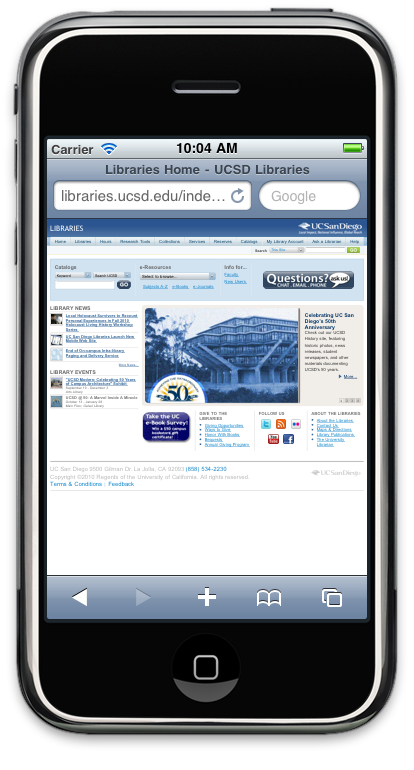
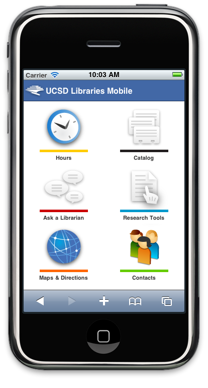
Figure 1. Contrasted displays of the UCSD full website vs. the mobile website designed for smartphones.
It was critical early on in the design process to set expectations and perspective in a mobile context. We designed our website with the understanding that mobile users have different goals when accessing the Internet than users coming from the traditional desktop or laptop interface, and we were careful to develop templates and content which required limited scrolling and used appropriate font and user interface element sizes. We continually referenced proven mobile best practice guides during the design process. We used the Safari Web Content Guide [9] while designing many of our user interface elements such as lists, buttons and icons. We also consulted the Yahoo Style Guide [10] for content formatting in a mobile context. CSS3 was used, when appropriate, for progressive enhancement styling of the user interface.
The interface is designed to be as intuitive as possible given the mobile context. For example, since users with a mobile device do not have the ability to hover over a link to see where it might take them, it was critical to not make them guess what the destination might be. An HTML link to send an email or text message, launch an application store such as iTunes, make a phone call, or even load an external website is a much more alarming experience on a mobile device than on a desktop browser. With that in mind, we were careful to design our link template to allow developers to specify the type of link, and included icons to inform the user what action will be taken when a link is chosen.
Navigation is also a unique experience on a mobile device. Today’s monitors with high resolutions of well over a thousand pixels per axis have no problem cleanly displaying multiple levels of navigation depth via breadcrumbs or lists. However, mobile devices do not have this real estate, with a width of generally either 480 pixels or 320 pixels for an HVGA screen (depending on how the device is oriented). Our solution was to leverage the icon set used on our main page as section breadcrumbs in navigation. As the user navigates the site, we offer a consistent icon-based breadcrumb trail for returning back to previously navigated levels of the site. Using fixed width icons rather than variable length page titles as breadcrumb hyperlinks ensures a consistent and intuitive experience for our users.
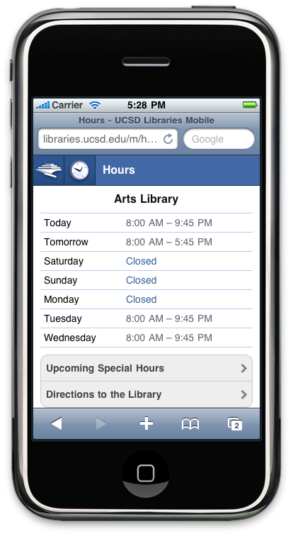
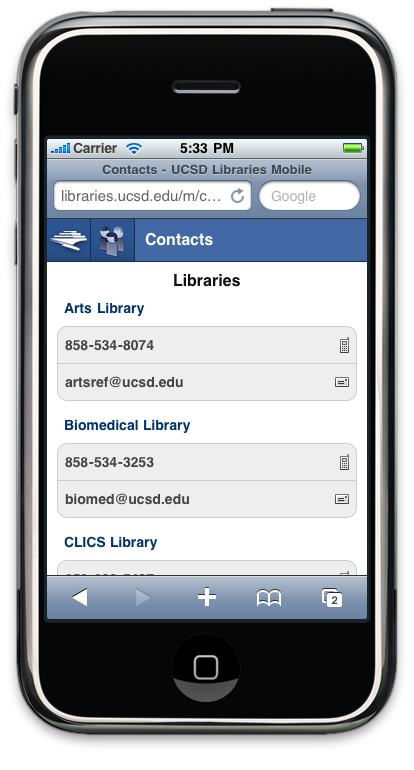
Figure 2. Navigation was simplified through icon based breadcrumbs.
Keeping in mind that we were the first group on campus to develop a mobile website using Cascade Server, we designed our templates so that they could be scaled to become a UCSD-wide solution. One of the key design decisions that made this possible was our icon-based breadcrumb trail. By simply adding a UCSD parent icon at the beginning of the trail, our mobile templates could be leveraged across the entire campus. This would give all UCSD users a consistent mobile experience, while ensuring content editors could use the same familiar Cascade Server template system. We are currently in discussion with the UCSD campus web development group to explore this possibility.
In order to provide the ability to redirect users browsing the web with a mobile device to our new website, we have taken advantage of the open source mobile browser detection script hosted at detectmobilebrowser.com. This script directs users accessing libraries.ucsd.edu with a mobile browser to libraries.ucsd.edu/m. We do, however, allow users to navigate to the full website if they desire, and we provide a link on the home page of the mobile site for this purpose.
Performance was another important consideration. Mobile networks are often considerably slower than fixed data connections. Mobile devices and browsers also do not have the same processing and memory caching abilities as desktop browsers. While Steve Souders [11] and Ryan Grove [12] have recently shown that the cache size limit for a single stylesheet or script has improved lately, the maximum cache size is still an area of concern and study. We have currently addressed this issue by compressing [13] our stylesheets and scripts, keeping images as few and compressed as possible, and setting far Apache future-expires headers for applicable content. We recognize, however, that this is a fluid area of study and will be paying close attention to any new solutions or developments within the web community that we can take advantage of.
Future Challenges
Creation of a new library service does not mark the completion of a project, but instead is one phase in the overall life cycle of the service. This is particularly the case for mobile devices, where rapid change and shifting platform support is the norm rather than the exception.
Looking forward, one immediate challenge is to routinize the process for updates and additions to site content. Since portions of our mobile website have the same content as our regular website, ideally staff could update both at the same time, and using the same tool. Thus critical content such as library hours and contact information would not get out of sync. Another challenge is to build in regular usability testing that is tailored specifically for cross-platform devices and the information needs of a mobile user. Lastly, we need to prioritize future additions to the website based on their usefulness and the amount of development work involved. Continually working towards these goals will ensure our mobile website evolves to meet the needs of library users.
Conclusion
Overall, this project and process have garnered positive feedback from users and library administration, and we envision employing a similar approach to development projects in the future. However, it is important to note that this is obviously not a panacea for project management in general, as certain characteristics limit what can be accomplished. This model is most appropriate for projects with:
- Small to medium scope
- Key staff available for a short duration of significant workload
- Support of library administration in allowing the representatives to make decisions on behalf of all the stakeholders.
- Timeliness and rapid development as a crucial factor for success
Conversely, it might not be a good model for projects with:
- Enterprise level scope
- Dependencies on campus or consortia-wide involvement
- The need to include and consider feedback from every stakeholder
- A lack of firm administrative support
To illustrate the above differences, we found the Agile-based approach is well suited for the development of a mobile website (with its small scope and technology timeliness), but might be the wrong choice for the creation of an entire library website. As stated earlier, with our organization there is a broad and layered hierarchy to most project planning and implementation, so short timelines, quick communication practices and overall agility would be challenging to implement with our organization.
As with any project, proper evaluation of the scope and timeline is a key factor in deciding whether a rapid development model will be successful, and it is key to embrace systems of development that can be modified to meet the needs and breadth of a project.
Endnotes
[1] http://www.editlib.org/p/12509
[2] James Shore’s The Art of Agile Development is an excellent introduction and practical guide to the agile method: (COinS).
[3] Pew Internet: Mobile Access 2010: http://pewinternet.org/Reports/2010/Mobile-Access-2010/Summary-of-Findings.aspx.
[4] Institutions were identified using the Library Success: A Best Practices Wiki: http://www.libsuccess.org.
[5] CDL Mobile Device User Research Project: https://confluence.ucop.edu/display/CMDUR/Resources#Resources-Comparativeanalysisresources.
[6] Hannon Hill Cascade Server: http://www.hannonhill.com/.
[7] MIT Mobile Web Framework: http://sourceforge.net/projects/mitmobileweb/.
[8] Admob Mobile Metrics: http://metrics.admob.com/2010/06/may-2010-country-data/ StatCounter Global Stats: http://gs.statcounter.com/#mobile_browser-US-monthly-201006-201008-bar.
[9] Apple Safari Web Content Guide: http://developer.apple.com/library/safari/#documentation/appleapplications/reference/safariwebcontent/Introduction/Introduction.html.
[10] Yahoo Style Guide: http://styleguide.yahoo.com/.
[11] High Performance Web Sites blog: http://www.stevesouders.com/blog/2010/07/12/mobile-cache-file-sizes/.
[12] Yahoo! User Interface blog: http://www.yuiblog.com/blog/2010/07/12/mobile-browser-cache-limits-revisited/.
[13] Yahoo! Developer Network: http://developer.yahoo.com/yui/compressor/.
About the Authors
Matt Critchlow is Web Technical Manager at the University of California, San Diego Libraries. Matt holds a Bachelor’s of Information and Computer Science from the University of California, Irvine. In his current position he works with UCSD Library staff on a variety of web projects and his group is responsible for the entire web presence of the Libraries. His professional interests include project management, user experience, digital preservation and staying out of trouble whenever possible. Matt tweets as @mattcritchlow.
Lia Friedman is Head of Public Services, Instruction & Outreach Librarian, Arts Library UC San Diego. Lia is also Staff Librarian for Make/Shift magazine and a member of Radical Reference. Contact Lia at lia.friedman (at) gmail.com
Dan Suchy is User Services Technology Analyst at the University of California, San Diego Libraries. He works with a broad range of technologies to improve the library user experience. You can email him at dsuchy (at) ucsd (dot) edu, or visit his badly outdated website at: http://sandiegotransplant.com.

Emily Lynema, 2011-01-07
I am interested in your thoughts about what types of project Agile methodologies work well for. In my thinking, one of the great things about Agile is increased transparency and open communication. You mention that at your institution, Agile techniques might not work well for the creation of an entire library website. But to me, that sounds like a great project for Agile! With iterative timelines, decisions can be made in small pieces, and staff and committees can have products like wireframes or mockups to react to even before anything has actually been developed. This kind of iterative feedback loop helps move along large projects where it’s really difficult to get all decisions made ahead of time.
So I guess my thought is that Agile could work well with large projects. Perhaps the issues that you anticipate are institution-specific, however.
Matt Critchlow, 2011-01-21
Hi Emily,
Great post. My thoughts are the following:
Yes you’re absolutely right that Agile could be the perfect project methodology to use for building an entire library website, or any other large project. Agile has been around for years, and there have been plenty of successful large projects completed using the methodology or it’s variants (e.g. SCRUM).
Like any project methodology, it is really only able to be applied successfully in the right environment. This includes project sponsor and champion support, as well as all stakeholders. Our environment is not currently at the point where building an entire library website would have the support necessary to use an Agile methodology, and that’s what we were trying to convey in the article. If your library/institution environment is different, you may be in a better place to pursue a large Agile project.
So all that to say, I think your environment, resources, as well as support from management/administration are going to be the indicating or limiting factors of whether Agile will work for a particular project.
I hope that helps clarify where we were coming from. If you’d like to discuss this more offline, both Dan and I will be at the code4lib conference or feel free to contact any of us on email anytime!
Jodi, 2011-09-19
So a bit more complicated than just downloading the mobile theme plugin on wordpress then ;)
when DIY = sigh. | info-mational, 2013-06-06
[…] in libraryland that listing them is a challenge. One well-documented tech-focused effort is an agile mobile site design project undertaken by cross-departmental staff at the UCSD Library – in essence, Lia Friedman, Matt […]