Introduction
Data dashboards are an excellent way for libraries to provide an at-a-glance view of their many ongoing activities. A well-organized, well-built data dashboard is easily understood, narrates a coherent story about the library, and provides readily identifiable metrics and data points that can inform evaluation and decision-making activities. In addition, because they can include a broad cross-spectrum of data sources, from circulation data, to collection counts, to server logs, dashboards make it possible to accomplish two things that are of particular value for libraries:
- Illustrate the full extent of a library’s activities: visually representing these disparate data points alongside one another helps to thoroughly illustrate the wide-range of activities that libraries support. This can be very helpful in demonstrating the library’s impact and value to campus and community stakeholders.
- Uncover interconnections between data: dashboards offer an opportunity to directly relate different data points to one another, and in doing so uncover previously unseen relationships between them. For example, by overlaying gate count with website visits, it’s possible to illustrate what relationship exists between the two different types of traffic.
Yet, taking advantage of these potential benefits is challenging. While the library generates a huge amount of data, it is far from consistent in its form or the systems that house it. As a result, there are three principal problems that libraries face in building a dashboard:
- Disparate data sources: each library uses a number of different systems for providing services. Examples include the integrated library system, interlibrary loan software, gate count trackers, web server logs, etc. Each of these systems requires a unique approach for accessing and merging the data programmatically.
- Heterogeneous data: the data structure is unique among for each of the source systems that house it. Representing this data in a holistic fashion requires normalizing it across systems.
- Accessing the data: each system provides different mechanisms for accessing the data. While some systems provide APIs for retrieving data, or the ability to export reports, in some cases you may need to screen-scrape web pages to extract the data.
In spring 2016, the Portland State University Library undertook a project to engage with these challenges and build a public-facing data dashboard and the technical infrastructure to support its ongoing maintenance. The data dashboard is part of the library website, and is aimed at illustrating the Library’s broad range of activities and the relationships between them. Most importantly, it is a first step towards enabling the Library to more effectively analyze the vast range of data available to it.
Portland State University Library’s Dashboard Project
As a first step in tackling this project, the Library included the following goal in its 2015-2016 annual plan: “Develop the technical infrastructure and workflows for collecting and reporting on Library metrics across systems and units.” The Library Technologies unit was tasked with leading work on this goal, and began work on it mid-way through the year.
Given the broad nature of the goal and the sheer size of the data challenge that the library faced, the scope for the project was quickly narrowed down to the creation of a data dashboard for the library website. The presentation of the library’s annual data on the website had always been rather simplistic, with tables and bulleted lists including a limited number of facts and figures from the previous fiscal year:
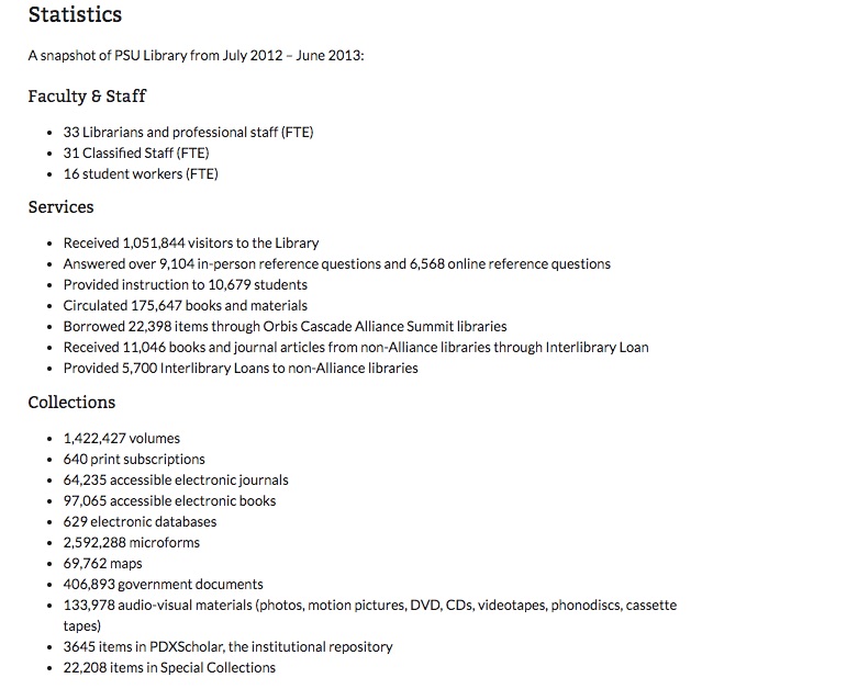
Figure 1.Screenshot of previous library statistics page.
Therefore, focusing on this specific goal enabled the project to achieve two good outcomes in one step: 1) replacing the current content with a more compelling and engaging dashboard, and 2) developing the infrastructure for managing and reporting on library data in a more extensive way in the future.
The project got underway with the formation of the project team, that included Library Technologies’ two developers (Mike Flakus and Chris Geib), our content strategist (Sherry Buchanan), and myself, the Manager of Library Technologies. At the outset, several decisions were made to focus the project’s scope in order to meet our brief six month timeline. Specific decisions included:
- The audience for the dashboard was defined as campus stakeholders (administrators, students, staff) and Library administrators.
- The dashboard would be focused on including data that could be harvested on a monthly basis and that was of enduring value to the Library.
- The process for harvesting and storing data had to be sustainable in terms of ongoing staff time to maintain the system, and so needed to be automated and reuse application modules wherever possible.
- The infrastructure for storing, making available, and presenting the data had to be as scalable as possible, and so it needed to be possible to add new volumes of data and new data sources with minimal effort.
- The interface needed to be visually compelling and as interactive as possible.
- Data reflecting all of the Library’s principal public-facing services needed to be included, such as circulation and electronic resource usage, reference and instruction, and both online and in-person traffic.
- The dashboard would be focused on ongoing, repeated reporting, as opposed to ad-hoc reporting.
With the scope defined, the project team broke the overall project down into discrete phases, to best structure our work and map out our timeline:
- Identifying data sources, evaluating available data, and selecting target data sources
- Selecting the data store, schema, and harvesting data
- Building the user interface
- Extracting and caching the data for repeated use in production
Step 1: data sources
Our first step was to identify the data sources that we would harvest information from. As with most libraries, the Portland State University Library makes use of a number of different systems to support all of our services, each of which is managed differently. Some are vendor-hosted, some locally-hosted, some have APIs while others don’t, etc. The sources we chose fit each of these models, giving us an opportunity to develop tools for working with most any data source.
The specific data sources were:
- Alma integrated library system and Primo discovery system: the Alma/Primo system is vendor-hosted, and includes an analytics engine that has a dedicated API for extracting reports
- Google Analytics: vendor-hosted, but offers an API for reports
- ILLiad interlibrary loan: this application is locally-hosted, and while it does not offer an API, we do have the ability to query the SQL Server database directly
- Gate count: this is a locally-developed application for storing gate count statistics, and whose database we can query directly
- Study rooms booking system: this is a locally-developed application for reserving and checking out study rooms, and whose database we can query directly
- Libstats: this is a locally-hosted open source application that we use for tracking reference statistics, and whose database we can query directly
- Instruction stats: this is a locally-developed application for tracking instruction session statistics, and whose database we can query directly
- PDXScholar: this is the Library’s institutional repository, which is vendor-hosted, and doesn’t offer an API or extractable reports. Instead, we needed to screen-scrape to get the data that we wanted.
Each of these systems houses a wide-range of data. But for the purposes of the dashboard, we focused on data that would clearly demonstrate high-level trends over time, and that would paint a broad picture of the Library’s ongoing activities. So after discussion with a range of stakeholders, we settled on including monthly data for each of the following data sets:
- Website visits for all of our sites (e.g. main website and all subsites, Libguides, PDXScholar, Primo discovery system, ) (Google Analytics)
- Walk-in (gate count) traffic (Gate count app)
- Study room checkouts (Study room app)
- Overall item checkouts (Alma)
- Item checkouts by specific item types (Alma)
- Consortial borrowing counts (Alma)
- Interlibrary loan borrowing counts (ILLiad)
- Reference question counts by question type (Libstats)
- Student counts for instruction sessions (Instruction stats app)
We also determined that the dashboard would include a table of annual usage numbers, which would be derived from the harvested data, and a chart illustrating the Library’s collections. This last one would be hard-coded, since the data was collected annually. We also wanted to include information reflecting the usage of our electronic resources, but at the time of implementation that data was not available programmatically (though we were able to add it by hard-coding it into the system).
Step 2: Data storage and harvesting
With the data sources selected, we turned our attention to how best to store the data itself. Our initial schema for the data, based on our vision for how we would use it, looked like this:
- Name: the descriptive name of the data being collected, which would be used for display purposes on the dashboard
- Counts: the harvested count(s) data
- Month: the month the data was accrued
- Year: the year that the data was accrued
- Tags: descriptive term(s) for categorizing the data, which would be used for grouping related data sets together
The counts and tags fields were especially challenging to handle when thinking about our storage mechanism. While some data points would include a single number for counts, such as “website visits”, others would include more granular data and multiple numbers for the counts, such as circulation data including “book checkouts, dvd checkouts, laptop checkouts, …” As a result, the storage mechanism needed to be flexible enough to accommodate a variable number of granular counts, with no upper limit.
The same was true for the tags field, which would need to accommodate a variable number of values for any given data point. Tags would be one of the critical aspects of the system, as we planned to use these to dynamically build groups of data sets and related visualizations.
Up until this point, we had principally used MySQL for all of our data storage, while recently adding Memcached and Redis for specific applications. But, none of these three solutions were optimal for this use case due to the variable nature of the data described above. So, for maximum flexibility we opted to use MongoDB (https://www.mongodb.com/), one of the many “nosql” databases that have risen to prominence in the last several years. MongoDB allows for data to be added to the system without a predefined schema, and has a robust query interface for retrieving data. And it can scale to support as much data as we could possibly throw at it.
With MongoDB selected, we designed our data model for the initial implementation. MongoDB stores data sets as “documents” that are part of a “collection” (akin to MySQL’s rows and tables), and so the document for a set of harvested data would use the following schema:
Document
name: (string)
raw_data: (hash)
-[data point name (string)]: [data point value: (integer)]
-…
month: (integer)
year: (integer)
tags: (array)
-[tag name (string)]
-…
(this excludes the automatically included fields, all of which are denoted with an underscore in the name (e.g. _id) in the examples below)
Here are a couple examples of how this schema would play out for specific data points:
*data collected with a single raw_data count
{
   "_created": "Fri, 02 Dec 2016 18:08:52 GMT",
   "_etag": "ea2e8a6078cf32a4ebedaadf7b4a43908a5d40e5",
   "_id": "5841b8b43a3d5f05b79c71aa",
   "_links": {
         "self": {
               "href": "library_stats/5841b8b43a3d5f05b79c71aa",
               "title": "name"
                 }
    },
    "_updated": "Fri, 02 Dec 2016 18:08:52 GMT",
    "month": 7,
    "name": "Website Visits",
    "raw_data": [
    { "Website Visits": "63817" }
    ],
    "tags": [ "Website", "Traffic" ],
    "year": 2014
}
*data collected with a multiple raw_data counts
{
   "_created": "Fri, 02 Dec 2016 18:09:20 GMT",
   "_etag": "fc55dca90348b7fe20751ec4be676b734da61d04",
   "_id": "5841b8d03a3d5f05b79c7257",
   "_links": {
        "self": {
              "href": "library_stats/5841b8d03a3d5f05b79c7257",
              "title": "name"
        }
     },
     "_updated": "Fri, 02 Dec 2016 18:09:20 GMT",
     "month": 11,
     "name": "Reference Questions Answered",
     "raw_data": [
           { "Email": 164 },
           { "Chat/Text": 344 },
           { "In Person": 2066 },
           { "Phone": 139 }
      ],
      "tags": [ "Reference" ],
      "year": 2016
      },
While MongoDB doesn’t enforce a schema on its own, we did need to ensure consistency in the centrally stored data, and so we implemented a Python library named Eve (http://python-eve.org/) that would function as middleware for enforcing consistency. Eve enables you to define a schema for each collection in your MongoDB database, and adds an API for the MongoDB database that validates data as it’s saved, before pushing it to the database. Using Eve, data is saved to the database via the Eve API, instead of being passed directly to the database, and data that does not meet the Eve-defined schema will be rejected.
Eve enables us to be sure that data that is saved will have a consistent schema, while at the same time still benefiting from the flexibility in data structures that MongoDB offers. In other words, while the schema sets a structure for the data, within that structure we can proliferate data as needed. For example, the raw_data section of each document stores a hash of key-value pairs describing the data from the source system. In practice, this can store any number of hashes, describing sets and subsets of data as needed. Eve allows us to ensure that the data being saved to raw_data will be a hash and that it is present, but within that relatively broad definition, we have the flexibility to add any number of hashes as are appropriate for the data set.
Schema definition in Eve:
schema = {
    'name': {
        'maxlength': 128,
        'minlength': 1,
        'required': True,
        'type': 'string',
        'unique': False,
    },
    'tags': {
        'maxlength': 64,
        'minlength': 1,
        'required': True,
        'schema': {
            'maxlength': 64,
            'minlength': 1,
            'type': 'string',
        },
        'type': 'list',
        'unique': False,
    },
    'raw_data': {
        'minlength': 1,
        'required': True,
        'schema': {
            'type': 'dict',
            'required': True,
        },
        'type': 'list',
    },
    'month': {
        'max': 12,
        'min': 1,
        'required': False,
        'type': 'integer',
    },
    'year': {
        'min': 2000,
        'required': False,
        'type': 'integer',
    },
}
With the database and data validator in place, we wrote mechanisms that would pull data from each of the systems listed above, and then pass it to the Eve API to be stored in the database. As noted previously, each system had different mechanisms for accessing the data, most using APIs or queries directly to the database. But the common element in each process was formatting the data for the API. Here’s an example of what that looks like when using Python to format the data from Alma, with the key section highlighted in bold:
def reformat_to_json(report_data, name, month_filter, key='key', tags=[]):
    soup = BeautifulSoup(report_data, features='xml')
    this_year = date.today().year
    this_month = date.today().month - 1
    group_name = "circulation"
    type_name = "circulation_all"
    library_stats = []

    for row in soup.find_all('Row'):
        material_type = str(row.Column1.string)
        if material_type != 'Other': # We don't want type Other
            month = str(row.Column3.string)
            year = str(row.Column4.string)
            key = str(row.Column5.string) # 'key' argument is ignored
            value = str(row.Column6.string)
            if month_filter:
                if month == str(this_month) and year == str(this_year):
                    library_stats.append({
                        'name': name,
                        'tags': tags,
                        'raw_data': [ {key: value} ],
                        'month': month,
                        'year': year,
                    })
    return library_stats
In this example, the data stored in the library_stats object is passed through the Eve API and stored in MongoDB.
We opted to write individual connectors for each data source, with each connector capable of pulling multiple data sets as needed. For example, if we queried the Alma API for multiple data sets (e.g. checkouts by type, and resource sharing requests), the same connector would be used for collecting both and pushing the data to the database, and the above code block could be used for processing the data from each individual query to Alma.
Step 3: Building the dashboard
Principal goals for the dashboard were for it to be both visually compelling and able to present data in an analytically interesting way. We had used the Google Charts API in the past, which offers a nice set of tools for formatting and displaying data. But after doing some research into other options, we quickly settled on the C3 JavaScript library (http://c3js.org/). C3 is built on top of the D3 JavaScript library, which is great for creating rich, dynamic charts. Yet, D3 can be challenging to leverage on its own, which is where C3 comes in. C3 makes it simpler to build charts with D3, by abstracting out the JavaScript code needed to build the chart itself, enabling you to simply pass your data and the chart type (you can see examples on the C3 site) to C3, which will then build the chart based on this.
With the chart library selected, we set about embedding the dashboard in our website. To do this, we developed shortcodes for each chart. Each shortcode includes all of the variables needed to construct and display the chart, and can be used to dynamically build and place it in the appropriate place on the page.
For example, this is a shortcode for including the circulation count data:
[chart name="MaterialsCirculated" type="bar" title="Materials Circulated" caption="Users borrow more than 28,000 PSU-owned items in certain months."]
In this example, the variables will be parsed as:
- chart name=“MaterialsCirculated” is the name of the
tag that will be used to wrap the chart
- type=“bar” indicates that the type of chart that will be used will be a bar chart
- title=”Materials Circulated” is the text that will be used as the label for the chart
- caption=”Users borrow…” is the text that will be used as the caption for the chart
In turn, a PHP script parses the variables and builds the block of HTML and JavaScript that will embed the chart on the page:
function chart($attr){
	$result = "";
	if(isset($attr['title'])) $attr['title'] = str_replace("&","&",$attr['title']);
	if(isset($attr['name']))
	{
		switch($attr['name'])
		{
			case 'walkin_v_website':
				$result = '<div id="'.urlencode($attr['name'])."_".urlencode($attr['type']).'"></div><div class="chart-caption">'.$attr['caption'].'</div><script src="//yourcontentserver.edu/static/data_dashboard/walkin_v_website_bar_and_spline.js" charset="utf-8"></script>';
				break;

				...

				default:
				$result = '<div id="'.urlencode($attr['name'])."_".urlencode($attr['type']).'"></div><div class="chart-caption">'.$attr['caption'].'</div><script src="//yourcontentserver.edu/static/data_dashboard/'.urlencode($attr['name'])."_".urlencode($attr['type']).'.js" charset="utf-8"></script>';
		}
	}

	return($result);
}
In this code example, specific charts that are more complex (such as the website versus walkin chart that overlays a spline chart on top of a bar chart) are called out and handled specifically, whereas the majority of charts are handled by the default case. The resulting block of HTML/JavaScript that is added to the page looks like this:
<div>
<div id="MaterialsCirculated_bar"></div>
<div class="chart-caption">In one month, users may borrow more than 28,000 PSU-owned items.</div>
<script src="//yourcontentserver.edu/static/data_dashboard/MaterialsCirculated_bar.js" charset="utf-8"></script>
</div>
The JavaScript file referenced is then called when the page is loaded, and in turn constructs the C3 chart:
var full_column_data_MaterialsCirculated_bar = new Array();

full_column_data_MaterialsCirculated_bar.push(['x','Dec','Jan','Feb','Mar','Apr','May','Jun','Jul','Aug','Sep','Oct','Nov']);

var mobile_column_data_MaterialsCirculated_bar = new Array();

mobile_column_data_MaterialsCirculated_bar.push(['x','Aug','Sep','Oct','Nov']);

var colors_MaterialsCirculated_bar = new Array();
	colors_MaterialsCirculated_bar['Previous 12 Months'] = '#00759A';
	colors_MaterialsCirculated_bar['Previous 4 Months'] = '#00759A';
	colors_MaterialsCirculated_bar['Current 12 Months'] = '#A8B400';
	colors_MaterialsCirculated_bar['Current 4 Months'] = '#A8B400';

full_column_data_MaterialsCirculated_bar.push(['Previous 12 Months','15378','23576','25526','25222','28040','26295','18107','10178','8286','9681','27936','25797']);

full_column_data_MaterialsCirculated_bar.push(['Current 12 Months','15513','23394','23890','20997','23058','22155','14359','8017','7749','9410','24133','20151']);

mobile_column_data_MaterialsCirculated_bar.push(['Previous 4 Months','8286','9681','27936','25797']);

mobile_column_data_MaterialsCirculated_bar.push(['Current 4 Months','7749','9410','24133','20151']);

var chart_MaterialsCirculated_bar = {
	bindto: '#MaterialsCirculated_bar',
	title: {text: 'Materials Circulated'},
	data: {
		x : 'x',
		colors: colors_MaterialsCirculated_bar,
		columns: {},
		type: 'bar',
		groups: [ [''] ],
		order: 'asc',
		},
	tooltip: {
		format: {
			value: function (value, ratio, id) {
				var format = d3.format(',')
				return format(value); }
			}
		},
	color: {
		pattern: ['#00759A', '#A8B400', '#dc9b32', '#A33F1F', '#60351D', '#474334', '#E6DC8F', '#650360', '#6A7F10', '#DFF2F5']
		},
	axis: {
		x: {
			type: 'category'
		},
		y : {
			tick: { format: d3.format(",")
			}
		}
	}
};

var MaterialsCirculated_bar_chart = c3.generate(chart_MaterialsCirculated_bar);
By default, we opted to include twelve months of data for each chart, with most presented as year-to-year comparisons by month. For example:
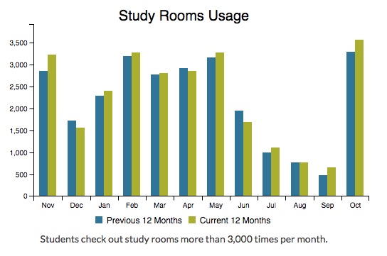
Figure 2. Example 12 month chart.Our website is responsive, and we needed the dashboard to be responsive as well. So we configured the dashboard to present an appropriate amount of data for each chart depending on the screen size, in this case reducing the number of columns when the screen size became too small:
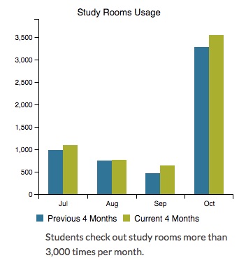
Figure 3. Same chart as above image, dynamically modified based on screen size.Step 4: Putting the dashboard into production
The last step in building and launching the dashboard involved moving away from the need to query the database each time the page was loaded. To do this, we built an automated process to extract the needed data from the database on a scheduled, monthly basis and store it in JSON format on a local web server. This would ultimately simplify the process (and the overhead associated with it) for retrieving the data, since the JSON formatted data could be easily parsed using JavaScript, and would result in much improved performance relative to having to query the database multiple times whenever the dashboard was loaded.
For the initial launch of the dashboard, all of the data was extracted to support the included charts. The compiled JSON data was formatted similar to this:
{"In Person": {"201412": 1256, "201501": 2366, "201502": 2043}, "Chat/Text": {"201412": 217, "201501": 423, "201502": 319}, "Email": {"201412": 249, "201501": 280, "201502": 296}, "Phone": {"201412": 62, "201501": 99, "201502": 112}}In turn, when the dashboard is loaded and the charts are generated, they pull the data from these static files on the web server.
Next steps & future development
As as a result of this project, the Library has a dashboard that is dynamic and engaging for users, that requires a sustainable level of staff time to maintain, and that can scalably incorporate additional data sources and data points over time. But at the outset of the project we’d set a number of additional goals that we wanted to move forwards on, and shortly after having completed this initial project, we’ve already begun working on these.
Dynamic dashboards
Chief among these, is the ability to dynamically create additional dashboards, by leveraging the tag structure of the stored data. As I mentioned earlier, each stored document includes one or more tags, such as “Circulation” or “Study Rooms”. The tags have a flat structure, meaning that there is no hierarchy among them. This enables us to make them as granular or broad as we’d like, and to easily add them to documents in the future.
Once the tags are associated with a document, querying the database by them is very simple. For example, to retrieve all documents in the database that include circulation data, you would just add the following elements to your base MongoDB URL:
[BASE URL]/v1.0/library_stats?where={“tags”:”Circulation”}This would be the data returned for this query:
{
      "_items": [
      {
            "_created": "Fri, 02 Dec 2016 18:08:43 GMT",
            "_etag": "31e1693b93850f5b0149b0ca2f4d3ff900025a75",
            "_id": "5841b8ab3a3d5f05b79c71a8",
            "_links": {
            "self": {
            "href": "library_stats/5841b8ab3a3d5f05b79c71a8",
            "title": "name"
          }
       },
       "_updated": "Fri, 02 Dec 2016 18:08:43 GMT",
       "month": 11,
       "name": "Summit Regional Borrowing",
       "raw_data": [
             {
                   "books, journals, and audiovisual": "2801"
             }
        ],
        "tags": [
        "Circulation",
        "Resource sharing"
],
"year": 2016
 {
      "_created": "Fri, 02 Dec 2016 18:08:51 GMT",
      "_etag": "592029b2113c4c5d7d1a842273ef96e79f6e9ee7",
      "_id": "5841b8b33a3d5f05b79c71a9",
      "_links": {
      "self": {
             "href": "library_stats/5841b8b33a3d5f05b79c71a9",
             "title": "name"
       }
      },
      "_updated": "Fri, 02 Dec 2016 18:08:51 GMT",
      "month": 11,
      "name": "Summit Regional Lending",
      "raw_data": [
      {
             "books, journals, and audiovisual": "289"
      }
      ],
       "tags": [
             "Circulation",
             "Resource sharing"
       ],
       "year": 2016
   },
…]
To limit this to a specific timeframe, such as a month, you add that element to the URL query string:
[BASE URL]/v1.0/library_stats?where={“tags”:”Circulation”},{“month”:9},{“year”:2016}]}This ability to dynamically retrieve all data for a given tag (or tags), is then coupled with standard definitions for how to present the data that is retrieved from the database. For this, we’ve set the following rules:
- Retrieved data is presented in charts that are grouped by the documents’ “name” field, and document groups are sorted by “name”.
- Data that is multifaceted (i.e. has multiple individual counts within the raw_data field) will be presented with three charts:
- Bar chart with summary data by month, for 12 months, presented as month-to-month, year-to-year comparisons (see the study rooms usage chart above for an example)
- Stacked bar chart presenting each granular count relative to one another, for 12 months.
- Pie chart, presenting the data broken down by the granular counts, summarized for 12 months.
- In comparison, data that is not multifaceted will be presented with just a month-to-month, year-to-year bar chart, as in the study rooms example above.
- Users will be given a choice of time periods to choose from, such as 6 months, 12 months, etc.
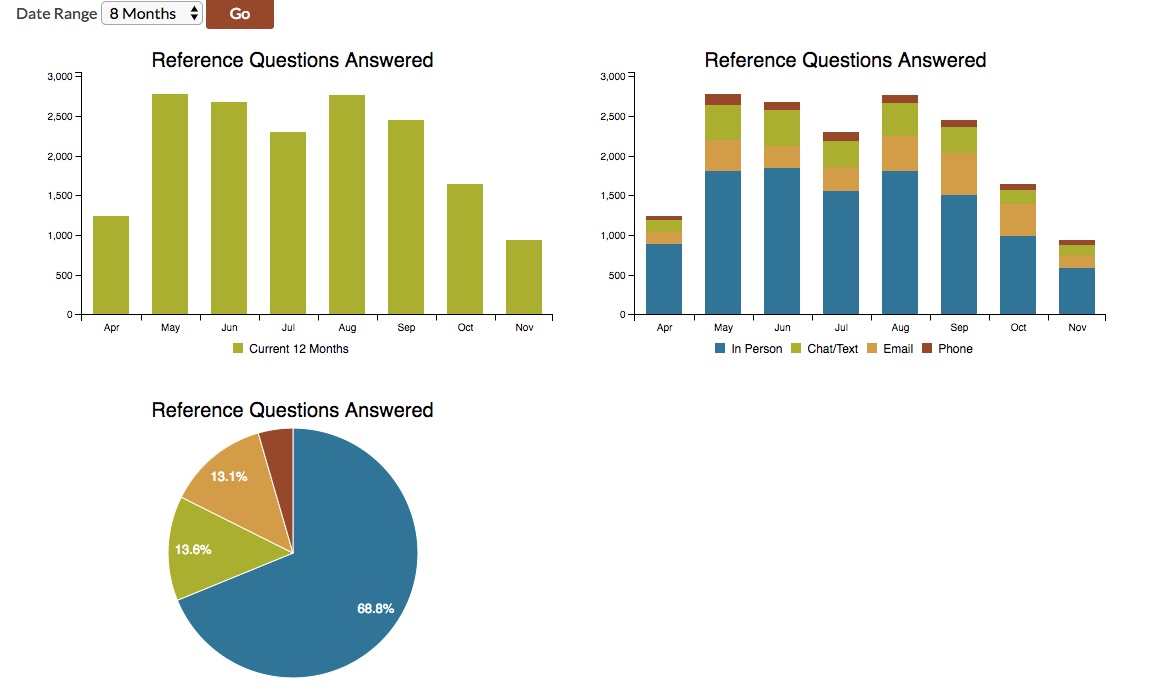
Figure 4. Example of how the dynamic dashboard would render charts for multi-faceted data, while offering a drop-down for additional time-range options.Setting out these rules enables us to programmatically build these tag-based dashboards dynamically. In turn, in our curated dashboard where we’ve laid out which charts appear, how they are grouped, and in which order, we can link out to the dynamic dashboards to offer users access to more granular data. For example, we can display specific charts in the Circulation & Resource Sharing section of the dashboard, and then link out to a dynamic dashboard for the tags “circulation” and “resource sharing” that will include a range of charts that present this area of data in greater detail. Ultimately, we will be able to take advantage of these tags and the programmatic logic behind the dynamic dashboards to scalably tap into the stored data to give users (whether internal or external) insight into the data in ways that are most useful and relevant to them.
Annual data
Our initial project was focused on collecting monthly data. But historically our Library’s “data” page included annual data too, and we want to include this in the dashboard as well. Data such as the Library’s collection profile, and the annual data summary for total circulation and other data, are both key elements for the finished dashboard. During the initial project, these charts were simply hard-coded, but we want to develop a long-term solution for them.
The chart for the annual data summary can reliably include information that is summarized from the data stored in the database. And so this chart will be relatively straightforward to include. The biggest challenge will be determining the optimal means of extracting and summarizing that data, and then storing it and presenting it in the dashboard.
In contrast, the annual collection profile data is very different from the data collected thus far. That data reflects our collection counts by material type at a specific point in time, and not how the counts are accumulating or decreasing month by month, the way something such as monthly circulation data does. As a result, how we derive and store the data needs to be carefully considered, so that it can comfortably be stored in the database alongside the monthly data, without causing issues in data retrieval and presentation.
At the moment, the collection profile chart only displays on the curated dashboard, and so we can easily control how the data is retrieved and presented. If we automate collecting the data on a monthly basis, it will need to be incorporated into our current structure for harvesting and storing data. Long-term, by collecting this data on a monthly basis and tagging it appropriately, we will also be able to leverage the tag-based workflow for the dynamic dashboards to illustrate trends in our collection profile over time.
Additional data sources
We have initially included the principal data sources that were already being used for reporting in the Library. But this is a subset of all of the Library’s relevant data sources, and there are additional ones that we would like to include in the long-run.
For example, EZProxy data would be very useful to include for giving us a picture of patrons’ use of our electronic resources, particularly in terms of usage trends over time, and illustrating on- vs. off-campus use. And EZProxy data is sufficiently well-structure that it would flow very well into the architecture that we have developed already.
In addition, our University uses a program called Labstats for tracking computer usage across campus labs. Tapping into this data would enable us to illustrate the use of Library labs and technology in other spaces in the building, and to juxtapose this with usage info from other labs on campus.
These are just a couple of examples of other data sources that might prove valuable to incorporate as additional phases down the road. As I mentioned at the outset of this article, libraries have many data sources available to them, and mountains of data within them to creatively tap into. Our overall goal is to continue to take advantage of the infrastructure that we’ve developed to make creative, effective use of this data.
Open source
Lastly, we plan on developing and sharing open source versions of the components of the system that will enable other libraries to take advantage of the work that we’ve done. Particularly since so many libraries use similar software for systems such as their integrated library system, interlibrary loan services, and proxy server, it will be possible to share source code that would enable libraries to tap into these common systems to create dashboards.
In addition, the structure for how the application stores and retrieves data is essentially source-system agnostic. The only part of the system that is thoroughly wedded to the source system for any given data set is the harvesting process. But even here, as long as data can be harvested from the source system and processed through the Eve interface for the MongoDB database, it would be possible for libraries to build additional system connectors with relative ease.
The Portland State University Library’s Github page (https://github.com/pdxlibrary) already includes a number of other projects that we’ve created open-source versions of. When we release the code for this project in spring 2017, this code will be included there as well.
Conclusion
Tapping into the Library’s wealth of data to fuel ongoing evaluation and decision-making is a challenging project to undertake. It is particularly complicated by the broad array of systems that each library uses, and the need to arrive at a sustainable means of collecting and reporting on data in an ongoing fashion.
But, arriving at a solution for this is a project that is ultimately of great benefit to libraries. Such a solution represents an opportunity to overcome data silos that prevent us from effectively leveraging data to support our ongoing work and strategic planning. Harvesting data centrally enables us to directly compare it with like data, offering insights that would have been difficult to obtain otherwise. What is more, because there are a number of commonly used library systems in place today, the development of such a solution would potentially benefit a many libraries.
The Portland State University Library’s project has provided an initial glimpse of what is possible with such a solution. We have a much greater ability to take advantage of data today than we did a year ago, and as we learn more and add new functionalities, our capabilities in this area will continue to improve. Our project also illustrates the type of steps that other libraries will need to consider if/when embarking on their own solutions, providing a roadmap of sorts for libraries who are also seeking to better leverage the data available to them.
About the author
Nathan Mealey (mealey@pdx.edu) is the Manager of Library Technologies at Portland State University Library, where he oversees the team of technologists who develop and maintain the Library’s web-based and desktop technologies.

Subscribe to comments: For this article | For all articles
Leave a Reply