by Cynthia Ng and Michael Schofield
Web accessibility is increasingly important. One reason is legal: in the US the federal government recently updated their regulation on accessibility of digital content, Section 508, incorporating the W3C’s Web Content Accessibility Guidelines 2.0 as well as harmonizing the guidelines with the EU’s information and technology communications rules (United States Access Board, 2017). While Section 508 only explicitly applies to federal departments, based on wording in other sections, such as Section 504, any federally funded program can also be held accountable in following the same guidelines.
Another reason is to ensure the site can be used by as broad a community as possible. Web accessibility generally refers to making digital services and tools understandable to assistive technology (AT) used primarily by those with disabilities. Being web accessible also improves access for older people, mobile users, new users, low bandwidth or older technology users, and people with low literacy or familiarity with the language (Henry & Arch, 2012).
Meeting accessibility guidelines does not automatically make a web service usable, useful, or valuable. Although there are certain considerations specific to assistive technology users, consider using the universal design approach in making web services usable and accessible to as many people as possible including those with disabilities.
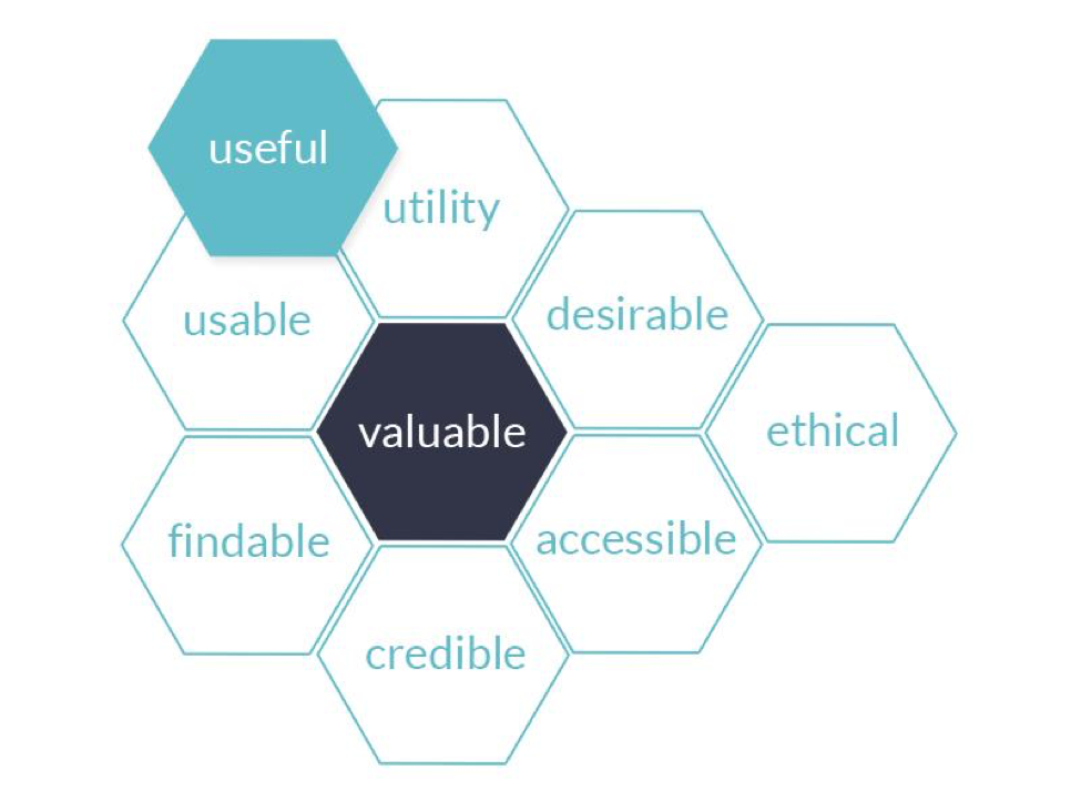
Figure 1. User Experience Honeycomb showing the different facets of user experience.
This article is meant to go beyond the low hanging fruit of creating accessible web content (as is often covered in accessibility articles) and focuses on the role of developers to make sites, tools, or services accessible. As such, the article assumes a basic knowledge of HTML, CSS, and website structure, and will not rehash guidelines generally meant for content creators, such as proper document structure, links, images and alt text, providing text alternatives to media, and document creation. The article will instead cover areas that are controlled at the system or template/theme level, emphasizing semantic markup, skip links, forms, media, fonts, roles and attributes of Web Accessibility Initiative Accessible Rich Internet Applications (WAI-ARIA), performance, and use of JavaScript.
The article begins with an explanation of ARIA as it can be difficult to discuss different aspects of developing for web accessibility without referring to how ARIA may have an effect, especially in regards to early considerations.
ARIA
The WAI-ARIA (Web Accessibility Initiative Accessible Rich Internet Applications) specification allows roles to be assigned to specific (HTML) elements that signal the kind of content, possible interactions, and state of the application to compatible AT. ARIA represents an optional developmental layer that Devon Persing conceptualized as “the accessibility stack” (2016).
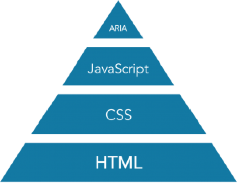
Figure 2. Persing’s Accessibility Stack.
This is a useful way to understand this toolset. Well-written HTML without frills is sufficiently accessible. As Barry T. Smith (2015) scolds us,
Websites aren’t broken by default, they are functional, high-performing, and accessible. You break them.
CSS’s various show/hide declarations — display: block; display: none; visibility: hidden; etc. — alter AT’s access to DOM elements. With care, CSS alone provides enough of a toolset to create screenreader-only instructions, skip links, and the like. Simple websites relying only on HTML and CSS might find that ARIA attributes are overkill.
However, when JavaScript interacts with the DOM or responds to user behavior (such as a touch event), AT’s ability to communicate these changes is diminished. Thus, ARIA acts as a structural support that anticipates and better responds to change. ARIA has two features that aid AT tools: Roles and Attributes.
ARIA Roles
We use the ‘role’ attribute in an HTML element to essentially communicate its purpose. There are many values for the ‘role’ attribute, but the most common are the eight navigational landmark roles that define regions of the page. They are
- application
- banner
- complementary
- contentinfo
- form
- main
- navigation
- search
The exception is for role=”application”, which tells AT that the page is an application rather than a document.
These roles help the assistive device communicate the relationship of one piece of content to another. For instance, <div role=”banner”> describes the header of the page, whereas role=”complementary” designates sections that are complementary to the main content (role=”main”), such as a list of related articles.
They can also guide complex interactions, for which in many cases semantic markup alone is not enough. These are typically for building complex, custom tools and applications (such as browser-based document editors), not for typical websites and content (see W3C, 2016b, and Fischer, 2010 for more information).
Sometimes, adding a role attribute to certain elements seems redundant, such as <nav role=”navigation”> or <form role=”form”>, but in the recent past this helped bridge the gap between browsers that understood the implicit semantics of new HTML5 elements (like <nav>) and those that did not. These can be used to simultaneously help assistive devices understand the various roles of content, while also semantically structuring it. Examples are often seen with structural roles like <button role=”button”>, <header role=”header”>, <article role=”article”>, and the like. [1]
As the technologies mature, the “Document Conformance Requirements for Use of ARIA Attributes in HTML” (W3C, 2016e) is updated with guidelines to follow on which elements benefit from the role attribute.
ARIA Attributes
Like roles, ARIA attributes are element attributes that convey relationship or the state of the element. They take the form of aria-*, where “aria” is prefixed to an attribute that contains some value or reference. For instance, <p aria-hidden=”true”> is a paragraph that is hidden to assistive technology; or <input type=”checkbox” aria-checked=”true” checked> communicates the “checkbox is checked” state to screen readers. [2]
Let Semantic HTML Do the Heavy Lifting
ARIA roles and attributes are powerful but can be complex to understand and implement. The ARIA specification is a living document. It evolves quickly, adapting to the changing landscape of the web. It can be difficult to fully understand, but it can be summarized with this goal: Whenever possible, let the browser maintain the implicit relationships between semantic HTML elements and their assistive conveyances. The bulk of the developer’s responsibility is in maintaining structural integrity: writing good HTML.
Of course, as the site or application becomes more complex, monitoring and maintaining its accessibility becomes a greater part of the developer’s technical debt.
The Browser Accessibility Tree
To best understand how markup is interpreted by assistive technology, it is important to know that each browser provides information to AT through its accessibility tree.

Figure 3. Browser Rendering Process with Accessibility Tree
The accessibility tree and the DOM tree are parallel structures. Roughly speaking the accessibility tree is a subset of the DOM tree. It includes the user interface objects of the user agent and the objects of the document. Accessible objects are created in the accessibility tree for every DOM element that should be exposed to an assistive technology, either because it may fire an accessibility event or because it has a property, relationship or feature which needs to be exposed. Generally if something can be trimmed out it will be, for reasons of performance and simplicity. For example, a <span> with just a style change and no semantics may not get its own accessible object, but the style change will be exposed by other means. (W3C, 2016f)
Basically, when a page renders in the browser, there is the Document Object Model (DOM) that is the underlying structure of the page that the browser interfaces with. It informs the browser that such-and-such is the title, what markup to render, and so on. It is hierarchically structured kind of like a tree. There is a root and a bunch of branches.
At the same time, there is an accessibility tree that is created. Browsers make them to give AT interpretation information. When we use ARIA attributes, we are in part giving instructions to the browser about how to render that accessibility tree.
There is a catch: not all browsers create accessibility trees in the same way; not all screen readers interpret accessibility trees in the same way; not all screen readers even refer to the accessibility tree, but scrape the DOM directly instead — some do both.
Early Considerations
Browser Support
Before even beginning development of a website, one of the major considerations is what browsers to support. Particularly in libraries and other non-profit organizations, the users served are diverse and are often still using older browsers. As well, when considering accessibility, one thing to keep in mind is that screen reader users often diverge from general browser usage due to the setup and interoperability with screen reader software.
According to WebAIM (2015), over 50% of screen reader users use some version of Internet Explorer as their main browser, about 30% for Firefox, and less than 10% for Safari or Chrome. Additionally, over 15% are generally using an older version of Internet Explorer, many of which do not support some of the newer web accessibility features.
In order to be accessible and usable to as many users as possible, progressive enhancement should be used. Progressive enhancement is the design concept of having basic content and functionality work in all browsers — assume old browsers, no JavaScript, slow connections, etc. — with additional or enhanced layout, behavior, and features added using modern techniques. It is recommended that web developers use sites such as caniuse.com to determine what is supported in the oldest browsers in use.
While each organization has to make their own decisions on when to stop supporting obsolete versions of browsers, using progressive enhancement generally means that even the oldest browsers can see and interact with a site on a basic level regardless of whether they are officially supported.
JavaScript is (Probably) Imperative
We need to address the increasing ubiquity and utility of JavaScript (JS)-reliant front ends. Largely informational sites do not require it, and basic interactivity (such as searches and form submissions) can be accomplished without JavaScript, but mostly JS-reliant front ends are commonly found and will likely continue to increase.
Recently, Ruth Hamilton for Creative Bloq (2017) rounded-up a small panel of front end experts to answer where it is ever “acceptable to build sites that do not work without JavaScript.” This is a topic of hot drama that has persuasive and passionate arguments for either side of the coin. It is not the role of this article to weigh in, but consider it an important point to mention.
Using progressive enhancement to develop first for the lowest common denominator is a sound strategy for organizations, particularly libraries and non-profits, whose user bases are so diverse that there is no single “device profile” to accommodate. Using this method may also assist developers to use interactive components that do not require JavaScript.
While CSS is increasingly capable and it is possible to build interactive components without JavaScript — like fly-out menus, tabs, form validation, modals, tooltips — this potential is easy to conflate with progressive enhancement so that some aspire to go “no-JS” all the way. Removing JavaScript as a point of failure can be good for stability and good for performance, but there is a downside.
Sara Soueidan (2017), during her attempt at building a fully-accessible tooltip without JavaScript, observed that
JavaScript is imperative to make fully-accessible interactive components. Sure, you can get away without using it in some cases, but a lot of accessibility requires JavaScript. Some ARIA roles and attributes are absolutely necessary to make components accessible, and many of those will simply not behave as they need to unless you make them work with JavaScript.
No-JS is an interesting approach but to be fully accessible it is probably not the correct one. This does not exclude progressive enhancement, but as sites accrue complexity, they more likely benefit from JavaScript than not. Using JavaScript can be a useful concession early in the planning process because it allows developers to consider JavaScript options much earlier and with wider applicability.
Source Order, Keyboard Focus Order, and Visual Reading Order
A core concept in web accessibility is that the order in which AT traverses a page is not always the order it appears on the screen. Scott Jehl (2016) described this as ‘disconnected interfaces’.
The modern web, especially with new CSS modules like Flexbox and CSS Grid Layout, allow developers to adapt layouts to suit the context of the user.
It is important that developers keep this discordance in mind. Here is the vocabulary and how it is used going forward:
- source order refers to the order in which elements and their content appear in the markup – more specifically as they appear in the DOM.
- keyboard focus order refers to the order through which users use their keyboard to navigate interactive elements like links, forms, and buttons. This normally follows source order but can be manipulated with the attribute tabindex.
- visual reading order refers to the intuitive order in which a sighted user reads the page content.
As mentioned above, screen readers tend to traverse content in the order it appears in the DOM — the source order — or something derived from it, namely the accessibility tree. A page laid out as a single column, such as it might appear on a phone, will typically have a visual reading order that is in sync with its source order, meaning that both the sighted and AT user have a comparable user experience.
In responsive sites, the relationship between source and visual reading orders is at most tenuous, because as the screen-width varies, the page will rearrange itself into multiple columns. Depending on visual design decisions, the intuitive visual reading order may drastically differ from its top-down arrangement in the DOM.
Given that keyboard focus order naturally follows the DOM, complex layouts can easily become difficult to traverse by keyboard alone.
Advanced search interfaces in discovery layers are notoriously problematic. Although facets are often left aligned, they are visually diminutive compared against right-aligned search results which are intended to draw the eye (because, of course, search results are what is important after performing a search). However, because these facets often appear first in the DOM, users must first navigate this link-rich sidebar before arriving at the search results.
It is the developer’s responsibility to keep these disconnected interfaces in mind. Nevertheless, this issue should not deter developers from optimizing layout for context, screen size, and the capabilities of the device.
Element attributes like tabindex — as in <input type=”text” tabindex=”1”> — can force the keyboard focus order explicitly.
A quick explanation:
- tabindex=”1” (or greater) defines an explicit tab order
- tabindex=”0” will place a normally non-interactive component, such as a <div>, in the logical tab order. In this case “0” does not mean that it comes first, but that it should be made available to the keyboard focus order
- tabindex=”-1” removes the element from the navigational flow but still allows it to receive programmatic focus
We should note that tabindex=”1” or any other positive integer is, as WebAIM tells us, “almost always a bad idea” (2016).
Developers may be tempted to use tabindex as a way to make up for unorganized source code with an illogical navigation order, but we do not recommend the use of positive tabindex values. Instead, fix the navigation order by restructuring the HTML. (WebAIM, 2016)
The value can be updated on the fly in response to user behavior. For instance, often when the user activates a modal — a pop-up — JavaScript will set the tabindex of the containing element to “0” and the tabindex of the <body> (the part the modal is floating above) to “-1”. In this way, users cannot keyboard-navigate out of the modal without intentionally closing the popup.
Nevertheless, tabindex does not compensate well for a “disconnected” source order. Rather, developers in certain cases might consider that rather than relying just on CSS to rearrange the layout of the page, they might go so far to rearrange the DOM.
The [accessibility] tree created from the DOM (and sometimes CSS) changes a lot. When the tree changes, the browser sends events to assistive technology saying a portion of the tree has changed or updated. Making a change to the DOM with JavaScript that causes a reflow or layout (Gecko and Blink terms for the same thing, respectively) will most likely create or recreate an accessible object for it. (Sutton, 2016)
This could be expensive, though. There is no silver bullet. In fact, the options are not all that ideal. Scott Jehl (2016) explains:
It seems this problem is only going to get worse now that advanced CSS layout is widely supported, and it certainly does not help that we now responsively toggle between many of these advanced layouts depending on viewport size. Unfortunately, the tools we have as web developers seem to be inadequate for addressing this issue properly. Given the choices of A) dynamically adapting our HTML source order for every breakpoint, B) sending different HTML sources to each client, or C) renumbering the tabindex attributes of all focusable elements to match their rendered order, we emphatically choose option D) “Nope”.
Still, developers have tools, and browsers’ implementations of Grid and Flexbox modules could address this issue by setting focus order in which elements visually appear first, but that might not coalesce. While there is no one solution and developers should be cautious about using advanced CSS layout while they are still maturing, ensuring that elements in the source order are ordered by importance, and that keyboard order still makes logical sense are good places to start.
Best Practices
As development begins, there are some best practices and guidelines to consider. Many of these practices apply to a general audience and may seem quite obvious, but are still important to keep in mind and implement.
Each page should have:
- valid, semantic markup,
- a descriptive title,
- the correct language (lang) attribute,
- consistent navigation,
- consistent identification (id) of the different parts of the page,
- a meaningful order to content, and
- provide multiple ways to discover content, such as a menu and a search box.
These best practices help all users, and not only those that need accessibility considerations. Without valid, consistent markup and a meaningful order to the content, browsers and search engines would have a hard time parsing and presenting a site. Without consistency or correct coding, users will have difficulty navigating a site. For example, if the menu for a site showed up in different places on different pages, or the menu is not the same across all pages, users would find it difficult to navigate, expecting the menu to be the same and in the same place across all pages.
Beyond the general guidelines of correctness, consistency, and meaningful order, there are a few areas that should be given special consideration. Below are best practices for aspects that are either often overlooked or consistently prove to be pain points. This is, by and large, low-hanging fruit, and attention in any of these areas has a huge impact.
The LANG attribute
We can define the language of the site or app at the root <html> element with the attribute lang. Its value is an ISO language code (Roberts, 2014) such as: <html lang=”en-us”>.
The lang attribute helps screen readers and other voice over (VO) software switch language profiles in order to correctly accent and pronounce content.
What is more, browsers can utilize this value to offer automatic translation if the client’s default language is something other than what is presented. Also, if the font is not otherwise declared in the CSS, operating systems may actually change the default system font to conform with the font that is standard in the parts of the world where that language is native.
The lang attribute is valid in all HTML elements, so it can actually be used in scoped instances where, for example, the language of a quote is different than that of the rest of the page. By instructing VO to adapt its language profile to that content, it is more likely to read that text in the correct language rather than as haunting robotic babble.
<p lang="es">El gato es negro.</p><p lang="fr">Le chat est noir.</p>
Additionally, VO is hardly restricted to AT and of course is the core component to conversational, voice user interfaces.
Semantic markup
We can use HTML in such a way as to reinforce the meaning or purpose of the content within the tags, employing semantic markup. Semantic markup is particularly important, especially since it can reduce redundancy and the amount of code necessary to make a website accessible. HTML5 introduced numerous elements that allow coders to impart information about the role of a certain element, such as <nav>, <header>, <aside>, <footer>, assigning meaning to sections of a website through the use of specific tags. Screen readers and other assistive software can easily find the menu by looking for the nav element without a coder assigning the navigation specific role to the tag.
Skip Links
Skip links describe links that appear on every page to skip repeated parts of a site (such as the header) to directly navigate to the content, search bar, or any other important section. Skip links are typically found at the top of a page, early in the source order, and usually hidden from users unless the link has focus. The links should be descriptive, such as “Skip menu to search results,” so that the user knows what they are skipping and where to. These type of links are particularly valuable to keyboard only and screen reader users, with over two-thirds using skip links sometimes or more often (WebAIM, 2015).
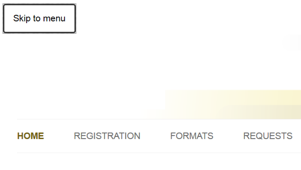
Figure 4. Screenshot of “Skip to menu” example link with focus
Generally, skip links are hidden unless the user has focus on the links, then they should show so that sighted users can see where their focus is. The following code is a sample of how skip links might be coded to achieve this effect:
HTML
<a href="#results" class="assistive-text">Skip menu to search results</a>
CSS
.assistive-text {
    position: absolute !important;
    clip: rect(1px 1px 1px 1px); /* IE6, IE7 */
    clip: rect(1px, 1px, 1px, 1px);
}

a.assistive-text:active,
a.assistive-text:focus {
    background: #eee;
    border-bottom: 1px solid #ddd;
    color: #1982d1;
    clip: auto !important;
    font-size: 12px;
    position: absolute;
    text-decoration: underline;
    top: 0;
    left: 7.6%;
}
While some sources suggest tying these links to access or keyboard shortcut keys, access keys can be very difficult to implement in such a way that it does not interfere with existing shortcut keys of either the browser or screen reader software (WebAIM, 2016).
Another option to make content ordering more meaningful is to have less repetitive markup at the top, and have users skip to that content if necessary. For example, have the navigation or menu near the bottom of the page (usually as part of or just above the footer), and have a skip link to the navigation. Visually, the navigation can still appear near the top using CSS positioning, especially on larger screens, but a menu at the end of the page means that users using assistive devices do not need to use the skip link on every page to get to the content they are looking for. All users, especially on mobile, may also find a bottom menu useful, since when they reach the bottom of a page, they are given the option to go somewhere (Wroblewski, 2011).
Fonts
Major browsers have a default font size of 16px, typically with the serif font Times or Times New Roman as its default. While there are mixed opinions about the general readability of serif vs. sans-serif, sans-serif increases readability for those with reading disabilities, such as dyslexia (Rello & Baeza-Yates, 2013).
Certain research suggests a sans-serif font with a minimum of 12px (or equivalent) for body text (Bernard et al., 2002) should work for the majority of users. However, the trend in this decade has erred toward larger base font sizes, rarely set below the browser default and commonly above. For example, Bootstrap, a widely adopted front-end framework, establishes a body font size at 14px, compared to the 16px chosen by its alternative Foundation. Those highly trafficked destinations dedicated to reader experiences, such as the New York Times, Washington Post, or the blog service Medium.com go beyond with base fonts at 17px, 20px, and 21px respectively.
While modern browsers correctly zoom text when pixels are used for font size, a small percentage of users may still be using an older browser (WebAIM, 2015), wherein zooming actually fails to increase the font size like one would expect. These edge cases require relative sizes.
Relative sizes refer to how the size of the various elements are coded. For example, the font size for h1 (heading 1) can be set to 24px. However, using px (a “fixed” size unit) requests older browsers to try keeping the element at that precise size. On the other hand, the element can be set using percentage (150% in this case) or em (the multiple of the font size, so 1.5em in this case), which will ask the browser to make the font size relative to its parent. In addition to percentages and em, there is also the rem unit, which is relative to the body element’s font size (or “root” em). See MDN (2016) for a more detailed explanation and Bracey (2015) for more on the difference between em and rem.
Often, for reasons of backward compatibility with older browsers, developers will stack their font-size declarations to take advantage of relative unit sizing with a fall back to pixels in the rare case when relative units are not supported. Here is what the New York Times does:
font-size: 17px;
font-size: 1.0625rem;
Using font-size is only one example as relative sizes can be used for any element where the size can be set and will affect zoom when used for the block elements on any site in older browsers.
Line Height and Line Length
According to W3.org:
Many people with cognitive disabilities have trouble tracking lines of text when a block of text is single spaced. Providing spacing between 1.5 to 2 allows them to start a new line more easily once they have finished the previous one. (2016g)
Additionally, to meet the WCAG 2.0 requirements for Visual Presentation (1.4.8), they recommend that “line spacing (leading) is at least space-and-a-half within paragraphs, and paragraph spacing is at least 1.5 times larger than the line spacing” (W3C, 2016c).
Their use of line-spacing directly refers to the CSS attribute line-spacing that can be set on any element. “Space-and-a-half” can translate to a relative unit as mentioned above, as either 150% or 1.5em – or just 1.5 without the unit specified.
The prerequisite spacing between paragraphs can be accomplished by applying margin or padding above or below.
p {
  font-size: 17px;
  font-size: 1.0625rem;
  line-height: 1.5;
  margin-bottom: 1em;
}
Although there is no official guideline, one also finds common recommendations that the average horizontal length of a line in a paragraph is most readable between 45-90 characters including spaces. This number choice is somewhat subjective so the choice may be more on the side of good design rather than specifically good for accessibility.
Chris Pearson, the creator of the Golden Ratio Typography Calculator, went so far as to figure out the mathematical relationship between font size and characters-per-line, noting that “this relationship will differ slightly from font to font.”
Each font has a character constant, μ, associated with it that relates the font size to the width of each character…. For instance, if you have a font size of 12px, and the font you’re using has a character constant of 2.3, then 2.3 characters will fit in every 12px increment of width (on average). Thanks to this relationship, it’s possible to predict CPL mathematically. (2012)
It is worth the read. Suffice to say, there are easier ways to design for this. Chris Coyier created a bookmarklet that highlights the sweet spot of a line of text after the 45th character, which can act as a useful visual for determining the width of the column allocated for that text.
See the Pen Bookmarklet to make the text between 45 and 75 characters turn red. by Chris Coyier (@chriscoyier) on CodePen.
Forms
Form guidelines apply to any input boxes including forms that only have one field, such as a typical site search.
The most basic and important guideline for forms is to have labels. Each form field should have a unique and descriptive label using the label tag. Making sure each field has an associated label is especially important for assistive software, because the software cannot tell if there is text visually near a specific form field, without the explicit label. Assistive software requires a semantic connection between the id of the form field and the for attribute of the label. Having appropriate labels also allows all users to choose field entries previously used in the same browser for fields of the same label, or use autocomplete form features. Labels can be simple (such as “Name”), and clear labels help users fill in forms properly and quickly.
Instead of labels, some sites use placeholder text. Placeholder text shows up in the field, but disappears once a user clicks inside of a text input. While forms can take up less space, placeholder text can be problematic since it only works with input fields, not radio or checkbox inputs. For example, users may forget what field they are filling out without a label, and placeholder text may not be read by screen readers and other assistive software. While placeholder text is not inherently a bad idea, an explicit label is still required even if it is visually hidden, and in general is more helpful than placeholder text by itself.
In addition to labels, it is important to have the correct input type for each field. Some input types (such as checkbox) need to be correct, because they change the way the input is displayed and functions. Label text will also act differently depending on the input (such as selecting a radio button when clicking on the label text). The latest browsers will also warn users pre-submission if a user’s input does not match the expected pattern based on the input type. HTML5 introduced a number of new types for the <input> element (such as email, see MDN, 2016a), some of which do not change the display of the input field, but do change how users interact with the input field and improve validation. Using the correct and most specific input type helps users fill in information accurately.
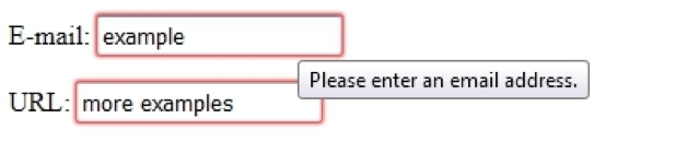
Figure 5. Screenshot of Example Email and URL Pre-Submission Validation Error Display in Firefox
Users should also always be notified of whether or not their form submission succeeded. Users also greatly benefit from being told the format of a form field (such as YYYY-MM-DD for a date field), having the format enforced by the form, and being reminded of the format if there is an error. Users will not be able to complete a form if there is an error and they are not given guidance on how to fix it.
When filling in a form, it is not unusual for a user to use the tab key to move from one field to the next. There is no “standard” tab order, so it mostly depends on how the fields are organized and that the tab order makes logical sense based on the fields available. For example, if a form includes first name, last name, and the various address fields, the tab order should not go from first name to street address, city, back to last name, then province/state, and country. Users may get confused or fill in the information in the wrong place. Having an unintuitive tab order may also frustrate or confuse users to the point where they simply give up. While some may change the tabindex to solve the order in which elements have focus using the tab button, it is not recommended to explicitly change the tabindex order (WebAIM, 2016) as discussed earlier in the article.

Figure 6. Screenshot of Example CAPTCHA. Source: Hampel, M. (2008). Suggestion from re:captcha. https://www.flickr.com/photos/a2community/2408912766 CC-BY2.0
If a CAPTCHA (the test to make sure a user is human) is necessary, consider having an accessible CAPTCHA. Commonly, CAPTCHAs involve a distorted image or audio clip which users have to interpret and enter the correct answer. While having both an image and audio version makes a CAPTCHA seem accessible, the distortion is such that many users fail the CAPTCHA repeatedly (Sauer et al., 2008). Many alternative CAPTCHA methods exist and have been suggested, such as simple questions (asking for the name of the organization, solving a simple arithmetic question, etc.) with a text field input that is validated against a set answer. Users are much less likely to fill in forms with a CAPTCHA (Robinson, 2015 found a decrease of 73%), so seriously consider whether a CAPTCHA is needed in the first place or whether there is another method to achieve the intended goal (such as a spam filter).
Finally, while timed sessions are rare on most websites, they are common with online public catalogues and kiosk interfaces. Ensure that users are warned if they are near the end of their time and allow users to extend the session, with enough time given to users to elect to extend the session. Any user would be baffled if they are being timed, but do not know how much time they have left, or get kicked out of a system without any warning. Users may also have any number of reasons why they need more time, so allowing them an easy way to extend their time will help them successfully achieve their goal.
To summarize, make sure that forms:
- have labels for each field,
- have the correct input type for each field,
- mark errors and provide suggestions for fixing the errors if possible,
- have a tab order that makes sense,
- use an accessible CAPTCHA (if applicable), and
- have warnings for a timed session ending and allow users to extend their time.
Media
Media encompasses any audio or visual format including images, audio, and video. While providing an accessible alternative to the content itself is important, as many other articles already cover how to deal with media as content, the focus here is on the way media is functionally presented or coded and its effects on accessibility.
With the introduction of HTML5, the new <figure> tag can increase the accessibility of media. The main use of the <figure> element is to provide a caption using the <figcaption> tag, so as to directly relate the caption text to the related media, or even a portion of text. For an image, the code might look something like this:
<figure>
  <img src="https://example.library.org/logo.png" alt="An awesome picture">
  <figcaption>Fig1. Example Library Logo</figcaption>
</figure>
Regardless of whether the source is within an online system or through a third-party, any media that ‘plays’ or has other interactive aspects must have controls to play and pause the interactions. Most audio and video players will have these basic controls built-in already, but the controls must also be accessible by screen readers and keyboards, typically using keyboard shortcuts once the media has focus or by allowing the user to tab through the different buttons.
As the importance of controls is so that the user decides when to interact with media, it is important that media do not automatically play (autoplay). While uncommon that audio or video autoplay, image sliders or carousels often autoplay and often do not have any controls to pause the animation. Autoplay causes multiple issues including, but not limited to:
- the user not being able to stop something if their focus is not there when first loading the page,
- assistive software often telling the user of every new image that is loaded, and
- depending on how it is coded, the autoplay will automatically put the user’s cursor focus on the media when it changes.

Figure 7. Screenshot from shouldiuseacarousel.com automatically advancing image slides
Another common issue with media and similar embeds is that they become “keyboard traps”. For example, a website has a Twitter feed embedded as a way to advertise how the organization is interacting with its users, but as a user tabs through the site, their focus ends up inside of the Twitter embed, and cannot get out because it just keeps going through the Twitter feed, which is simply loading more content the farther the user tabs inside of the feed. Thus, a keyboard-only or screen reader user’s focus gets “trapped” inside of the Twitter feed and cannot get past the feed unless they somehow find a way to reload the page and skip the feed on the next passthrough.
There are, however, times when the cursor focus should purposefully be trapped. For example, if using a lightbox or similar modal, when a user clicks on something that opens the modal pop up, then the user’s focus should be trapped inside of the modal with an easy way for them to close it and return to the main page. If the user’s focus is left on the site in the background, they may not be able to access the modal to see what has been opened, or to close the modal.
The main things to remember with making media accessible are that the user should be the one in control of how they interact with the media and web content, and that their focus moves logically through as they interact.
Color Contrast
Content should use high contrast and large enough text size to ensure readability of content. This helps all users, including those with visual impairments, reading and learning disabilities, and with small screens.
The recommended contrast ratio between the foreground and background colors is at least 4.5:1, or 3:1 for large text (see W3C, 2016c), where large text is the equivalent of at least 24px or bolded 19px. There are many tools to check color contrast and sites, such as WebAIM’s Color Contrast Checker, that allow the background and foreground colors to be entered manually.
Auditing Accessibility
While full coverage of auditing accessibility is out of the scope of this article, a brief overview is provided here in the hopes that it is enough to provide a starting point.
Assessing accessibility can be done in many ways with different purposes in mind.
Many accessibility checkers rely on evaluating whether the code meets specified guidelines and suggested techniques. Commonly used code checkers include:
- HTML Codesniffer (bookmarklet)
- AChecker.ca
- AccessLint.com
- QuailJS.com
- Asqatasun (open source site-wide tool)
The caution with these code checkers is that it evaluates the code based on very specific rules and may result in quite a few false positives. For example, an empty alt text tag will be considered an issue, but there are many cases where an alt text is supposed to be empty.
Emulators provide a way to see what users with specific conditions or using specific types of AT see or hear:
- WAVE Toolbar displays webpages in different ways, such as outline of headings.
- Colorblind Web Page Filter simulates different types of colorblindness.
- Fangs, a Firefox plugin, emulates a screen reader in text format.
While code validators and checkers will ensure that accessibility guidelines are met, to make sure that a website or digital tool is usable, it needs to be tested with assistive software and devices, preferably with users who regularly use the assistive software or devices.
Conclusion
There is a lot to consider and take into account when developing web services in such a way as to be fully accessible. While it may take some extra time and effort to make something accessible, more often than not, the benefits positively affect AT and non-AT users, and frequently make web services legally compliant, more usable and desirable.
While a single article cannot cover everything, the article is meant to provide an overview on developing with accessibility in mind, with references to further reading and resources. Hopefully, this article has provided guidance on how to begin meeting and implementing accessibility guidelines.
Endnotes
[1] The specification does not actually require role indicators for the above examples, and could be flagged as redundant in a validator. As browsers have matured, elements such as <nav> and <footer> consistently convey implicit semantic meaning and role at the same time (see W3C, 2016d) without the need to specify.
[2] The last “checked” indicates to the browser that the box is checked, but that is not necessarily communicated through the accessibility tree or may not be picked up by assistive technology. While it seems redundant, there are cases, such as ‘checked’ where the ARIA property is required. For a list of required and supported properties, please refer to the W3C’s ARIA in HTML.
References
Bernard, M., Lida, B., Riley, S., Hackler, T., & Janzen, K. (2002). A Comparison of Popular Online Fonts: Which Size and Type is Best? Software Usability Research Lab. http://usabilitynews.org/a-comparison-of-popular-online-fonts-which-size-and-type-is-best/
Bracey, K. (2015). Comprehensive Guide: When to Use Em vs. Rem. Evatotuts+ http://webdesign.tutsplus.com/tutorials/comprehensive-guide-when-to-use-em-vs-rem–cms-23984
Coyier, Chris. (2013). Bookmarklet to Colorize Text Between 45 and 75 Characters (for line-length testing). https://css-tricks.com/bookmarklet-colorize-text-45-75-characters-line-length-testing/
Fischer, D. (2010). The Accessibility of WAI-ARIA. A List Apart. http://alistapart.com/article/the-accessibility-of-wai-aria
Hamilton, R. Is it okay to build sites that rely on JavaScript? Creative Bloq. http://www.creativebloq.com/features/is-it-okay-to-build-sites-that-rely-on-javascript
Henry, S. L., & Arch, A. (2012). Social Factors in Developing a Web Accessibility Business Case for Your Organization. https://www.w3.org/WAI/bcase/soc
Jehl, S. (2016). Maintaining Accessibility in a Responsive World. https://www.filamentgroup.com/lab/accessible-responsive.html
MDN (Mozilla Developer Network). (2016). Summary. Font-size – CSS. https://developer.mozilla.org/en-US/docs/Web/CSS/font-size
MDN (Mozilla Developer Network). (2016a). Summary. input – HTML. https://developer.mozilla.org/en-US/docs/Web/HTML/Element/input
Pearson, C. (2012). How to Tune Typography Based on Characters Per Line. https://pearsonified.com/2012/01/characters-per-line.php
Persing, D. (2016). The accessibility stack: making a better layer cake. http://simplyaccessible.com/article/the-accessibility-stack/
Rello, L., & Baeza-Yates, R. (2013). Good Fonts for Dyslexia. ASSETS. http://www.taln.upf.edu/system/files/biblio_files/assets2013.pdf
Roberts, A. (2014). ISO 2 Letter Language Codes. Sitepoint. https://www.sitepoint.com/web-foundations/iso-2-letter-language-codes/
Robinson, G. (2015). Is Google’s No Captcha reCaptcha A Conversion Killer? It’s Digital Marketing. http://www.itsdigitalmarketing.co.uk/2015/02/05/googles-no-captcha-recaptcha-conversion-killer/
Sauer, G., Hochheiser, H., Feng, J., & Lazar, J. (2008). Towards a universally usable CAPTCHA. Proceedings of the 4th Symposium on Usable Privacy and Security, 6, p. 1. https://cups.cs.cmu.edu/soups/2008/SOAPS/sauer.pdf
Smith, B.T. (2015). This is a motherf***ing website. http://motherfuckingwebsite.com
Soueidan, S. Building a fully-accessible help tooltip. https://sarasoueidan.com/blog/accessible-tooltips/
United States Access Board. (2017). About the Update of the Section 508 Standards and Section 255 Guidelines for Information and Communication Technology. About the ICT Refresh. https://www.access-board.gov/guidelines-and-standards/communications-and-it/about-the-ict-refresh/overview-of-the-final-rule
W3C. (2016b). ARIA in HTML. https://www.w3.org/TR/html-aria/
W3C. (2016c). Contrast (Minimum): Understanding SC 1.4.3. Understanding WCAG 2.0. https://www.w3.org/TR/UNDERSTANDING-WCAG20/visual-audio-contrast-contrast.htm
W3C. (2016d). WAI-ARIA Overview. https://www.w3.org/WAI/intro/aria
W3C. (2016e). Document conformance requirements for use of ARIA attributes in HTML. https://www.w3.org/TR/html-aria/#docconformance
W3C. (2016f). Core Accessibility API Mappings http://w3c.github.io/aria/core-aam/core-aam.html#intro_treetypes
W3C. (2016g). C21: Specifying line spacing in CSS. https://www.w3.org/TR/WCAG20-TECHS/C21.html
WebAIM. (2015). Screen Reader User Survey #6 Results. http://webaim.org/projects/screenreadersurvey6/
WebAIM. (2016). Keyboard Accessibility. http://webaim.org/techniques/keyboard/
Wroblewski, L. (2011). Organizing Mobile. A List Apart. http://alistapart.com/article/organizing-mobile
About the Authors
Cynthia Ng is the Manager of Technology and Technical Services at the New Westminster Public Library near Vancouver, Canada. She has previously worked in various technology and accessibility related positions in academic and special libraries. With a focus on users and a holistic approach to technology, she advocates integrating accessibility into projects and everyday work along with other aspects of development and user experience.
Michael Schofield is a developer and librarian deeply interested in user experience design. He helped start the Library User Experience Co. (LibUX), hosts the Metric user-experience podcast, and is part of the Practical Service Design Community leadership team. In 2015, he won an ACRL IS Innovation Award for his work making an accessible instructional video platform called LibraryLearn. This year, he joined Springshare.

Subscribe to comments: For this article | For all articles
Leave a Reply