by Katherine Lynch
Introduction
According to Google Analytics, in September 2009, the Drexel University Libraries website (http://www.library.drexel.edu) received over 141,500 unique visitors. Of those visitors, 23 were on mobile devices. In September 2011, nearly 800 unique mobile visitors used the Drexel University Libraries website on handheld and tablet devices, and that number continues to climb steadily each month.
As mobile usage figures grow dramatically for many libraries, having a mobile-optimized web presence becomes nearly as important for reaching patrons and students as having a web presence at all. A mobile application or mobile-optimized version of a library’s website is beneficial to the institution in many ways, from reaching more users to creating a clean, semantic version of the site. The Drexel University Libraries website has benefitted in all of these ways with the development of a smooth, seamless user experience for mobile patrons across our multiple content management systems.
In this paper, I will describe the process of design and development for the first mobile-optimized web presence for Drexel University Libraries. I will detail the challenges posed by working with the existing architecture of a website running on multiple content management systems, and the solutions we employed. I will also address ongoing improvements we made to our mobile presence, as mobile-optimization tools and techniques have emerged and matured.
It is important to note that, when we decided to create a mobile version of the Libraries website, we did so with the knowledge that this would require the development of more than one mobile optimization solution. The Drexel University Libraries website, as it is referred to in this paper, is comprised of the following:
- A website containing primarily resources, services, and location information, which includes personalized, dynamic, and interactive elements. This section is powered by the open-source content management system, Drupal 6.
- Blogs maintained by staff and liaison librarians for research and information, powered by WordPress.
- Research Guides maintained by liaison librarians, powered by WordPress.
- Several small web-based projects and applications too small to require a separate content management system, written in HTML and CSS; for example, the Drexel University Libraries Annual Report web version, an online version of a widely-circulated print document roughly 20 pages long
Motivations
In the summer of 2009, a few months before those first 23 mobile users graced our website with their presence, Drexel University Libraries undertook a usability study of the current website with in-depth user interviews of several Drexel students from diverse groups. Participating students were asked to give some details about their daily web use habits, including data on how often they went online each day, the websites they used the most, and the ways in which they used the Drexel University Libraries website. The sampling of students included undergraduates and graduates, with majors ranging from Engineering to Art History.
Two recurring themes emerged from these interviews. First, our students were beginning to need constant access to the Internet for their studies, which would result in increased acquisition and usage of mobile devices by the student body. Second, if we wanted to continue to offer all of the information and services available on the Drexel University Libraries website to our students as often as possible, it was no longer good enough for our full browser website to look passable on a mobile device. It was time to create a user experience specifically for mobile devices.
Our goal in taking this project on was not to create a stripped-down, application-like mobile version of the website, but rather to make all information and resources on the Drexel University Libraries website available, accessible, and readable on a wide range of mobile devices. With this in mind, the design process began.
Interface Design
The design of the new mobile presence stripped out all elements located in the peripheral areas of the sidebars of the full browser version of the website. Sectional navigation deemed absolutely necessary was planned for inclusion at the base of each page. The horizontal navigation across the top of the full browser version was preserved in this design, as these large buttons were easy to use on touch screens as well as desktops, well recognized from the full browser design, and followed the lead of other successful button-centric mobile designs.


Figure 1: Finalized design mockups for mobile-optimized website pages
Apart from stripping out most sidebar content, the information presented on pages with this design was to remain the same as the content presented in the full browser version.
For the mobile site’s homepage, the elimination of content was a bit more radical. All content was stripped from the homepage, save the omnipresent, horizontal navigation, the resource and catalog search interface, three popular links, and the chat widget. In this way, we created a design that followed the stripped-down nature of mobile-only sites, but still allowed users, upon entering, to access any information available on the full browser version of the site.
The mobile-optimized designs for the WordPress-powered pages were very much the same. The full browser version of the Drexel University Libraries website preserves the same aesthetic look and feel across Drupal- and WordPress-powered pages, and something similar was desired for the mobile-optimized version.


Figure 2: Finalized design mockups for mobile-optimized Blogs and Research Guides
Mobile Optimization with Drupal 6, WordPress, and Media Queries
Once the look and feel of the mobile site had been decided, it was obvious that one mobile solution would not extend far enough to cover every part of our site’s presence. We realized that three solutions were needed – one for Drupal, one for WordPress, and one for any stray pages or side projects written in HTML. As in our desktop presence, the mobile site needed to seamlessly switch between platforms, without any indication to the user that the current solution had been withdrawn and a new one was in place.
Integration for a Seamless Experience
The goal for integration was a coherent, consistent user experience, referring not just to the overall branding of the site but, more importantly, to the rule that a user would never be thrown out of the mobile-optimized version of the web presence, regardless of where they went within the site. Each of the modular solutions provided this in a robust way, and the custom themes, while not all identical to the original designs, were solid representations of the mobile-optimized web presence for the whole site and excluded no necessary content.
Drupal
In researching this issue, it was determined that there were two main ways to create mobile-optimized websites in Drupal: the Mobile Tools module and the Mobile Plugin module. Both offered a certain amount of plug-and-playability and seemed to favor similar methods for mobile conversion, specifically theme-switching. Each module set the Drupal theme for use in content display based on rules set within the module’s configurations for device groups including desktop, tablet, and handheld devices.
The Mobile Tools module did not show much promise at first. There was very little helpful documentation to consult when something did not work as intended. The initial selection of “theme-switching” in the interface did nothing to change the theme once enabled and configured, and very little could be determined about what was wrong. Multiple experiments were performed with site caching and PHP memory limits, but the module could not function as needed for theme switching.
Mobile Plugin, on the other hand, seemed the better choice. Once configured, theme switching worked like a charm on many mobile devices, including tablets and devices with non-standard operating systems.
The configuration interface was not terribly user-friendly, to say the least, though with good reason. Administrators could set device detection rules for each mobile device type and operating system that might hit the website.
Though it required more technical knowledge for entering rules, this would actually afford greater control, should the need arise to have even more different themes associated with other devices or screen resolutions.
Rules are entered as text by the administrator and dictate which devices the module treats as mobile. In the example below, devices in the group “mobile” are treated as mobile and devices in the group “no” are full browser. Rules also use a “weight” variable to dictate which theme should be given precedence for devices that land in multiple groups. An example of the Mobile Plugin rules is shown below:

Figure 3: Mobile Plugin device detection rules configuration screen
However, it was not without its quirks. By enabling Mobile Plugin on the Drexel University Libraries customized Drupal installation, our site lost the ability to employ a separate theme in the administrative sections of the website. This option is built into every new Drupal installation, and is generally beneficial in helping content editors better understand how to use and edit a site. The newest version of Mobile Plugin evidently overrode the Drupal variable used to set the administrative theme internally, causing the theme to always default to the live one. While it was irksome to lose this feature, it was not a deal breaker when the reward was gaining a completely functional mobile solution for Drupal.
Additionally, theme switching required Drupal’s built-in site caching mechanism to be disabled. This would have been true of Mobile Plugin or Mobile Tools when using theme switching. Theme switching for device detection in Drupal requires an absence of Drupal performance caching at all times.
Drupal performance caching consists of built-in content caching features that primarily utilize compression of site elements such as cascading style sheets and Javascript files along with database query caching for minor to moderate site performance boosts. This type of caching allows Drupal pages to be rebuilt from memory rather than from a live database lookup every time, and so provides a substantial speed increase on websites that use it.
With Drupal caching turned on, a theme could not switch fast enough—mobile users would still get the full browser site, likely exiting before ever seeing a change to the mobile version. Therefore, Drupal site caching had to be turned off to use theme switching through Mobile Plugin. While this was not an ideal situation, it was unavoidable for creating a mobile Drupal presence and the performance was not bad enough to force us to scrap the entire mobile effort.
Even with these two small-to-moderate stumbling blocks, Mobile Plugin ensured a more robust front-facing user experience; thus it was the solution we chose to implement in the mobile pilot site.
Building the Mobile Theme
The Drupal mobile theme, named DRX Mobile, was built as a customized fork of Nokia Mobile, a contributed base theme (available at http://drupal.org/project/nokia_mobile). In the documentation, Nokia Mobile is the recommended starter theme to accompany sites using Mobile Plugin, and with good reason; it serves as a helpful and comprehensive framework of base HTML for mobile designs.
To match our own mobile design, nearly all of the built-in look and feel were stripped out and replaced with custom PHP, HTML, and CSS. With the exception of some later additions of content and menu items, the Drupal result was extremely similar to what had been planned.

Figure 4: Unaltered Nokia Mobile theme on a sample site

Figure 5: DRX Mobile theme in action

Figure 6: DRX Mobile theme in action

Figure 7: DRX Mobile theme on a tablet device

Figure 8: DRX Mobile theme on a tablet device

Figure 9: DRX Mobile theme on a desktop device

Figure 10: DRX Mobile theme on a desktop device
Drupal Performance Caching
The mobile optimization in Drupal functioned well with theme switching from the Mobile Plugin module, but could not be considered a long-term solution as long as we were unable to utilize even basic, built-in caching for site performance in the same Drupal installation and had no other caching solution in place for mobile, tablet, or desktop users.
We researched some methods for controlling the cache outside of Drupal through server configurations, but we needed help balancing the performance load of the high traffic on the Drexel University Libraries full browser Drupal-based site pages.
We first considered using a caching proxy such as Squid with a reverse proxy setup on the web server. Using reverse proxy, we could provide cached versions of popular pages on our site to unlimited users on one server. However, as we were running multiple content management systems, using Squid for production would require extensive testing before rollout. This was not a deal breaker, however it seemed that there might have been a simpler solution to our caching problem related solely to the Drupal installation. Before pursuing Squid, we searched out a simpler Drupal-based solution, and found one.
There was always another option for mobile optimization in Drupal. Rather than theme switching, we could employ domain switching, directing users to a separate URL for the mobile site. Our main reason for resisting this approach at the outset was our desire not to manage two separate sites—one mobile, and one desktop.
Creating two separate sites would mean several headaches. Content duplication across the two websites would increase the risk of inconsistent or outdated information on one of them. Measures to avoid this would mean twice the work for content editors and site maintainers. Most importantly, two sites would create a potentially jarring transition for users between Drupal and the rest of the website. The only way that this solution would work was if it allowed us to maintain a single base of information available in our web presence, and display it in an optimized way, responsive to the device of the user.
Additionally, this was only a Drupal problem. As I will detail later in this paper, the WordPress and HTML pages had no caching problems. Keeping the WordPress and HTML pages on the main website and pushing only the Drupal solution off onto a separate mobile domain would create a problematic data silo that we wanted to avoid. Therefore, we compromised.
Researching ways to manage multiple domains within one installation of Drupal immediately led us to the Domain Access module, written for just this purpose. The module could be used to control multiple site instances with multiple backend databases, but most importantly, it could control multiple URLs pointing to the same Drupal installation, while displaying a different theme based on the URL accessed. In other words, we would be able to have one site accessible from two URLs, pulling all of the same content from one database, and the only difference would be which theme was displayed.
We secured the mobile URL of m.library.drexel.edu through the Drexel University Office of Information Resources & Technology. Then we configured the Domain Access module to pull all content from one database, use the full browser Drupal theme for users visiting the site from www.library.drexel.edu, and use DRX Mobile as the theme when the site was viewed from m.library.drexel.edu.
Furthermore, the Domain Access module allowed separate caching configurations for each domain. The main website could therefore finally start using basic Drupal performance caching again without a negative impact on mobile users. As an added bonus, within this solution we were also able to employ a separate configuration of Drupal performance caching for the mobile theme, which gave it a nice performance boost as well.
However, once we got the URLs and themes distributed, we still needed a mobile detection mechanism. As we wanted to move away from Mobile Plugin’s favored method of theme switching for mobile detection, we reexamined the Mobile Tools module. An unexpected bonus to moving away from Mobile Plugin was that the administrative theme bug in the Mobile Tools module went away. We were again able to have a separate theme in the administrative side of Drupal.

Figure 11: Drupal theme shown to patrons and anonymous users on the live website

Figure 12: Administrative theme in use on a page administration screen in Drupal
Upon installation and configuration, there was still one relatively small problem. While tablet devices could be assigned a specific theme for theme switching in the Mobile Tools plugin, tablet devices were automatically classified as desktop devices for domain switching. Upon contacting the developer, we were informed that this was because of a belief that tablet devices were closer to desktop devices, and therefore should use the full browser version of a site. For our own configuration, we needed a more flexible approach. We needed to direct tablet device users to the same mobile site as handheld device users. We built a small custom module we built designed to catch the Mobile Tools detection variable and set it to “mobile” for users coming into the site from certain tablet devices to solve this problem.
After this module was installed, and a few other minor configurations were made, we had a mobile Drupal site that seamlessly moved between a mobile URL and full browser URL, able to blend well with our additional solutions while also taking advantage of caching for site performance.
To summarize our Drupal research, the following Drupal modules were at some point used and/or tested:
Domain Access
Allows one Drupal installation and one shared database to power multiple domains. http://drupal.org/project/domain
Domain Analytics
Allows each domain on a single Drupal installation to have separate Google Analytics account settings, which allows for separate analytics information to be collected for each domain. http://drupal.org/project/domain
Mobile Tools
Provides theme switching and domain redirection capability for mobile devices. http://drupal.org/project/mobile_tools
Mobile Plugin
Offers theme switching and domain redirection through administrator-defined device detection rules for mobile devices. http://drupal.org/project/mobileplugin
WordPress
When this project began, the WordPress-powered blogs had already been experimentally employing a plugin called WPTouch to make them mobile-friendly. The plugin was a set-and-forget type, which offered no real configuration and no way to preview the look and feel within the browser. It only optimized WordPress blogs, and did so in a very rigid way.
The mostly unchangeable interface of the mobile optimized WordPress instances using WPTouch resembled that of many news blogs and feed readers. The interface is suited for the delivery of information that changes rapidly over time, for which the context of date and time are integral.
Unfortunately, WPTouch was not right for Drexel University Libraries’ more stable research guides running on WordPress. The research guides utilized pages in favor of here-today-gone-tomorrow posts, and required front pages with static information. While it was possible to create these in WordPress, it was not possible to display them this way using the WPTouch plugin.
Another obstacle to the continued use of the WPTouch plugin related to the fact that, as mobile technologies continued to advance, the WPTouch module did too, but as WPTouch Pro, a plugin that the developers forked from their open-source version and were gearing up to sell commercially. This was signaled by the already-sparse configuration options for the open-source WPTouch plugin becoming sparser, and losing some support in favor of the pro version. Ultimately, the reason we chose not to upgrade to WPTouch Pro was the fact that the plugin could only provide a semi-seamless mobile web experience for 50% of our WordPress presence. Another approach was required.
Enter the WP Mobile Detector plugin. As with WPTouch, there were open-source and paid versions of this plugin available, but the open-source version already offered a wealth of configuration options for the creation of a mobile site in WordPress. We were able to drop our own custom WordPress theme into the file structure of the plugin, turn mobile site tracking on or off within the configuration, dynamically resize rich media to fit smaller screens, and, most importantly, create a fluid experience entering and exiting WordPress, for both the blogs and the research guides.
In creating the custom DRX Mobile WordPress theme, based on the Anakin Mobile WordPress theme, the design changed slightly for both sections. In order to preserve the familiar mobile experience created by using the WPTouch plugin, the homepages of the blogs were modeled similarly to their previous appearance. Single blog post pages kept Drexel University Libraries branding and website color combinations, but gained an even more stripped-down look. The horizontal navigation was removed in favor of the bottom-up navigation utilized at the bottom of each mobile Drupal page. The research guides gained static homepages for guide listings and the same stripped-down branding, while also keeping the Drexel University Libraries-consistent color scheme. These themes proved not only sleeker on handheld devices but also pleasantly easy to read on tablet devices.


Figure 14: Mobile-optimized WordPress blog homepage and single post


Figure 15 and 16: Tablet-optimized WordPress blog homepage and single post


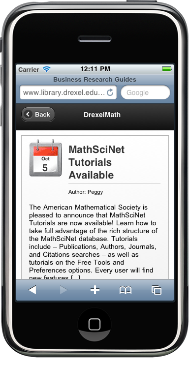
Figure 17 and 18: Mobile-optimized WordPress research guide homepage and single guide


Figure 19 and 20: Tablet-optimized WordPress research guide homepage and single guide
Unlike our Drupal solution, the WordPress mobile solution included minimal drama where caching was concerned. We used the popular W3 Total Cache plugin for site performance on desktop and mobile devices already. This plugin cached database queries, minified CSS/Javascript files/RSS feeds, and utilized browser caching for repeat page views for a performance boost. It also specifically claimed to work well with mobile devices by offering caching configuration options for separate device groups, similar to the Mobile Plugin Drupal module.
We were happily surprised to find that the authors of WP Mobile Detector had taken the W3 Total Cache plugin into consideration when creating their plugin. A tip rolled right into the WP Mobile Detector’s WordPress.org FAQ page (http://wordpress.org/extend/plugins/wp-mobile-detector/faq/) stated that the only configuration needed to make WP Mobile Detector work while W3 Total Cache was active was adding the WP Mobile Detector cookie into the W3 Total Cache “Rejected Cookies” list, as show below:

Figure 21: Page Cache configuration screen in the W3 Total Cache plugin, configured to exclude pages defined as mobile by the WP Mobile Detector plugin from desktop-optimized page caching
By rejecting this cookie, the WordPress pages that were labeled “mobile” by WP Mobile Detector would not be subject to the page content caching of desktop pages through W3 Total Cache. Database caching, external script and feed minification, and other caching mechanisms remained in place for mobile devices.
Device groups, referred to as “user agent groups” in the W3 Total Cache plugin, used rules set by administrators for which themes would display dependent on the user agent. Any active theme could be selected for forced display on any user agent in an administrator-defined group. However, there was also the “pass-through” option, which, when selected, passed the specified user agent group through the W3 Total Cache module’s theme selection for caching and allowed another theme switching solution, such as the WP Mobile Detector’s theme switching mechanism, to take precedence.

Figure 22: Configuration screen for sorting user agents into groups for specific theme and URL redirection in the W3 Total Cache plugin
The plugins used that were crucial to creating our mobile-optimized WordPress configuration are as follows:
Google Analytics for WordPress
Allows WordPress blogs to be associated with Google Analytics accounts for analytics and metadata tracking. http://wordpress.org/extend/plugins/google-analytics-for-wordpress/
W3 Total Cache
Caches WordPress sites through database query caching and minified CSS/Javascript – also caches by device group to support mobile theme switching. http://wordpress.org/extend/plugins/w3-total-cache/
WordPress Mobile Admin
Delivers mobile-optimized display of WordPress Administrative pages for mobile content management. http://wordpress.org/extend/plugins/wordpress-mobile-admin/
WP Mobile Detector
Detects mobile devices and displays an administrator-selected mobile-optimized theme based on the device. http://wordpress.org/extend/plugins/wp-mobile-detector/
CSS and Media Queries
With content under the Drupal and WordPress content management systems optimized for mobile devices, the only pages left with a decided support gap were some semi-static pages written in HTML and CSS. There were not many of these pages, but any of them could cause a break in the mobile-optimized user experience, so a solution was put in place.
Cascading style sheets provided some of the easiest-to-implement solutions for creating mobile content. We used the technique of conditionally calling style sheets to hide certain non-optimized content, reveal mobile-only content, and change the look and feel of content existing in both realms. To conditionally call style sheets, we used a media query. A media query is a logical expression check performed by the user agent against the current media type—in this case “screen”—for the conditions or parameters of a certain feature of that media type. Features can be one of many variable display items, including aspect ratio, color display, screen orientation, and device width.
Our CSS solution consisted of a combination of three style sheets – one for mobile content on the smallest screens, one for standard mobile screens, and one for overriding any mobile-specific CSS classes or content. To determine when to call each style sheet, we employed media queries as follows:
<link rel="stylesheet" media="screen and (max-device-width: 480px)" href="micro-handheld.css" />

<link rel="stylesheet" media="screen and (min-device-width: 481px)" href="handheld.css" />

<link rel="stylesheet" media="all and (min-device-width: 1024px)" href="override-handheld.css" />
Using this code, we were able to determine the maximum and minimum device width of any incoming users. This media query checked the width of the user’s device and called the style sheet only if width conditions were met. If a device with a screen width of 480 pixels or less called up the website, the “micro-handheld” style sheet was called. If a device with a minimum screen width of 481 pixels called up the site, the “micro-handheld” style sheet was not called and the regular “handheld” style sheet for handheld device classes was called instead. Finally, if a device with a screen width of 1024 pixels or more called up the site, the handheld classes were overridden in the “override-handheld” style sheet.
This CSS technique was used not only for side projects and the occasional HTML page, but has also come into use on content in both Drupal and WordPress pages. Data tables and wide-format content that display well in a full browser site but not on a mobile device have mobile-specific CSS classes assigned to their HTML elements. These CSS classes re-style the content for better readability on smaller screens.

Figure 24: Full browser version of the Drupal-powered Hagerty Library staff page

Figure 24: Full browser version of the Drupal-powered Hagerty Library staff page
This CSS solution is by far the most reliably adaptive solution for optimizing web content for mobile users, changing mostly when the standards of actual device widths change. Possibly our best example of its extensive use to date is in this past year’s Drexel University Libraries Annual Report 2009-2010, web edition.

Figure 26: Full browser version of Annual Report homepage

Figure 27: Tablet version of Annual Report homepage

Figure 28: Handheld version of Annual Report homepage
The handheld version of the Annual Report was designed after the full browser version was complete. In the full browser version, all of the report’s content was dynamically displayed using jQuery with pagination effects. These effects suited a desktop user agent, but were inappropriate for the stripped-down look required for an easy-to-use mobile interface. As each section was loaded dynamically, the desktop version consisted of one index file, so we opted to create the mobile homepage’s content—a list and the report’s description—at the end of that index file. Each item in the mobile homepage’s list linked to small, separate, mobile-optimized pages, one for each of the report’s sections. Separate pages for each section made it easier for handheld and tablet users to bookmark sections of the annual report for later referral and sharing.
Media queries were used to stop the mobile version from appearing in the desktop version, and vice versa. From there, the tablet-optimized version’s CSS, which would override the mobile CSS, was called using an additional media query on the mobile version of the site’s HTML.
We made a concerted effort to create specially optimized experiences for both handheld and tablet device users when building this application, because it was designed with the idea of allowing visitors from outside of the Library to learn more about our institution and accomplishments in a friendly and intuitive way, a way encouraged by the social nature of information sharing on mobile devices. The result has afforded outside visitors a positive experience with this report, and has also made it far easier for our professional staff to refer to it in professional conversations and presentations.
Conclusion
Our current successful recipe for a seamless mobile web experience is as follows:
Drupal
- Mobile URL
- Domain Access module
- Mobile Tools module
- Configured to use domain switching with the mobile URL
- Small custom module to augment tablet support
WordPress
- WP Mobile Detector plugin
- Custom theme based on the contributed Anakin theme
- W3 Total Cache plugin, configured to exclude the detection cookie used by the mobile plugin
HTML
- CSS media queries conditionally calling style sheets based on screen resolution
Each of these solutions requires minimum upkeep and maintenance from developers and creates no extra work for content editors. As we have been able to keep all of the content for each platform or technology coming from the same source as the full browser version, the daily workflow of editors and site maintainers remains the same. The most up-to-date web content is available at every point of access to Drexel University Libraries website users, whether they enter from a desktop computer, an iPad, an Android, or any other device.
These solutions have not only shown that we can create a reasonably responsive design for a site managed across multiple platforms, but have also allowed us to embrace new technology at the same pace as our student body and patron population. This gives them the ability to continue using the Drexel University Libraries website as a learning tool and educational environment wherever they go and gives us the ability to continue using our website as a tool for information and education for all.
Related Links
Drexel University Libraries:
- Main Web Site – http://www.library.drexel.edu
Drupal
- Domain Access Module (Drupal) – http://drupal.org/project/domain
- Mobile Plugin Module (Drupal) – http://drupal.org/project/mobileplugin
- Mobile Tools Module (Drupal) – http://drupal.org/project/mobile_tools
- Nokia Mobile Theme (Drupal) – http://drupal.org/project/nokia_mobile
WordPress
- Google Analytics Plugin – http://wordpress.org/extend/plugins/google-analytics-for-wordpress/
- Mobile Admin Plugin – http://wordpress.org/extend/plugins/wordpress-mobile-admin/
- Mobile Detector Plugin – http://wordpress.org/extend/plugins/wp-mobile-detector/
- Mobile Detector Plugin FAQ – http://wordpress.org/extend/plugins/wp-mobile-detector/faq/
- W3 Total Cache Plugin – http://wordpress.org/extend/plugins/w3-total-cache/
About the Author
Katherine Lynch works as web developer for Drexel University Libraries in Philadelphia, PA. She presented on Drupal mobile development at Drupal IG Meeting Annual 2011 at 2011 ALA Annual Conference, and writes and presents extensively on Drupal, mobile development, and web accessibility. More information can be found at her website, http://www.katherinelynch.org/.

Junior Tidal, 2012-02-03
Excellent article. Right now we’re using a separate mobile site outside of our D6 installation and using the Mobile Tools module, but it doesn’t seem to be working too well. I think I’ll have to check out the Mobile plug-in.
Joshua Odmark, 2012-08-06
Katherine,
What a great writeup. I enjoyed the flow of the article as it followed your thought process.
I wrote the WP Mobile Detector, so it was a pleasure reading how it has helped create a mobile website for Drexel University Libraries.
Cheers.