by Laura K. Wiegand and Bob Humphrey
Libraries are experts at collecting statistics. We have complex systems that collect data on transactions, we have analytics that track online visits, we have gate counters that record visits, we have forms to keep track of our interactions with users, we get reports on PDF downloads and how many times our computers get logged into. But what to do with all this data? We often use it internally for decision-making or reporting, but what about communicating these often staggering numbers to our stakeholders and clientele?
Like many libraries, UNCW Randall Library had a page on our website under “About Us” that listed out, in bulleted sentences, some of our more compelling numbers (e.g., “9,185 People Received Instruction”). But in today’s world of instant metrics and focus on return on investment (ROI), these annually updated lists of numbers were uninspiring. In addition, they didn’t show context over time, neither reflecting the academic year cycle nor the steady increase year to year. In response to this less than helpful list of statistics, our University Librarian asked that we create a “Statistics Dashboard” to visually demonstrate activity in the library.
Other libraries have built dashboards, both external [1] [2][3] and internal[4], used data visualization for art and physical displays displays (such as the well-known ticker display of check out data at the Seattle Public Library) [5], produced kicked up marketing materials [6], and employed it for decision-making [7]. In fact, in an era of increasing availability and flexibility of massive amounts of data, employing effective data visualization has become increasingly important [8]. On the spectrum of data visualization, our project was relatively simple. Our goal was to present traditionally collected statistical data about the library in a graphical and dynamic manner. This “dashboard” was to be a piece of the newly created “Facts and Planning” (http://library.uncw.edu/facts_planning ) section of our website designed to provide the University community with information about our resources and their stewardship.
In their article “Statistical Graphics: Making Information Clear – and beautiful” Niemi and Gelman outline the qualities of a “well-designed graph” [9]. They write when planning visual representation of statistics or data, the first questions to ask are “Who is your target audience? What are you trying to show?” In our case, our target audience was university administration, our users and possibly librarians from other libraries. We were trying to show the large volume of transactions, visits, instruction and usage increasing over time and cycling through the academic year. Next they recommend “Avoid distracting elements. Use informative colour. Keep the figure simple.” We attempted to do this by styling the graphs to match our website, creating simple graphs using proven graphing techniques (line, bar, area) and having exact numbers remain hidden until the user hovered over the graph.
In terms of infrastructure, we wanted the dashboard to be fully integrated with our Drupal 6 website in a way that both allowed for the reuse of content and harnessed existing technology. Additionally, we are a medium-sized academic library with limited staff resources, meaning that building a complex, custom system was not an option. Since many other libraries utilize Drupal, and likewise have limited resources, we thought we would share the steps for setting up a simple dashboard in Drupal.
Tools for Building the Dashboard
To create the dashboard, we chose Open Flash Chart, a free, open source charting package available at http://teethgrinder.co.uk/open-flash-chart-2/. This software creates beautiful animated charts in a variety of styles, including line charts, bar charts, stacked bar charts, and pie charts. The project has adequate online documentation and the charts can be built and customized using PHP.
There are several Drupal modules that can be used to integrate charts. We chose the Open Flash Chart 2 API module (http://drupal.org/project/ofc_api) based on its ease of use. The procedure for installing this module was similar to that for any other Drupal module except for the addition of a couple of extra steps. Once the module had been saved in the Drupal installation sites/all/modules folder, then the Open Flash Chart (OFC) files needed to be added to the ofc_api folder. We downloaded OFC from http://sourceforge.net/projects/openflashchart/files/open-flash-chart/Version%202%20Lug%20Wyrm%20Charmer/ and extracted the contents of the .zip file. Then we moved the OFC files into the module as follows:
- The open-flash-chart.swf file was copied from the OFC package to the ofc_api module
- The php-ofc-library folder was copied from the OFC pagkage to the ofc_api module
- The swfobject.js file from the js folder within the OFC package was copied to the ofc_api module
When we were finished moving files, the dirctory of the ofc_api module looked like this:
ofc_api
|-- php-ofc-library [folder]
|-- ofc_api.info
|-- ofc_api.install
|-- ofc_api.module
|-- open-flash-chart.swf
|-- swfobject.js
The next step was to configure the module at [website]/admin/settings/ofc_api. We checked the options to use SWFObject to embed charts and to use an external library and set the path to the external library file as ‘php-ofc-library/open-flash-chart.php’.

Figure 1: Open Flash Chart API configuration
Page and Block Display Setup
We chose to put our graphs inside of individual blocks to make it easy to reorder, update, add and remove the various charts that we would be creating over time. Since the Randall Library website already had more than 200 blocks defined (future clean-up project!), there was a real possibility that our new dashboard blocks were going to be difficult to manage. To deal with this, we took some extra steps at the beginning of the project to help organize the new blocks being created. Drupal makes it easy to define new display regions that can be incorporated into the theme being used, so we decided to add a new ‘dashboard’ region to our theme. This was done by including a new element in the regions array defined in our theme .info file, as shown below:
regions[left] = left sidebar
regions[right] = right sidebar
regions[navbar] = navigation bar
regions[content_top] = content top
regions[content_bottom] = content bottom
regions[dashboard] = dashboard
regions[header] = header
regions[footer] = footer
regions[closure_region] = closure
Then we had to specify exactly where the new region should appear on a web page. To do this, we modified our theme page template page.tpl.php to display the content in the dashboard region just above any content that would normally be placed in the content-area of a page.
<?php if ($dashboard): ?>
    <div id="dashboard" class="region region-dashboard">
        <?php print $dashboard; ?>
    </div> <!-- /#dashboard -->
<?php endif; ?>
<div id="content-area">
...
</div>
All blocks created for the Dashboard page were then assigned to the new dashboard region.

Figure 2: Dashboard blocks
Next we created a Page node consisting only of a title and url alias. This provided us with an empty container that we could then fill up with Drupal blocks, each one holding a different chart or graph to be displayed in our dashboard.
Creating a Dashboard Chart in a Block
We were then ready to create our first chart, a line graph showing the weekly number of logins to the computers in our Learning Commons. The process for creating a graph consisted of the following steps:
- Creating and configuring a new block
- Writing a short PHP script to specify all the parameters for the chart.
We set the new block to display on the container page created earlier, and changed the input format to PHP code. If this input format is not an option to you, it will need to be enabled as an available text format at [website]/admin/settings/filters/list. Also, the user creating the block needs to be assigned to a role that has permissions to use the PHP code input format (grant with care!).
We then proceeded to write the code that would display the desired chart. The resulting script consisted of two parts. The first part specified the data that was going to be displayed in the graph, i.e. the number of logins and the week ending date. The second part described the appearance of the chart, including each of its various elements, such as title, data points, lines, and axis.
To accomplish the first part of the task, a query was made against the database that contained the login data, returning the following information:
| Week Ending | Number of Logins |
| 1-7-12 | 180 |
| 1-14-12 | 201 |
| 1-21-12 | 3318 |
| 1-28-12 | 4284 |
| 2-4-12 | 5365 |
| 2-11-12 | 6281 |
| 2-18-12 | 6528 |
| 2-25-12 | 6460 |
This data was then placed into two arrays at the beginning of the script:
<?php
// data and labels

$data = array(180,201,3318,4284,5635,6281,6528,6460);

$labels = array('1-7','1-14','1-21','1-28','2-4','2-11','2-18', '2-25');
We then proceeded to the second part of the task, defining all the various elements of the chart. The first item specified was the chart title:
// chart title

$title = new title( '2012 Learning Commons Computer Usage, by Week' );
The next step was to describe the appearance of the data points. There are a couple of different approaches to figuring out how to create data points or any other OFC chart element. The Open Flash Chart website contains dozens of code examples for building every kind of chart. If you are familiar with PHP, it’s not overly difficult to find a chart you like and use the code as a guide for creating your own graph.
Another method that might be useful, especially for those who are comfortable with object oriented programming, is to make use of OFC Data Structures class documentation at http://teethgrinder.co.uk/open-flash-chart-2/doxygen/html/annotated.html. Studying the class hierarchy, we were able to see that there were 9 different classes for representing data points, each of them a subclass of the dot_base class. For this particular chart, we chose the hollow_dot class, which had no particular properties of its own, but inherited all of the properties of its base class, including size, halo_size, colour, and tooltip. Specifying the appearance of our data points was simply a matter of creating a new hollow_dot object and setting its various classes.
// define data point appearance

$d = new hollow_dot();

$d->size(4)->halo_size(1)->colour('#006666')->tooltip("Week ending #x_label#
#val# Logins" );
The lines were defined in a similar way:
- A line object was created.
- The data property of the line was set using the $data array defined at the beginning of the script.
- The dot style property was set using the data point style defined above.
- The width and colour properties were set.
// define line appearance

$line = new line();

$line->set_values( $data );

$line->set_default_dot_style($d);

$line->set_width( 4 );

$line->set_colour( '#006666' );
The next task was to define the horizontal x-axis. We followed the same steps as we did in creating the data points and lines. Referring to the Open Flash Chart documentation for guidance, we created an x_axis object and then specified its properties. Note that the $labels array defined at the beginning of the script was used to set the labels for this axis using the set_labels_from_array() method.
// define x-axis

$x = new x_axis();

$x->colour('#DDDDDD')

->grid_colour('#DDDDDD')

->tick_height(5)

->stroke(3);

$x->set_labels_from_array($labels);
Before creating the vertical y-axis, we needed to determine the scale of the values being represented. According to the data table shown above, the greatest number of logins (6528) occurred during the week ending February 18. Therefore, 7000 was selected as the maximum value for the y-axis. This would be large enough to accommodate the full range of values that need to be displayed, and small enough so that the line graph created would expand to use up most of the available chart space. It was also decided that the graph would have horizontal gridlines representing 1000 logins, 2000 logins, and so on, up through the maximum value of the axis. To accomplish this, three range variables were set as follows:
// set the range of values for the y-axis

$low_value = 0;

$high_value = 7000;

$step_value = 1000;
With the range of values accounted for, the rest of the y-axis could then be defined:
// define y-axis

$y = new y_axis();

$y->set_stroke( 3 );

$y->set_colour( '#DDDDDD' );

$y->set_tick_length( 5 );

$y->set_grid_colour( '#DDDDDD' );

$y->set_range( $low_value, $high_value, $step_value);
At this point, all the different elements of the chart had been specified. The last remaining task was to create a chart object and add to it all the various objects representing the chart elements.
// create chart and add all elements to it

$chart = new open_flash_chart();

$chart->set_title( $title );

$chart->add_element( $line );

$chart->set_bg_colour('#EEEEEE');

$chart->set_x_axis( $x );

$chart->set_y_axis( $y )
We finished the block off with a little bit of text providing some additional information about the chart.
// add text below the chart

print '<div class="dash-chart-text">';

print ofc_api_render($chart, 400, 250, array('wmode' => 'opaque'));

print 'The approximately 100 computers in the Learning Commons are logged onto several thousand times a week; many students use them daily.';

print '</div>';

?>
All of this code was entered into the Block body field of the block input form. The block was then saved and enabled for the dashboard region of the site display.
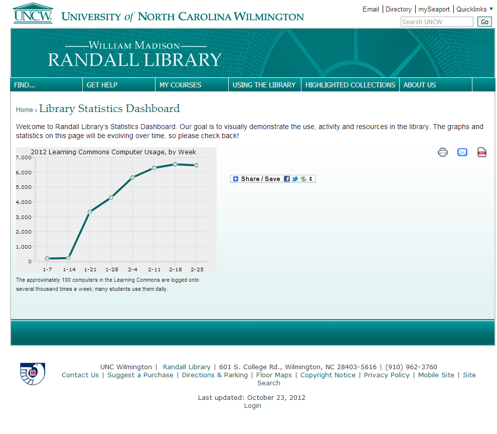
Figure 3: Library Statistics Dashboard with Open Flash Charts graph
Automatic Data Updates
At first we kept the chart current by manually updating the $data and $labels arrays on a weekly basis with new information. But as soon as time permitted, code was added to obtain this information directly from the database where it was stored, thus eliminating the need for this weekly chore.
// data and labels

$data_r = array();

$labels_r = array();

// connect to the database and query it

$conn=mysql_connect('[SERVER]',[USER NAME],[PASSWORD]);

@mysql_select_db([DATABASE NAME]);

$sql =  [SQL CODE TO RETRIEVE NUMBER OF LOGINS AND DATE FROM THE DATABASE FOR THE PREVIOUS 16 WEEKS];

// populate the data and label arrays with information from the database;

// keep track of the largest value being used

$high_value = 0;

$result = @mysql_query($sql);

if ($result) {

$x = 2;

while ($row = mysql_fetch_array($result, MYSQL_ASSOC)) {

$value = intval($row['logins']);

$data_r[] = $value;

$high_value = ($value > $high_value) ? $value : $high_value;

$rem = $x % 2;

if (!$rem) {

$labels_r[] = substr($row['date'], 5);

}

else {

$labels_r[] = '';

}

$x++;

}

}

// reverse the arrays so that they display in the correct order on the chart

$data = array_reverse($data_r);

$labels = array_reverse($labels_r);
The new code created a connection to the database and retrieved the number of logins summarized on a weekly basis for the previous 16 weeks. As each record was returned, the arrays $data_r and $labels_r were updated with the information. Since the records were retrieved in the opposite sequence in which they needed to be displayed, the arrays were reversed before building the chart.
An additional consideration in automating the data retrieval was to programmatically determine the correct scale for the y-axis of the graph. As each record was retrieved from the database, the number of logins was compared to the value of the previous records, and $high_value was updated if the number of logins was the largest value returned up to that point. Then, when all the records had been read, $high_value was adjusted up to the next hundreds value. $high_value was then divided by 5 to determine the other amounts to be displayed on the y-axis.
// set the range of values for the y-axis

$low_value = 0;

$places = strlen($high_value) - 2;

if ($places > 0) {

$high_value = ceil($high_value / pow(10, $places)) * pow(10, $places);

}

$step_value = $high_value / 5;
Discussion
Our goal for this project was to replace our traditional statistics page with a more compelling display, and to demonstrate the scope of activity in the library to our users and stakeholders. We feel that we are on our way towards meeting those goals with the current implementation. Our previous list of statistics has indeed been replaced by attractive, informative graphics. Our University Librarian has included demonstration of the dashboard in presentations to administration. The charts are easy to update, harness existing technologies, are integrated with our website and can easily connect to external data sources for hands-off updating.
However, we have fallen short in some ways. For example, the number of charts we have set up is limited, and only a handful of them are dynamically updated. We are planning to continue to increase the number of graphs, specifically increasing the number of graphs that utilize dynamic or automatically updated data.
Second, the metrics we are currently displaying are relatively simple and consist of statistics traditionally reported by libraries (i.e, number of information literacy sessions per month). These traditional counts over time may not be the most interesting way to show the impact of our activity. A better demonstration might be a chart that compared information literacy sessions to the number of librarians and the number of number of students at UNCW. Enhancing the way we think about data and statistics, and then turning those into charts, would be another way to meet our goals.
Finally, the statistics dashboard is relatively buried on our website; this is somewhat intentional because it is auxiliary to prime functions on our website. However, as we update our website we will be considering ways to further integrate or display the dashes so that our users can get a glimpse of the activity in the library in relevant contexts.
References
[1] dashboard_beta :: dashboard information [Internet]. Providence(RI): Brown University Library; [cited 2012 Oct 31]. Available from: http://library.brown.edu/dashboard/info/
[2] Dashboard [Internet]. [updated 2010 Sept 16]. Indianapolis (IN): The Trustees of Indiana University; [cited 2012 Oct 21]. Available from: http://www.ulib.iupui.edu/dashboard
[3] Library Dashboard [Internet]. [updated 2012 June]. New York(NY): Libraries of The Metropolitan Museum of Art [cited 2012 Oct 31]. Available from: http://www.libmma.org/watstat/
[4] Morton-Owens, E, Hanson, K. 2012. Trends at a Glance: A Management Dashboard of Library Statistics. Information Technology and Libraries [Internet]. [cited 2012 Oct 31]. 31(3): 36-51. Available from: http://ejournals.bc.edu/ojs/index.php/ital/article/view/1919/pdf
[5] Legrady, G. 2005. “Making visible the invisible” Seattle Library Data Flow Visualization. In: Digital Culture and Heritage. Proceedings of ICHIM05 Sept. 21-23, 2005. Paris(France): Archives & Museum Informatics Europe (AMIE). Available from: http://www.archimuse.com/publishing/ichim05/Legrady.pdf
[6] South Dakota Public Libraries Data Digest 2011. Pierre(SD): South Dakota State Library. [Cited 2012 Oct 31]. Available from: http://library.sd.gov/SDSL/publications/DOC/RPT-DataDigestPubLib2011.pdf
[7] Visualizing Library Data [Internet]. Raleigh(NC): NCSU Libraries. [cited 2012 Oct 31]. Available from: http://www.lib.ncsu.edu/dli/projects/dataviz
[8] Davis, Hilary. 2009. Not just another pretty picture. In the Library with the Leadpipe [Internet]. [cited 2012 Oct 31]. Available from: http://www.inthelibrarywiththeleadpipe.org/2009/not-just-another-pretty-picture/
[9] Neimi, J, Gelman, A. [2011] Statistical graphics: Making information clear — and beautiful. Significance. 8(3):135-137.
About the Authors
Laura K. Wiegand (wiegandl@uncw.edu) is an Information Systems Librarian at the University of North Carolina Wilmington.
Bob Humphrey (humphreyr@uncw.edu) is the Library Web & Applications Developer at the University of North Carolina Wilmington.

Subscribe to comments: For this article | For all articles
Leave a Reply