by Nicole Johnston, Alicia Salaz, and Rob O’Connell
Introduction
In 2011 the Higher Colleges of Technology (HCT) formed a usability committee to look at usability throughout the library system. The HCT library system consists of seventeen campuses with a central department of Library Technical Services (LTS) overseeing electronic resources and systems for the whole organization. The library, as of 2011, had been using two search interfaces for its resources; Innovative Interfaces’ integrated library system, Millennium, for physical library holdings, and Serials Solutions’ product, Summon, for electronic resources. The supervisor of LTS initiated development and testing of the open source software Vufind as a possible means of unifying the interface for these two search systems and creating a more seamless experience for HCT library users. Vufind was conceptualized in this circumstance to sit on top of both search systems and mediate queries between them and users.
There is limited literature outlining the use and testing of Vufind as a search interface, especially outside of America. Western Michigan University (WMU), York University, the University of Illnois and Yale University have all published articles on the testing and usability of Vufind (Bauer, 2008; Denton & Coysh, 2011; Emmanuel, 2011; Ho, Kelley, & Garrison, 2009). This literature was used as a basis for the initial design of the interface, but the usability committee at HCT felt it important to pursue a study of our particular users in the context of a public institution of higher education in the United Arab Emirates. This user group is comprised of primarily Emirati students who are non-native speakers of English, as well as a group of globally diverse faculty members.
Vufind is highly customizable and each implementation is quite different. This article will describe core features of the design adopted by the HCT along with functionally important snippets of coding for any developer attempting to replicate the design. Additionally, details of usability testing conducted with HCT users and a discussion of findings and design changes that were made as a result will inform developers in making decisions about Vufind implementation.
Design Concept
The Higher Colleges of Technology (HCT) created its Vufind interface to cater to both first-time patrons and advanced users. We initially designed the interface to be a wrapper for the Summon electronic resources search service with the intention of continuing to use Innovative Interfaces’ Millennium OPAC for physical holdings material (“local” material). As we began our testing, we quickly realized that we needed a simpler search mechanism for first-time patrons. After several design changes, we settled on a layout which would divide the results of an initial search into two columns, with electronic resources and local material divided respectively to the right and left. An “Everything” button was included to shift patrons to a single-column Vufind-Summon interface which also offered more advanced search options.
Designing the Split Column Layout
The split-column layout provided us with the opportunity to ease new patrons into the library catalog. Patrons searching for light reading material such as graphic novels, graded readers or fiction can quickly locate their resource and not be bogged down by facets and limiters. Exact title searches for books and electronic resources can be quickly located. Patrons have the ability to compare our local content with the electronic resource collection. This works particularly well for ebooks as patrons may select an ebook if their local copy is checked out.
The split screen requires the addition of a resource folder in web/services and three new files: AJAX.php, Home.php, and Results.php. Additionally, interface adjustments must be made in the blueprint theme to include two separate searches – one for Solr and one for Summon. To facilitate fluid interaction between Solr and Summon, a toolbar was added to each page that would switch according to the module selected or the template used. The code is located in blueprint theme under layout.tpl:
{if $module == "Summon" && $pageTemplate != 'advanced.tpl' && $pageTemplate != 'record.tpl'}

{include file="$module/searchsum.tpl"}

{/if}

{if $module == "Summon" && $pageTemplate == 'record.tpl'}

{include file="$module/searchsumrec.tpl"}

{/if}

{if $pageTemplate == 'advanced.tpl'}

{include file="Summon/searchsumadv.tpl"}

{/if}

{if $module != "Summon" && $pageTemplate == 'record.tpl' }

{include file="Search/searchnav.tpl"}

{/if}

{if $pageTemplate == 'view.tpl' }

{include file="Search/searchnav.tpl"}

{/if}

{if $module=="Resource"}

{include file="$module/searchall.tpl"}

{/if}

{if $module == "Search" && $pageTemplate != 'history.tpl' && $pageTemplate != 'advanced.tpl'}

{include file="Search/searchbrowse.tpl"}

{/if}

{if $module == "MyResearch"}

{include file="MyResearch/myresearchbar.tpl"}

{/if}

{if $module == "Author"}

{include file="Author/searchauthor.tpl"}

{/if}
Vufind as a wrapper for Summon
Advanced patrons require more search options than our first-time users. Those that had been using our Summon interface had been extremely happy. In our design, we wanted to take the good functionality of Summon (eg facets, limiters) and integrate it into Vufind. This can easily be done in the Vufind configuration file. The difficulty we ran into was that we wanted to keep our local materials searchable in Summon so we could provide a unified search, however information about the availability of material from Millennium would not display correctly. Fixing this required that we copy the availability code over from the result.tpl file, located in Record Drivers/Index, and place it in the Summon/list-list.tpl. However, it is not enough to just copy over the code, as Summon adds additional information in the URL for local material. This required us to strip out the additional information so that we could grab the record ID:
<span class="ajax_availability hide" id="callnumber{$record.ID.0|substr:18:8|escape}">{translate text='Loading'}...</span><span class="ajax_availability hide" id="location{$record.ID.0|substr:18:8|escape}">{translate text='Loading'}...</span><span class="ajax_availability hide" id="status{$record.ID.0|substr:18:8|escape}">{translate text='Loading'}...</span>
We also needed to stop Summon from pulling availability information on electronic materials out of Millennium, which wouldn’t display correctly. Availability information should be displayed for hard copy materials only, since electronic resources are always available. Millennium can only display availability information correctly for material that has an item record. Because most of our electronic material has only a bibliographic record and not an item record in Millennium, we were able to use an ‘if’ statement based on the existence of an item record to either display availability information (for hard copy material) or a link to full text (in the case of electronic material).
Title</pre>
<div>
<div>{* <a href="{$url}/Record/{$record.ID.0|substr:18:8|escape:">
{if $record.ID.0|substr:6:13 == "hct_catalog_b" }

</a><a href="{$url}/Record/{$record.ID.0|substr:18:8|escape:">
{else}

</a><a class="title" href="{$url}/Summon/Record?id={$record.ID.0|escape:">{if !$record.Title.0}{translate text='Title not available'}{else}{$record.Title.0|highlight}{/if}</a></div>
</div>
<h4>Availability</h4>
<pre>{if $record.ID.0|substr:6:13 == "hct_catalog_b" && $record.ContentType.0|getSummonFormatClass|escape != "electronic" && $record.ContentType.0|getSummonFormatClass|escape != "Government Document"}

{else}

{if $record.link}
<span><a class="fulltext" href="{$record.link|escape}">{translate text='Get full text'}</a></span>
{elseif $record.URI && (!$openUrlBase || !$record.hasFullText)}
<a class="fulltext" href="{$record.URI.0|escape}">{translate text='Get full text'}</a>
{elseif $openUrlBase}
<span>{include file="Search/openurlresults.tpl" openUrl=$record.openUrl}</span>
{/if}
Once these additional bits of codes were added, the Vufind Summon interface was able to correctly display status information for HCT material that had item records and move everything else to a status of get full text.
Usability testing method
Usability testing of Vufind was conducted at three campus libraries across the United Arab Emirates. Each campus tested the Vufind search interface with five undergraduate students and two faculty members for a total of 21 participants. The usability testing was conducted by three librarians who formed part of a four person usability committee set up to test and investigate new library technologies. One set of tests was completed with male students at a men’s campus and the other two sets of testing were done with female students. Faculty members were also tested to see if they faced similar issues as students in using Vufind.
Nielsen (2000) argues that five participants in a usability study is an optimal number; beyond five, the rate of new user issue discovery drops significantly and most data is redundant. Therefore the most useful information and highest return on research investment comes in the first five users. Usability testing of search interfaces conducted at other higher education institutions libraries have tested between five to fifteen users. (Bauer, 2008; Denton & Coysh, 2011; Emanuel, 2011) In this case, the total of 21 users allowed us to include people from a range of distinct groups of male, female, faculty, and student users. The participants were given eight tasks to complete such as finding books, journal articles and narrowing searches. (See Appendix A) The participants were also asked a series of questions after they had completed the tasks on the appearance and usability of the search interface to help determine what features were easy or difficult to use. (See Appendix B)
Participants were recorded navigating through VuFind using the screen capture software Camtasia. Recording allowed us to record the time required for each task, review the same performance multiple times and to adjust specific areas (for example, originally the tabs were on the right, then they were changed to the left after watching the recordings. This study used the “Think Aloud Protocol”. The Think Aloud Protocol is a testing method where the user is presented with Vufind and given a set of tasks to perform. The user speaks his/her thought processes. The benefits of using think aloud protocol include being able to redesign elements of your user interface based on users’ misconceptions, or things they did wrong as well as discovering which parts of the user interface users found easy to use. (Nielson, 2012)
Findings of the Usability testing
Our inquiry resulted in several changes and enhancements to the original draft interface. Users found the interface intuitive and were able to perform most of the test tasks independently without advice from the accompanying investigator. Overall, users said they preferred even the draft interface to the previous version of the catalog. It was also observed that users progressed rapidly in their proficiency from the first task to the eighth, taking less time to navigate the interface and narrow searches after each subsequent task. Some of the intuitiveness might be attributed to the carryover of verbiage from the prior catalog. Where possible, the draft interface employed similar language as the catalog – for instance, using “request” vs. “hold”, “cite” vs. “reference”, etc.
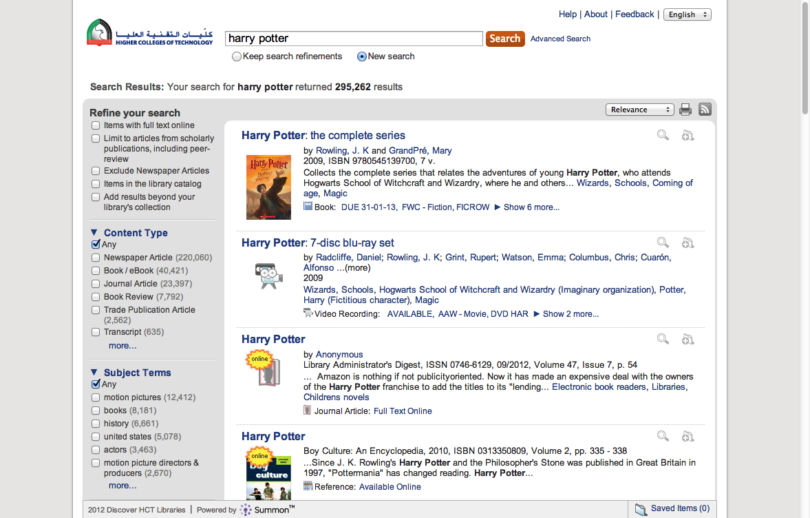
Figure 1 : previous version of Summon search interface used before implementation of Vufind
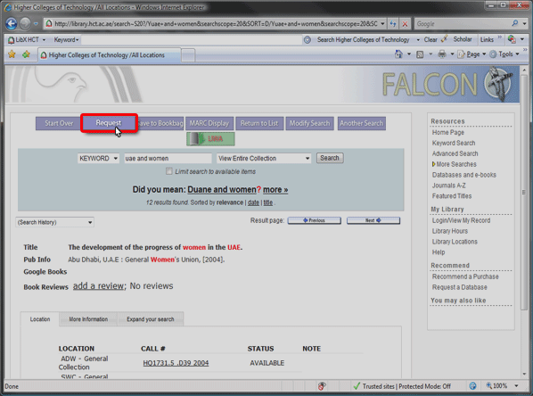
Figure 2: previous version of library catalogue used before implementation of Vufind
Social features
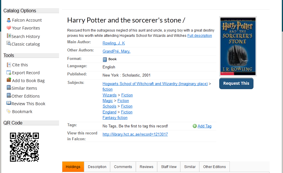
Social features commonly found in library search systems include functions such as the ability to tag content, comment on content, share content via Twitter, Facebook or other social media sites, and make use of social bookmarking. We found a disparity between students and faculty users that we tested in terms of personalization and social features. Similar to what Ho, Kelley, & Garrison (2009) found, neither our student nor faculty users made use of these features, although the study tasks didn’t ask them to. The students we tested generally ignored the presence of these features. Faculty in our tests, in contrast, expressed a dislike for the way these features are presented in catalog records – deeming them unimportant and secondary to the primary goals of a library search system. Faculty users were also unsure of where to find what they considered more critical information, such as the location and call number of a book. This information was further down the page and required scrolling to view. Multiple faculty members suggested removing personalization and social features from item record pages altogether, or moving them down the page or into other, less obvious places in favor of prioritizing “more important” information. This recommendation was taken and the final version featured a less cluttered item record page with personalization and social features tucked into labeled menus on the left side of the page [Figures 3 and 4]. These changes also resulted in other information about the items moving up from the bottom of the page, becoming partially visible without scrolling.

Figure 3: DRAFT INTERFACE shows social, sharing and personalization features such as an item QR code, comments, tags and favorites, located prominently in the center of the page. Similar items are displayed on the left. Item location information is not visible anywhere on the screen and the user must scroll down to see it.
- Figure 4: REVISED INTERFACE shows certain features categorized and moved to a less prominent location on the left and bottom of the page, including the QR code, comments, and favorites. Similar items are now hidden behind a clickable button, rather than displayed by default. Users are invited to scroll down the page by visible tabs indicating that more information is available.
Linguistic Orientation
Because the draft VuFind layout separated print and electronic resources into two vertical columns [Figure 5], one of our key questions prior to the study was whether native Arabic-language users would begin their interaction with the page from left or the right. If our students were to begin looking for important features on the right side of the page, this would have design implications for us. The Arabic language is written and read right to left and many Arabic websites place their menus and navigation on the right side. (For example, the Abu Dhabi Government website ) Somewhat surprisingly, we found that these users did tend to interact with the search interface and navigation menus from left-to-right; perhaps because they are accustomed to doing so when content is presented in the English language. Most users intuitively looked for books and significant headers on the left (as indicated by mouse movement), and when asked explicitly, agreed that the layout was logical.
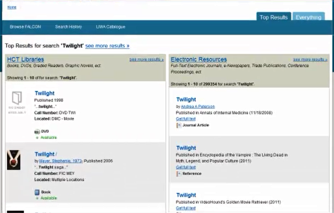
Figure 5: DRAFT INTERFACE Initial search results through VuFind are separated into print results (left) and electronic results (right).
Accessing full text
Our test subjects did not intuitively understand how to access the full-text of e-books and articles. Users frequently attempted to access the full-text of a retrieved item by clicking its hyperlinked title; which retrieves a bibliographic record for the item but does not immediately present the full-text [Figure 6].
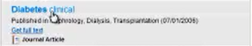
Figure 6: DRAFT INTERFACE Users tended to click the hyperlinked title of an item when searching for full-text, overlooking the “Get full text” link just below.
The committee considered linking titles to full-text, but decided against it. Although many users do not care to examine an item’s bibliographic record, there are many others that do. The bibliographic record is the key route for more sophisticated researchers to select a database source of their choice when the item is available in multiple databases. We also recognize that many search engines and electronic interfaces (eg databases such Proquest and EBSCO) link the title to the bibliographic records, and that our user group may reap the benefit of greater transferability if they learn to look for a ‘full-text’ button or option in our search interface. Therefore, we have addressed this usability issue with a combination of some minor changes to the interface [Figures 7, 8, 9], along with a user education initiative which focuses on accessing full-text.
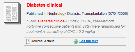
Figure 7: REVISED INTERFACE The item type and full-text link has been emphasized with space and content divider bars

Figure 8: DRAFT INTERFACE After a user has clicked on an item’s title seeking full-text, the bibliographic record provides no clear avenue to continue. Most users did not recognize that the holdings link at the top would retrieve full-text, and instead pressed the back button.
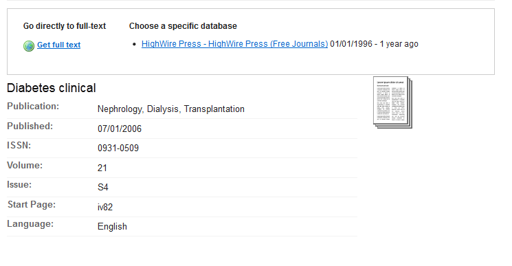
Figure 9: REVISED INTERFACE The “Get full text” link has been added to the item’s bibliographic record as well, to enable users who do come here by mistake to proceed.
New and Multiple Searches
Another finding was that users in our test who performed multiple searches would re-search from the same page where they finished their prior search, using a search box at the top. This resulted in new search listing results in the same format as the last page, rather than the original results format of books on the left and electronic resources on the right. Given the positive user feedback about this division, we reset the search box to always default to this format on a new search, regardless of where the search was performed from.
Emotionally Intelligent Wording
Additionally, wording was changed to be more emotionally intelligent. We tried to anticipate the emotional reactions of our users and promote more positive reactions. The users we tested, particularly faculty, expressed feelings of annoyance and anger through the think-aloud protocol when they encountered wording on an initial results list about the location of book copies. In order to save space, the first draft interface included a results page which listed the physical location of a hard copy in the format LOCATION : [CAMPUS – COLLECTION]. However, if multiple copies of the item existed in multiple campuses, the results would read LOCATION : MULTIPLE LOCATIONS [Figure 10]. Users could see a list of locations by accessing the item record after clicking its title. Users, however, felt that the MULTIPLE LOCATIONS indicator was useless, redundant, and unhelpful, resulting in negative emotional reactions. Users did not understand where they could see a list of locations for the item. This wording was changed to an imperative construction providing a better indication of how users could get more information [Figure 11].
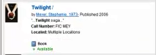
Figure 10: DRAFT INTERFACE Users reacted negatively to the “Multiple locations” indicator, exhibiting frustration.
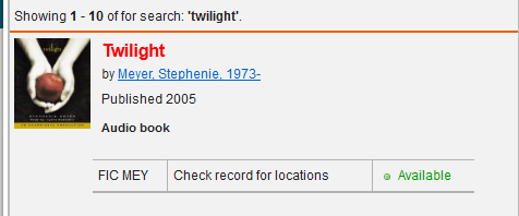
Figure 11: REVISED INTERFACE The “Check record for locations” indicator provides a useful instruction for users about where to get the information they are seeking.
All Fields Search
User search behavior tended towards the default ALL FIELDS search regardless of what they were looking for; be it author, title, topic, or other. Author searches tended to come in first name, last name order rather than the reverse. This information was used in customizing data input and search parameters to make results more relevant.
Conclusion
Our users are largely consistent in their behavior with other groups in prior studies. (Denton & Coysh, 2011; Ho, Kelley, & Garrison, 2009) Based on the results of this study, several changes were made to the VuFind interface in order to facilitate a more intuitive search experience for our users, including the rearrangement of features on item record pages, the nature of wording and the size and placement of text and images. Based on these results, we also made some decisions about what usability issues should be treated through interface adaptations, and which should be treated through user education.
Further study into whether user behavior changes along with the language of use (right-to-left or left-to-right) and whether native language orientation has any impact, would be helpful to confirm and support our initial observations in this study.
Future Directions
The revised Vufind interface was launched in September 2012 incorporating the findings and observations from the usability study. Feedback from faculty and students on the new interface was positive. The usability committee plans to keep adding features to the Vufind interface and another usability test or user satisfaction survey will be conducted in order to ensure that the search interface continues to be user friendly.
References
Bauer, K. (2008). Yale University Library VuFind Test—Undergraduates. Retrieved 28 Aug, 2012, from https://collaborate.library.yale.edu/…/summary_undergraduate.doc
Denton, W., & Coysh, S. J. (2011). Usability testing of VuFind at an academic library. [DOI: 10.1108/07378831111138189]. Library Hi Tech, 29(2), 301-319.
Emanuel, J. (2011). Usability of the VuFind Next-Generation Online Catalog. Information Technology and Libraries, 30(1), 44-52.
Ho, B., Kelley, K., & Garrison, S. (2009). Implementing VuFind as an alternative to Voyager’s WebVoyage interface: One library’s experience. Library Hi Tech, 27(1), 82-92.
Nielsen, J. (2000). Why You Only Need to Test with 5 Users. Retrieved 28 Aug, 2012, from http://www.useit.com/alertbox/20000319.html
Appendix A- Usability Study Task List
Usability Study Task List
- Determine if we have the book “Twilight” at any college. Is it available at this college?
- Find books by the author J. K. Rowling.
- How many copies of “Harry Potter and the Sorcerer’s Stone” are there?
- Can you find similar items to this book? What are they?
- Cite “Harry Potter and the Sorcerer’s Stone” in APA.
- Find the following book: Introducing public relations : theory and practice
- Who published this book?
- Was that information easy/difficult to find?
- Find a book about drawing comics or manga characters at any college, and make a request for it.
- Find and open an article (newspaper/magazine/journal) from 2005 or 2006 about diabetes in the UAE.
- Find and open an E-book which will help you learn about Adobe Photoshop.
- Find information about ‘human resource management’. Find a newspaper article on the topic. Open the full text.
- Find a scholarly journal article about Emiratization. Open the full text of the article.
Appendix B – Task Debrief
[To be discussed verbally with, and recorded by, interviewer].
- Overall, what do you like most about this search interface?
- What do you not like?
- How did the search interface help/not help with your searches?
- What do you think of the arrangement of what is on the left and what is on the right side of the screen?
- How would you change it, if you could?
About the Authors
Nicole Johnston is a faculty librarian at the Higher Colleges of Technology. She has previously worked as a librarian and English teacher in Australia, Ireland and Japan. She has a Bachelor of Arts degree, Masters of Library and Information Science degreeand is currently a PhD candidate at QUT in Brisbane, Australia. nicole.johnston@hct.ac.ae
Alicia Salaz is a faculty librarian at the Higher Colleges of Technology and Doctor of Higher Education student at the University of Liverpool. She earned her Masters of Library and Information Science from the University of Washington in Seattle in 2006. alicia.salaz@hct.ac.ae
Rob O’Connell is the manager of Library Technical Services at Higher Colleges of Technology with eight years of library experience. Rob specializes in managing Integrated Library Systems and has overseen the Millennium Library System at the Higher Colleges of Technology and LIWA library consortium for four years. Rob has a Bachelors degree in Graphic Design and received his Masters in Library Science from Clarion University in Pennsylvania. roconnell@hct.ac.ae

Subscribe to comments: For this article | For all articles
Leave a Reply