By Lisa Gayhart, Bilal Khalid, Gordon Belray
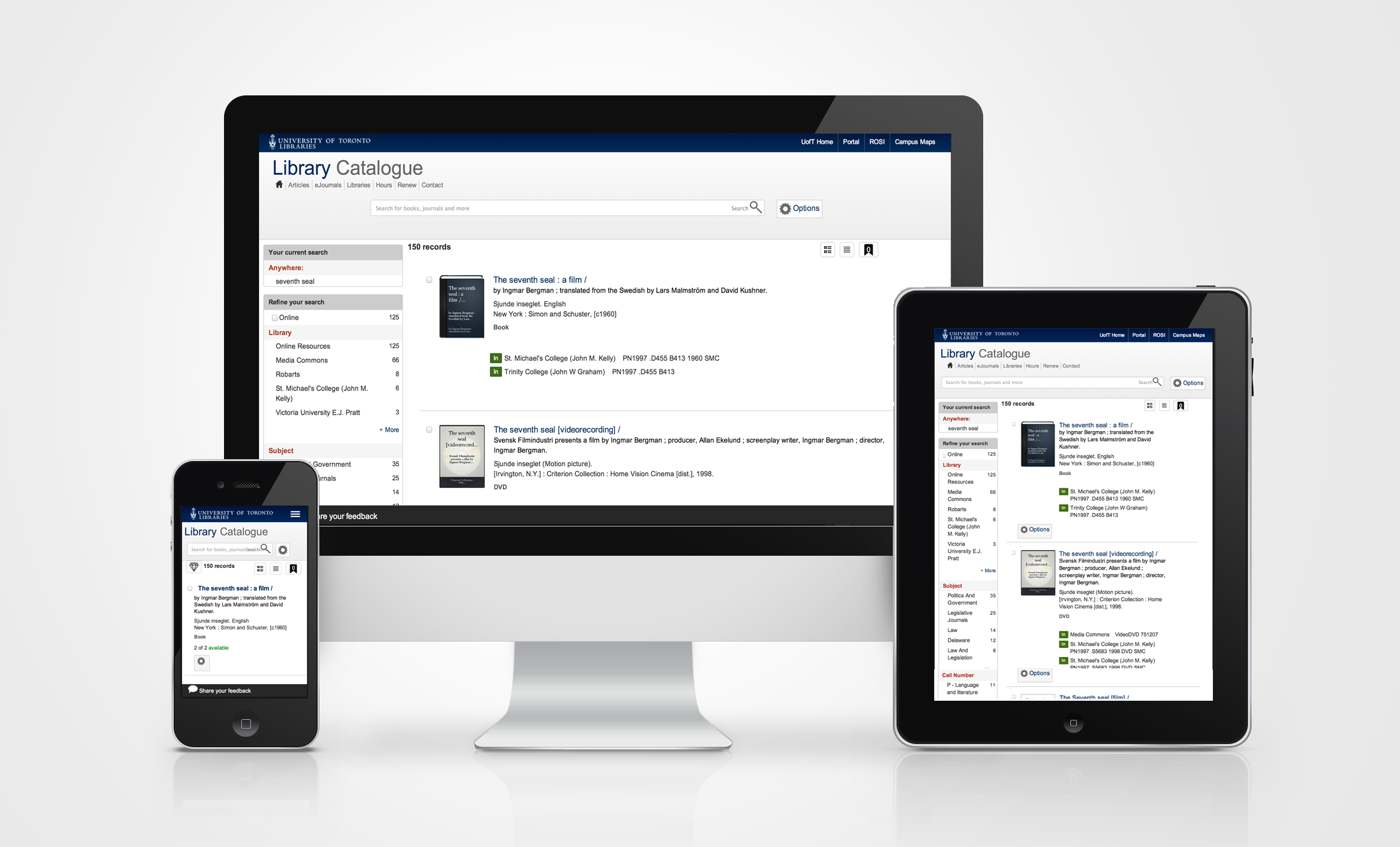
Figure 1. Sample Responsive Layouts (enlarge)
Introduction
With the recent surge in the mobile device market and an ever expanding patron base with increasingly divergent levels of technical ability, the University of Toronto Libraries embarked on the development of a new catalogue discovery layer in early 2012. The goal: provide an app-like experience for our users through modern and familiar web design patterns that is information-centric and brings our content to our users. The result: a mobile-friendly, flexible and intuitive web application that brings the full power of a faceted library catalogue to users without compromising quality or performance, employing Responsive Web Design (RWD) principles.
Responsive Web Design and Designing for the User Experience
“It is the pervading law of all things organic and inorganic, of all things physical and metaphysical, of all things human and all things superhuman, of all true manifestations of the head, of the heart, of the soul, that the life is recognizable in its expression, that form ever follows function. This is the law.” [1]
The results of good design are barely noticed or considered, nor should they be. Design should be clear, intuitive, and responsive, ultimately guided by the same laws of “form follows function” or as Don Norman of Apple would coin more concisely as “User Experience Design (UX).” [2]
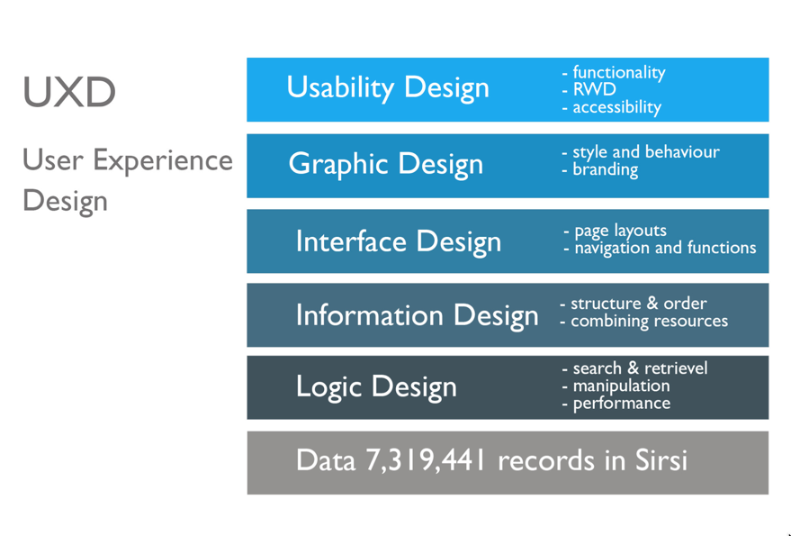
Figure 2. UX Design Layers (enlarge)
For us, UX design is a non-linear multi-tiered approach to software development. We weren’t developing the catalogue from scratch: we leveraged our experience, knowledge, and history of users’ interactions of the existing catalogue (which we also developed) as a foundation for improvement. While a primary focus was making the catalogue responsive, a redesign also allowed us to enhance the overall user experience. The mobile first strategy as outlined by Luke Wroblewski [3], although compelling, wasn’t practical in our case as the majority of users (93% as of the writing of this paper and 2 months into the launch of the RWD catalogue) come to us from a desktop environment.
Our design challenge: take the current desktop environment and scale it to mobile screens and everything in-between.
Stats and Specs
The University of Toronto Library catalogue is a collection of almost 7.5 million bibiographic records, 2.7 million authority records, and 12 million item records. There are, on average, between 10,000-15,000 transactions per day (record updates and item checkouts/renewals/returns) and the catalogue web application receives over 250,000 visitors per month, responsible for an average of 1.2 million pageviews.
A brief background of the web application and its various front-end and back-end components:
- The front-end of the web application is written using the Freemarker template engine, with jQuery and CSS3 providing the interaction and styling to the rendered HTML.
- The back-end is comprised of Java objects and servlets organized in a Model-View-Controller pattern.
- The primary data source for the catalogue is Endeca Enterprise Search and Index, which is accessed via their proprietary Java API. Supplementary data is stored in MySQL and the interface for connectivity is the MyBatis Persistence Framework.
- Data is processed into Endeca indexes (called “dgraphs”) via various shell and Python scripts, which pull the content from the library system’s SirsiDynix Unicorn ILS. The SirsiDynix API and Oracle SQL queries are used to export data from the ILS.
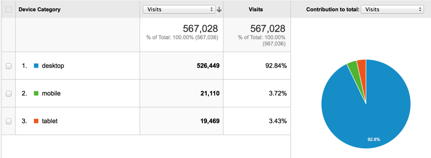
Figure 3. Device usage tracked in Google Analytics. (enlarge)
Front-End Design
Continuity for users was an important consideration when redesigning the library catalogue. Web users in general tend to appreciate consistency and predictability: accordingly, we aimed to minimize any confusion from the switch to a new design, especially for long-time users of the service. As a result, the site experience has remained largely unchanged for the desktop: the search box remains at the top of the page; search results retain a two-column layout (for facets and result items); and record details are contained in a dedicated space [4]. On smaller devices, the facets column is tucked away into an off-canvas layout that can be accessed via a button and the search results column expands to fill the width of the device. The layout is also “orientation-friendly,” meaning that any interactions in the portrait orientation are preserved in landscape orientation.
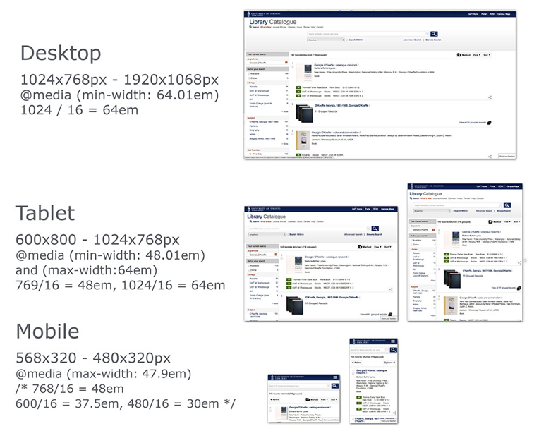
Figure 4. Device Parameters and Media Query breakpoints. (enlarge)
RWD best practice recommends em based media queries to allow for user initiated zooming on browsers, so simply divide your screen resolution by 16 to convert pixel widths to ems.
Device Testing
While developing, it was essential to test on as wide an array of devices and browsers as possible, matching the wide user base we support. Beyond the standard desktop environments (e.g. various browsers in Windows, Mac OS and Linux), we also tested on a variety of iOS, Android, Blackberry, and Windows Phone devices. Emulating real world situations meant our testing had to account for the latest smartphones (e.g. iPhone 5) as well as some of the older models (e.g. iPhone 3), and speeds ranging from LTE to 2g connections. For ease of layout development, we found a number of responsive bookmarklets and made good use of them, including the RWD Bookmarklet and ViewPort Resizer.
Our metrics indicate a need for continued support of older versions of Internet Explorer with approximately 8% of users still using IE8. Therefore our testing also expanded to these older browsers.

Figure 5. Search Results by device. (enlarge)
As a result of this testing, we made a number of CSS and JavaScript based enhancements within our code. We decided to use polyfills [5] to enable backwards compatibility: Respond.js allows older, non CSS3-compatible browsers to support Media Queries, which in turn uses the MatchMedia.js polyfill to execute media queries in JavaScript.
Looking back, deeper testing with our users would have exposed many issues we dealt with post-launch. Although we held many sessions with users, they often listened and provided verbal feedback rather than performing hands on tasks. In the future, a more structured testing framework will be used to surface issues earlier in the development.
Three Component Pages
The catalogue interface is broken down into three main component pages: search results, record detail, and marked items. A landing search page exists but the majority of users come to the catalogue via the search engine on the library’s home page.
The search results page offers faceted refinement, sorting and viewing options and less cluttered interface for catalogue items.
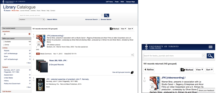
Figure 6. Search Results component, desktop and mobile. (enlarge)
The detail page has a persistent “sticky” menu with options to jump to content and includes permitted uses, subject listings, enhanced data where it exists (summaries, reviews, table of contents, author information, etc.), and MARC view. Users can navigate through their search results with previous/next buttons.

Figure 7. Record Detail View, desktop and mobile. (enlarge)
The marked record page contains items saved from the user’s session and has tools for emailing, importing into RefWorks, and exporting as CSV.
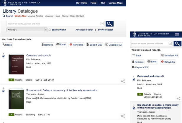
Figure 8. Marked Record View, tablet and mobile. (enlarge)
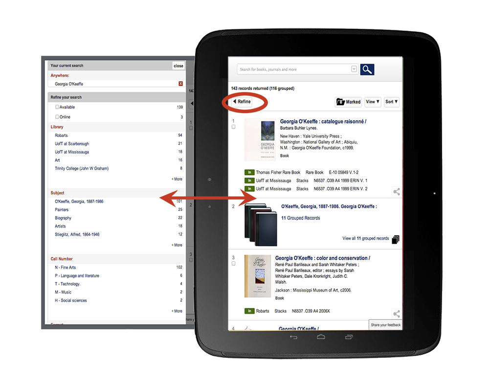
Figure 9. Off canvas layout for faceted searching. (enlarge)
An ongoing design challenge is determining an economy of content, making the most critical information highly visible while hiding secondary content behind icons and detail pages. For example, we use a simple ‘in/out’ with red/green signifiers [6] for item status, and the holding information has been re-ordered according to importance: status, library, location, and call number.
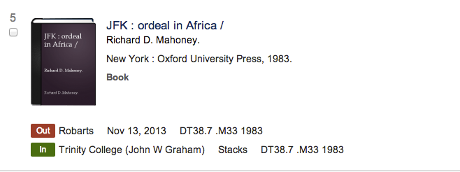
Figure 10. Holdings example. (enlarge)
Each item’s toolset is hidden and includes: detail view, request item, permanent link, RefWorks, cite, email, and My.Library. A sharing icon accesses these options using jQuery and a hidden div.
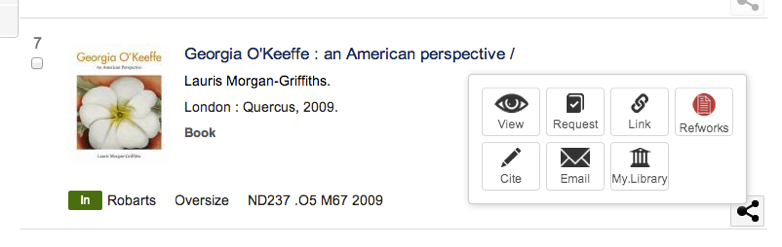
Figure11. Individual record’s toolset on the search results page. (enlarge)
Economizing screen space is an integral part of designing for mobile devices. As some item titles are very long, a special truncation feature was implemented in JavaScript that trims long titles and paragraphs. A button becomes available to all the user to view the full text when necessary. The snippetting occurs on page load and takes the viewport’s dimensions into account, meaning devices with larger screens that can comfortably display the content don’t trigger snippetting.
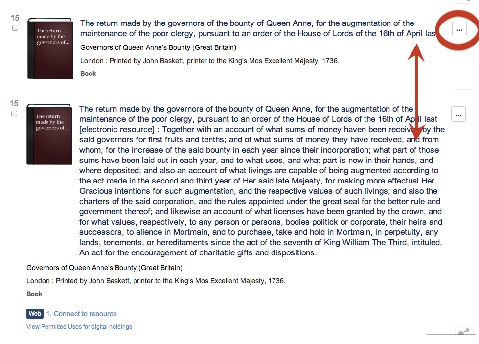
Figure 12. Title trimming option for long titles. (enlarge)
Navigation
Navigation items across the search results and details screens are also responsive. Individual navigation actions are visible on-screen when sufficient real-estate is available and collapse into dropdown menus otherwise. Similarly, cover jackets for records are responsive. No native responsive image solution currently exists for every web browser, so we have made use of the picturefill.js library [7] to request images of different dimensions using a combination of Media Queries and JavaScript.
Along with screen space considerations, we have also updated our interface to use more modern ways of navigation in the now touch-friendly interface. For example, instead of a paging mechanism for search results, we have switched to lazy-loading results as the user scrolls to the bottom of the page. The ease of scrolling with touch devices makes this a more natural experience than a full page reload. We have also introduced alternative layouts; there is a “text-only” display option available for search results along with the standard display, and a “tiled” display is scheduled to be released soon.
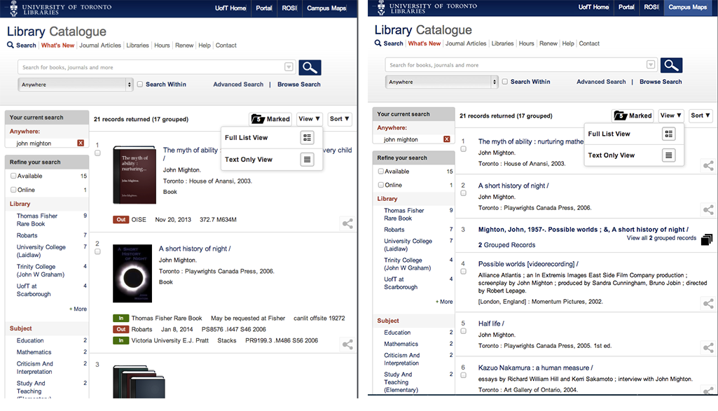
Figure 13. Full record and text only views. (enlarge)
Headers
Sticky headers were implemented in both the search results and details screens, making it easier for users to jump to various parts of the page without requiring excessive scrolling.

Figure 14. Sticky header search results example. (enlarge)
In the previous iteration of the library catalogue, grouped records entries [8] were not as visible and our visitors often missed important records. The search results page now indicates that items are “grouped” and there are two visual representations indicating multiple items. Additionally, we developed the ability to ungroup records, the release of which is pending approval.
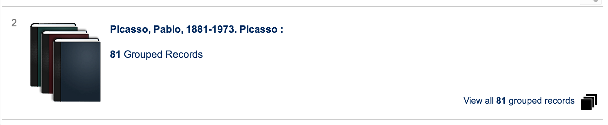
Figure 15.Grouped Records. (enlarge)
Icons and Book Jackets
Approximately 30% of catalogue items have publisher-provided covers. To create a more balanced row-item display for records without covers, we generate format icons through an in-house application that writes the record’s data onto custom graphics. Format icons offer users a visual aesthetic and continuity similar to popular sites such as Amazon and provide an immediate indication of what type of material is contained in the item record. We also offer a text only list of search results, which was developed in response to several requests from librarians.

Figure 16. Examples of custom format icons. (enlarge)
Back-End Design
Improving search functionality, performance, and data-liveness
Along with developing a responsive front-end interface, we completely overhauled the application and serving infrastructure with four goals: improved site performance; decreased page load time; high availability; and data currency. This work included restructuring the back-end web application, designing the server infrastructure for better performance and redundancy, and overhauling the scripts that fetch the data from the ILS.
Application infrastructure
Designing the back-end to scale with user demand was a critical requirement. The library catalogue is one of the most heavily used web applications at the University of Toronto. For example, over the month of October 2013 we averaged over 250,000 unique pageviews per week, resulting in over a million requests to the Endeca dgraph indexes per week.
The new architecture uses the open source HAProxy load balancer to process requests to both the web application and the Endeca dgraph indexes. When an HTTP request arrives at http://search.library.utoronto.ca, HAProxy acts as a sticky load balancer in front of a cluster of virtualized web servers (currently seven) hosting the catalogue application. Each web server in turn communicates with a cluster of dgraphs (currently three), using HAProxy to load balance the requests. Although normally powered by ten different servers, the entire application can run, if necessary, on only one web server and one dgraph server.
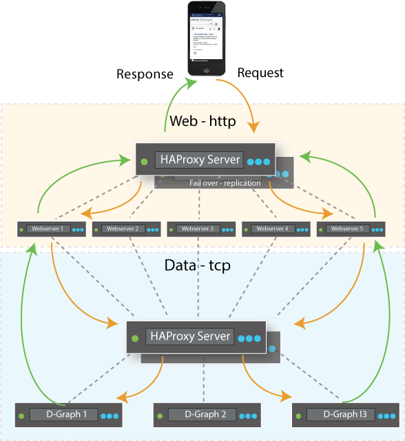
Figure 17. Request – Response loop. (enlarge)
Running the application on multiple identical web servers not only improves performance under load but allows for adding more front-end servers on demand during peak times, such as end of school term. The site uses several performance enhancing techniques such as using Google’s mod_pagespeed Apache module to optimize and cache CSS and JavaScript files, an internal, heavily cached CDN for serving static content, and delivering cover images from a separate web server to increase the number of simultaneous page element downloads.
Endeca dgraph performance is optimized by using servers with 128 GB of RAM to cache the entire index as well as millions of queries, and by configuring the dgraph processes to make as efficient use as possible of multi-core CPUs. We have consistently achieved catalogue query result page load times of less than 2 seconds, very much in line with user expectations of modern websites. [9]
Responsive Design, Responsive Data
One of the classic challenges in developing a catalogue that has been decoupled from the underlying ILS is ensuring that the data has been searched and delivered to users is current and accurate. Given that the catalogue data is stored in Endeca, and not directly being served from the ILS, we use a full and partial update model. A full update syncs the entire Bibliographic, Item, Authority and Holding dataset from Unicorn to Endeca, whereas a partial update syncs data that has been updated in a specific time interval. In our previous model, we used to handle Bibliographic and Item updates separately. For Bibliographic data: full updates once a week and partial updates once a day. For Items: full updates once a day, and partial updates every 20 minutes. This arrangement became fairly cumbersome and complex to maintain, especially since the partial updates didn’t capture all changes, and the full updates caused load issues on our Endeca Index servers. In the new model, we have combined all of our various data sources (Bibliographic, Item, Authority etc), streamlined data retrieval into partial updates every 10 minutes, and more or less eliminated the need for full updates [10]. Now, adds, deletes, and updates to all types of data is indexed and available to the web application within 10 minutes.
A Focus on Our Users
Information Technology Services (ITS) at the University of Toronto Libraries is actively working towards improving communications with our diverse user base of students, faculty, and staff. With a major change in service looming – the complete redesign of the library catalogue – we capitalized on the opportunity to manage this change with a structured communications plan. The plan focused on increasing project and staff visibility, obtaining and incorporating user feedback, and preparing users for the pending change in service. The communications plan detailed key messages, goals and objectives, target audiences, available communications channels, stakeholders, budget, collateral to be created, and key performance indicators. A timeline with specific deadlines was attached.
The catalogue team worked consistently to increase visibility of the project and its staff members. The low levels of communication around past projects in ITS were acknowledged and the team committed to transparency around the development of the new library catalogue. Messaging around project status, opportunities for feedback, upcoming events, and next steps were disseminated in a consistent manner through a variety of communications channels [see Appendix]. Internal communications were also increased to ensure that departmental staff were also aware of the project and timelines.
Accessibility
UTL is committed to providing all users with equitable access to University of Toronto Libraries’ digital spaces, such as the library catalogue, central libraries’ websites, and digital collections. We strive to ensure our web spaces conform to Level AA standards, as per WCAG 2.0 and AODA (Accessibility for Ontarians with Disabilities Act) standards and timelines. This work includes making sites compatible with assistive technologies, such as screen readers, as well as ensuring content is clear and understandable to a wide variety of users.
The catalogue team received training on developing with accessibility in mind, including attending the University of Guelph’s Accessibility Conference in May 2013. Additionally, we were in contact with the University of Toronto’s accessibility office for advice on outreach and testing; reached out to resources at Scholars’ Portal and OCUL; and participated in the development of the Accessible Content E-Portal (ACE) Pilot Project. This information gathering and training allowed our team to run in-person and online usability tests with users with vision impairments and circulate a beta site link to contacts who represented users with disabilities.
The team worked with our Web Coordinator Librarian, who leads accessibility work for the library, to test the site at various stages of development and provide recommendations for changes. Tools used for testing included Colour Contrast Checker, WAVE, JAWS, ChromeVox, and HTML_CodeSniffer. As users spend more time with the catalogue, we continue to gather feedback and subsequently improve accessibility features.
Managing Change
Managing the impending change in service required targeted communications to users who were identified as highly affected by the change: faculty, librarians, and library staff. Since the catalogue was scheduled to transition at the beginning of the fall semester (late August 2013), these users required appropriate lead time to get acquainted with the new design and update teaching materials, LibGuides, and help videos. Demonstrations, feedback sessions, and training opportunities worked to give these users the tools they needed to prepare. Reaching the majority of these users was a difficult process: many were away during the summer months and not present to receive our attempts at outreach. In the future, it would be useful to avoid the summer months when communicating with these specific groups.
Promotion and Feedback
Opening and maintaining a two-way dialogue between the project team and our users was integral to the communications effort. Users were encouraged to submit comments and questions throughout the entire project and this message was included in all outgoing communications. Feedback was received in many ways: dedicated project email address, online feedback form embedded in the catalogue, paper comment forms, usability testing, focus groups, and through conversation with project staff (verbal comments and meeting discussion notes were entered manually into our tracking system).
To help users transition to the new library catalogue and encourage users to submit feedback, a link to the beta site was distributed early in the development of the new interface. The beta site ran publically for three months with online feedback open for the duration. The beta site was released in phases: first to early adopters identified by project staff, secondly to departments who work closely with ITS, and finally to all users.
In-person events, such as drop in feedback sessions gave users an opportunity to meet the project’s staff members and engage in discussion. These events also worked to give a “face” to the project, make personal connections, and create a venue for impromptu brainstorming with users.
All feedback was managed through JIRA, an issue tracking and management web application. Using JIRA allowed us to create tickets for all feedback items, manage conversations, save users’ contact information, and export data for analysis. A central system also promoted better prioritization and planning within the team itself. All solicited feedback was reviewed and incorporated into the development of the catalogue at various stages, where applicable. Changes were then communicated back to users.
The launch day of the new library catalogue was also widely promoted. Staff were available to support users via phone and email. Help pages and documentation were limited and users requested more detailed information. New pages are being developed and include video tutorials, created in coordination with Reference Services, to provide visual instruction on various catalogue features and functions. These videos will be repurposed and used to improve awareness of the RWD catalogue through the main library website, digital signage, and posters.
Overall, the targeted and consistent communications around this large change was well received. A short survey of staff members indicate that they were well aware of the project, were kept apprised of timelines, and felt that the project was well communicated. Anecdotal evidence from library users suggests that most people were aware of the change in service and were prepared to make the transition. Based on this success, this approach to communications planning will be used as a model for deploying new products in the future.
Future Directions
We plan on migrating a few remaining features from the previous iteration of the catalogue interface to the current one, such as virtual shelf browse, item location maps, and print on demand. Long term plans include developing an authentication layer that would allow integration with other library services such as usage history, loan information, persistent marked records, item recommendations, and more. We would also like to facilitate interaction with social media by way of adding sharing options, as well as improving search engine optimization by introducing linked data into the catalogue.
Although the catalogue has been launched to our users, the project continues to evolve and grow. We continue to receive feedback from our users and make improvements and changes based on these suggestions. As always, we look forward to discussion with the Code4Lib community through the Journal, Listserv, and in-person events.
References and Notes
[1] Sullivan, Louis H. (1896). “The Tall Office Building Artistically Considered”. Lippincott’s Magazine (March 1896): 403–409. Accessible via Internet Archive: https://archive.org/details/tallofficebuildi00sull.
[2] “I invented the term because I thought Human Interface and usability were too narrow: I wanted to cover all aspects of the person’s experience with a system, including industrial design, graphics, the interface, the physical interaction, and the manual.” http://uxdesign.com/ux-defined
[3] http://www.lukew.com/ff/entry.asp?933
[4] One key difference with record details: in our previous iteration the details loaded in a popup window atop the search results. We have now dedicated a full page to record details to give the content more breathing room.
[5] Polyfills are JavaScript libraries that emulate modern CSS3 and native browser functionality for older browsers.
[6] Replaces ‘in/N/A.’ The red/green with white text has a AAA accessibility pass for colour contrast and offers a text alternative for users with difficulties discerning colour
[7] https://github.com/scottjehl/picturefill
[8] Grouped records employ an approximation of FRBR (Functional Requirements for Bibliographic Records), a model developed by IFLA which allows users to define relationships between the entities (eg. books) that provide links to navigate through the relationships, creating new search paths
[9] See: http://www.webpagetest.org/result/131115_WQ_T73/
[10] Unless required for application changes or bug-fixes.
Appendix: Communications Channels
A summary of outreach and communications channels used:
- Hosted in-person demonstrations and feedback sessions
- Visited the Scarborough and Mississauga campuses for in-person events
- Facilitated focus groups with staff and students
- Performed individual usability tests
- Created a dedicated email account for direct feedback
- Distributed consistent staff email updates
- Updated staff at University committee meetings
- Updated at staff meetings in various library departments
- Deployed digital signage in various library buildings
- Distributed multiple news items in the University of Toronto Bulletin (an all-staff and alumni bi-monthly e-newsletter)
- Included articles in departmental newsletters targeting faculty and students
- Contacted faculty and departments through faculty liaison librarians
- Created and distributed a new library catalogue brochure
- Used the active social media accounts at all three campuses and the central University of Toronto accounts
- Distributed messages to the Code4Lib Listserv asking for feedback and announcing the product launch
- Created and distributed news items and website banner images (featured on the main library website and two campus websites)
- Created a project-specific webpage detailing the project’s purpose, progress, and next steps
- Distributed rolling messaging via social media accounts and enews with Student Life (undergraduate focus), Graduate Student Union, the iSchool, and the Faculty of Arts & Science
- Performed outreach to librarians and library staff with teaching duties to assist in updating instructional videos and online Q/A
- Created an online help page explaining new functions and icons
- Participated in various professional activities, such as conference presentations, poster sessions, and articles
About the Authors
Lisa Gayhart is the Digital Communications Services Librarian in Information Technology Services at the University of Toronto Libraries. As the dedicated communications team member in ITS, her number one priority is to move library IT from the sidelines to the spotlight through structured and actionable communications.
Bilal Khalid is a Senior Application Developer at University of Toronto Libraries. He is responsible for the core development for the library catalogue, as well as other web development projects at the library. His interests include: emerging web technology trends, cross-platform development, and improving software development workflows.
Gordon Belray is an Information Architect at University of Toronto Libraries who specializes in User Experience (UX) design and server application development (FADIS and MyMedia). His current focus is on Responsive Web Design (RWD) and accessible design. He is a graduate of the Department of Art, University of Toronto.
Acknowledgement
This article expands upon “Your Library, Anywhere: A Responsive Library Catalogue at University of Toronto Libraries” as published in the Winter 2014 20(1) issue of OLA Access.

Subscribe to comments: For this article | For all articles
Leave a Reply