by Jay L. Anderson & Edwin Guzman
Introduction
The New York Public Library’s (NYPL) design website system, NYPL Design Toolkit, was built by its in-house team over the past two years, but is only the latest in a much longer collaborative process. The development and implementation of NYPL’s current digital style guide is the result of many elements, many changes, and many contributors who brought different skills to the team and department at different times. Sometimes those elements came from a team member’s experimentation; sometimes they were inspired by existing frameworks. Ultimately this project’s value is due to continuous collaboration.
Growth and change: a content problem
NYPL.org is a complex resource which serves multiple purposes and multiple audiences. NYPL patrons include a wide range of identities and personas, including high school students, parents of beginning readers, professional researchers, job seekers, all reading in a variety of languages. 91 branches are served by NYPL.org, including the 4 research libraries. Patrons visit the site for information from local branch hours and catalog access to original content and Library events.
In order to manage the complexity of the site, NYPL.org underwent a major overhaul in 2009 that included migrating existing content into a modern content management system (CMS). We adopted Drupal as our new CMS because we wanted to give our staff a tool to control their own content, as well as the ability to blog for the first time.
With this new emphasis on staff expertise and exposure of the Library’s offerings, the amount of content produced grew quickly. Allowing the content to grow organically encouraged content creators to discover new avenues of interest, but it also allowed the site’s visual treatment to become inconsistent. This was confusing to the user and detrimental to the dissemination of the Library’s updated branding, which was launched in 2009 by our Communications & Marketing department.
The organization had no UX design documentation at this time; in fact, the term “UX” was new in the web design industry as well as at the Library. As a design team, we were just beginning to have conversations that would evolve into standards and best practices. We had a set of guidelines for using the new logo, and some rules regarding usage of our new color palette, but we didn’t have anything that governed or documented the website look and feel.
Growth and change: a people problem
The team that was responsible for the design and code of NYPL.org has changed continuously since the 2009 Drupal migration. While some of this change was enacted to respond to evolving needs (both of the site’s content and the technology needed to create it), some changes created challenges. We had a multitude of projects and a small, shifting team. The formation of the NYPL Labs team in 2011 contributed more capacity for the development of digital properties, and the teams came together and diverged as needed to cover the breadth of those properties. However, the most successful projects, such as the Building Inspector and NYC Space/Time Directory, were those whose scope supported a short timeline and a singular purpose. Design concepts that exceeded a certain scope were not able to mature to their full potential; this included the creation of a unified design system.
This kind of change may seem very familiar to other institutions; the shifting of resources and priorities is inevitable in a large multi-audience non-profit organization. Add to that the nature of digital growth, such as the evolution of available technologies, and an institution’s digital creative team is hard pressed to maintain consistency. When those are the conditions of the problem, the solution needs to be modular, distributed, and standardized, so that it can withstand constant change and provide a reliable foundation.
Evolving the design system
NYPL’s current design system, the Design Toolkit, has been built to support not only modularity, but a potentially wide distribution of ownership. Its modular design means the different user interface components can be added and removed as needed, and its distributed structure means that multiple developers can own and affect each piece. This code-based design system is built on web standards and open source principles, which makes the modular setup easier to sustain.
The development of this resource is a story of trial and error, in which the team learned how to put the right people in the right roles, how to make decisions that became best practices, and how to spend as much time building useful code as possible. This process showed our team, over several years, how to build a design system that not only produces design but adapts to change.
The first generation: NYPLBase
Design Toolkit evolved from other design system projects starting as far back as 2010. The first design system, called NYPLBase, was created by the team’s first UX Designer, Jay Anderson. Initially, Anderson experimented with Twitter Bootstrap‘s pre-built framework to create a style guide and pattern library for NYPL.org. Ultimately, InuitCSS, an architecture-only framework by Harry Roberts, was chosen for the underlying foundation of NYPLBase, and Anderson wrote the Sass that contained the styling for the design patterns and branding elements. Because of the amount of customization required by a multi-functional site like NYPL.org, it was more efficient to write the styling from scratch than to overwrite default styling choices made by a full use interface (UI) framework like Bootstrap.
NYPLBase was used to build an updated Locations section of the site, as well as Research Divisions, a filterable listing of scholarly collections across the four research libraries, and Staff Profiles, a list of prominent NYPL subject matter experts. These projects provided the first test of our new design system against real UX situations. Usage of the applications over time revealed the need for significant updates, including better accessibility practices. Because Anderson, the original designer, was no longer with the team, updates proved difficult to incorporate. While the influence of a single developer had kept the designs from becoming inconsistent, the design system needed to be distributed among teammates in order to grow.
A second start: Ethyl
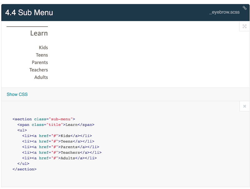
The next design system was a components guide built with the SC5 style guide generator and called Ethyl, built by Ricardo Galvez. Ethyl was created as the style guide that would house the new user interface designs and patterns that were built in collaboration with an outside firm. (This collaboration was initially set up for a redesign of the homepage, with the plans for the rest of the website later in the planning phase, but did not continue after the initial release). Ethyl contained the branding elements and additional code implementation documentation for the UI components. Supplying code snippets for UI components is a practice that we kept from the NYPLBase structure. Code snippets help the developers on the team examine how components should be written in the DOM with proper class names, which in turn helps them quickly build components from those samples. This was the pattern used when developers began to build UI components in React, the main JavaScript library we used for our projects.
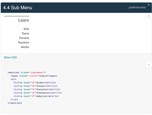
Figure 1. Sub Menu code snippet found in Ethyl http://ethyl.nypl.org/section/4.4 (enlarge)
The Sub Menu element, for example, had a corresponding component built in React and used across a few projects. Since the DOM was decided and defined in Ethyl, the developers were able to confidently use one component in multiple places and know that the design pattern was being used correctly. This practice of building applications with more modular components became more common for the team.
In order to extend the modularity for these React components, we began publishing those components on the node package manager (npm). For example, Ethyl included original versions of our SVG icon set. We modularized those icons by creating an equivalent React SVG Icon set, dgx-svg-icons, which developers could import into their applications through the npm. We detached discrete pieces of code (such as the SVG icons and the JavaScript libraries) wherever possible, and we allowed multiple developers to update those pieces. This approach also allowed developers to run `npm install –save @nypl/dgx-svg-icons` on the command line and know that they were getting the latest version.
Today’s solution: Design Toolkit
In August 2016, the team began work on the Shared Collection Catalog project. This discovery system allows users to find materials from the ReCAP Shared Collection, an initiative from The New York Public Library, Columbia University, and Princeton University. The basic wireframes and mockups built for this project were collected into a resource called Discovery Designs (originally created by former team member Brian Foo), which evolved into NYPL Design Toolkit. The Design Toolkit was created by Mauricio Giraldo, former designer and developer at NYPL, and was initially implemented for the Shared Collection Catalog. Ethyl had been created to support a single project, and Giraldo noticed that the Design Toolkit, though also created to support a specific project, would need a structure that would better support reuse by designers and developers alike.
The structure of the Design Toolkit, similar to NYPLBase, provides pre-styled, pre-coded UI components for creating applications. Developers import the Design Toolkit into projects, write the DOM structure with the appropriate CSS classes, and produce components and patterns that adhere to NYPL design standards.
Component-based design
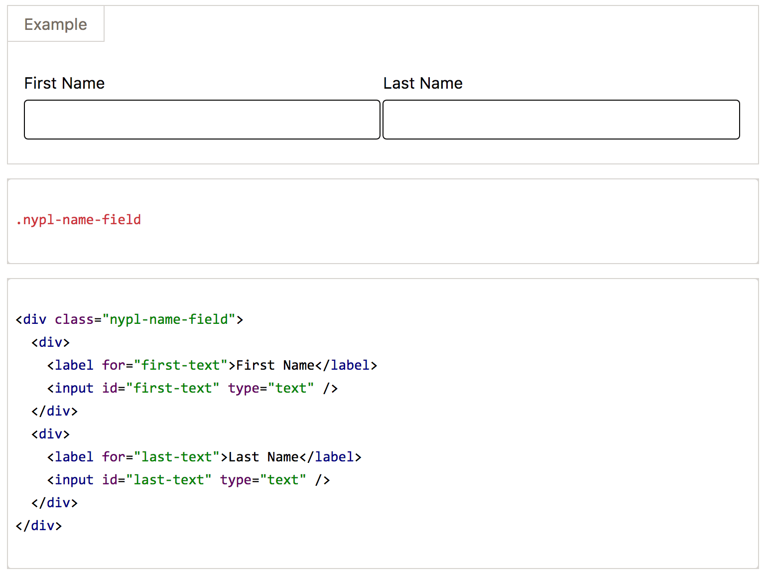
The first section of the Design Toolkit documentation describes the modular pieces that make up the entirety of the project. The documentation for each UI element (such as forms, buttons, and icons) is abstracted to DOM element patterns, and includes a description on how to use them. Modularity is built into the CSS structure at the broadest and narrowest definition of each component; there are high level grid classes to construct the layout, and lower level classes for granular HTML elements. This approach helps the developers construct forms, for example, that can have any amount of input fields but all have the same theme regardless of the type of input. For example, the `nypl-name-field` class wraps the label and input elements and cascades styling to both elements. By abstracting the styles away from the DOM, UI developers can focus on composing the application rather than designing components.
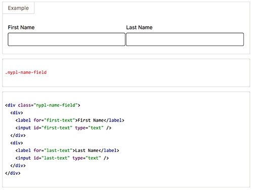
Figure 2. Name field class (https://nypl.github.io/design-toolkit/sections/forms.html#nameFields) cascades styling to child elements (enlarge)
Interoperable is accessible
NYPL projects are built on dozens of platforms, including Drupal, React, AngularJS, and Ruby on Rails. For this design system to be useful beyond its application in a single project, it had to be completely platform-agnostic. The only tool constraint built into Design Toolkit is the use of Sass as its CSS preprocessor. Otherwise Design Toolkit uses standard HTML for accessibility.
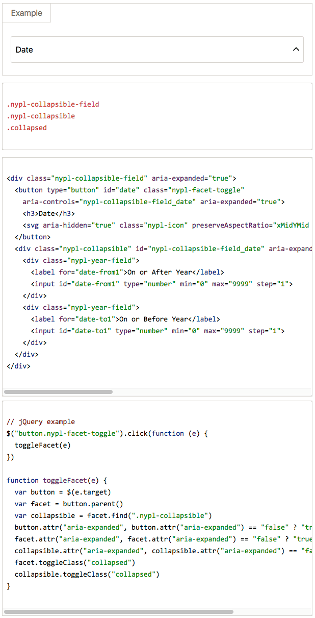
Some of the design patterns do use JavaScript for functionality, but that usage is equally modular. For example, the collapsible field sets elements depend on CSS classes and JavaScript for functionality. For ease of use across different projects, jQuery was chosen to implement this component in the Design Toolkit. This does not mean, however, that this or any other component needs to be implemented in jQuery.
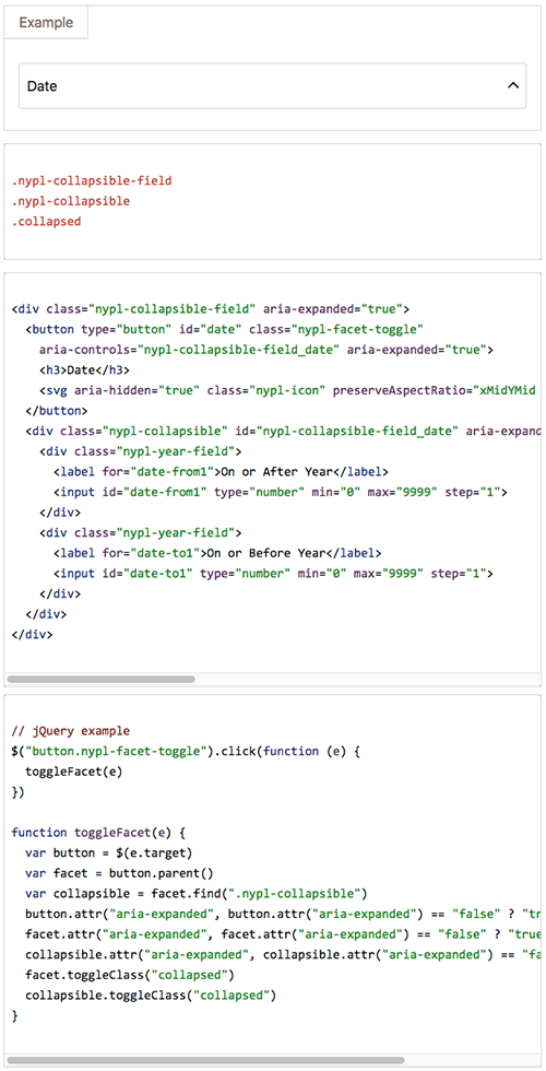
Figure 3. Collapsible field set (https://nypl.github.io/design-toolkit/sections/forms.html#collapsibleFieldsets) : display and code (enlarge)
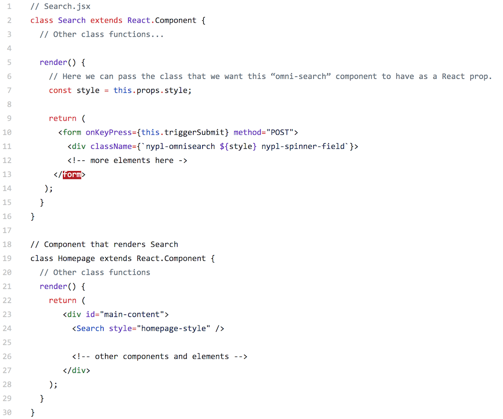
In the Shared Collection Catalog, components’ functionality is handled by ReactJS. Adding and removing classes through React is simple and allows us to update styles for components dynamically. For example, we use a React prop called `style` to dictate the class name for a form element. Regardless of whether React, jQuery, or regular JavaScript is used, it is a helper but not a requirement.
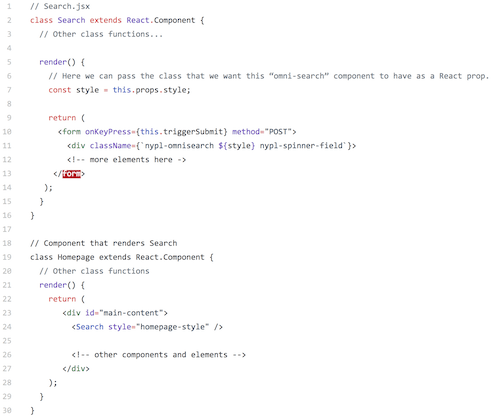
Figure 4. Form element with JavaScript helper (enlarge)
Benefits and challenges: components vs. layouts
Design Toolkit’s inclusion of example layouts is a practice that started during the development of the Discovery Designs, and continued as the team developed the Shared Collection Catalog workflow. Giraldo, as the designer on the project, designed components as they were needed by copying output code from the project in development, and refining the component designs in his own environment. When a component was ready, he passed it back to the developer for further refinement, and also contributed it to the Design Toolkit. This close collaboration between designer and developer, fueled by solving project-based problems, allowed the contributors to learn along the way.
Full mockups were also created using UI components found in the Design Toolkit to quickly build proofs of concept for stakeholders and managers. These mockups also gave developers an idea of the user experience expected from their finished components and complete product.
Figure 5. Full page mockup of the Discovery Search Results page (enlarge)
This approach worked well except when small components and full pages were built side-by-side. Small component development can be lost in the holistic thinking required by full page design. Essentially, we had created a dependency in our workflow. Building the design and the implementation at the same time (done due to time and resource constraints) meant that we needed to carefully coordinate moving new CSS rules from the production implementation to the Design Toolkit, instead of the other way around. For example, a set of components would be built into a full page design. When it was implemented in React, that implementation would need to be broken down by a developer into smaller UI components and style rules. Later, refactoring was needed for the full-page design to conform to the modularity of the developer’s components, for use in other projects.
Benefits and challenges: delivery systems
Another dilemma we encountered was how to best import the Design Toolkit into projects. We could have imported it through a content delivery network (CDN) like NYPLBase, but we hesitated to add an external dependency and an HTTP request. We decided to host it on NYPL’s npm account as a package. For our NodeJS and Webpack projects, developers can run `npm install –save @nypl/design-toolkit` in the command line at the project’s root folder and get the latest version of the Design Toolkit. (We also created Design Toolkit as a gem for use in Ruby-based projects.) But in the AngularJS applications, such as Locations which uses the original NYPLBase patterns, we had to import a static file from an NYPL CDN endpoint. This meant that developers had to keep close track of the current working version of NYPLBase and if there were active changes and updates in NYPLBase.
The Design Toolkit is currently NYPL’s centralized location for UI components, full page designs, development and accessibility documentation, and other resources and tools. It documents the extensive accessibility knowledge the team gained through development experience. The work on Design Toolkit’s Color Accessibility Table, for example, helped us fully recognize why some color combinations in our palette are not accessible. Other resources are more generalized, such as the validation tools that are used in the QA check workflow. This makes the Design Toolkit not only a design pattern resource but also a use case for building with accessibility testing.
Conclusion: the way forward
Since the inception of NYPLBase in 2010 through to NYPL Design Toolkit today, our team has learned that to build a reliable design system, you need to adapt to changes, and to distribute ownership as much as possible. Lessons we learned included making sure the roles and responsibilities of the team members are assigned correctly. It was a UX designer that started the first NYPL.org design system effort, because her connection to both content and design allowed her to see the full picture of what was needed, even if she couldn’t code every piece. But it was the later expansion of the project to include both designers and developers that allowed the project to grow.
With this in mind, a team wishing to build their own design system would do well to assess the skills of the team members and use them to their greatest potential. Developers will likely do most of the coding, since they will be most familiar with the nuances of your institution’s tech stack. But team members with less advanced code skills, like certain UX roles or content strategists, are crucial at evaluating pattern usage, design completion and flexibility, and branding. Find out what each team member does naturally: that is the work they will do most readily.
It’s also best to plan the building of your design system so that it fits into your regular project workflow as much as possible. If a contributor has to stop and remember a different process in order to commit a change to the design system, it is less likely those changes will get updated efficiently. Also, posting a “cheat sheet” for the workflow someplace easy to access will save time and resources getting a new contributor up to speed or refreshing the memory of a team member.
Finally, testing real projects also tests the design system. The development of the Design Toolkit was tied to a real project, which helped it grow as the more abstract approach of NYPLBase did not. Real world usage and regular user testing will reveal gaps in the design system’s flexibility, while testing the code will reveal opportunities to streamline or refactor.
The value of this effort wasn’t that our team got it right the first time or invented something new; it was that we learned, adapted best practices, and helped each other to a common goal, even across shifts in personnel in the department. As the department underwent changes, so too did the workflow and the technology. The team members, past and present, who worked to create style guides were willing to try new approaches and toss out what wasn’t working. This willingness to adapt, along with a structure that allows the interoperability of separate pieces, allowed the team to build a reliable resource that can still grow.
About the Authors
Jay L. Anderson is a Senior UX Designer at The College Board. Jay was formerly the Senior UX Designer for the New York Public Library. http://memorabilist.com/
Edwin Guzman is a Senior Applications Developer at the New York Public Library. http://www.edwinguzman.com

Andrew Darby, 2018-08-17
Note: This article was modified after publication to include the name of the Ethyl developer.