by Jim Hahn
Introduction
This paper reports the results of a logfile analysis of users’ experiences with the library catalog search accessed through mobile digital interfaces in the CARLI academic library consortium. The analysis included three months of search logs from two different versions of the library consortium’s VuFind search index. Susan Farrell, a UX strategist, advocates analyzing 3 to 6 months of search logs for UX insights, writing that “…search engines can produce a log (text file) containing a list of all the questions and terms that users type into the search tool. Logs also have useful information about each search query, such as the user’s IP address or other identifier and the time of the request, which means you can often look at a sequence of searches in one person’s session if you sort the list by user identifier and time” (Farrell, 2017, p. 1). According to Farrell, analyzing logs can help UX practitioners understand “…what your web visitors want, how they look for it, and how well your content strategy meets their needs” (p. 1). In the case of this study, search logs were analyzed to understand the popularity of mobile device types used (e.g., iOS and Android devices), the nature of search terms in mobile searches (the number of words per query), and VuFind search facets used and not used in mobile search of the library catalog.
VuFind is available both as a responsive mobile web page and through a native mobile search app. Each of the two platforms offers specific strengths and benefits (discussed in more detail in the following section). This study analyzed the search logs from the two different platforms to see whether and in what way users’ search behavior for the same service differs between the platforms. Because log files contain both the actual searches’ text, as well as the amount of time users spent interacting with the platform, we can learn a great deal by performing some basic data analysis. The questions this research addressed included:
- Do users approach the service differently because of their differing interfaces?
- If so, in what way?
- What are the implications for library mobile app design?
The design of, and access to, mobile technology has evolved as the web has grown to accommodate more and more mobile devices, and there are a variety of options to increase access via mobile devices. Mobile access history and development in libraries is considered in the literature review.
Literature Review
This literature review addresses three related topics:
- explanation of the terminology used to describe native apps and mobile web content;
- discussion of contemporary library mobile app design, with an emphasis on the use of mobile web sites versus native apps, and finally,
- other UX studies that investigated specifically the differences between use of native and mobile web apps both in and out of libraries.
Mobile and native app terminology
A mobile website is developed using HTML which is interpreted by a web browser to render content on a device’s display. In contrast, a native app is written in a compiled language which takes better advantage of a device’s hardware. By taking advantage of mobile phone capabilities, such as GPS and Bluetooth Low Energy (BLE) connectivity, native apps offer a seamless interface with these sensors. A general low-cost solution to make a website mobile friendly is to use responsive design. Responsive mobile design is a content strategy designed “…to make a web page look equally good regardless of the screen size of a device” (Kim, 2013, p. 29). Table 1 below delineates and summarizes the various mobile design options available to libraries. Contemporary frameworks allow for development of hybrid apps that include HTML compiled to a binary for distribution on an app store, and newer libraries to compile JavaScript to native apps.
Table 1. Terminology and definitions used to describe mobile access options.
| Term | Definition | Example |
|---|---|---|
| Native mobile apps | Written in compiled languages and delivered to users via app stores. | iOS, Android |
| Responsive websites | Written in HTML, CSS, and JavaScript. | HTML websites use CSS to respond to mobile screen size. |
| Hybrid apps | A combination of HTML, JavaScript, and compiled languages. | May exist in app stores or be hosted on websites. |
Contemporary Mobile App Design
Mobile access in libraries has been of interest to UX practitioners since the contemporary wave of smartphones emerged in the form of iPhone and Android devices. A review detailing mobile implementations made by libraries between 2010 and 2016 (Blummer & Kenton, 2016) revealed that library studies on mobile apps specifically were underrepresented the most in the literature. However, there were several similarities in the progression of trends among libraries that implement mobile initiatives, which, in general, followed the path of “…obtaining support, collecting data, as well as promoting and assessing the projects. One or more of these strategies remained characteristic of libraries’ mobile initiatives identified in the literature during these years” (Blummer & Kenton, 2016, pp. 118). A related review of mobile learning tools available noted that the volume of research had doubled from 2012-2016 compared to the literature in 2007-2011 (Tu & Hwang, 2018). These studies underscore the interest and growing body of work in the area of mobile access, but also the need for research studies that provide user implementation data related to native mobile app use. While studies of mobile app use do exist (Hahn, Ryckman, & Lux, 2015), sustained study of mobile app uses remains comparatively rare in the literature. This paper helps fill this gap by providing mobile app study data.
A research paper that compared access of library-hosted video content from an app and a mobile website found an equal distribution of use with no clear preference on the part of student users of the content (Wong, 2012). The authors noted that the app use exceeded expectations because they believed that overall mobile access in libraries would be comparatively low (Wong, 2012, pp. 108). Therefore, it is possible to find information supporting either mobile or native app development in the literature. This could be attributable to the way that each author frames the debate, but as the UX practitioner may well surmise, the choice ultimately will depend on the objectives that the tool would help meet. It may well be the case that among end users, the underlying technology is less important than whether the technology is useful to complete desired tasks quickly and easily (Berg, 2010, p. 8).
Related studies on mobile apps: responsive web design and hybrid approaches
A mobile usability study of web presence designed responsively predicted that implementing a responsive site would provide greater consistency across all of the library’s digital channels (Tidal, 2017). However, the study found that “…responsive design may not necessarily equate with a singular experience across different devices. Smartphone users will continue to have a greatly different experience compared to that of tablet and workstation users” (Tidal, 2017, p. 32). With respect to smartphones, Tidal noted that facets are hidden from users so that filtering options by format is difficult because it is found at the bottom of the smartphone list view (2017). This study reviews and supports the relative popularity of facets used in mobile VuFind and native apps.
In a similar study of web services that send data to native and mobile web apps, researchers found that, compared to a native app’s response time “…the Web apps initiate more requests and consume more traffic and need longer response time” (Liu et al., 2015, p. 343). A comparative study of mobile web and desktop-based searches in a study of fifty users revealed that a library mobile website completed some tasks more efficiently with faster search times (ChanLin & Hung, 2016). These included searching by title, author, and subject; therefore, mobile interfaces vary from library to library and findings based on task may not have the ability to be generalized to mobile websites across all user studies. Researchers have advocated clustering the results of search queries and found it effective in retrieving information by prototyping ways to improve the mobile presentation of information-based search results (Carpineto et al., 2009).
Hybrid approaches to mobile native app development were introduced to help web developers take advantage of native app development and make use of an app store’s reach and popularity. Previously, hybrid approaches were viewed as an alternative to creating a full-fledged native app (Charland & LeRoux, 2011). In their review of the relative benefits and drawbacks of each, the authors suggested “…software makers must balance the Web-vs.-native debate based on an application’s primary objectives, development and business realities, and the opportunities the Web will provide in the not-so-distant future” (p. 53).
With respect to summarizing mobile design trends overall, Blummer and Kenton’s (2016) analysis of over one thousand papers found that, “the literature on mobilizing libraries’ services and resources point to the importance of incorporating responsive web design, conducting an environmental scan, partnering with other entities in developing mobile services, employing commercial products in their creation, and promoting the services to students. Monitoring students’ usage of mobile devices, as well as the library’s services and resources following the mobilization of the website is essential to ensuring the library remains relevant…” (p. 129). The data reported in this study helps provide an indicator of overall mobile use of a responsive website and native app. These data are indicators of mobile search popularity in the CARLI consortium which have not been previously understood.
Methods
The method used was a transaction log analysis. Previous studies in this area were illustrative in understanding foundational approaches to analyzing logs and what types of technologies are available that make log analysis possible. Peters’ (1993) pioneering work indicated that early research did not attempt to build a methodological science to analyze logs but focused more instead on a specific study’s objectives to understand subject and keyword searches or other retrieval metrics, such as recall and precision. Jensen (2006) refined and standardized transaction log methodology and articulated an approach to employ databases that store information about queries at the time of the transaction. These databases proved useful subsequently in understanding trends in user searches, particularly because the queries were organized in a relational model that made querying by researcher interest possible. At present, study logs are analyzed using relational models, but database queries have been replaced instead by using Splunk Enterprise software (available at: https://www.splunk.com/) to parse unfiltered server logs shown in Figure 1, filter them based on browser data, and export them in a more amenable format, such as the comma-separated values (CSV) model, a file format for associative data that is easy to read (Figure 2). The CSV is imported to visualize data and analyze them further with Tableau (https://www.tableau.com/). Tableau was the visualization software used to derive the trends in Figures 5-8 reported in the results section.

Figure 1. Server logs in the Splunk Enterprise system before exporting transactions as comma-separated values (CSV).
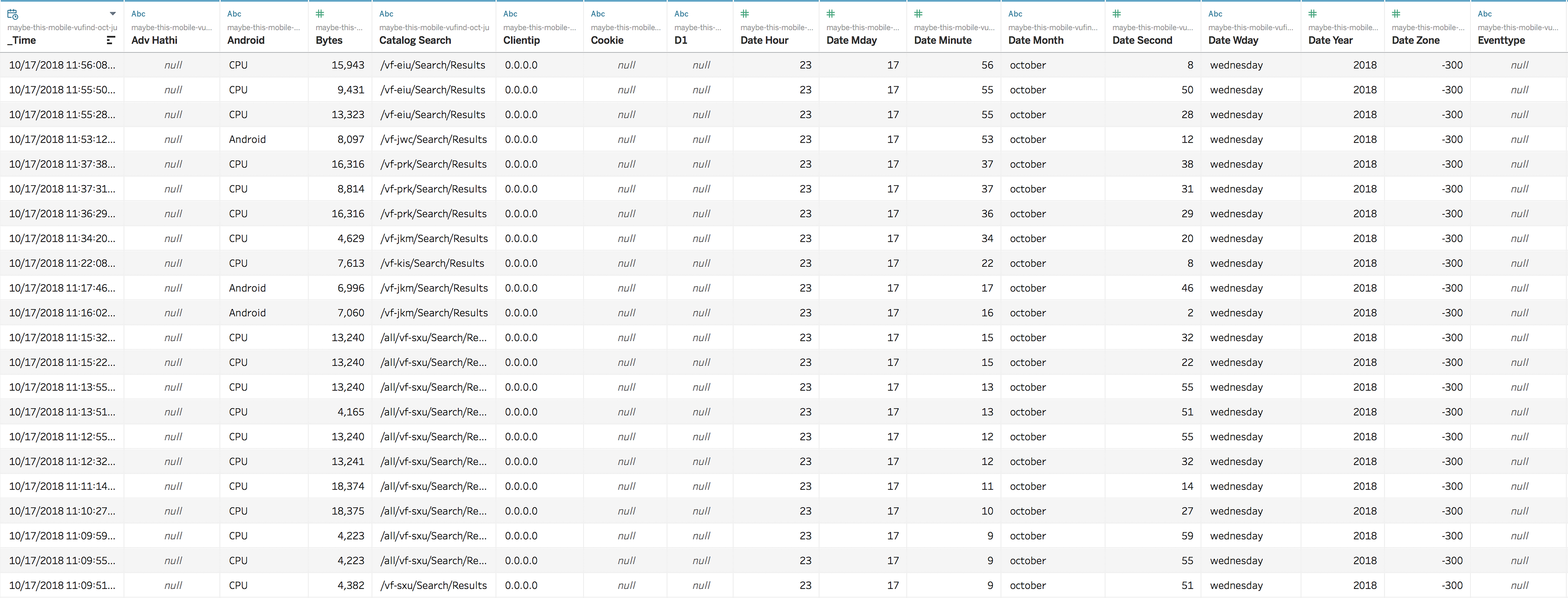
Figure 2. Search logs transformed in CSV format used in tableau to visualize data.
Logs of both native and responsive mobile apps can be compared for search terms used, search query length, and relative popularity of each access type across the state, e.g., baseline data about the use of each. The time frame of the logs analyzed was mid-July to mid-October 2018 and comprised ninety days of users’ searches across a majority of the academic libraries in Illinois. Because the web servers that display the catalog search results generate the server logs automatically, the server pre-processing steps depend on the data’s source. In the case of the native mobile app, all log data serve the mobile app, although they could be serving a mobile phone or a tablet as well. In the case of the VuFind 4 server, the catalog search results are parsed based on user agent data that the mobile browser sends the server. Figure 3 shows an example of a browser agent from the logs.
Figure 3. Sample browser agent from the search transaction logs.
IRB approval was obtained to analyze the data that users had entered into the search previously. This study was a retrospective human research study in the sense that we did not recruit participants, but analyzed their actions instead with no intervention on our part.
Filtering for facets in the logs was performed with the use of OpenRefine (http://openrefine.org/), a data tool that offers many filtering and data reconciliation options, and is used to work with messy datasets on the web. In the case of this research, OpenRefine was used to filter based on facets and search format types found in the query URL path.
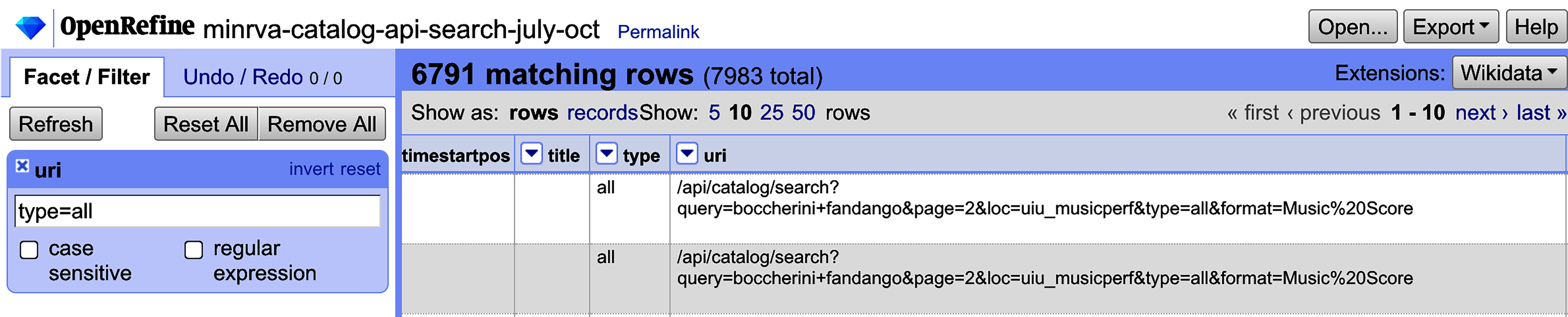
Figure 4. Example filter used to report keyword-only searches in the native app.
Finally, a text analysis of search terms in both search logs was undertaken using Voyant text mining tools. These tools can be run on a desktop or accessed from the web (Sinclair & Rockwell, 2016). The principal advantage of running a Voyant app on a desktop is that the data are secure and insights into large datasets can be obtained without the need to transfer data over a web request. Depending on the desktop system resources, the text mining results likely will be generated more quickly if they are on a desktop computer rather than the https://voyant-tools.org/ webpage.
Results of Search Transaction Analysis
General Access and Use
Access and use data were generated first to understand the makeup of the two server logs. The general access analysis found that during the 90-day study period, there were 7,983 native mobile catalog searches. A delineation by month and a grand total is shown in Figure 5 below.
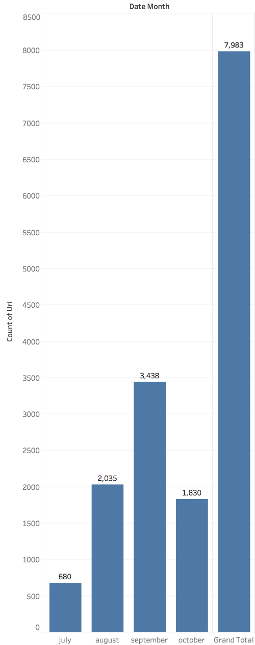
Figure 5. Total native catalog searches by month and overall.
A similar analysis of access data was undertaken for VuFind mobile website totals. The analysis of these server logs indicated that there were 45,001 searches of the responsive mobile VuFind website during the study period (Figure 6). Therefore, the initial data analysis indicated much higher mobile browser than native app access. A further examination of the percentage of mobile browsers represented in all searches showed that 2,172,451 searches were performed during this period with all browsers, inclusive of mobile access. Therefore, those mobile agents that displayed a mobile friendly page represented only 2% of VuFind searches during the study period.
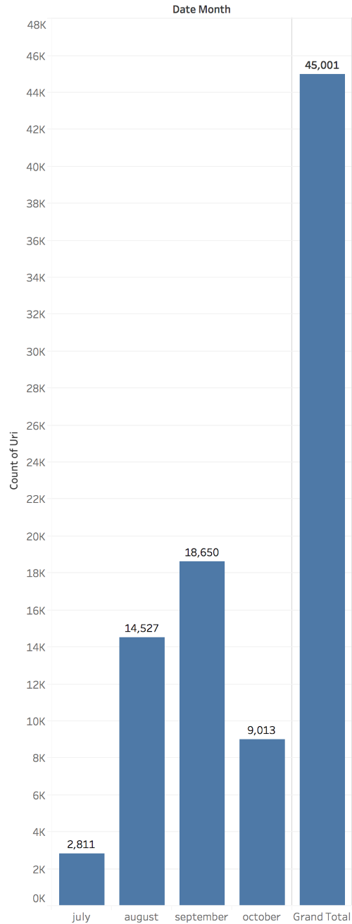
Figure 6. Responsive website totals by month and overall.
Number of iOS and Android Devices among Responsive VuFind Mobiles
To understand Android and iOS devices’ relative popularity as a way to access the responsive VuFind page, two popular mobile device types from the VuFind webserver were analyzed (Figures 7 and 8). A comparison of the totals in the figures shows that the iOS devices observed in the search logs were two times more popular than were other mobile device types.
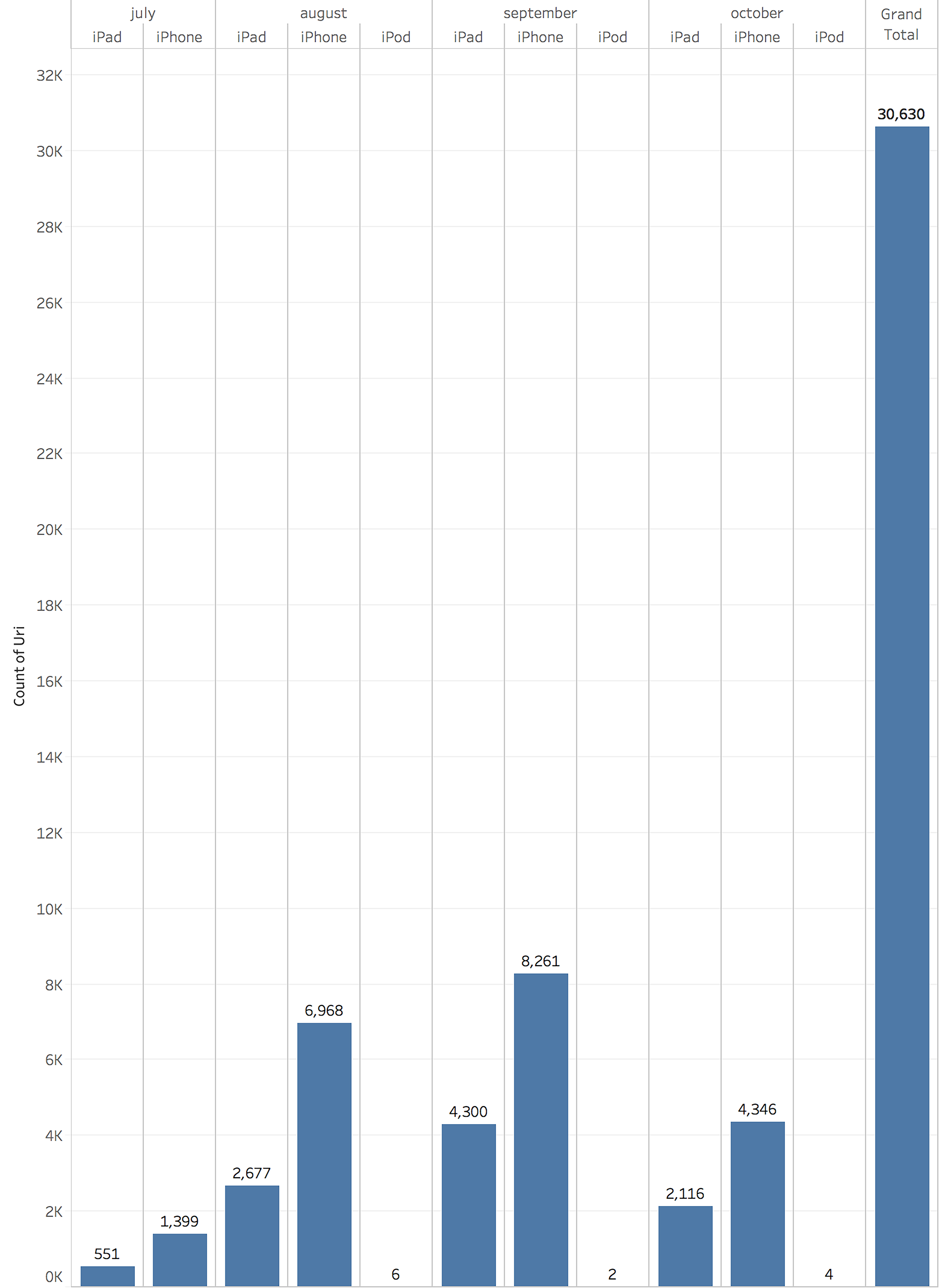
Figure 7. iOS responsive VuFind totals.
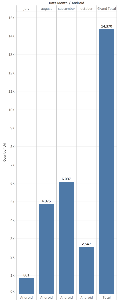
Figure 8. Android responsive VuFind totals.
Search Terms
The server logs from each service recorded search phrases that were analyzed with the Voyant text mining software. The results indicated that the mobile responsive VuFind search corpus had a total of 123,815 words and 14,221 unique word forms. Search queries performed in the responsive VuFind interface had a mean of 4.2 words. The most frequent words in the responsive corpus included “history” (512); “psychology” (493); “e2” (432); “American” (420), and “art” (412).

Figure 9. Word cloud of responsive search terms Voyant text mining generated.
Results from text mining the native mobile app search corpus found a total of 17,351 words and 2,181 unique word forms in searches. The native mobile app’s mean number of words per search query was 6.5. The most frequent words in the native app query corpus were: “Saundra” (322); “Hitchcock” (257); “k.ciccarelli” (256); Rochberg (173), and “darkest” (168).
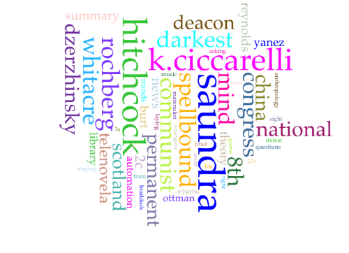
Figure 10. Word cloud of native search terms Voyant text mining generated.
Catalog features used in searches
Asking what catalog features were used in the mobile searches revealed facets and format trends. With respect to the responsive website, 81% of the time (36,609 of 45,001 total searches), the default keyword/no facets were used. In mobile responsive searches, the next most popular facet was Title followed by Author. Table 2 shows the results from the responsive mobile interface facets.
Table 2.Responsive search facets used.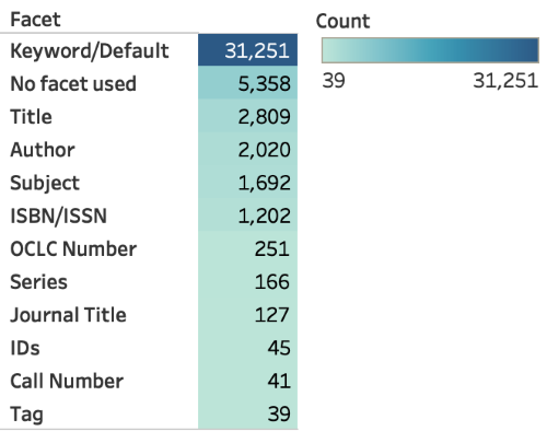
85% of all native app searches (6,791 of 7,983 total searches) also used the keyword facets. The next most popular facets were Author followed by Title searches, respectively. The results from the native app interface facets are shown in Table 3.
Table 3. Native app search facets used.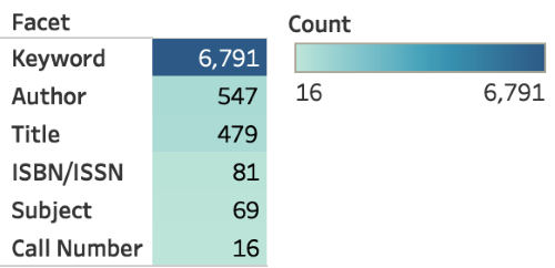
Format types were not used significantly in the mobile responsive web interface. Book format searches were the most popular for this interface but represented less than 4% of all searches. Table 4 shows the delineation of other format filters used.
Table 4. Responsive search format types.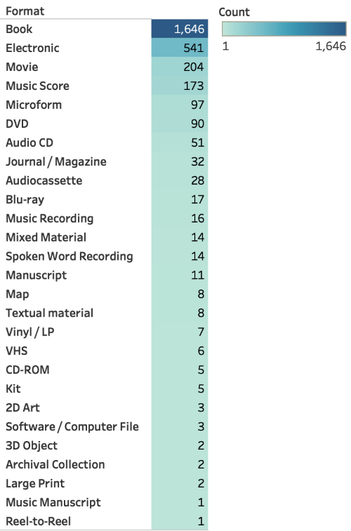
Searching by format type was observed more prominently in the native app. Book format searches were the most popular for this interface and represented 20% of all searches. Another popular format filter for the native app included music scores, which constituted 6% of native app searches, and DVDs, which constituted 5% of searches in this interface. The delineation of other format filters used is shown in Table 5.
Table 5. Native search format types.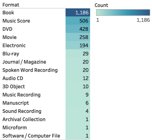
Discussion
A key finding was that format filtering is used more often in the native mobile app. However, with respect to general popularity, it is clear that during this study’s period, the responsive mobile website in VuFind was used more overall. The logs showed that users accessed mobile responsive websites more often with iOS devices. The analysis also showed that iOS devices in the consortium are twice as popular than are other mobile devices.
It was not surprising that keyword (default) searches were the prominent search type, as this trend has been observed in other search log studies in library discovery systems. However, when query length was examined, it was somewhat surprising to see that the query length in the native app were longer than were those in the average responsive app. The average responsive app users’ mean query length was 4.2 words, while that of native app users was 6.5 words. It is unclear whether this is because native app users may be more likely to cut and paste words and full citations more often than do responsive web users, but this may be one factor to consider in the longer mean search terminology. One additional finding in this respect was that the data showed no overlap in popularly-occurring phrases or search terms, which underscores the finding that the mobile interface type may play a role in whether and what users search for in the library catalog.
Search types varied by interface. The native app seemed to make greater use of format filtering than did the respective responsive app format filters. However, after the search interfaces were compared side by side (Figure 11), it is clear that the native app has prioritized filtering in the drop-down menu, but the responsive mobile site has filtering by format at the bottom of a results page, thereby precluding its use until the user reaches the bottom of the page.
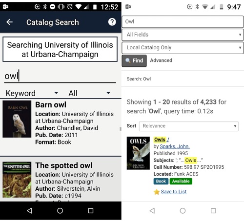 Figure 11. Side by side comparison of the mobile interfaces. The native app is on the left, the responsive mobile website on the right.
Placing the format filtering in a more prominent position in the responsive interface is recommended, because, as the native search logs show, library patrons use format filtering when it is displayed prominently. Further, from the information retrieval standpoint, format filtering helps users find the exact item for which they are looking when searching the mobile interface. The search log analysis does raise the question of whether the native interface perhaps is used by some segment of the library user population that prefers to search for known items and format types. Therefore, the question of what the native app seems to offer to different segments of the user population could be a focus of further qualitative study.
Conclusion
Implications for library mobile app design in the consortium include understanding the mobile search features that users find helpful. We can ascertain several areas to improve the responsive interface and understand its significance, as more users access mobile content designed responsively than through native access. It was clear that native access seemed to support more of the catalog features used, such as format filtering. Future focus groups that study why some users chose to install the native app, rather than use the mobile responsive VuFind page, would help to expand the quantitative data collected in this study with qualitative feedback to better understand several of the new questions introduced by this study.
References
Berg, A. (2010). Browser vs. app: Which is better? Wireless Week, December, 2010.
Blummer, B., & Kenton, J. (2016). Academic libraries’ mobile initiatives and research from 2010 to the present: Identifying themes in the literature. In L. Briz-Ponce, J. A. Juanes-Méndez, and F. J. García-Peñalvo (Eds.), Handbook of research on mobile devices and applications in higher education settings. Hershey, PA: IGI Global, 118-139. https://doi.org/10.4018/978-1-5225-0256-2.ch006
Carpineto, C., Mizzaro, S., Romano, G., & Snidero, M. (2009). Mobile information retrieval with search results clustering: Prototypes and evaluations. Journal of the American Society for Information Science and Technology, 60(5), 877-895. https://doi.org/10.1002/asi.21036
ChanLin, L-J. & Hung, W-S. (2016). Usability and evaluation of a library mobile web site. The Electronic Library, 34(4), 636-650. https://doi.org/10.1108/EL-07-2015-0119
Charland, A., & LeRoux, B. (2011). Mobile application development: Web vs. native. Communications of the ACM, 54(5), 49-53. https://doi.org/10.1145/1941487.1941504
Farrell, S. (2017). Search-log analysis: The most overlooked opportunity in web UX research. https://www.nngroup.com/articles/search-log-analysis/
Hahn, J., Ryckman, B., & Lux, M. (2015). Topic space: Rapid prototyping a mobile augmented reality recommendation app. Code4Lib Journal, 30, http://journal.code4lib.org/articles/10881
Jensen, B. J. (2006). Search log analysis: What it is, what’s been done, how to do it. Library & Information Science Research, 28(3), 407-432. https://doi.org/10.1016/j.lisr.2006.06.005
Kim, B. (2013). Responsive web design, discoverability, and mobile challenge. The Library Mobile Experience: Practices and User Expectations, Library Technology Reports, 49(6), 29-39. http://dx.doi.org/10.5860/ltr.49n6
Liu, Y., Liu, X., Ma, Y., Liu, Y., Zheng, Z., Huang, G., & Blake, B. (2015). Characterizing RESTful web services usage on smartphones: A tale of native apps and web apps. 2015 IEEE International Conference on Web Services, New York, NY, 337-344. https://doi.org/10.1109/ICWS.2015.53
Peters, T. A. (1993). The history and development of transaction log analysis. Library Hi Tech, 11(2), 41-66. https://doi.org/10.1108/eb047884
Sinclair, S., & Rockwell, G. (2016). Voyant tools. http://voyant-tools.org/
Tidal, J. (2017). One site to rule them all, redux : The second round of usability testing of a responsively designed website. Journal of Web Librarianship, 11(1), 16-34. http://dx.doi.org/10.1080/19322909.2016.1243458
Tu, Y-F., & Hwang, G-J. (2018). Trends of library-associated mobile learning based on a review of academic studies published from 2007–2016. The Electronic Library, 36(5), 875-891. https://doi.org/10.1108/EL-06-2017-0138
Wong, S. H-K. (2012). Which platform do our users prefer: Website or mobile app? Reference Services Review, 40(1), 103–115. http://doi.org/10.1108/00907321211203667
About the Author
Jim Hahn is an Associate Professor in the Undergraduate Library at the University of Illinois. His research into technology-enhanced learning has led to many software development projects within library settings and provides unique insights into new student’s expectations and needs and helps inform the work that he does as the Orientation Services and Environments Librarian for undergraduate students at the University of Illinois. He founded and manages the Minrva project (https://minrvaproject.org) and currently serves as project PI for a research & development grant funded through the University of Illinois Campus Research Board, entitled, “Information and Environment: Integration of an IoT-powered recommender system within the FOLIO open source platform,” the aims of which are to incorporate Internet of Things functionality into a FOLIO wayfinder application ( https://github.com/minrva/ui-wayfinder) and make the resulting software available in the open source.

Subscribe to comments: For this article | For all articles
Leave a Reply