by Atalay Kutlay, Cal Murgu and Tammera Race
Introduction
At the New College of Florida, we sought to develop a tool that allowed us quickly to visualize the relationships of our instructional librarians and teaching faculty using internal data. Our main objectives with this project were twofold: 1) Develop an open-source application that can easily render network graphs depicting instructional activities at our Library using our LibInsight datasets; 2) Include export/reporting functions for straightforward sharing. Over the course of development, we included several stretch-goal features, including relationship weighing and additional reporting features. This article documents our experience creating a Shiny app, Fabric, that quickly and efficiently renders interactive network visualizations. Fabric renders an illustration of the recent and current relationships between librarians and faculty members, and offers fast exporting functions for planning purposes. Ultimately, Fabric is a lightweight, open-source alternative to other Social Network Analysis (SNA) applications, like Gephi or UCInet, that supplements the visualization features currently available in LibInsight.
Background
Like many other academic libraries, the New College of Florida Jane Bancroft Cook Library began collecting various data to document the work of librarians in different service areas, including instructional data as well as research consultations. We started using LibInsight in 2016. We created a series of standardized forms that collect a variety of information, such as front-desk analytics, library instruction, and research support interactions with students and faculty. While we have been analyzing this data in different ways since then, either through LibInsight’s built-in visualization tools or through local analysis using Excel or R, we sought to create an application that allowed us to easily render network graphs depicting instructional activities and enabled us to create reports for internal and external stakeholders. While LibInsight provides basic reporting functionalities, such as line, column, spline, and pie charts, we wanted to represent the relationships of our librarians with faculty and students in a way that is more akin to how we see ourselves: as part of an academic network.
Visualizing library data has been in vogue recently. Others have written about their experiences creating applications centered on the application of library data. Costello and Martin, for example, detailed Stony Brook University Libraries’ efforts to consolidate their data streams into a Tableau dashboard that enabled them to “tell stories with data” (Costello and Martin, 2018). Their objective is a familiar one: they required “a way to quickly share information among different [stakeholders within] and outside the library” (Costello and Martin, 2018). Similarly, Horne-Popp, Tessone and Welker detailed the implementation of a local data dashboard, built on Rails, concluding that, among other things, “the ability to visualize data by setting a few parameters greatly increased the flexibility of data sharing with library administration and other internal and external stakeholders” (Horne-Popp et al., 2017). Other studies focus on how we can leverage data to support library strategic-decision making (Murphy, 2013), scholarly communications (Smith, 2013), library assessment (Murphy, 2015), and collection development (Lewellen and Plum, 2016). It is not at all surprising that Tableau features in much of this scholarship, although not exclusively, given the software’s relatively low barrier of entry yet excellent querying and visualization options. This speaks to an important element of any data centered visualization strategy: it needs to be accessible, both for a user as well as the administrator.
The aforementioned literature informed our own approach to visualizing library data. In particular, we noticed that the type of graph that made most sense to us given our focus on relationships was missing from many of these dashboards: network graphs. After considering several options, including an internal pipeline that pushed LibInsight data to proprietary software such as UCInet and open software such as Gephi, we decided to explore the R package, Shiny (https://shiny.rstudio.com/). Shiny is an open source package which makes it easy to build interactive web applications or data dashboards. Shiny leverages R’s abilities to enable you to create interactive web applications that focus on data (Beeley and Sukhdeve, 2018). Most Shiny applications revolve around displaying data in interactive, manipulable views. In addition to Shiny’s relatively simple development process, we used Shiny because of its limited footprint. Essentially, Shiny applications are R projects that can be run locally and do not require a server or an intricate environment to run. The application can also be hosted, either on a web server or on shinyapps.io, a freemium hosting solution provided by RStudio that enables low-volume users to host Shiny applications at no charge (limited to 25 hours of active hosting per month). As a result of this flexibility, and a desire to learn more about how we could leverage R in the library, we decided to build a Shiny web application.
Networks
Before we explore our application, Fabric, a quick primer on network graphs would be useful in situating our project. Social network analysis emerged as a methodology in the field of social psychology and sociology in the early 20th-century (Scott, 1988). It promoted the empirical and theoretical analysis of relationships between agents (people, institutions), taking methodological direction from graph theory, the mathematical study of graphs, as well as the qualitative study of social relationships. Depicting these relationships as a series of visual models was a natural extension of social network analysis. Taking cues from graph theory, scholars interested in social network analysis developed a variety of measures to determine the centrality of certain nodes in a network (a proxy for importance), the density of a graph (number of relationships), and node clustering, among other methods. However, a basic network graph is actually quite simple. It includes nodes (people, objects, things) connected by a series of lines, known as edges or relationships. A simple network graph can be seen in Fig 1.
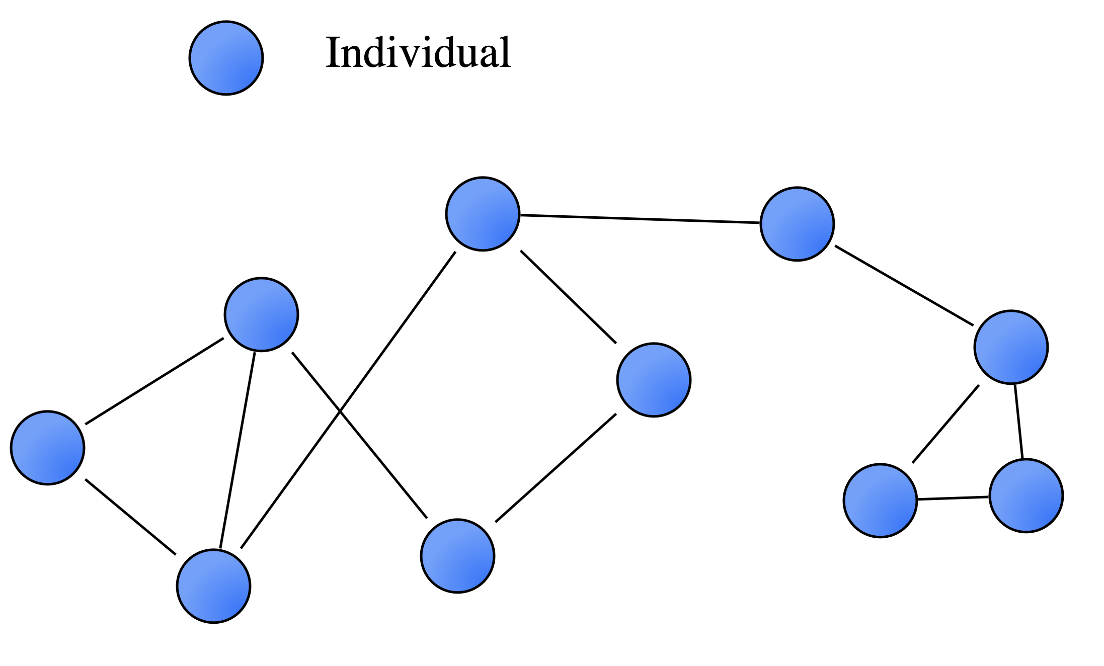
Figure 1. A basic network graph
For our use case, the nodes represent instructors and librarians, and the edges represent instructional activities. The first iteration of our results can be seen in Fig 2. While this basic data is enough to create a network graph, it limits its potential for identifying patterns among relationships in the graph because it does not include other variables that introduce additional nuance. For example, our first result did not delineate between type of nodes (librarians or teaching faculty), departments or schools (Arts, Sciences, Social Sciences), and the number of interactions and intensity of the relationship between nodes. The graph required a significant amount of institutional knowledge to be able to be read and applied in a strategic way.

Figure 2. Network graph of librarians and teaching faculty
Additionally, we realized that beyond visualizing the nodes and relationships that are evident within the dataset, we needed to include those individuals (in our case, instructors) who were not included in the dataset. In other words, we needed to include nodes that, to date, did not have a relationship with a librarian. After an analysis of our LibInsight data, we recognized that what we collected enabled us to render more complex network visualizations. An example of the final iteration of our network graph rendering can be seen in Fig 3.
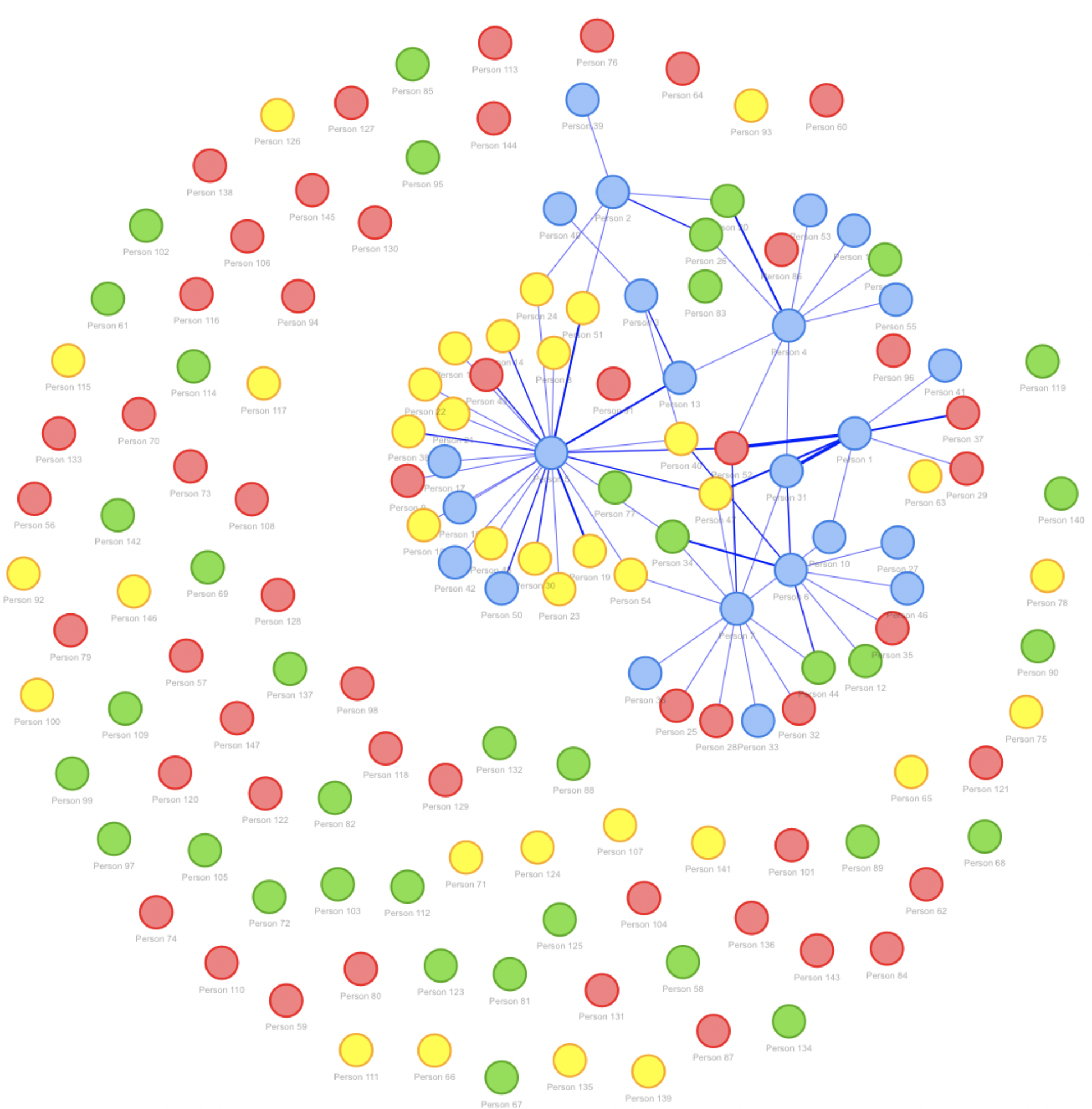
Figure 3. Complex network graph showing additional variables
Functionality
Our application allows users to render graphs varying in complexity based on the type of data that is available. While we happen to collect data using Springshare’s LibInsight, Fabric simply needs a properly formatted CSV to function. To render a basic network graph, a dataset need only include two columns: a column listing librarians, and a column listing instructors. This basic information is enough to create a graph that shows the relationships with faculty, with dynamically weighted edges. Should a user want to delineate between departments or schools, an additional dataset which includes two columns is required: a column listing faculty members, and a column listing their departments or schools.
Developing the Shiny Application
There are 2 main components in a Shiny app: UI and Server. For the UI component, developers can either use Shiny’s own functions to create a fluid UI or use their own custom HTML templates with correct div classes and ids. For Fabric, we used a custom HTML template for more flexibility and better user experience, such as mobile compatibility. The data manipulation, analysis, and rendering occurs in the Server component. We used the visNetwork package to visualize the social network, the DT package for the tables, and the tidyverse package collection to handle most of the data manipulation and analysis. Fig. 4 shows the structure of a Shiny application, as well as the libraries we used in Fabric.
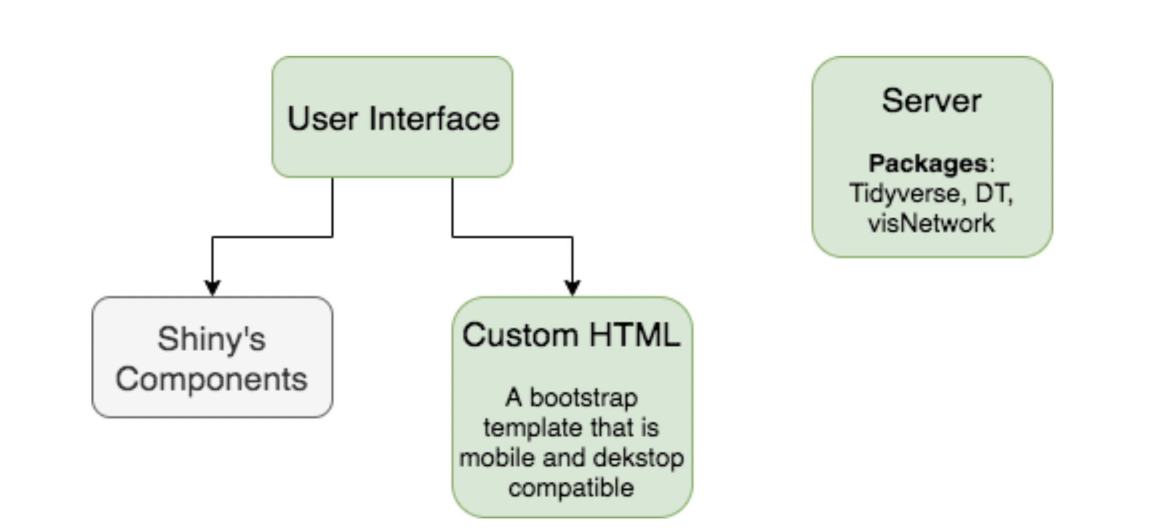
Figure 4. The structure of Fabric shiny application
Using the Application
Fabric offers a simple user interface. There are 4 main steps to generate and export a social network, which can be seen in Fig. 5.

Figure 5. Featured steps in Fabric
1. File Upload: The first step requires users to upload their interaction data and/or an optional complete list of faculty. Users may choose either one of the existing datasets for testing, or upload their own datasets for analysis. Users can also choose to anonymize the data that is visualized.
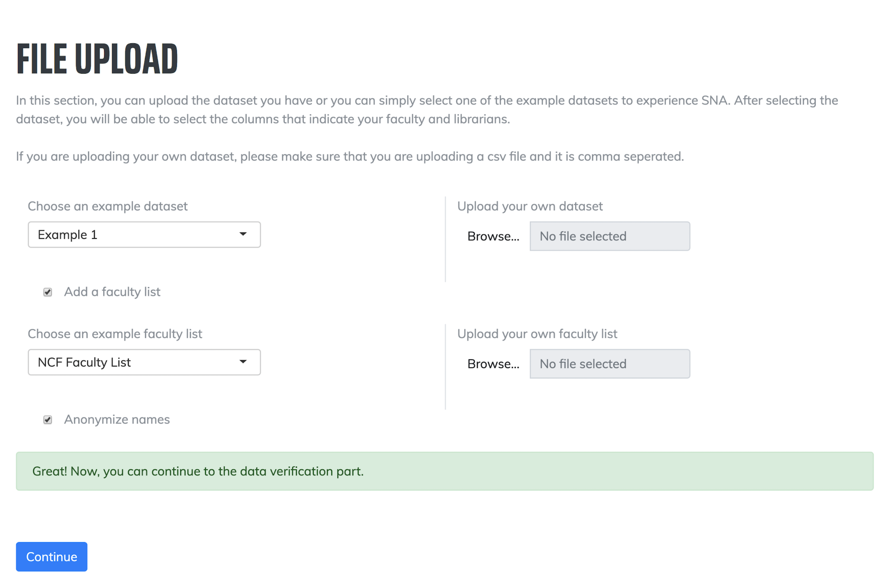
Figure 6. Screenshot of the file upload
2. Data Verification: Like with other network graph visualization software, users need to describe certain features of the dataset. The second step requires users to explain which column lists librarians and instructors. If users choose to include an option complete faculty list, they will need to clarify which columns have the faculty members and their division/school/department in the second optional dataset.
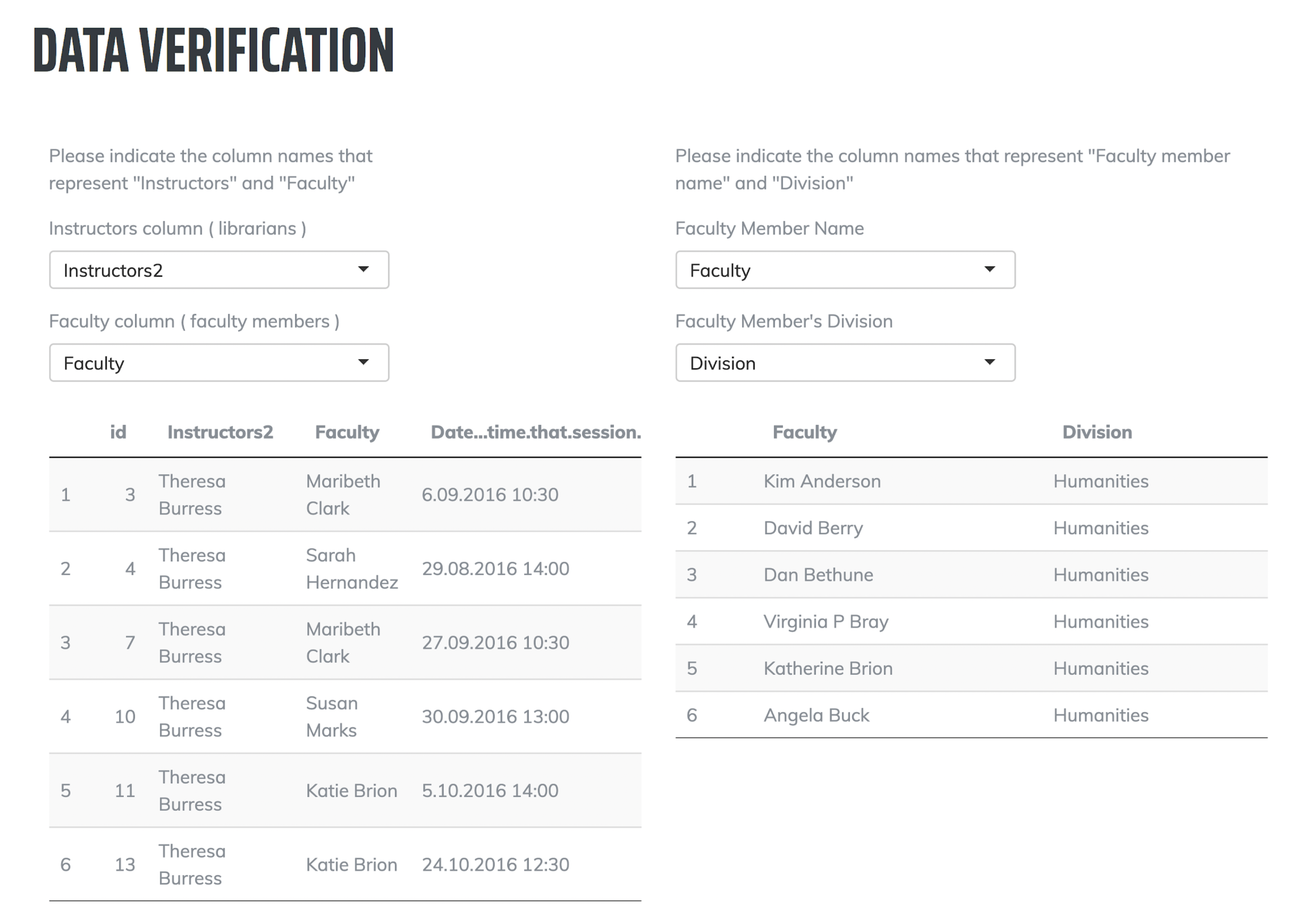
Figure 7. Screenshot of the data verification
3. Results: The third step renders the interactive network graph. Users can click on each node for additional information, such as the distribution of their relationships among divisions, top 5 interactions, and average number of interactions with the same person. Users can also facet by particular groups of nodes, or by individual nodes.
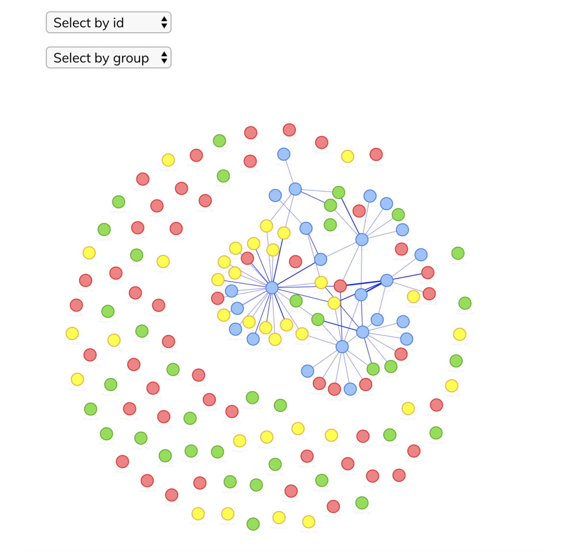
Figure 8.1 Screenshot of results
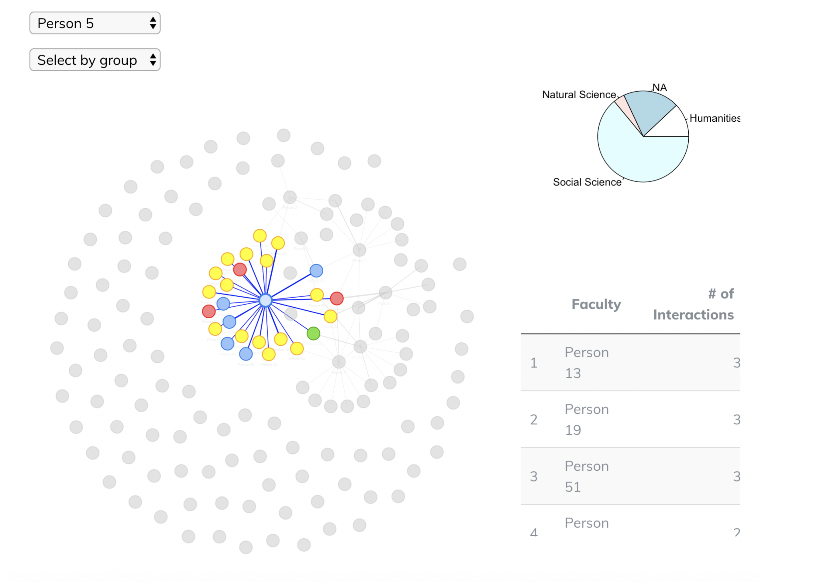
Figure 8.2 Screenshot of results
4. Export: Finally, the fourth step offers an export function that creates an interactive HTML file, which can be opened and manipulated locally. We find exporting helpful to use the data in reports or presentations.
5. Understanding the results
Understanding a complex network graph may be confusing at first. In the following section, we briefly explain the information you can gain from the network graph.
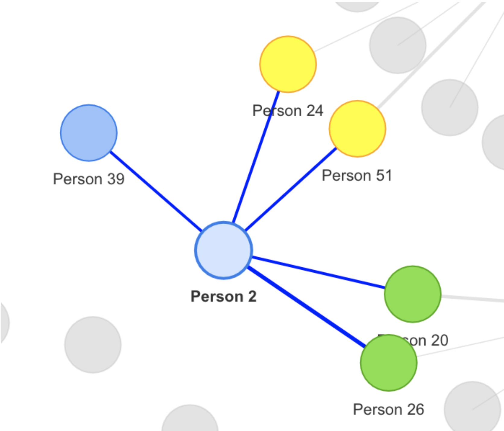
Figure 9 Different weights of edges
First, we will look at the types of information that can be gained from the edges. 3 different types of edges can be seen in Fig. 10. Edges are weighted with the number of interactions between nodes. Looking at Fig. 9, we can deduce that the number of interactions between Person 2 and Person 26 is greater than the number of interactions between Person 2 and Person 39.
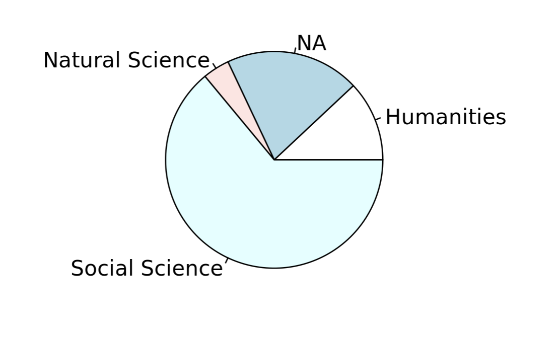
Figure 10 Pie chart of the division/school distributions
Second, we will consider the charts and tables that our tool generates. Fig. 11 indicates the distribution of a librarian’s instructional relationships across different schools or divisions. NA may represent possible errors in the dataset (disambiguation, missing fields, spelling mistakes). This information may be particularly useful in settings where instructional librarians are not linked to specific departments or schools. Finally, Fig. 12 shows a table summary of the top interactions a librarian has with instructors.
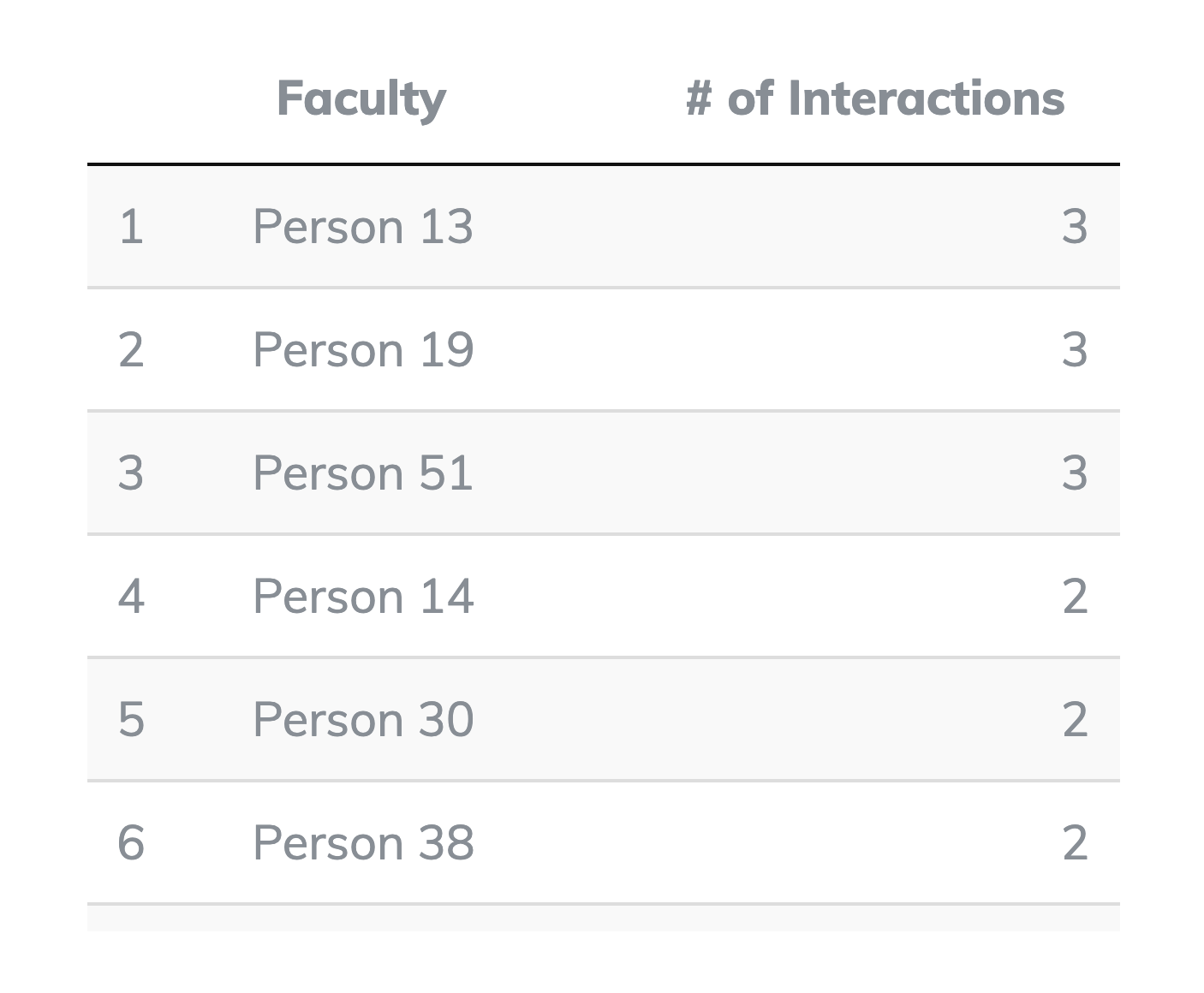
Figure 11 Table of top interaction list for a librarian
Discussion
We have developed this tool for our own particular needs but with the larger library community in mind. Visualizing library data is an important practice given the ability of visuals to communicate information, and for visuals to enable us to determine insights and patterns that are sometimes obscured by the spreadsheet. The following provides you with a notion of how we have used this tool at the Jane Bancroft Cook Library:
- To assess whether the shift from the liaison to team-oriented instruction model has changed the way we interact with instructors across disciplines. A year-to-year comparison made clear that despite moving away from our liaison model, our interactions with faculty continue to be informed by previous relationships between subject librarians and their “home” disciplines;
- To identify strong faculty partnerships that consistently ask for and are active supporters of library instruction;
- To identify gaps in our instruction services with respect to who and what departments we collaborate with more often than others. This allowed us to explore why that gap exists in the visualization, and prioritize actions to reconcile these gaps;
- Allows us to onboard new librarians in a way that is much more intuitive, by making it possible to visualize institutional memory. We are working to embed this workflow as a part of our onboarding process. This is critical given that according to several studies, the cost of recruiting a new employee “approaches 30 percent of the new hire’s annual salary and the total cost of replacing an employee can be as high as 150 per cent of the annual salary after calculating lost productivity, recruiting expenses, retraining and time-to-productivity.” Moreover, research indicates that the return on investment for a comprehensive onboarding program can reduce employee turnover from an average of 44 to 14 percent while improving new employees’ time-to-productivity by 33 per cent (Hall-Ellis, 2014).
- Visualize instruction activities in promotion material, strategic planning, and stakeholder engagement meetings.
Conclusion and Future Development
In conclusion, while much work is being done to operationalize library data for a variety of institutional and professional reasons, we found that there was a lack of focus on network graphs. Beyond simply quantifying the number of instruction sessions, we consider network graphs to be the most appropriate way to visualize instruction data given the importance of relationship building to successful library services, including instruction. Using Shiny, an R package for web application development, we created Fabric to enable library professionals to quickly visualize relationships in the form of network graphs. The resulting visualization is interactive, and can be exported and easily shared with internal and external stakeholders.
We have found that this approach has helped us confirm or reconsider certain ideas that we hold about our contributions to the institution. We hope our examples will give you a sense of how this tool could be modified/applied in your specific context. We plan to continue developing certain aspects of the application. For example, we would like to include temporal delimiting in the application to allow for effortless year-to-year analysis.
Try it out
The complete source code for this project can be found at: https://github.com/ncflib/Fabric If you’d like to try the application, check out the most current version at the following link: http://dss.ncf.edu/fabric.
Notes
Beeley, C., & Sukhdeve, S. R. (2018). Web Application Development with R Using Shiny: Build stunning graphics and interactive data visualizations to deliver cutting-edge analytics. Packt Publishing Ltd.
Costello, L & Heath Martin (2018). Creating the Library Data Dashboard. In Using digital analytics for smart assessment (pp. 107-116). American Library Association.
Hall-Ellis, S. (2014). Onboarding to improve library retention and productivity. The Bottom Line, 27(4), 138-141.
Horne-Popp, L. M., Tessone, E. B., & Welker, J. (2018). If You Build It, They Will Come: Creating a Library Statistics Dashboard for Decision-Making. In Developing In-House Digital Tools in Library Spaces (pp. 177-203). IGI Global.
Lewellen, Rachel, and Terry Plum.“Assessment of E-resource Usage at University of
Massachusetts Amherst: A MINES for Libraries Study Using Tableau for Visualization and Analysis.” Research Library Issues: A Report from ARL, CNI, and SPARC, no. 288 (2016): 5–20.
Murphy, S. A. (2013). Data visualization and rapid analytics: applying tableau desktop to support library decision-making. Journal of Web Librarianship, 7(4), 465-476.
Murphy, S. A. (2015). How data visualization supports academic library assessment: Three examples from The Ohio State University Libraries using Tableau. College & Research Libraries News, 76(9), 482-486.
Scott, J. (1988). Social network analysis. Sociology, 22(1), 109-127.
Smith, V. S. (2013). Data dashboard as evaluation and research communication tool. New Directions for Evaluation, 2013(140), 21-45.
About the Authors
Atalay Kutlay is the Digital Scholarship Library Fellow at the New College of Florida Jane Bancroft Cook Library.
Cal Murgu is the Digital Humanities Librarian at the New College of Florida Jane Bancroft Cook Library.
Tammera Race is the Systems, Metadata & Assessment Librarian at New College of Florida

samato, 2020-03-31
Updated to include third author.