by Erinn Aspinall, Amy Drayer, Gabe Ormsby, and Jen Neveau
Design systems: an introduction
W3C standards call for designing an online experience that is equitable for people with diverse abilities. Building on this guidance, the University of Minnesota Libraries (Libraries) developed a technology-agnostic design system and applied it to the Health Sciences Library (HSL) website [1]. The system outlines core principles and strategies for accessible, ethical, inclusive, sustainable, responsible, and universal design across its content, code, and design elements.
If design systems are not on your radar, Jeremy Keith provides this description:
The generally-accepted definition of a design system is that it’s the outer circle—it encompasses pattern libraries, style guides, and any other artefacts. But there’s something more. Just because you have a collection of design patterns doesn’t mean you have a design system. A system is a framework. It’s a rulebook. It’s what tells you how those patterns work together [2].
This article aims to outline the rationale behind using a design system, and how it was practically implemented to uphold our design system’s core principles.
Old problems, new solutions
The Libraries has a distributed development environment. The Libraries’ Web Development team manages the primary websites, while separate departments each have responsibilities for managing the online catalog, digital repositories, Springshare products, and online finding aids interface. Web content ownership is also distributed; with owning and editing rights provided to all 300 staff members.
Early efforts to take a more unified approach to web development began in 2015. The Web Development team produced semver releases (a code versioning method) of an assets repository, which were made available from the main website server. Developers and content owners could reliably point at any one version of the library assets to receive some cohesive branding and support [3]. The assets contained images, CSS, and JavaScript. The semver releases acted somewhat like a Content Delivery Network (CDN), but they relied on the main website server’s uptime. This model included a brief style guide built on the Bootstrap framework and relied primarily on the framework’s code-focused documentation. Due to a lack of asset repository adoption, communication, and content documentation, however, the websites managed outside of the Web Development team quickly became outdated.
In 2017, the Libraries adopted LibGuides, and guidelines were established by the implementation team. Again, limits of ongoing support for these guidelines led to their inconsistent application. These experiences made it clear that the Libraries needed a more established framework to meet its goal of cohesion and clarity with distributed content ownership.
During our LibGuides implementation, the Web Development team began investigating how web principles might manifest within our work. These principles — accessible, ethical, inclusive, sustainable, responsible, and universal design — aimed to create a user-centered approach to web development that addressed real and urgent community needs.
A driving factor for a principles-based approach came from a 2018 University of Minnesota student survey which reported that 42% of the participating students were diagnosed with at least one mental health condition in their lifetime, and nearly 20% had a diagnosis within the past year [4]. During COVID, these numbers have jumped to a 48% diagnosis rate for students, with 21% diagnosed in the past year [5]. Additionally, a 2015 study from the National Council on Disability reports that approximately 11% of undergraduate students have a disability and that students with disabilities attend college at rates similar to nondisabled students. However, their completion rates are much lower, with only 34% of students with disabilities finishing a four-year degree in eight years [6]. In comparison, the six-year national graduation for all students is 62% [7]. With library websites serving as a common tool to support student success, the need to move towards content that is accessible to all users was clear.
As we moved towards a user-centered, principles-based approach, the Web Development team was able to make accessibility changes to the theme but had little control over the accessibility of the content. The primary intent of the Libraries website is to get a person to their information destination, and in this way it acts as a directory. As a directory to other resources, the web principles prompted work to reduce obstacles a person might experience in their journey. We could make optimizations to the code and server setup but wanted to push ourselves to reach every content editor and developer. We heard about design systems through Dan Mall and Brad Frost in a video series by SuperFriendly, and it seemed like a solution to our concerns [8].
After warm reception to a presentation in principled web design to the stakeholders for the HSL web redesign project, the Web Development team’s User Interface Developer began a nearly year-long research and development project to write principles using Shopify’s Polaris design system as a model [9, 10].
The Libraries’ design system was born in a Google Doc. We began by integrating an internal values discussion into principles to guide the work, then developed content guidelines with our Content Strategist for review and approval by the Web Content Management Committee, the Libraries steering committee for content on the web. As content was audited and rewritten to new guidelines, code patterns and components were developed, and the live version of our design system was written with the cleanest most semantic accessible code possible (Figure 1). By developing the patterns we hoped to put into practice, we had a shared language to move towards our goal to produce a highly user-centered, task-focused, inclusive website.
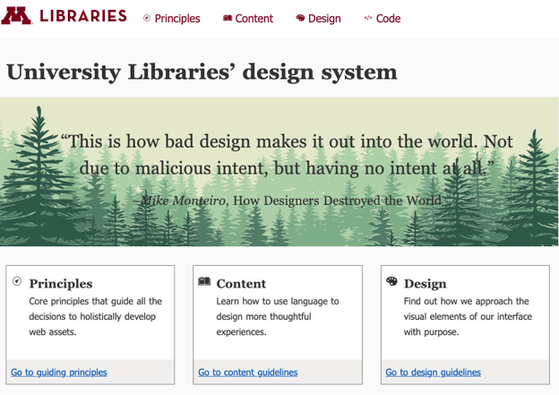 Figure 1. Libraries design system in progress
As we began developing our design system, we learned that the University of Minnesota’s University Relations team was working on a pattern library, which eventually evolved into a design system (Figure 2) [11]. When reviewing the University’s pattern library, we found that we had slightly different goals. Our design system incorporated principles and content sections and avoided JavaScript dependent components, while the University’s pattern library reflected broader user goals and a far more diverse clientele that were out of scope for the work of the Libraries. We borrowed liberally from the University’s efforts as well as existing design systems where possible, modifying content and code to meet local needs and priorities.
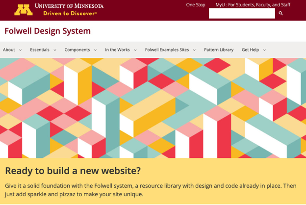 Figure 2. Folwell Design System developed by the University of Minnesota’s University Relations
The Libraries’ design system is technology-agnostic, allowing for development from any operating system. As a technology-agnostic tool, the design system required removing complexity and frameworks from the development stack. When it was migrated out of Google Docs, it was coded into pure HTML and CSS published in a GitHub Pages repository with some simple Gulp commands. This allowed for quick iteration during the communications and development phase.
Presenting the solutions in HTML rather than scripting languages provides the universal outcome that colleagues should aim towards rather than dictating the method to generate code as it will present in the DOM (i.e., we wrote only HTML and did not additionally document how to write it in AngularJS). With the markup and intent publicly documented in the design system, it is possible to have deeper and more meaningful conversations to progress towards a mature Web.
Setting the culture shift
Practical implementation of our design system on the HSL site was prompted by the move from Drupal 7 to Drupal 8. Before detailing the technical considerations of this process, we will share how we addressed the known sociocultural complexities that required attention to ensure successful design system application. Namely, the use of our design system required a cultural shift towards our shared, user-centered principles to achieve a more unified approach. This cultural shift took time and support as we moved through the stages of separation, transition, and incorporation that are common to any rite of passage [12].
Separation
Shared principles helped us begin to separate from our long history of distributed ownership as they provided an important foundation on which to build a cultural shift. Creating separation allowed us to be forward-thinking in our work and move away from a “how we’ve always done things” approach. We started by introducing the project team to a user-centered principles-based approach through a locally-developed presentation (Figure 3) [13]. The presentation built awareness around the principles on which our design system was built, and it was instrumental in separating from old ways of working as it developed a shared vocabulary and an understanding of the user-centered goals for web content — ultimately leading to team buy-in.
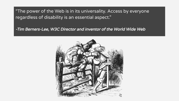 Figure 3. Slide from a presentation on overcoming self-centered design
Transition
Separation was followed by a transition time when we learned about how to best create a user-centered site. With team buy-in in place, the design system took center stage, showing how the principles shared in the presentation could be practically applied to the HSL site. As a result, our design system reinforced a user-centered approach and helped us achieve team readiness.
As the project team became familiar with our design system, we cemented our user-centered mindset when we incorporated what we learned and applied best practices across all site elements. And because many viewpoints and priorities were reflected in our project team — knowing that we were all using a unified approach and working towards a common purpose created a safe space to share and test ideas. As a result, we were able to take a highly collaborative approach to the HSL redesign from the very beginning, which proved to be a meaningful step towards a more unified approach.
Throughout the redesign process, we shared our process, content, and designs broadly with staff at departmental and management level meetings. We also sent updates in our internal newsletter and had broad representation on our project team from across our library staff. At these contact points, we reinforced a user-centered approach and spent time helping colleagues join in the learning process, offering opportunities to understand and question our approach, voice concerns, surface problems, and acclimate to new site features. This allowed our whole organization to join in the transition.
Incorporation
With the design system in place, we were able to consider the user experience as the sum of the experiences encountered by users — from lean code that can impact load time, to accessibility best practices, to content that is readable and thoughtfully organized to support successful task completion. Although this culture shift didn’t happen overnight, the shift was made faster through a uniform approach, centered on our design system.
We acknowledge that a culture shift takes time. It requires an application of complex skills and an ability to navigate complex relationships. We recommend building in extra time to accommodate this shift, as well as concrete plans to facilitate the process. This way, the project team members feel authority and ownership over the process, and the expectation of authority is understood and accepted within the larger organization.
Investing time and resources to create a shared purpose and approach has proven to have lasting returns, as conversations could start at the point of shared understanding as we introduced a centralized Drupal-based editorial workflow and extended design system standards to non-Drupal content that is pulled dynamically to our site (e.g., hours, news, events) so we maintained our design system standards and user-centered goals across all content elements.
Content first
Once the culture shift was in motion, we could more effectively apply design system guidelines. This work began with a holistic look at site content, with a review of every page (and every word on every page) to ensure that our content-related guidelines were met.
Core strategy statement
The content review process began by writing a core strategy statement — a tool to guide content creators through evaluating existing content along with how and when to create new content. It does this by identifying the audience and tying their needs to business goals.
The strategy statement was developed using a Madlibs exercise, modeled on Sara Wachter-Boettcher’s 2018 workshop “Coaching content: turn any colleague into a content ally” [14]:
The (site) supports (primary audience, and it can’t be everyone!) (primary tasks, limit to 3), which helps us (internal goal). In order to do this, our content must be less (problem area 1), (problem area 2), (problem area 3), and more (aspiration 1), (aspiration 2), (aspiration 3).
Filling in the placeholders for HSL, our final strategy statement read as follows:
The University of Minnesota Health Sciences Libraries website, as part of the University Library system, seeks to provide low-barrier access to health sciences information in order to support 1) discipline-specific information needs of AHC (Academic Health Center) faculty, students, and researchers; and 2) effective and meaningful engagement with library staff, services, and tools. In order to do this, our content must be less hidden, less complex, and less confusing, while being more task-driven, more accessible, more user-focused, and more contextualized.
Card sort
A card sort was used to review existing content against our content strategy. From a practical standpoint, we placed printed labels on sticky notes for each published page. The sticky notes included the page title and a unique ID that matched our spreadsheet records. Our strategy group then worked with the Web Development team to sort the sticky notes on large sheets of paper (Figure 4).
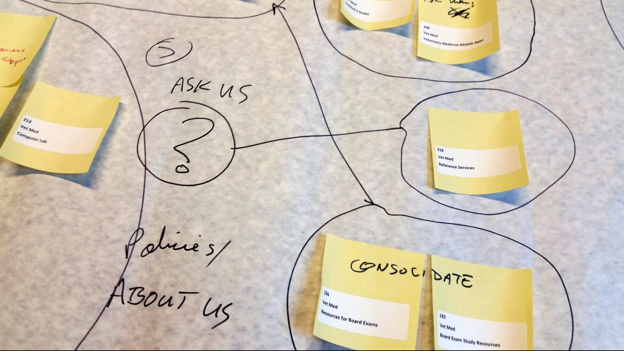 Figure 4. Card sort.
The combined paper/sticky note approach let the content drive design. As we moved through each page as a physical object, separated from legacy structures, we were able to organically identify existing patterns and start creating and defining the primary content buckets: services, resources, spaces, exhibits.
Each content bucket was simply defined for easy application to the content. For example, the services bucket was defined as the stuff we do (the things requiring interaction with staff), while the resources bucket was defined as the stuff we have (items in collections, or subscriptions, that users can discover on their own).
We also began to markup the card sort with brainstorming ideas, identifying pages to be combined or deleted, as well as those that would need reworking to fit into a new bucket.
Content review (evaluating for content R.O.T.)
After the content buckets were identified, the project team moved into the content review process, where we audited all existing Drupal content, both published and unpublished.
All of the 167 pages of unpublished content were reviewed and all the pages could be removed permanently. For the 500 pages of published content, each page was reviewed by two team members, who determined if there was content R.O.T., or content that is Redundant, Outdated, or Trivial. Those determinations were followed by a recommendation for final action: keep, delete, or update (Figure 5). With two reviewers for each page, we could determine if there was consensus or a need for further review and discussion.
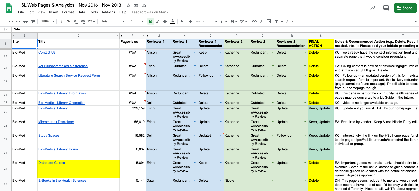 Figure 5. Content review spreadsheet.
Templates
Simple templates were developed for each content bucket to align with design system standards and create a consistent experience as users moved between pages in the same bucket. The templates were intentionally basic, with the hopes that their simplicity would encourage compliance. The services template, for example, includes a title and a plain language description. It also includes a way to contact someone to engage in that service — a required element of the services template — as well as placeholders for sidebar content, including contact information, and related services and resources (Figure 6).
The templates were used as the project team members reviewed and re-wrote the pages. They served as shared tools to foster collaboration between the project team and the subject matter experts, and they gave writers an opportunity to completely re-imagine their content in alignment with a uniform approach. By effectively separating the content from its presentation, the templates allowed subject matter experts to do what they do best — know stuff — and content and user experience experts to deliver that content in the best way to users.
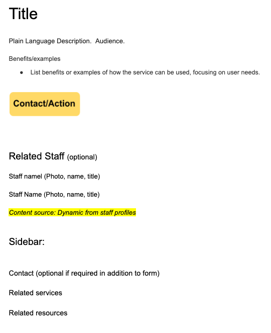 Figure 6. Service content template example.
Writing
The design system brought a set of core principles and their practical application to the writing process. It contained specific guidelines for writing inclusive and accessible content with a focus on plain language, as well as a cohesive editorial style (presented both in full, as well as in a brief checklist format). It served as a training tool for the project team to learn and apply content standards and best practices.
All of this led to a shared sense of the “why” and the “how” behind user-centered content that set the stage for the shift towards a more unified approach. Despite these efforts, content writing proved to be the hardest and lengthiest part of the project due to perceived and real challenges around content ownership and authority. As a result, the writing process took three times longer than projected. Ultimately, we were able to come together with a cohesive approach, but our experience with the writing process reiterated the importance of supporting a cultural shift within an organization when technical changes disrupt established norms.
Ongoing quality assurance through Workflow
Drupal’s Workflow system provided the tools to ensure an ongoing review of content changes. The workflow system established “states” for content revisions — New draft, For editorial review, Published, Archived — and delegated different “transitions” to different “roles” (authors could “Create new draft” and “Request editorial review”; site editors could “Publish” and “Archive.”) This helped ensure that the standards for content and design so painstakingly developed as the site was built could remain in place through a more uniform approach to content oversight.
Theoretical code to practical application
As content discussions progressed, the Web Development team began discussing the technical implementation of Drupal’s content editing interface. Taking the agnostic HTML-based patterns from our design system and incorporating them into Drupal required work on several different levels:
- The authoring system (Drupal’s content create and edit interfaces) needed to present the design system patterns in a way that content editors could easily select and use without concerning themselves with the intricacies of HTML code;
- Drupal and our Drupal theme, which rely on an elaborate nesting of templates using the twig templating system, had to be set up to output this staff-created content consistent with our design system;
- Site content generated by query builders (Views), feed harvesting (e.g. from Google Calendar and WordPress), or administratively-configured content (Blocks) also needed to use the design system components.
Presenting patterns to content editors
Out of the box, Drupal presents a content editor with the “body” field, a large, freeform field for a web page’s main content. Typically, this field offers a WYSIWYG editor with a wide range of formatting and media options. Our goal was to “empower through constraint” by reducing the overwhelming number of options presented and better aligning these options with the components outlined in our design system.
We found a solution in the Paragraphs module. Paragraphs allows Drupal site administrators to set up a number of Paragraph types, each of which is a collection of fields presented as a modular package. The previously-mentioned freeform “body” field may then be reconfigured to present a list of Paragraph types that may then be inserted, arranged, and rearranged within the body area (Figure 7). As each Paragraph pattern was developed, we ensured the authoring interface also maintained the design system’s accessibility standards.
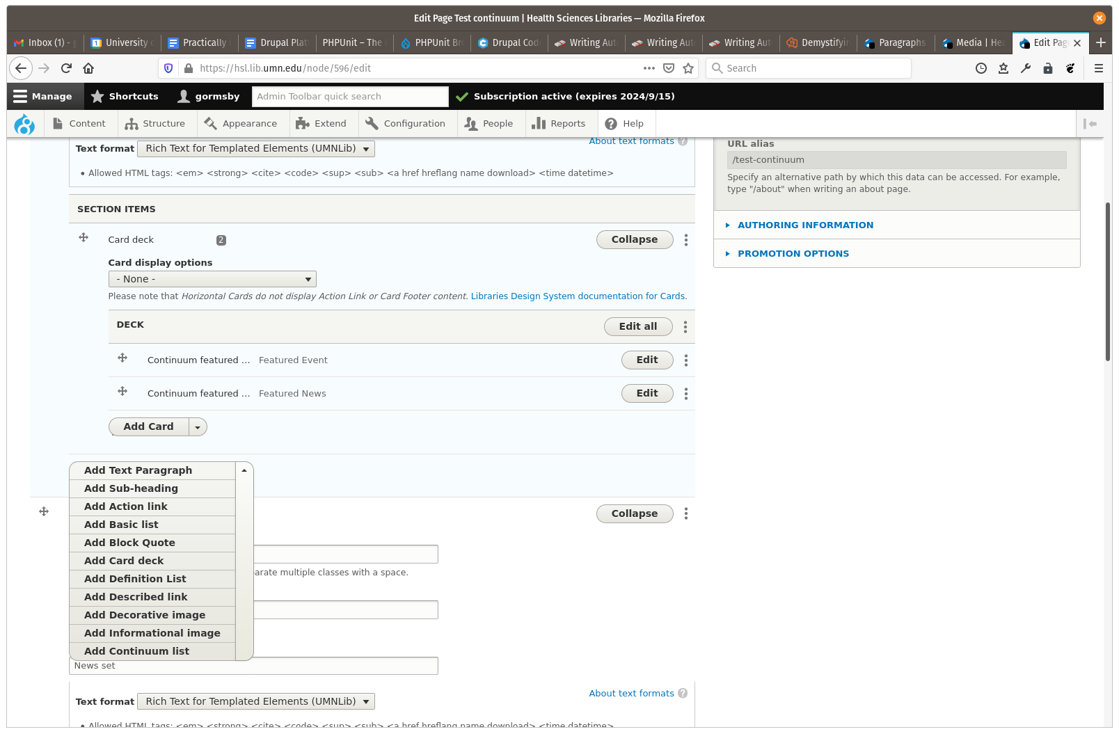 Figure 7. Within a content section, editors may insert certain types of Paragraphs. Here, a card deck is already added (with sub-elements). The dropdown menu shows other allowed Paragraph types suitable for adding to the section. The content section, shown, is in turn a sub-element within the page’s “body” field.
We developed a suite of Paragraph types that mirrored many of our design system components. Thus, we could provide, for example, an “informational image” Paragraph type that included fields both for displayed content (the image, the caption, and the image credit) and for display options available to content editors (such as alignment and relative width (Figure 8). The User Interface Developer and Drupal Developer spoke frequently about the nuances of the theoretical code and how to apply the options in an authoring interface. How much control should the author have, what were the options built within each component, and how were these decisions best communicated to the people who would use them?
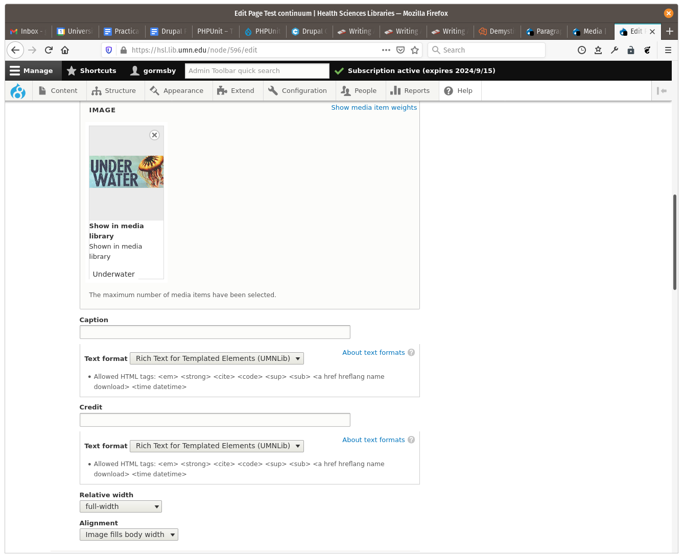 Figure 8. After choosing to add an informational image, the options for the informational image Paragraph type are available.
Conforming Drupal template output to design system goals
Drupal’s model for rendering web content is to use multiple nested template files, written in the Twig templating language. Broadly, the template files provide the HTML markup, and Drupal sends content variables into the template to provide the content within that markup. By design, a system of precedence based on template file names allows individual Drupal themes and modules to override default templates at nearly any level, from the HTML wrapper (<head> and <body>) to individual content fields. The Paragraphs module, tailored to match our design system, also provides these template suggestions, allowing us to customize output for each Paragraph type.
We went one step further, however. To make the relationship of Drupal templates with our design system component more clear, we made the mapping explicit. To do this, we used another Drupal module called Component Libraries. This simple module allows the declaration of a new theme template namespace, “components,” that can be referenced by Twig’s “embed” functionality. With this module in place, we could map files named for standard Drupal template suggestions (“sources”) to files in our “components” directory within our theme (“targets”). This also allowed us to make the component templates cleaner and abstract (Figure 9), while using the source files to transform content values coming out of Drupal into values that fit the more abstract “target” implementation (Figure 10).
 Figure 9. The full “components/image/informational-image.html.twig” file. This implements our design system pattern for an informational image. It has clear expectations of what it is receiving for data, and logic is limited to testing whether a rendered value exists or not, where that affects markup.
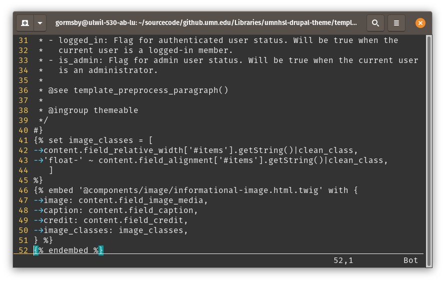 Figure 10. An excerpt of “templates/paragraphs/paragraph–informational-image.html.twig”. We turn user-editable “content” values for relative width and alignment into values better suited for use as HTML class names (lines 41-45), which is what our abstract design component expects. The “embed” code block (lines 46-52) specifies which component template to use and maps variables sent into the “paragraph–informational-image.html.twig” template to those it will send forward to the design component template.
Aligning different Drupal content sources
Not all Drupal content comes from Paragraphs created by content editors, however. Content may also be sent to a page by Views (Drupal’s query builder for listing site content), by Blocks (pre-configured content not bound to a single page), or by Drupal modules, such as those that harvest events or news feed data. Any of these sources for data may be passing in content suitable for various design system components.
Fortunately, our use of the Component Libraries module to send data from a specific Drupal source template to a target component template provides a solution: any number of Drupal instance templates can route to a single component template. Each specific instance template will likely have different inbound data. For example, an HTML class selection may originate as a “yes”/”no” checkbox value in a content field in one source or as a hard-coded value in a PHP array in another source. The instance templates can manipulate these different kinds of incoming data to fit the expectations of the target template. As the abstract design system components evolve, we need only update the corresponding Drupal files in one place: the templates under our ‘components’ namespace.
User response
Launched in January 2020, the new HSL site takes a bold and user-driven approach that incorporates our design system’s core principles of accessible, ethical, inclusive, sustainable, responsible, and universal design. Significant changes include a “menu-less” design (navigation sections link to the home page, with additional no drop-down links), no hidden content, links to form actions from the homepage, the search box on every page, and information in context (e.g., the makerspace page includes makerspace workshops, news, events, staff).
We love that the site presents our entire library to users at-a-glance, which helps them have a better understanding of the breadth and depth of our work. The usability study and other feedback post-launch suggest that users love it too — even though 80% of our web pages were removed as part of the redesign process. We had very little feedback from HSL staff (making the old catalog interface available, allowing color photos for staff directory), very little feedback from the broader Libraries staff (one comment related to aesthetics), and very little feedback from users (one comment about a database that was removed from the homepage). Additionally, the post-launch usability study showed good use of the site’s search capabilities, good task completion, and successful navigation through the site (Figure 11). The usability study also showed that clear content buckets added context to users for ambiguous terminology (e.g., services and resources).
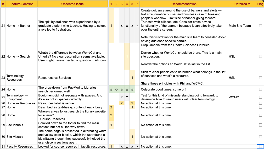 Figure 11. Usability study results (excerpt).
Conclusion
When implemented, the principles-based design system proved to be critical in our bold and user-centered approach across our code, content, and design. The new site demonstrates the highest levels of usability, accessibility, inclusiveness, and sustainability. It meets and exceeds WCAG 2.1 AA guidance and also cognitive and learning considerations. Analytics from Webpage Test and Website Carbon Calculator demonstrate that our site is [15,16]:
- faster (fully loading in 1.37 seconds),
- more sustainable (nearly carbon neutral, could offset with 1-2 trees planted / year); and
- lean (the size of our new homepage is less than 15% of the previous homepage).
Additional performance statistics show that our new site:
- moved from 62 HTTP requests to 14 over HTTP/2;
- reduced the total homepage download from 1,478Kb to under 203Kb or less;
- reduced the number of triggers for DOM repainting;
- reduced the number of pages that load JavaScript (one bit of inline JavaScript is used for the Chat link on every page); and
- passed the Google Lighthouse Performance audit with 100%.
These data points demonstrate that the application of our design system to the HSL site has aligned the site with our core principles. As a result, it better supports all users regardless of their abilities, attention level, mental status, reading level, and strength of their internet connection, all of which are especially critical now as an elevated number of people experience crises, anxieties, and depression.
Notes
[1] Health Sciences Library. [Internet]. c2020. Minneapolis (MN): Regents of the University of Minnesota; [date unknown] [cited 2020 Dec 8]. Available from: https://hsl.lib.umn.edu
[2] Keith, J. Design systems. [Internet]. 2018. Adactio; [cited 2021 Jan 21]. Available from https://adactio.com/journal/13844
[3] Preston-Werner, T. Semantic versioning 2.0.0 [Internet]. [date unknown] [cited 2020 Dec 8]. Available from: https://semver.org
[4] Boynton Health [Internet]. 2018. Health and health-related behaviors University of Minnesota – Twin Cities Students. Regents of the University of Minnesota. [cited 2020 Dec 8]. Available from: https://boynton.umn.edu/sites/boynton.umn.edu/files/2019-09/CSHS-2018-UMN-Twin-Cities.pdf
[5] Boynton Health [Internet]. 2020. Results from the Modified College Student Health /COVID-19 Survey. [cited 2021 Jan 21]. Available from: https://boynton.umn.edu/sites/boynton.umn.edu/files/2020-11/CSHS-COVID-19-survey-report.pdf
[6] National Council on Disability. 2015. Briefing Paper: Reauthorization of the Higher Education Act (HEA): The Implications for Increasing the Employment of People with Disabilities. [cited 2021 Jan 21]. Available from: https://ncd.gov/publications/2015/05192015
[7] U.S. Department of Education, National Center for Education Statistics. 2020. Fast facts: Graduation rates. [cited 2021 Jan 21]. Available from: https://nces.ed.gov/fastfacts/display.asp?id=40
[8] SuperFriendly Co. Classes: Make Design Systems People Want to Use [Internet]. c2012-2020. SuperFriendly Co; [date unknown] [cited 2020 Dec 8]. Available from: https://superfriendlydesign.systems/classes
[9] Drayer, A. Principled web design [Internet]. 2018. [cited 2020 Dec 8]. Available from: https://z.umn.edu/code4lib-issue50-artifact1
[10] Shopify. Polaris [Internet]. [date unknown] [cited 2020 Dec 8]. Available from: https://polaris.shopify.com
[11] University of Minnesota. Folwell [Internet]. c2019. Minneapolis (MN): Regents of the University of Minnesota; [date unknown] [cited 2020 Dec 8]. Available from: https://folwell.umn.edu
[12] van Gennep A. 2001. The Rites of Passage, trans. Monika B. Vizedom and Gabrielle L. Caffee. Chicago: University of Chicago Press.
[13] Drayer A, Neveau J. 2019. Through the looking glass: Overcoming self-centered content. University of Minnesota Libraries. Minneapolis, MN.
[14] Wachter-Boettcher. 2018. Coaching content strategy: How to turn any colleague into a content ally. Confab. Minneapolis, MN.
[15] Catchpoint. [date unknown]. Webpagetest: Test a website’s performance. [cited 2020 Dec 8]. Available from: https://www.webpagetest.org
[16] Wholegrain Digital. [date unknown]. Website carbon calculator [Internet]. Strand (London): Scamper Ltd. [cited 2020 Dec 8]. Available from: https://www.websitecarbon.com
About the authors
Erinn Aspinall (aspin005@umn.edu) is an Associate Director at the University of Minnesota Health Sciences Libraries where she works to ensure that users have a consistent experience across the library’s full range of services. Erinn holds an MSI from the University of Michigan School of Information, and has interests in organizational development and continuous process improvement.
Amy Drayer (adrayer@umn.edu) is a User Interface Developer at the University of Minnesota Libraries where her work focuses on developing web interfaces utilizing inclusive design principles, usability, accessibility, and optimization tools to deliver user-oriented experiences. Amy has a masters degree in library and information studies from the University of Wisconsin-Madison.
Gabe Ormsby (gormsby@umn.edu) is a Web Developer at the University of Minnesota Libraries, where his focus is on maintaining the Libraries’ Drupal-based websites and integrating them with other library tools and services. He holds a Bachelor of Arts from Gustavus Adolphus College.
Jen Neveau (jneveau@umn.edu) is the web content strategist for the University of Minnesota Libraries. She’s been working on the Libraries websites since 1996, in a variety of capacities, including design, development, & usability testing. Jen serves on the board of the University of Minnesota Communicator’s Forum, is co-chair of the Libraries DEI leadership committee, and holds an advanced certificate from the University’s Office of Equity & Diversity.

Subscribe to comments: For this article | For all articles
Leave a Reply