by David Schuster
Power BI Introduction
Libraries are constantly trying to manage statistical evaluation of their services and proving value to their organization. Vendors have put together platforms to gather library statistics for a fee, and libraries have attempted to use different tools to visualize their collective data using R and Tableau, but the tools seem to come and go. Few libraries have explored using Power BI, a Microsoft tool that most universities already have a license for through their institutions.
Purpose
In 2021, Binghamton University Libraries started a Strategic Planning process and set up several task forces to gather information about the library to help inform future decisions. One task force was charged to gather and look at data throughout the library. During the month-long exploration, they discovered lots of data silos across the library. The challenge was getting access to the data in a timely fashion, collecting the data, massaging the data to make it useful, and then looking at analyzing that data. The group was very successful in identifying the silos, but that was about as far as they could get in a month. At the time, there was no way to connect the disparate data let alone analyze and make any analysis of it.
Once the Strategic Plan had been put in place, the Library Systems Department began looking at how this siloed data could be presented and gathered in a more user-friendly way. SAS, Tableau, RStudio, SQL database possibilities, and Power BI were all examined and evaluated for pros and cons. Power BI was selected as a possible solution, as it has many tools and the campus already had a Microsoft license, so unlike other products that would cost thousands for connectors and manipulation, Power BI for Premium users, based on the campus contract, was only $100 per Premium user which the libraries paid for two users. We chose to do this as it allowed for additional features we would want in the future, such as Dataflows, DirectQuery to databases, ability to refresh more than eight times a day, Query caching, and the ability to share dashboards with anyone by publishing them to a web server.
As part of our Power BI evaluation, we discovered Power Automate allowed us to capture email attachments from the library automation system (Alma) and other systems. Binghamton University selected Google Workspace for all of campus Email, so using Power Automate is not just a Microsoft option. Power Automate looks at an email inbox and when a specific subject line comes in, it captures the attachment and stores it as directed in the automation setting (SharePoint, folders, file shares, etc.). has the ability to read an entire folder and capture the data on a routine basis. As the data is captured, you can perform ETL (Extract, Load, Transform) automation for formatting of the columns and normalizing the data as needed for future data imports.
In this paper, we will discuss in more detail some of the challenges that were encountered, along with the success we have discovered in our desire to become data-driven.
Pilot
For our pilot, the author and the library systems server manager identified some of the data we wanted to gather and how it was going to be delivered. We decided it was going to be easier to pull regular reports out of the Alma library automation system that could be emailed to a generic email address. Then Power Automate would grab those attachments and place them in the appropriate folders based on the subject line. We were already sending weekly circulation transactions and adding new users to the patron database and explored what data might need to be adjusted. We had already sent “academic” information to our Alma library system in the user record that showed the department, college, semester, degree, user group, and if they were a transfer student, along with their student ID information. Being able to export that information as a table was vital to being able to connect a lot of our existing data to build meaningful reports.
One of our first dashboards shared data on physical library circulation and the physical collections being used.
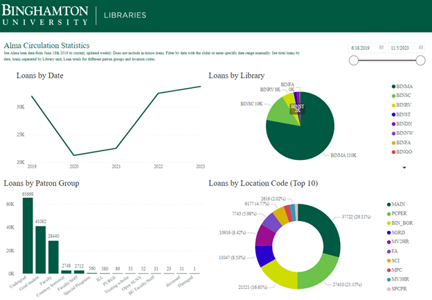
Figure 1. Dashboard of Circulation Statistics for the collection from 2019-present
From this dashboard, we can adjust the date range with a slider, see who the most active user group is within this timeframe, check activity by library location, and the collection breakdown. We have ILLiad integrated with Alma and from this donut diagram, you can see BIN_BOR (which is our location code in Alma) is about 16.61% of all circulation of physical materials for this almost 5-year timeframe, along with PCPER being 21.25% (these are the miscellaneous items we circulate from the circulation desks such as laptops, phone cords, whiteboard markers, phone cables, battery banks, etc.).
Starting in 2020 (during COVID-19), our number dropped drastically. As we gradually reopened in late 2020, our usage numbers are coming back up as you can see with the Loans by Date line chart in Figure 1. We calculate the year based on the university’s academic calendar, so the 2023-2024 academic year started in July so our data (as of November 2023) has surpassed the data from the 2022-2023 academic year. If you click on any particular segment of a visualization in the dashboard, PCPER as an example in the donut, it adjusts the other visualizations on the screen to help see how that impacts the other visualizations.
With this success, we started to look at other statistical needs. What about drilling down more into the Library of Congress (LC) call numbers and their relation to circulation use?
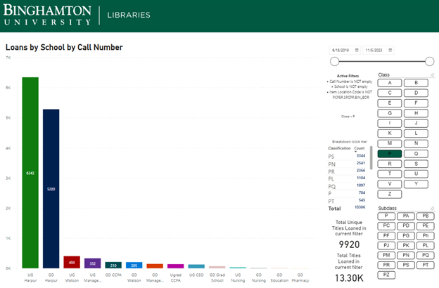
Figure 2. This visual allows you to interact with the classifications to see how parts of the collection circulate and the user groups that are borrowing. It even allows you to break it down further by subclass.
Again, in Figure 2, date slider at the top right, and the bar graph indicates the College and Undergrad Graduate category of the circulation. UG Harpur is our College of Arts and Sciences, and the Library of Congress P classification (Language and Literature) is heavily used in that area. We can add call number ranges by clicking on the letters, or even drill down by clicking the subclass within a particular letter at the bottom.
This was spectacular information! We can see exactly what areas of the libraries are more actively used than others and by whom.
We can evaluate collections by language, author, LC Classification code – we have the data, so we just need to know how librarians want it broken down as seen in Figure 3.
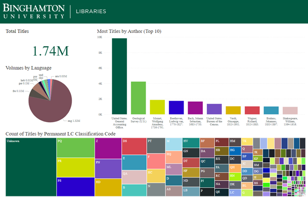
Figure 3. Collection analysis based on Authors, Call number, and language
A different set of data we have brought into Power BI are the library in-person gate counts (we have ceiling mounted counters that determine in and out direction of the moving blocks of people and is very successful in counting) which are more accurate than the security gate count. The beauty of Power BI is its ability to take an Excel spreadsheet or connect to an SQL database and allow you to determine the fields you want in the visualization. Figure 4 shows that for the time period 1/21/2021 through 11/8/2023 period 14 is the busiest time of day (or 2 pm) across the libraries except UDC. Bartle Library generally opens at 8 and is open until 2 am most days and is the largest library. The science library in purple is the second busiest library. From this interactive visualization, you can click on any part of it and Power BI will display specific data for that bar. At this point again you could use the slider to adjust the date period or even look at specific days of the week to see traffic patterns. The day of week being a number, and the hours being in 24 hour time is little awkward. That is how the data comes out of the counting system, but we could change the labels in Power BI to make it more user-friendly.
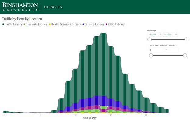
Figure 4. Gate counts for all locations, hours, and day of week (Military time, and days of week numbered 1-7)
Technical
In order to publish dashboards and use Power Automate, the Premium license is needed. Our campus has a Microsoft license but the libraries had to purchase them for the two users that were “designing” the visualizations and publishing them for the library. Power Automate is built in as part of the Power BI desktop, but has limited functionality without the Premium license, there is now an Office 365 version of Power Automate as well.
Initially, we ran a report with the following data fields from the Alma Analytics library automation system:
Normalized Call Number, Permanent Call Number, Permanent LC Classification Code, MMS Id, OCLC Control Number (035a), Title, Title (Filing), Author, Publication Date, Publisher, Resource Type, Language Code, Record Format
Then we automated the sending of this report limited by date added to capture new materials weekly to build the dashboards. As reports are run, the attachment is automatically added to the appropriate folder via Power Automate and then Power BI picks up the new data when Power BI is loaded.
Circulation fields (Fulfillment) fields we use for pulling data out of Alma in CSV format to load into Power BI.
Loan Date, Primary Identifier, User Group, Call Number, Barcode, Loans (Not In House), Item Library Code, Item Location Code, Circ Desk Library Code, Return Date, Publication Year, Renewal Date, Due Date, Renewals, MMS Id
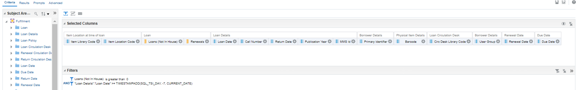
Figure 5. Screenshot of the report that is automated to update Power BI weekly with new circulation data
For ongoing reports, we use this Alma Analytics filter:
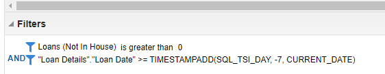
Figure 6. Screenshot of the filtering in Alma Analytics to just get new circulation transactions
For patron data, we use the following fields (Users subject area) in Alma to generate reports to generate data related to users.
Primary Identifier, User Group, Statistical Category 1, Statistical Category 2, Statistical Category 3, Statistical Category 4, Statistical Category 5, Creation Date, First Name, Last Name, Expiry Date, Identifier Type, Identifier Value
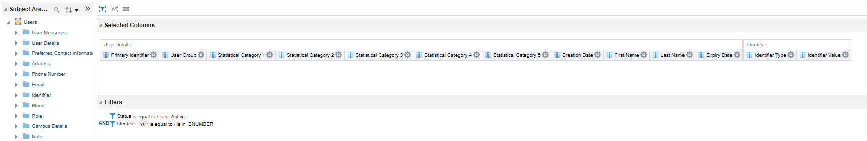
Figure 7. Screenshot of Users report in Alma Analytics to pull updated information about users
The Pbix (Power BI Desktop File format) files we are using are linked at the end of the article.
Future and Next Steps
After demonstrating that the pilot was a success and that we could build reports of this nature, we wanted to make the reports available to staff. The problems with that are anonymizing the data, and installing a Microsoft Gateway (which is free to download and install either on a PC or a web server). The gateway allows reports to automatically get refreshed and embed on another webspace. We can publish reports to a web server, but if you don’t have a Microsoft Gateway, they are static reports unless the desktop report is refreshed and republished.
We have successfully connected our ILLiad database to Power BI directly for the most current data out of the ILLiad database. With this, we are now able to join two ILLiad tables to get call number information about what our patrons have borrowed by call number, along with what libraries we borrow the most from, all in pretty visuals.
We have begun to explore our EZproxy data and how we can visualize it. The log data is complex, and we have 30 GB worth of data in 2023. We are now using an Microsoft SQL Server to ingest the EZproxy data for us to use Power BI with. We have developed a PHP script to process the log data into the SQL database which makes it available in a table structure for Power BI to query.
We continue to explore other datasets that we can bring in and join especially those that may have identified user data. We are using a hash as part of a Power Automate process before the data is fed into Power BI for display ensuring anonymization of user data.
In conclusion, we feel that Power BI has great potential and we will continue to explore using it and building new dashboards. We are exploring how the dashboards we have created could be shared for others to potentially drop in their data. Microsoft continues to build out what they are calling Power Tools, adding features along with enhancing existing service. This tool is not discussed much in the library literature, but we have been very pleased with our pilot data gathering and visualizations. We are formalizing how we will be using it and expanding our dashboards.
Many thanks to Jesse Russell, Library Systems Specialist, Binghamton University on this project.
Instructions
To try this out with your data –
1. Generate files with the same Alma Analytics structure as noted above, and save them as:
CircStats.csv to c:\temp (c:\temp\CircStats.csv)
Almabibs.csv to c:\temp (c:\temp\Almabibs.csv)
2. Download Power BI to your computer – you do not need a premium license.
3. Go to this website: https://orb.binghamton.edu/librarian_fac/91/
4. Download the file C4L.pbit, and the C4Lbibs.pbit which is further down the page.
5. When you open the C4L.pbit file in Power BI, it will prompt with a drop down – you can select “Sample” and it should load the file from your temp directory from above.
6. To look at the C4Lbibs.pbit file, open that file in Power BI and it should load the Almabibs.csv file as saved above.
Correction
5 February 2024: The first published version of this article linked to two Microsoft Power BI files containing circulation data. We, the editors of the Code4Lib Journal, sincerely apologize for the incident in which Personally Identifiable Information (PII) was released. More about this, please see Extra Editorial: On the Release of Patron Data in Issue 58 of Code4Lib Journal.
About the Author
David Schuster has been working at Binghamton University, leading various units. A few of the departments he has led are Special Collections and Preservation, Technical Services (Cataloging and Acquisitions), Technology, and Digital Initiatives, which include Scholarly Communications and Digital Scholarship. In his 30-year library career, he has worked in and been involved with School Libraries, Public Libraries, Academic Libraries, and has worked for a vendor. These experiences make him a well-rounded individual with concerns relevant to all types of libraries. He has a bachelor of science in Business Management with an emphasis in computer science, with an MLIS emphasis on Technical Services from the University of Missouri Columbia. He is interested in strategic alignment, leadership, and access to resources – how people access information. He enjoys gardening, reading, glamping in their camper, and playing with his Westie, Stella.

Subscribe to comments: For this article | For all articles
Leave a Reply