by Jonathan Bradley
In the spring of 2022, the University Libraries at Virginia Tech (VT) opened its Prototyping Studio to the VT community and public writ large. The space provides large machines like CNC milling machines, over a dozen 3-D printers, vacuum forming machines, a pick-and-place machine, and others, but in addition, the space provides access to thousands of hand tools and consumable items, everything from microelectronic components to fasteners. Given the huge scale of the number of items kept in the Libraries’ inventory and made available, organization and record-keeping quickly became an issue for the space. However, this issue existed both for us as the maintainers of the space, who needed a way for the studio’s student workers to know where to return items left out in the space and understand when tools go missing or consumables are running low, and for the studio’s patrons, who needed to be able to quickly locate the tools or search for options when they may not be sure what tool they need for the given situation. We set out to build a visual map and searchable inventory of the items in the space that could be made available on a public kiosk for patrons and employees to use.
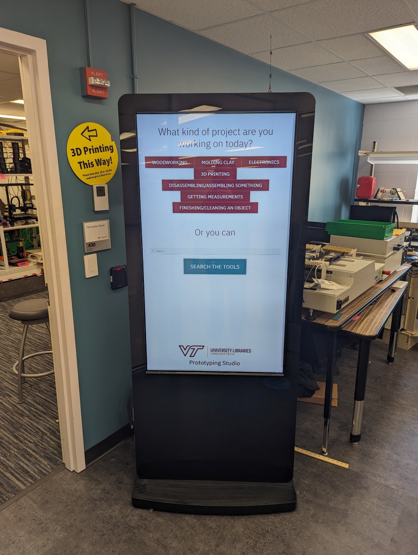
Figure 1. A photo of the tool finding kiosk in the Prototyping Studio in Newman Library
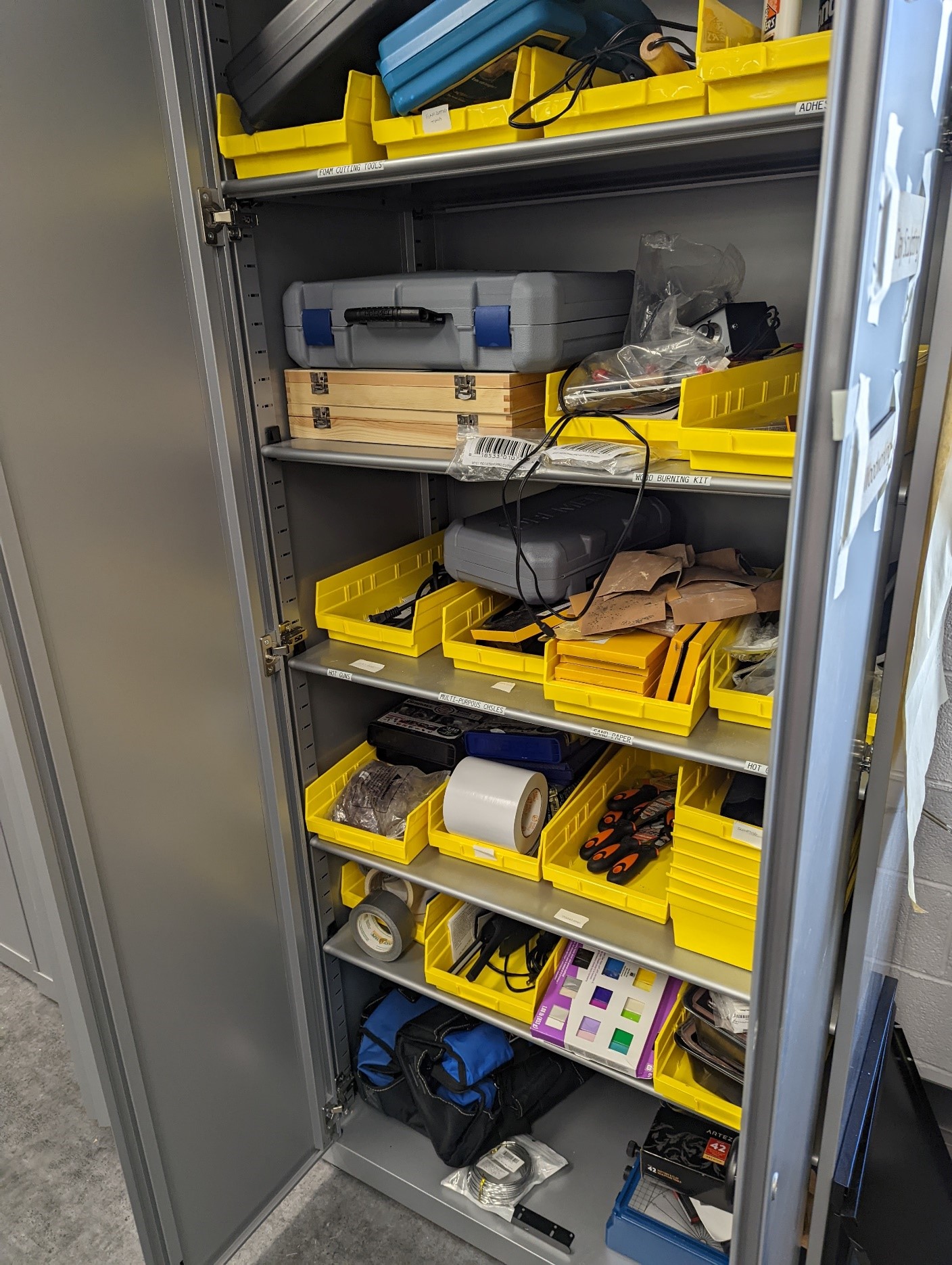
Figure 2. A photo of one of the cabinets in the Prototyping Studio, complete with tool baskets
The Data
A frequent problem that I’ve faced over the years building applications or systems for use in VT’s libraries is how to handle the fact that very often non-technical people are being asked to maintain the data. This drastically narrows the field of approaches that are viable. Many ways of manipulating data that a developer might be comfortable with are well outside the reach of the average user, and ease of use is also a huge factor in getting people on board with your solution, particularly when those people are student workers. One option is to build a back end structure and interface for a database that allows users a GUI to work with, but there is significant overhead with an approach like that, such as building authorization and authentication methods and maintaining them and asking people to go to one more new location as part of their jobs. I’ve used this approach over the years, but recently I’ve decided on a different approach for new projects that has been working really well, and that is just using a Google Sheet.
I primarily build web applications, so I prefer my data coming in as JSON data. A Google Sheet can be published to the web as a CSV file, which can easily be converted to JSON data using a library like Papa Parse. This makes getting data a single fetch call away with minimal setup, and while there are downsides, the benefits are numerous.
Some of the downsides include lack of type verification on data fields, relying on Google’s existing structures and distribution mechanisms staying constant, and the ability for users to put invalid data into the sheet. We have run into all these issues while using Google Sheets in this way; we’ve had students and staff put a type of data into a field in the spreadsheet that isn’t what we are looking for and it causes a problem on the front end. Usually, this sort of issue makes itself known quickly, and luckily Google Sheets maintains a history so you can see who made the change and undo it quickly and easily. I often put comments on fields to let people know any rules I need them to follow about putting data in a field, or, if it becomes a recurring problem, I will put data validation rules within Google Sheets on a column to try to cut that behavior off before it can keep popping up. Honestly, though, this rarely comes up, and when it does, it is usually a matter of sending a message to the user who put the data in wrong, explaining what you need from them, and it usually doesn’t happen again.
We’ve also run into the issue in the past of Google changing its APIs or altering the way URLs are generated and by extension breaking something in the system. But this is simply a product of relying on cloud infrastructure, and we’ve had these same issues arise using other systems from different vendors that were supposed to be designed for this sort of work. Generally, I just update the code to accommodate Google’s changes and move on, and this happens very rarely. In the years that I’ve been setting up spreadsheets to act as data sources this way, I’ve only run into this once.
But despite these issues, the benefits are immense. Google’s infrastructure already has methods for authorization and authentication, and those methods are well-tested and maintained and already available to users for accessing the sheets and controlling permissions. The interface is also very familiar and easy to use for library employees. I have yet to run across the student worker or staff member who couldn’t update and maintain a spreadsheet, and the value of familiarity is often vastly overlooked when preparing systems like this. Finally, the simplicity of using a spreadsheet in this way in comparison to something like setting up a database infrastructure with API and authentication controls, is an enormous boon for small projects. I can have a data source ready for an app in less than 10 minutes.
Would I recommend an approach like this for a large complex app, or one in which data integrity was important? Absolutely not. But for small projects, particularly the public kiosk or service point assistance apps like the ones I’ve used it for in the past, it is a very easy method to get a working app online that requires very little upkeep and overhead while also allowing other non-technical users to maintain the data.
For the tool finding app, the studio’s student workers and staff for the space maintain a Google Sheet that was designed by myself and the space manager. It includes all the fields they needed for inventory purposes and those I required to make the app work, and once established, we’ve locked the structure so none of the other staff could alter it. If it is decided that new columns are needed, we can add those in a way that doesn’t break anything, and since I don’t have to use all of the fields available in the sheet, they can also include additional information that we don’t show on the public kiosk, like when we last ordered the tool or consumable, which is valuable information for us in record keeping and maintaining the service, but not so much for a patron trying to find a hammer.
In the past, I’ve been asked how we handle data that we might not want exposed publicly, since publishing a sheet means others could access the URL. The first argument I have is, if you are using it in a public app, you have already made the data available to the public via the app itself, so you should make sure any data that is there is safe to be shared in this way. The fact that someone can access the CSV data from the spreadsheet is moot; anyone who knows what they are doing could have gotten that data from your app anyway.
But what about the scenario in which you want to keep information in the spreadsheet, information you need as employees, but that you don’t want the public to have? In this situation, we have created a second sheet in the Google Sheet and mapped only the fields that we want to make publicly available in the app into this second sheet. Google Sheets allows you to only publish a specific sheet when deciding to publish the CSV data, so this way you can release only a subset of the total information you are keeping for your records if need be.
The Front End
For the front end of the app, I went with what is quickly becoming my default solution for small apps: Svelte. As a note, I am using Svelte and not SvelteKit, as I don’t feel like for these small projects, many of which only have one or two pages, I need the extra infrastructure, and by extension overhead, that SvelteKit offers, though I would definitely consider it for a larger project.
I used to build these sorts of applications in React, and consistently found that React, especially if I needed global state via store management, was just a lot more complex than what I needed for my projects. Svelte, on the other hand, has a small setup process, and store management is far simpler than with a framework like React, providing benefits like two-way data binding without the additional features that are really targeted toward a much larger app. It also doesn’t hurt that Svelte is a lot easier to learn and looks a lot more like regular HTML, CSS, and JavaScript (JS), than React, and I am confident that if needed a new programmer in my organization could look through the code and gain an understanding of what is going on without much trouble.
The app is composed of six components, a main App component that controls which of the other components are on display and handles initial data fetching, a footer, a greeting page, the Scalable Vector Graphics (SVG) map of the shelving, and a table or catalog view for combing through the available tools.
The footer is simply VT libraries’ logo lockup–a special version of Virginia Tech’s logo with an additional text treatment created by the University Relations department to include “University Libraries” as part of the logo–which is displayed at the bottom of every screen. The app component contains logic for switching between different views of the app. When the app is loading and the data is being fetched, it displays a loading spinner. It then has three switches for whether to display the greeting page, the table, or the catalog. The app loads the greeting page by default, which was a suggestion by a member of our libraries’ communications team who thought it might be nice for patrons to see a very short explanation of what the kiosk is for and presenting them with some prefilled search options instead of always expecting them to type in the search box. The app asks patrons what kind of project they are working on, and provides some buttons with common project types the Prototyping Studio receives, such as woodworking, electronics, 3D printing, or measurement. Libraries’ staff intend to do some usability testing on the app, and these suggestions are one of the areas my unit are hoping to get feedback on. Are these categories helpful? Are there categories that definitely should be included, or should we reword those we have?
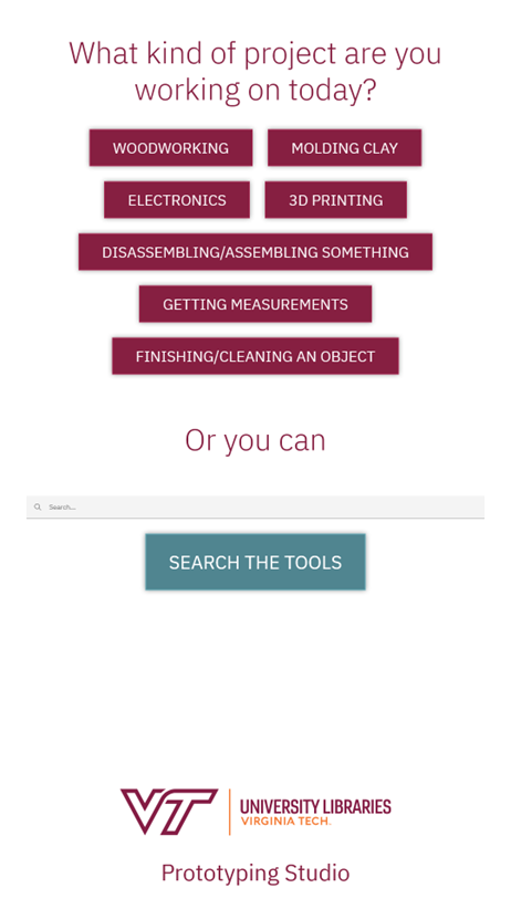
Figure 3. A screenshot of the welcome screen of the kiosk app, including footer
In addition to prefilled buttons, patrons also can just go ahead and search for tools, and if they click the search box an onscreen keyboard appears. Whether they use the search functionality or prefilled options, the system takes them to the next screen, which is a combination of the map of the shelves and the catalog, which is the default view method. Users can then switch to a table view by using a button in the top right-hand corner if they choose.
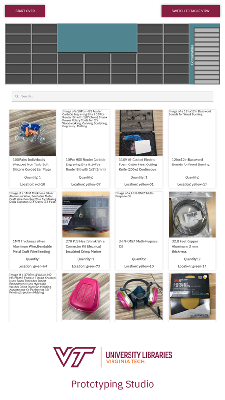
Figure 4. A screenshot of the catalog view of the app
Both the table and the catalog use two-way data binding with the search field to filter out results, and the filtering function is a custom one that searches specific data fields chosen by myself and the space manager.
The primary difference between the two display methods is that the catalog shows photos of the tools in question, and the table is more compact and displays more information at once. We chose the catalog to be the default view because the initial reaction from patrons was that they appreciated being able to confirm if the tool was the one they needed by looking at it, but which view should be the default is something we plan to look at during the usability testing.
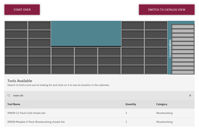
Figure 5. A screenshot of the table view of the app
The final component, and by far the most complex one from a coding perspective, is the map of the shelving. It displays at the top of the screen regardless of which view you are using and by default displays a vector graphics facsimile of the shelving and storage we have in the space. By default, all the shelves are empty. However, when a patron taps a tool on the touchscreen, either via the table or catalog, a location highlights on the shelving for where the tool should be. This highlighting takes the form of a color-coded storage basket, which is how we store the vast majority of the tools. This visual indicator is intended to immediately tell a patron something along the lines of, “the tool you are looking for is in the last cabinet on the right, second shelf down, in the red basket.” By extension, this system can also be used by the studio’s own student workers when trying to return tools to the cabinets that have been left out.
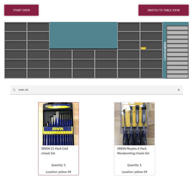
Figure 6. A screenshot of an item in the catalog selected and the resulting storage basket appears
For the most part, the front end of the code is fairly standard single-page application (SPA) running Svelte, and its primary interest lies in the control of the SVG file that the map is made of.
The SVG
During development, a rough prototype of the needed SVG that I created was used for testing purposes, but the final production graphic was created by a library employee with a design background and skill in working with vector graphics. The file was created in Inkscape, a free and open-source vector graphics program that is very good at creating files for use on the web, unlike Adobe Illustrator, which often produces malformed SVG files when exporting. During the process, I talked with the designer about the requirements of the file. It needed to have a separate layer that contained all the background shelving elements. In the studio space, the shelving has doors attached, but we chose to omit them in the graphic as they caused additional visual noise that we didn’t want the patron to have to deal with. In addition to the background layer, we needed another layer containing all the baskets, each one a separate object with a unique id and an id attached to the entire layer. The designer ended up putting together one basket design and just copying it, changing the metadata information, and editing the color information for it when needed. They also needed to go through and place all the baskets on the shelves where they appear in real life. This was a significant amount of work, but luckily was one-time work, and barring some sort of very large overhaul of the studio’s organizational structure for the space, should only need maintenance moving forward.
The ids for the baskets is what makes all of this possible. Each one has an id similar to “blue-01” and “blue-02”. These ids are all also used in the spreadsheet of data on the back end to indicate which basket a tool is located in. The layer that contains all the baskets also has an id of “baskets” so it can be accessed directly. For those unfamiliar with working with SVGs, these ids, classes, and other elements are all treated like HTML elements when loaded in the browser, though this only works if you load it in specific ways. For example, loading the SVG file using an <img> tag will result in you being unable to access the ids within the SVG the way you would any other HTML element. However, simply copying the content of the SVG file into the HTML file makes all its elements available for dynamic manipulation. Luckily, Svelte offers an {@html …} template option that will take whatever content is provided and drop it in as HTML, meaning we can load the SVGs into variables using import syntax and then drop them into the HTML where they belong. The benefit to doing it this way, in addition to the SVG being available to the CSS and JavaScript, and being able to handle files programmatically instead of hard-coding, is that we can leave the SVG as a separate file that can be edited and maintained as a modular component and, perhaps most importantly, tracked by git in a repository. SVG files, unlike raster image types like jpg or png, are a plaintext set of instructions on how to create the graphic, not a series of data points on which pixels are which color, meaning they mesh very well with a git and plaintext workflow, allowing you to see the specific changes happening to the file over time via a git diff.
When the tool-finder app is loaded, a bit of JavaScript cycles through all the child elements of the id “baskets” and changes the visibility of all those elements to hidden, meaning the user is presented with an empty set of shelves. When a patron taps on a tool either in the table or catalog view, we grab the id that is associated with that tool (included in the data from the spreadsheet), find the element with that id in the SVG file, and change its visibility to visible. Thus, the user gets a dynamically changing set of shelves that can show any one of the potential locations for tools based on the spreadsheet data.
Finally, after a period of inactivity on the page, we reload the page to reset the system for the next patron using a standard JS setTimeout() function.
Challenges
This project presented several challenges, but few were actually the product of the code and instead more the logistics of setup. Since working with SVGs is so easy with HTML, CSS, and JS, the code to provide the expected behavior was done fairly quickly. However, we have had some issues with how the project appears on the kiosks. The code for the project is being served on a standard LAMP stack cPanel server owned and maintained by the University Libraries, and the kiosk just loads the URL in a kiosk browser for display in full screen mode. We’ve done this for most of my unit’s public service applications and it works really well, but the lingering problems that come up are two-fold. The first is on-screen keyboards. It can be hard to get an on-screen keyboard on a kiosk to show up in the right area and not block important information, and this project was no exception. This, however, can be solved with a trial-and-error session with the University Libraries’ IT hardware team. The second problem that often arises is the browser on the kiosk. I usually test the application on my computer in different browsers using the resolution of the kiosk we have purchased, but each kiosk is a little different in terms of the operating system on the device, and some have their own versions of browsers or particularly old versions of browsers on them, so getting everything to look and behave just right is always a bit of trial and error as well once it is on the specific machine it will run on.
The other major challenge has been the data for this project. The spreadsheet is complex and the number of items we have that need to be tracked is quite large, roughly 325 discrete types of items and thousands of individual pieces when small consumables are considered. And this number is continuing to grow. It is maintained by student staff, part-time wage, and one full-time employee, and the result has been a need for ongoing improvement. Items including long or unhelpful titles, poor tagging, and lack of photos for some equipment have resulted in a struggle to have the information presented in a helpful manner that is easy to search, but this is a problem that will improve over time as more people work on it.
The Future
For the future of this project, in addition to improving the overall data that feeds into the system as mentioned above, we have two main ideas we’re planning to pursue. One is the need for usability testing, mentioned earlier, with the hope that we will get feedback to help improve the interface and maybe make the whole system more attractive to patrons as they enter the space. The testing is currently scheduled for the end of the University’s Fall 2023 semester, so we may have improvements implemented by Spring 2024 if all goes well.
The second goal for the future is to add a mechanism for finding machines outside of the shelving storage system. We have machines like the CNCs and 3-D printers that aren’t on the shelves, but people may be interested in. The goal right now is to add an icon to the SVG map of a person with a speech bubble that says “Ask an attendant” that will appear when a patron has selected a tool or machine that requires special assistance, so they don’t keep searching needlessly. This feature will also provide the Prototyping Studio an option for handling items in the inventory that don’t have a location currently because they aren’t on any of the shelves but need to be kept track of by staff.
This system is currently in production and seems to be helpful for patrons. As time passes, we will continue assessing if using the kiosk is actually helping guests; for example, do repeat users of the space who used the kiosk once use it a second time, or is it viewed as not worth it? The project is very much an experiment in how digital interfaces can improve a patron’s experience at a service point, and like all experiments, if it isn’t successful, we will adapt or drop it completely. And this mindset acts as an explanation for why it is so important for us to use these simple, quick development options like Svelte or Google Sheets as a back end. The more time, effort, and infrastructure that was put into a project, the more invested people feel in them and the less likely they are to be willing to call it a failure and move on or make drastic revisions. So often projects are propped up by a sunken cost fallacy long after their lack of effectiveness has become clear, but these development approaches free projects from this burden and allow them to be assessed more faithfully.
The code for this project can be found at: https://github.com/VTUL/proto-tool-finder.
About the Author
Jonathan Bradley is the Assistant Director for Learning Environments and Innovative Technologies at the University Libraries at Virginia Tech. In this position, he oversees the Libraries’ six studio spaces, which focus on technologies ranging from virtual reality to media production to maker tools. He also does web development for the studios, creating various tools to gather feedback from patrons and improve the service point experience. He earned his doctorate from Middle Tennessee State University in 2013.

Subscribe to comments: For this article | For all articles
Leave a Reply