by Michael Lascarides
Introduction
In November 2008, in anticipation of an upcoming home page redesign, The New York Public Library’s Digital Experience Group ran a traditional online survey using the popular web-based tool SurveyMonkey.com, which we linked to from a one-line text banner at the top of our NYPL.org homepage. It was a regular, please-answer-these-questions pitch comprised of 19 questions about web usage habits spread across 8 pages. Over 14 days, that survey received 7,341 individual answers to questions from 520 respondents, just 60% of whom completed the whole survey.
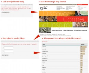
About the same time, we discovered the Five Second Test (fivesecondtest.com), a web service built by an Australian design firm based on an idea proposed by usability expert Jared Spool. The Five Second Test (as the name implies) involves showing a visual design to a user for five seconds and then asking them to recall specific features, or asking them which of two designs (each shown for two and a half seconds) they liked better. We even considered using the fivesecondtest.com service to evaluate new NYPL.org designs, but it lacked an easy way to redirect users back to our site once they were finished.
The contrast between the two tools got us wondering if there wasn’t a way to make surveys and usability testing more painless (and dare we say fun?) for our users in order to maximize the number of responses received.
To be sure, the Library has strategic questions that require a lot of setup and deep knowledge about the respondents. We have a lot of those questions, and we are asking them in all their properly-sampled, audience-segmented glory, often with the assistance of consultants and our Strategy department. But during the day-to-day process of designing a web site, what is often needed is just a reassurance that our team is on the right track.
We contacted the fivesecondtest.com developers, who graciously gave us their blessing to adapt and expand on their ideas, and set about coding a prototype. Ruby on Rails was chosen as the development platform due to its flexibility and rapid prototyping capabilities, its full open source codebase, and the fact that our team had already successfully built several Rails-based sites.
In February 2009, we launched our solution: Infomaki, an open source web application that incorporates ideas from both the Five Second Test and traditional surveys. In its first 48 hours of public use, Infomaki collected over 6,900 responses from 840 respondents, almost exceeding the entire total from the two-week traditional survey.
Design and Implementation
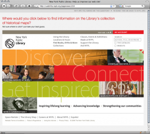
Infomaki is a “lightweight” usability testing tool developed to evaluate new designs for the NYPL.org web site and uncover insights about our patrons. Designed to act as a “one question” survey, it presents respondents with a single question randomly selected from a pool of active questions. Initially, two types of questions were supported: multiple choice and “Where would you click to…?” (attached to a screenshot or other image). Recently, we have added five-second tests for comparing two designs and for testing recall of a design’s features. Response times for each answer are captured as well.
Infomaki was designed from the ground up to be as respectful of the respondent’s time as possible. To this end, all of the language used in the project is geared towards lowering the cognitive load on the respondent. The link from our main web site to the tool reads, “Answer a single question and help us improve our web site!” The “sales pitch” makes it clear that even if you only answer one question, it will be welcomed.
Responding to a question only takes one click, and the “Thank You” page that follows immediately (but politely) asks the respondent to answer another. As such, we’re finding that even with the “one question” pitch, an astonishing 90% of respondents answered more than one question, and the average number of questions answered per respondent is almost 11. It seems to be the potato chip of surveys: no one can eat just one.
This has made an appreciable difference in our approach to surveys: rapid feedback leads to rapid turnover. We’re mining the vast middle ground between putting a full survey in the field with full protocols and methodologies, and asking people in the office “Does this look right to you?” Infomaki is not intended to be a formal research tool; rather, its strength lies in lowering the turnaround time between formulating a question and getting a response to that question from the general public.
To this end, care has been taken to make it as easy as possible for staff to add questions to the system. Designers here have already gotten into the habit of adding questions on Friday night and returning Monday morning to several hundred responses on their latest designs from weekend visitors.
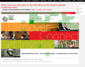
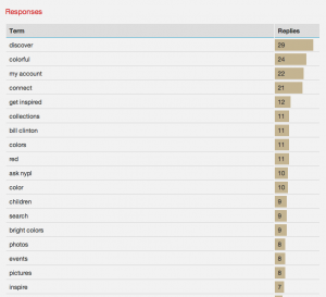
Internally, the application is optimized to store all results from varied types of questions in a single common database table, which makes it extremely easy to analyze response statistics and ensure that no respondent sees the same question more than once. Response data is displayed in tables and histograms (for multiple choice-type questions) and heat maps (for “click on this”-style questions). Heat maps can show up as individual clicks or a percentage grid overlay, and colors are adjustable for contrast with different designs. We welcome those from outside the NYPL who would like to analyze the collected data; feel free to contact us.
Results
The “lightweight” level of engagement on the part of the user has led to stellar response rates. In its first seven months of intermittent use, Infomaki has captured 111,823 responses to 231 design, language and demographic questions from 10,203 individual respondents. That’s an average of 484 responses per question posted and 10.96 questions answered per person. When the banner is posted on NYPL.org, roughly 1% of visitors click through from the main site, and over 90% of respondents answer more than the “one question” we asked them for.
Surprisingly, given that it’s essentially just a survey tool, users have called Infomaki “fun,” “like a video game,” and “addictive”. More than one person has reported wanting to “find the end” by answering all of the active questions. In fact, the first improvement implemented as a result of user feedback was a way to skip the thank you page and keep answering questions without interruption.
By testing designs with Infomaki and in-person usability tests in tandem, we have been able to uncover a number of insights and potential pitfalls. Ambiguities in navigation language were especially plentiful; for example, shortening the link to our fundraising page from “Support the Library” to “Support” led to confusion with “Technical Support” (we reverted to “Support the Library”), and using the label “Community” for a page with links to social networking tools had the unforeseen effect of siphoning clicks away from users seeking information on their local branch library (as much as 40% in one test; we changed the link to “Interact With Us”).
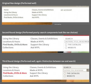
More broadly, the iterative testing process has made abundantly clear the degree to which changes in a single element have an effect on other parts of the page. On one recent web page design, the main navigation was working acceptably, and when we added a search bar, response times went up precipitously. Analysis showed that the search bar components looked too much like the other navigation links, increasing the (apparent) number of choices that users were required to cognitively parse. Adding a background tint to the navigation and other design cues to create a distinction with the navigation returned the response times to acceptable levels.
Drawbacks and Criticism
We have identified a few problems with the Infomaki approach. First, by linking to the survey from the main web site, we don’t get a rounded profile of all Library users. It’s safe to assume that Infomaki respondents are among our more web-savvy patrons. But as long as we’re aware of that limitation, we’ve determined that it’s not a detriment to have a bias towards web users since most questions posted directly relate to the web site.
A more pressing issue is the identification of particular “user segments” or “personas,” groups of users who are deemed to have the same general behavior patterns (such as researchers, recent immigrants, and so on). When we recently announced a new round of tests on Twitter, usability expert Craig Tomlin tweeted back, “Ouch, they don’t know the Persona of the tester!” We had not deemed segmentation as critical for this particular test, since we were a) mainly testing global navigation which needed to apply to everyone, and b) testing so iteratively that problem areas would become apparent even though we might not know who was having the problem. But Tomlin’s comment spurred us to add new tools to mark the referral source of the respondent. We also plan to add cross-segmenting based on the subset of users who answered a demographic question during the same session (for example, show only clicks from respondents over 50 years old).
There are definite order biases that can creep in by presenting questions randomly. Sometimes, when asking for user feedback in a text field, we will find users responding with the exact language that was used in a previous question. This may be mitigated in the future by presenting questions in a preferred order rather than a truly random one (for example, the “five-second recall” test works best when the user hasn’t already seen the same design in a different kind of question).
However, we feel strongly that frequent, high-volume iterations of testing, combined with smaller volumes of more formal, segmented testing should give us a well-rounded view of potential problem areas with web designs.
Open Source Release
The Infomaki source code was released to the community under the GNU General Public License on May 5, 2009.
The current release is a “throw it over the side and see if it swims” release. To get it running, one needs to be familiar with the Ruby on Rails programming framework. It has spotty-to-nonexistent test coverage, a bit of vestigial code, and possibly some dependencies on a RubyGem or two that we forgot to package. Some non-user-friendly features remain in the administrative interface, such as the fact that it’s possible to delete screenshots that are in use, causing errors. The NYPL plans to update the code to include more user-friendly administrative features by the end of the year. For more information on deploying Infomaki from the current codebase including step-by-step “quick start” instructions, see this blog post: http://labs.nypl.org/2009/05/06/infomaki-goes-open-source/
Since the open source release, we have been alerted to a couple of similar projects (see Usabilla and Chalkmark in the “References” section), the developers of which have been gracious in sharing ideas with us. To the best of our knowledge, Infomaki is the only full open source tool in its class.
Roadmap
We’ve added a number of generic demographic questions to the mix (how old are you, where do you live, etc.) and the hope is that in future versions, we will be able to segment responses to one question based on the answers to another question. For example, we can test familiarity with certain terms in one question and segment out those responses by age (for any respondents who answered both questions).
Behind the scenes, there are definitely some improvements that need to be made. It’s becoming clear that a frequent pattern of use is to test the same question (”Where would you click to…?”) over screen-shots of several variant designs. Right now, one must enter the same question repeatedly to get these comparisons. A future redesign of the administrative interface may allow us to build a suite of questions and simply upload a new screenshot to that suite to launch a new battery of tests and compare it to previous versions.
We have also been thinking about ways to score accuracy, perhaps by adding values to particular click locations. Since the tool is already capturing response times, a scatterplot chart with time on one axis and accuracy on the other would be a compelling illustration of which designs are performing the best.
Ideally, we’d like to work out a way that this tool can be “baked in” to the new NYPL.org redesign so that user feedback becomes an ongoing, always-on process. We are considering ways of displaying the feedback banner based on context, such as only displaying the banner to a small, random percentage of visitors, or only to those visiting certain pages or searching for certain terms.
As of this writing, we already have prototype versions of some of these features running locally and will be folding them into the public source code within a few weeks.
We encourage everyone to download the Infomaki source and let us know how your experience goes!
References
Infomaki project page at SourceForge
http://sourceforge.net/projects/infomaki/
Infomaki on Twitter
http://twitter.com/infomaki
Infomaki’s launch announcement
http://labs.nypl.org/2009/02/16/introducing-infomaki-bite-sized-usability-testing/
Infomaki’s open source release announcement
http://labs.nypl.org/2009/05/06/infomaki-goes-open-source/
Jared Spool’s original post on the Five Second Test concept
http://www.uie.com/articles/five_second_test/
Five Second Test web service, from the Australian firm Angry Monkeys
http://fivesecondtest.com/
Usabilla, a similar web service (free beta)
http://usabilla.com/
Chalkmark, another similar web service (fee-based)
http://www.optimalworkshop.com/chalkmark_alt.htm
The design firm Volkside was one of the first users of Infomaki after its public release
http://www.volkside.com/2009/07/usability-test-with-infomaki/
About the Author
Michael Lascarides is the User Analyst for the Digital Experience Group of the New York Public Library and a member of the MFA Computer Art faculty at The School of Visual Arts.



Dennis van der Heijden, 2010-10-29
Besides NY Library is someone else using this? Like to see some working example the NY lib is not working anymore
Jesus Tramullas, 2011-01-16
A reference to this work (in spanish), http://tramullas.com/2010/11/02/analisis-de-usabilidad-con-infomaki/