By Nancy Fried Foster, Nora Dimmock, and Alison Bersani
Introduction: Background and reason for the project
Early in 2007, the University of Rochester’s River Campus Libraries decided to revamp the libraries’ web presence. The library website serves many purposes, the most important being to provide an entry point to the library catalog, subscription databases, and digital repository. The site contains extensive information about other library resources and services, such as special collections, interlibrary loan, electronic reserves, news and events, and library locations and hours. It also aggregates and highlights course content and related resources, providing for the use of databases and other finding aids, contact with librarians, and access to other important library information. The redesign was motivated both by the problems uncovered in ongoing usability testing of the site and by the desire of librarians to incorporate new technologies and features into the Libraries’ web presence. Although many of the site’s catalog-related usability issues, such as context-sensitive forms or FRBR or other faceted results, remain outside the scope of a web redesign (and are currently being addressed by the eXtensible Catalog project), improvements to the site’s architecture and ease of use made the complete redesign a priority.
River Campus Libraries has developed a process for new technology design and development, represented in Figure 1. The process begins when the Libraries’ dean constitutes a Project Team to head up the overall development process, and gives that group a mandate, defining the aims and scope of the project. The Project Team (sometimes also known as a “content group”) has 2 major roles. One is to define the requirements of the new technology and the other is to manage the entire process from research to implementation and continuous improvement.
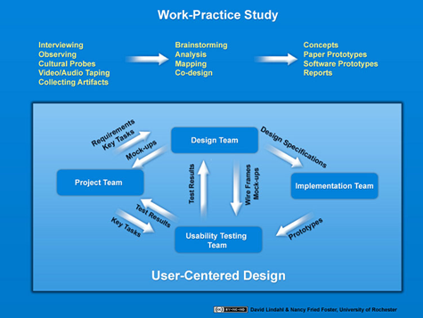
Figure 1. Technology design process used by River Campus Libraries, University of Rochester
“Participatory design” is an approach to technology design and development that we have followed for more than 5 years. It entails collaboration among designers, developers and end users, as facilitated by social scientists. The approach derives from work done in Scandinavia in the 1970s to include worker input into the way computer technology was introduced into their workplaces (Schuler and Namioka, 1993). It has been further developed in the U.S. mainly in corporate settings. The hallmark of this approach is providing workers and other end users with ways to provide their expertise to the project, often by documenting and analyzing the way they do their work – their “work practices” – and how they use existing technologies, how they work around technological problems, and how they would like to improve their work.
As the image shows, we conduct work-practice studies continuously, often in conjunction with grant-funded projects, but also as part of the Libraries’ regular work. We draw from this pool of information whenever we begin a new project to build technology. This process is a departure from the previous process by which the Design Team created initial designs based on requirements from the Project Team but without user input.
In the case of our current website redesign project, the Project Team defined key tasks for the main page and prioritized tasks for lower-level pages by drawing extensively on the information gathered in the participatory design workshops. They handed this information off to the Design Team, which created designs. The Usability Testing Team is currently in the process of testing these designs and working with the Project Team and the Design Team to improve them. Once the designs are acceptable, they will be handed off with a full set of specifications to the Implementation Team (programmers) for coding. With stops along the way for additional usability testing on prototypes, the process will run through to completion of the new code, testing of the new site, and implementation.
In this article, we recount how the Project Team drew on existing work-practice studies and commissioned additional research, which was gathered through participatory design workshops, in order to create an informational basis for the identification of key tasks and other requirements for the new site. We explain our methods, describe the participants, and then review our key findings. We also show how our findings have led to important decisions for our local implementation. We conclude with general remarks about the costs and value of this kind of user research in technology development. While this article is not meant as a manual, it will give the reader some idea of the methods and benefits of this approach and whether it may be worthwhile to seek some initial support in trying it out.
Methods
The website redesign project provided the perfect opportunity for the Project Team to bring the user into the design phase. River Campus Libraries had recently completed a major project on undergraduates and how they write their research papers (Foster and Gibbons, 2007). We were able to draw on that research, plus additional research with faculty members that we had done on an IMLS-funded project related to digital repositories (Foster and Gibbons, 2005). While 2 participatory design workshops with undergraduates provided the Project Team with a good pool of research from which to draw, they needed more information about the habits and preferences of faculty members and graduate students. The leaders of the redesign process formed a Web Redesign User Research Team – we’ll refer to this group as the “Team” in this article – to do just this. The Team included Katie Clark, the director of our science library; Nora Dimmock, the head of the Multimedia Center; Marc Bollmann, library assistant in the art and music library; Alison Bersani, engineering librarian; and Nancy Foster, the Libraries’ anthropologist. We want to point out that much of this work is possible precisely because our library has an anthropologist on staff to assist in the planning and execution of our research activities and to help make the step from raw to analyzed data and then to concepts and implementation.
The Team reviewed the results of several participatory design workshops that had taken place in the library, including the 2 workshops in the undergraduate research project (Smith and Clark, 2007) and another design workshop related to the renovation of a large library space (Gibbons and Foster, 2007). In one of the undergraduate workshops, students were given a blank piece of paper and asked to design their ideal homepage. In the second undergraduate workshop, students were given a blow-up of the current homepage and asked to mark it up, crossing out elements that they do not use and circling things they value. In the library renovation workshop, students were asked to design the perfect library. The team used all of the drawings – and the insights we gleaned from them – to plan a participatory design workshop specifically for graduate students and faculty members.
The workshop had 4 parts:
- First we asked the participants to fill out a questionnaire (see Appendix I).
- Using a laptop, we asked participants to show us the page they go to for library work and we asked them what they did on this page. Then, we asked participants to imagine that one library page had disappeared. Which page, we asked, would they find most disruptive to lose. We also asked what they did on that particular page. We bookmarked these pages so we could analyze the data later.
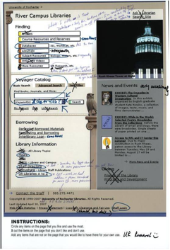
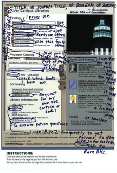
- For the design portion of the workshop, we first conducted an “X and O” activity. We gave participants a blowup of the homepage of the current library website to modify. We asked them to use pens and sticky notes to…
- Circle the items on the page that they like and use the most
- Add any items that are not currently on the page but that they would like to have there
- “X” out any items on the page that they do not like or use
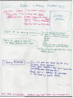
Figures 2 and 3 illustrate this step of the workshop.
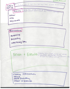
- Finally, we conducted a “plain paper” design. We gave participants a blank sheet of paper and asked them to design their ideal library website. To do this, we asked them to imagine the following scenario: “Let’s say the library were going to redesign its website and asked you to come up with a website that would be perfect for you. Use your marked-up page plus these art materials to create that page.”
Figures 4 and 5 illustrate this step of the workshop.
The workshop protocol marked a significant departure from the typical usability testing approach used in the design of our current website in 2002, especially in terms of the role of the user. Participatory design and usability testing are complementary methods that come into play at different points in the design, development and implementation cycle. Usability testing refers mainly to having some end users try a product out in the course of attempting representative tasks. This is usually done with a prototype or working version of the technology and it provides quick and inexpensive feedback for course correction, improvement and refinement of a product. Participatory design, by contrast, begins before a product is even identified and continues throughout conceptualization, design and development.
In our experience, usability testing is indispensable and has saved us far more time and money than it has cost. Participatory design is more costly and not as commonly done or understood, thus harder to justify. We continue to use this approach because it is our primary way of understanding our users’ needs and, more importantly, their preferred and successful work practices. This ensures that we have an informational basis – as opposed to a set of unchecked assumptions – for building technology that meets our users where they are as opposed to forcing technology upon users. And our results have justified this approach (cf. Foster and Gibbons, 2007).
In the previous design cycle, the Usability Group conducted a series of mental model tests to gather information about users. Graduate and undergraduate students were asked to complete key tasks on one of three academic library sites and the results were translated into key findings for the designers to use in creating initial designs for the website. The task-based nature of the test protocol did not allow the users to give us any information about what they valued about our website, or what features they would like to see added or removed; it only gave us task-specific information, such as “Most students do not recognize library jargon like catalog, database, or circulation services.” The key tasks were pre-determined by the Project Team based on their expertise, and without user input.
The participatory design workshops, however, focused solely on the personal experience of the user and were open-ended. Workshop activities were designed to elicit a personal narrative, for example, “draw your perfect webpage.” These data were then used to determine what the key tasks ought to be, thus allowing the user to participate in the initial design.
Participants
10 faculty members participated in the workshop, representing the following disciplines: Anthropology, English, History, Linguistics, Modern Languages and Cultures, Political Science, and Visual and Cultural Studies. Although we invited science and engineering faculty to the workshop, no one in any of those fields attended.
15 graduate students also attended the workshop, representing such disciplines and programs as Chemistry, English, History, ECE, Mechanical Engineering, Optics, Physics and Astronomy, Psychology, and Visual and Cultural Studies.
We provided coffee and cookies to all participants. Additionally, we thanked the graduate students who participated by forgiving their video overdue fines.
13 undergraduates had attended the web design workshops held the previous year. We did not document any demographic information but our observations were that the groups were fairly diverse along the dimensions of age, sex, and major.
Key Findings
Faculty members are all business when they use the library website, something they do more often than entering the library building. They are frequently looking for a known item; they also browse for literature in their research and teaching areas. They want to be able to get to their search – whether a Voyager or database search – with no delay. They use the library web pages to support their own research and to select, designate, and review teaching materials. They sometimes use the site to see what materials other instructors are using in their classes. And they want to request and retrieve interlibrary loan materials and keep track of their loans. Faculty members want a library web page that is all about their work.
Graduate students are heavy users of the library catalog search box, interlibrary loan, and databases. In general, graduate students begin all searches from the homepage rather than going directly (via links or bookmarks) to the pages they use most heavily, although many say that they wish they could go directly to sites within proprietary databases. By their own reports, graduate students use the library website more frequently than faculty members – nearly every day. They also use the physical library more often than faculty members, many of them on a daily or nearly daily basis. They want a library website that supports their research. In other words, graduate students want the same thing that faculty members want: a library page that supports finding articles and books.
Undergraduates differ from graduate students or faculty members, and they use the library homepage in a completely different way. Their academic and social lives are intertwined. They want a web site that reflects that total integration of work and play. Undergraduates want a portal that enables them to check their grades, get in touch with a professor, order a pizza, and find a book or article. Undergraduates want to include a lot more “outside stuff” in a page or portal. They want links to library resources as well as links to professors’ pages, exam schedules, music, Facebook, IM, and so on. Undergraduates want to personalize their library pages with color, outside links, and other features. This is a very different vision than a faculty or graduate student library page. However, undergraduates do not want to be denied access to any library resources, pages, or portals that are available to their instructors. They want the bells and whistles, but they also want to conduct searches using the library catalog, use other borrowing tools, check course resources, and find articles. They want it all.
We want to point out the relatively small number of participants in our design workshops and explain that our ongoing research involves much larger numbers. However, even with small numbers the research is valuable and actionable since we are conducting design research not exhaustive, authoritative studies. In design research, the alternative to small numbers of participants is no participants at all.
Specific Implementation
Analysis of the results, facilitated initially by the staff anthropologist and conducted subsequently by the Project Team, led to the identification of key and secondary tasks for four different groups of users: faculty members, graduate students, undergraduates, and library staff. The following table indicates these tasks and their importance to the different user groups.
| Key Tasks | Faculty | Graduate | Undergrad | Library Staff |
| Find Databases | x | x | x | x |
| Find Books | x | x | x | x |
| Find Journals & eJournals | x | x | x | x |
| Find Articles | x | x | x | x |
| Find DVDs | x | x | ||
| Find Reserves | x | x | ||
| Place Request (ILL, Off-Site, Purchase Request) | x | x | x | x |
| Manage My Account (see what I have out) | x | x | x | |
| Get Help (phone #’s, staff, chat) | x | x | ||
| Find Library Hours | x | x | x | |
| Secondary Tasks | Faculty | Graduate | Undergrad | Library Staff |
| Find Subject Resources | x | x | x | |
| Find out about remote access & wireless | x | x | x | |
| Find maps of buildings | x | x | ||
| Find a place to study | x | x | ||
| Access Staff Directory | x | |||
| Find all UR libraries | x | |||
| Log into staff modules | x | |||
| Go to UR webpage | x | |||
| Find out about library and UR news & events | x | |||
| Manage Course Reserves | x | x |
We found that different groups want to do different things with the website and that undergraduates alone want non-library content on the library website. These findings have led us to consider creating a customizable, modular website.
The Design Team was able to use the analyzed data to develop preliminary guidelines for design of the new site. The following is a rough, preliminary list of guidelines that were developed by our interaction designer working with members of the Project Team:
- Website that knows you
- What's going on in the library
- Intelligent search
- Improved catalog
- Website that helps you
- Website that links you with human contact
- Website that listens to you
- Website that builds a community around its resources
The project is currently in the initial design concept stage and the Design Team is working with the Project Team to refine the concepts, tasks, and requirements. This will lead to the selection of features and functionality and the creation of screen designs. The process will continue from there, as in Figure 1.
General Conclusions
Google, Amazon, Facebook and other heavily-used sites create high expectations that make new demands on libraries. Time and again in our workshops, undergraduates demonstrate the expectation that the library will provide a “search engine” with a single search box that searches across all material types and locations. All participants in our workshops indicate that they want to be able to customize the page both with the functionality they want and with their own look and feel. Faculty members and graduate students similarly show in their workshop drawings that they want the ability to select modules for their page so that they can go directly to the library services, search tools, databases, and other resources that are most important to them.
One of the biggest problems facing our libraries is that few patrons know how to use any but a few of the numerous services and resources already available on the site. For example, we can see from our research that a large number of our patrons need but are not aware of the bibliographic tools that are already available to them. One of the major challenges coming out of the web design workshops, and corroborated by other research that we have done, is to determine how to expose users to the tools already at their disposal. The obvious answer is to make everything on the website “intuitive,” but this can be impossible in the case of proprietary tools. Even when the tools are part of the local code, it is hard to educate patrons on their use because there are so many tools, and they are not all on the homepage. We have yet to discover, despite our attention to this problem, a good way to solve it.
The workshops have affirmed our belief that user research is a valuable tool in our design and development toolkit. As much as we value usability testing, its emphasis on task-based analysis is not sufficient for conceptualizing and building great websites. The user research described in this article is an affordable and effective way to gather information about what it is that people need to do. We can use this information to come up with tools that support the work that they do and then perform usability testing to be sure the tools are friendly, intuitive, and functional. Simply asking people what they are doing and what they need their tools to do is better than making assumptions about how they do their work and what would be “good for them.” The methods briefly described here are a great way to stop assuming and start asking.
Appendix: Questionnaire
- Name:
- Department:
- When was the last time you used the library via computer? Please tell us the date and what you used it for or what you did.
- When was the last time you used the library in person: when and why?
- What three websites do you use the most on your work computer?
- Did you use a cell phone today?
- What web browser do you use?
☠Internet Explorer
☠Firefox
☠Safari
☠Other____________________________________________ - What word processing program do you use?
☠Microsoft Word
☠WordPerfect
☠Claris Works
☠WordStar
☠TeX
☠Other____________________________________________
Acknowledgements
The authors thank Katie Clark and Vicki Burns for their careful reading and helpful comments. We also thank Katie Clark for providing resources from Carlson Library to make our workshops possible.
References
Foster, Nancy Fried and Gibbons, Susan. (2005). Understanding Faculty to Improve Content Recruitment for Institutional Repositories. D-Lib Magazine, II (1). http://www.dlib.org/dlib/january05/foster/01foster.html
Foster, Nancy Fried and Gibbons, Susan. (2007). Studying Students: The Undergraduate Research Project at the University of Rochester. Chicago: Association of College and Research Libraries. ISBN: 978-0-8389-8437-6 http://www.ala.org/ala/acrl/acrlpubs/downloadables/Foster-Gibbons_cmpd.pdf
Foster, Nancy Fried and Gibbons, Susan. (2007). Library Design and Ethnography. In Nancy Fried Foster, & Susan Gibbons, Studying Students: The Undergraduate Research Project at the University of Rochester (pp. 20-29). Chicago: Association of College and Research Libraries. ISBN: 978-0-8389-8437-6 http://www.ala.org/ala/acrl/acrlpubs/downloadables/Foster-Gibbons_cmpd.pdf
Schuler, Douglas and Namioka, Aki (eds.) (1993) Participatory Design: Principles and Practices. Boca Raton: CRC Press. ISBN: 0-8058-0951-1 Participatory Design of Websites with Web Design Workshops (COinS)
Smith, Jane McCleneghan and Clark, Katie (2007). Dream Catcher: Capturing Student-Inspired Ideas. In Nancy Fried Foster, & Susan Gibbons, Studying Students: The Undergraduate Research Project at the University of Rochester (pp. 30-39). Chicago: Association of College and Research Libraries. ISBN: 978-0-8389-8437-6 http://www.ala.org/ala/acrl/acrlpubs/downloadables/Foster-Gibbons_cmpd.pdf
About the authors:
Nancy Fried Foster is lead anthropologist at the University of Rochester, River Campus Libraries. She conducts work-practice studies on the academic practices of faculty members, graduate students, and undergraduates and facilitates the incorporation of findings into the technology design and development process.
Contact: nancy.foster@rochester.edu
Nora Dimmock is the director of the Multimedia Center at Rush Rhees Library at the University of Rochester. She is the subject specialist for film and media studies and a founding member of the library’s website usability group.
Alison Bersani is the engineering subject librarian at the Carlson Science and Engineering Library at the University of Rochester. She provides reference assistance for students and faculty and supports engineering collection development for the library.


Participatory Design for Library Websites? — Library Journal Reviews, 2011-11-29
[…] Participatory Design for Library Websites? November 29, 2011 By Cheryl LaGuardia Leave a Comment // As I’m gearing up for this week’s CLIR workshop, I’ve been looking around for materials related to what we’ll be working on, and I came across, “Participatory Design of Websites with Web Design Workshops,” in The Code4Lib Journal, I…. […]
Got Web Redesign Resources? — Library Journal Reviews, 2012-03-21
[…] like to offer up any resources that others have found helpful. I’ve already suggested, Participatory Design of Websites with Web Design Workshops, by the scintillating Nancy Fried Foster, Nora Dimmock, and Alison Bersani, but would love to hear […]
Week 2 Reflection | IDEA9106 Design Thinking, 2014-06-05
[…] Article: Nancy Fried Foster, Nora Dimmock, Alison Bersani. (2008). Participatory Design of Websites with Web Design Workshop (2). http://journal.code4lib.org/articles/53 […]