by Andreas K. Orphanides
Introduction
A common challenge in libraries is to present service information of immediate interest and need to users in an unmediated way. At the NCSU Libraries, we have in the past attempted to fulfill this need through the use of e-boards with rotating displays of such information (Morgan and Mori 2008). While this e-board initiative has been successful, a notable shortcoming is that users cannot call up the desired information on demand. In October 2010, the NCSU Libraries debuted its first public touchscreen information kiosk, in order to provide on-demand access to these commonly consulted real-time displays of library information. The kiosk is available during all hours of library operation (a total of 146 hours per week during the school year [1]), and remains powered on at all times.
In this paper I report our process for designing and implementing the web-based touch interface used to drive this kiosk, provide an analysis of the development process and the kiosk’s usage, and draw conclusions to inform future development of public touch-based interfaces. I first recount the process for creating and adapting content, selecting hardware and software, designing the interface, and deploying the kiosk, and provide a rationale for our choices at each stage of development. I also identify challenges we encountered during the development process and shortcomings in our implementation that have revealed themselves since project inception. I then explore how users have interacted with the kiosk since its deployment by analyzing the most frequently consulted content areas and by rendering heatmaps to examine user touch patterns. I conclude with lessons learned in the process of creating a public touch kiosk, including recommendations for developers, guidelines for interface design, and avenues for future research.
Motivations
The inspiration for development of a touchscreen kiosk in the D. H. Hill Library resulted from the confluence of several ongoing endeavors at the NCSU Libraries:
- A perceived need for improved user access to unmediated wayfinding information. The NCSU Libraries has long recognized a need for a publicly accessible, interactive wayfinding solution in the D. H. Hill Library.
- An initiative to showcase and test out novel user interfaces, including touch-enabled devices, in the D. H. Hill Library, in preparation for the use of such interfaces at the James B. Hunt Jr. Library, currently under construction.
- A desire to provide single-point access to a growing collection of dynamic, time-dependent, user-facing information tools describing library and campus services.
As part of the above-mentioned novel interfaces initiative, the Research and Information Services Department at NCSU Libraries received a 42” touchscreen e-board display for use as an interactive kiosk in the Learning Commons of the D. H. Hill Library. The task of selecting and developing content, identifying and configuring additional hardware, and designing and implementing an interface, fell to me, along with my colleagues Keith Morgan, Principal Librarian for Digital Media [2], and Jason Walsh, Technology Support Specialist [3].
A primary goal for this project was rapid development and deployment — the project began in early summer of 2010 with the goal of rolling out the final product early in Fall semester of the same year. This goal drove many of the major implementation decisions:
- In order to minimize delays due to hardware acquisition and configuration, we elected to use the Macintosh Mini as the system CPU. Mac Minis are our preferred hardware for other e-board applications; as such, the Mac Mini platform is familiar, well supported, and readily available.
- To limit potential difficulties associated with learning new technologies, to maximize opportunities to reuse existing web content, and to ensure flexibility in design, we elected to develop the interface in HTML and display it through a web browser.
- To minimize costs, we chose to use common, freely available web browsing software and plugins to configure the system to be suitable as a public kiosk.
Content Selection
At the time of project inception, the Libraries already had a well-established e-board initiative (Morgan and Mori, 2008), with numerous flat-panel e-boards in the 40” range distributed throughout the library and displaying library- and campus-oriented information on availability of services, advertisements for events, and staff contact information. An early goal of this project was to identify the most “useful” information displayed on the e-boards and consolidate that information into the kiosk system so that users could view the information on-demand. We recognized this need from casual observations at the reference desk: at the D. H. Hill Library, several e-boards are mounted prominently near the reference desk, displaying various information on a rotating schedule. A common interaction pattern that librarians (including myself) observed during reference desk shift was as follows:
User approaches reference desk, but keeps his/her eyes fixed on a nearby e-board. User halts and continues to watch e-board. After a few moments, user leaves reference desk area.
Observations from the user side of the reference desk confirmed our suspicion that users exhibiting this behavior were waiting for a particular piece of information to appear in the rotation. Although all our observations were anecdotal in nature (i.e., no statistics on these observations were maintained), it appeared that the most common displays consulted in this manner were the campus bus system's real-time map of bus locations (presumably to check for the proximity of a particular bus to the library bus stop) and the computer availability map of the Learning Commons (presumably to identify the location of an available computer).
The common thread in these two activities was that users were seeking to fulfill an immediate need, related to a resource with time-dependent variations in availability. This suggested that a public kiosk would fulfill user needs best if it exposed such time-dependent information to users on demand. Such a kiosk would also spare users having to wait for their desired information to appear in the rotation. With this in mind, we selected the following services to include on the kiosk:
- Computer availability [4] (see Sierra 2009)
- Real-time bus location map for the campus bus service [5], centered on the library (referred to below as the "campus bus map" for brevity)
- Group study room availability
- GroupFinder service [6] (see Ryan and Boyer 2011)
- Library hours [1]
In addition, as a response to the perceived need for interactive wayfinding as mentioned above, we elected to include a wayfinding feature to direct users to common destinations in the library.
Hardware and Software Configuration
One of our implementation goals was to build a touch interface that appeared to be completely dedicated and self-contained: we did not want it to be apparent to the user that the interface had been created with and was being driven by commodity components. To this end, we wanted to minimize user awareness of operating system components, software and hardware infrastructure, etc. This goal, along with the three implementation decisions stemming from our short development timeline (as mentioned in the “Motivations” section above), drove many of our system configuration decisions.
The touchscreen hardware, an Elo TouchSystems 4220L 42” single-touch display [7], was provided to the Research and Information Services department with the express purpose of creating an interactive kiosk. The display behaves as a normal large-format flat-panel display, with the addition of a touch-responsive overlay that acts as a single-touch input device. The CPU that drives the display is a Macintosh Mini (mid-2007 edition) with a 1.83GHz Intel Core 2 Duo processor and 1 gigabyte of RAM [8]. This CPU was repurposed from another e-board display setup elsewhere in the library.
The touchscreen’s touch-sensitive overlay connects to the CPU via a USB connection, and with the appropriate drivers the CPU receives input from the touchscreen as though it were a mouse. The touchscreen uses the UPDD touch driver from Touch-Base Ltd. [9], which provides calibration software as well as several options to configure how touch interactions are interpreted. Of the options available, we faced a choice between “Click and Drag,” which allows the user to perform a mouse-drag action by touching the screen, dragging while still in contact with the screen, and releasing the touch; and “Point and Click” which only allows click actions on the screen — any drag action performed by the user is ignored. The selection of “Point and Click” to disallow drag actions has many benefits:
- Click events on interactive elements are interpreted more clearly and reliably by the application, since users may accidentally drag their finger slightly while touching the screen. In “Click and Drag,” the slight drag action will register as a drag event in the application and may not respond in the expected manner.
- Users are prevented from accidentally highlighting on-screen text in the web browser. Accidental highlighting may be disruptive or confusing to the user; on a more aesthetic level, the ability of the user to highlight text reveals the fact that a web browser is being used to render the display, a fact that we would prefer to disguise.
- Likewise, disabling "Click and Drag" prevents the user from accidentally performing a drag action on displayed images, which in modern browsers causes a “ghost” duplicate of the image to appear to support drag interactions with the remote image file. This ghosting action again would have the potential to be disruptive and confusing to the user.
In addition, the driver software can be configured to permit or disallow double-clicks. The primary advantage of disallowing double clicks is in a failure case: should the browser driving the kiosk display crash, or should the machine be forced to reboot, the computer’s desktop (in this case, a typical MacOS X desktop) would become visible and available to users of the touchscreen. Disallowing double clicks prevents users from opening applications and filesystem locations in cases where the system desktop becomes available.
Despite the benefits of “Point and Click” and disabling double-clicks, we opted to place the driver software in “Click and Drag” mode and to permit double-clicking. Our reasoning stemmed from the inclusion of the campus bus map, which is driven by Google Maps, as one of our content areas. In order to provide as interactive an experience as possible, we wanted to allow users to pan and zoom in the bus map application, which requires dragging to support panning and double-clicking to support zooming (no zoom slider is provided in the campus bus map application by default, and we were unable to discover a method to enable it programmatically). We felt that this use case was sufficiently strong to enable both “Click and Drag” and double-clicking, at least provisionally.
In order to create a touch interface that feels dedicated and self-contained, we felt it was important not to display a cursor on the screen at any time, lest the illusion of a system independent of standard computer software be broken. We were surprised to find that the UPDD Console software did not offer an option to hide the cursor, as we felt as though a “kiosk-like” implementation was a common use case for touchscreen drivers. We discovered a program for MacOS X called Cursorceror [10] that would hide the cursor on demand; installing this software allowed us to keep the cursor continuously hidden once the system was booted and the software launched.
Due to its standards compliance, familiarity, and breadth of available plugins, we chose to display the web page serving as the kiosk interface in Firefox [11], although we had some reservations about its stability over uptimes measuring in the days and weeks. Since the screen would be in a location with easy staff monitoring and access, we felt the potential stability risks were outweighed by the utility of the Firefox plugin system and our facility with developing web sites that rendered well in that browser.
To make Firefox suitable for kiosk use, we needed to hide the browser controls themselves; although Firefox’s full-screen mode (accessible with the F11 key) did a passable job of hiding its controls, especially considering that users would not have access to a mouse or keyboard, we had concerns that the users might still be able to reveal the browser controls somehow with the touch driver in “Click and Drag” mode. To keep the browser more thoroughly locked down, we installed the R-Kiosk plugin [12], which completely hides all browser controls while it is enabled, causing the browser to display only the viewpane.
Although our design for the kiosk interface did not include links to external websites, we found that the campus bus map application’s Google Maps window includes a link to Google Maps’ Terms of Use, which opens in a new browser tab. This presented two problems: first, this link provides access to web content outside the kiosk interface, an unacceptable condition; second, although R-Kiosk hides the browser's tab bar, a new tab is opened when the link is touched. To prevent a user from accessing other web content, we installed the ProCon Latte web filtering plugin [13] for Firefox. This plugin allows whitelisting or blacklisting specific websites, and also permits redirecting blocked traffic to a specified web address. To partially solve the “Terms of Use” link problem, we whitelisted only the kiosk interface’s URL. All other sites were blocked and set to redirect to the kiosk interface. Although we were not able to find a solution to prevent a new tab from opening if a user happened to click on the “Terms of Use” link, the ProCon Latte configuration simply redirected the new tab to the kiosk interface’s URL; the existence of multiple tabs remained hidden to the user.
This solution presented two problems, which we considered acceptably minor: first, the action of opening a new tab presented the user with a blank gray screen for a moment as the website reloaded; second, there was the potential for unlimited multiple tabs to be open in the background if this event occurred repeatedly, consuming computer resources and potentially causing browser instability. The former problem we simply accepted; the second problem could be solved with periodic monitoring of the kiosk’s performance and by restarting the browser if necessary.
Although it was not a problem at the time the project was initiated, it should be noted that both R-Kiosk and ProConLatte are supported only through Firefox 3.6.x [14]. A search for acceptable alternatives to these plugins for the current version of Firefox (at the time of this writing, version 6.x) was not successful. It should also be noted that Opera Software’s Opera browser [15] is nominally capable of white/blacklisting websites, suppressing the opening of new tabs and windows, and running in a locked-down kiosk mode without the need for additional plugins. We discovered this only after successful configuration and testing of the Firefox solution mentioned above, and near the deadline for rolling out the touchscreen; because of the timing we did not have an opportunity to test an Opera-only solution to a locked-down browser.
Interface Design
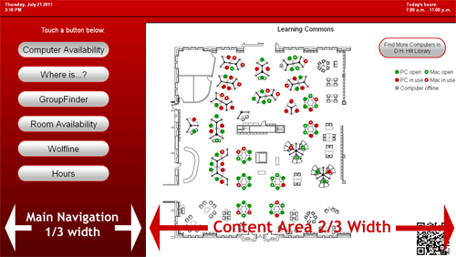
Our goal for an interface was to develop something simple and self-evident, with the minimum explicit instruction necessary to effectively guide the user. The rough outlines of the interface were hewn in prototyping: early development used YUI Grids templates [16] to split the screen into a ⅓ width column on the left for main navigational controls and a ⅔ width column on the right for content (see Figure 1), a layout that was preserved through production. The interface concept was to maintain a static set of controls to call the available content areas on the left, updating the right pane with the corresponding content when the user selected a control.
Figure 1. Basic kiosk layout and screen division
An early design hurdle was determining how to indicate that the kiosk was interactive and touch-enabled, a challenge exacerbated by the fact that the touch kiosk would be replacing a non-interactive e-board of the same general size in roughly the same location. Because of this, we wanted to be explicit; at the same time, we wanted to include the minimum amount of instructional clutter necessary. The main navigational controls were designed in a “button” style to reinforce to the user that they are interactive. We chose to include a simple legend reading “Touch a button below” immediately above the main controls, trusting that the labels on the buttons could be made to be sufficiently descriptive for the user to predict (or quickly learn) how the screen would respond to a touch. We hoped that the “touch” language and the button-style controls, coupled with the lack of other input devices at the kiosk, would be enough to suggest a touch-enabled interface.
We designed the buttons carefully to make it as clear as possible that they were control elements. The lack of a cursor deprives the user of cursor-contextual affordances that indicate controls (e.g., the cursor turning into a “pointer-finger” icon or the background color of a control element changing on mouseover), so we felt it was important to strengthen the visual affordances provided by the controls by giving them a familiar, button-like appearance. At the same time, we wanted to disguise the interface’s web-page nature. We found the options for HTML button styling to be too limiting, so we created image files for simple two-state “lozenge”-style buttons with a heavy border and a subtle 3D effect (see Figure 2). The 3D styling and prominent border recall both real-world and HTML buttons — inviting the user’s interaction — while having a distinctive appearance. The buttons were made oversize, 275 pixels wide by 50 tall (measuring approximately 7 ¼ x 1 ¼ inches as rendered on-screen) to increase both their prominence and the readability of their labels. The same button styling motif was repeated on other controls to cue the user to interactive elements throughout the interface.

Figure 1. Two-state button graphic. The upper part of the graphic is the normal button state; the lower part the "mousedown" state
Integrating Content into the Interface
For every content area except wayfinding, there was already a web-based version of the content available, originally created for display either on a website or on an e-board. For those content areas owned by the library, i.e., computer availability, library hours, group study room availability and GroupFinder, we were able to modify existing displays or create new displays based on the same data with only minor modifications to styling or rendered size. To support smartphone users, for each content area where a mobile web address existed to provide access to the same content (GroupFinder, campus bus map, computer availability, group study room availability), we included a QR code pointing to the corresponding mobile URL in the lower right of the content area.
Library Hours
The library hours display used in the kiosk interface was created especially for the kiosk, using the data service that drives hours displays on the Libraries' website. The data service provides current and future operating hours for a large number of library services and all campus libraries; we thought carefully about the right extent of information to present in order to balance utility of display with ease of browsing for a particular entry. We settled on displaying hours for a three-day time span — the current day and the next two days — to allow a user to see building and service hours through the weekend if they were viewing the kiosk on a Friday. We chose to provide both building and service hours for the D. H. Hill Library, where the kiosk is located, as well as the building hours for the branch libraries. In addition, in the kiosk interface's header bar, which is visible to the user at all times, we provided the building's hours for the current day.
Campus Bus Map
Integrating the campus bus map presented multiple challenges. The campus bus map is provided by the university’s transportation department and is operated by a third-party developer, TransLoc [17]. A display generator [18] is provided by TransLoc to create campus bus maps for web applications, which offers options for map area to display, alert sidebars, branding, etc. The display generated from this tool is a full-page Flash application running at a TransLoc URL with query parameters specifying the display options; the only method we were able to identify for integrating the map into another website was to use an HTML iframe tag. The combination of iframe and Flash raised concerns about browser stability and responsiveness, but inclusion of the campus bus map was a high priority so we chose to set aside these concerns.
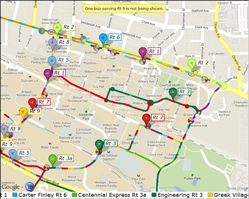
As mentioned above, we wanted to allow users to pan and zoom the bus map to provide a maximally interactive experience and increase the utility of this feature. Since it would potentially be difficult or impossible for the user to return the map to its original view after extensive panning and zooming (recall that no zoom slider is present on the campus bus map application (see Figure 3), so double-click zooming cannot be undone), we included a "map reset" button in the campus bus map content area, which reloaded the iframe containing the map, returning the map to its original viewport.
Figure 3. Campus bus map application as configured for kiosk. Note the absence of a zoom slider
Wayfinding
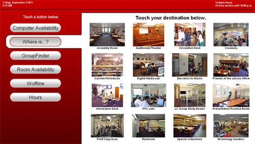
The wayfinding content area required generating the majority of its content from scratch. We chose a simple text-and-picture interface to provide a menu of destinations, with each text/picture block serving as a control to bring up a wayfinding map guiding the user from the touchscreen location to the destination. Sixteen common destinations on the first and second floor of the D. H. Hill Library were selected based on our anecdotal experience in providing directional service at the reference desk. We chose sixteen as the number of destinations based on the amount of information that comfortably fit in the space available: a 4×4 matrix of images with text provided adequate space for the images to be discernible while allowing sufficient space between each image (see Figure 4). We were unable to develop a satisfactory design for these controls that mirrored the button styling described above — failing to achieve the goal of keeping all control elements consistently styled. To partially mitigate this shortcoming, the wayfinding screen states explicitly that the user should touch his or her desired destination.
Figure 4. Wayfinding display, destination selection
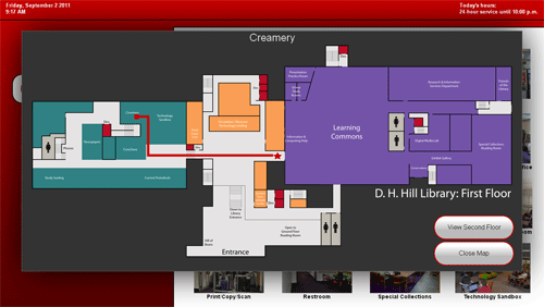
When the user selects a destination, a graphic of the main level of the D. H. Hill Library is displayed in a "lightbox"-style overlay rendered by the jQuery TOOLS plugin [19], which overlays the majority of the interface; a star indicates the user’s current location with a red path showing the user to his or her destination, or to the stairs/elevator for destinations on the second floor (see Figure 5). A button is provided to toggle the view to the second floor of the library; if the user's destination is on the second floor, a continuation of the route is shown on the second floor map. Another button allows the user to close the lightbox to return to the main interface.
Figure 5. Wayfinding display, map overlay
The map graphic and path are implemented as separate PNG files of the same dimensions in pixels, positioned absolutely, with the path atop the map graphic. The background of the path image (i.e., all parts of the image that are not path) is transparent, allowing the map to show despite the fact that it is overlaid with another image. This arrangement allows us to keep the map images logically separate from the path images; thus, if the map must be updated or if a path is changed, only one file needs to be altered or replaced.
Idle Behavior
In addition to selecting content for the kiosk and developing an interaction model for that content, we determined that some sort of idle mode would be necessary to call attention to the kiosk when it was not currently in use. Our first idea was to display a rotation of slides, similar to other (non-interactive) e-boards in the library, advertising the kiosk’s functionality and possibly other library services. We decided against this approach, feeling that simply stating that the screen was touch-responsive and listing the available content areas would not be compelling enough to elicit user interaction. Instead, we decided to have the kiosk cycle through displaying the available content areas during idle periods, showing the same content that users would see if they manually selected a content area.
During idle times, the kiosk sequentially displays each content area for 10 seconds, cycling through them in the same order as listed in the main navigational controls, a state that we refer to as “attract mode.” A user exits attract mode by touching anywhere on the screen; if the user touches a main navigation button, the display switches to the corresponding content; otherwise, the currently displayed content is maintained. Once attract mode is exited, the kiosk will respond normally to user input (“interactive mode”) until it receives no input for a period of 180 seconds, at which time it returns to attract mode. A visual cue is added to the appropriate main navigation button when the screen is in interactive mode; this cue is not present in attract mode (see Figures 6 and 7). This allows the user to know at a glance whether the screen is displaying its idle cycle or is awaiting user input in interactive mode.
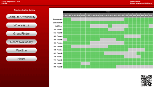
Figure 6. Group study room availability display in attract mode
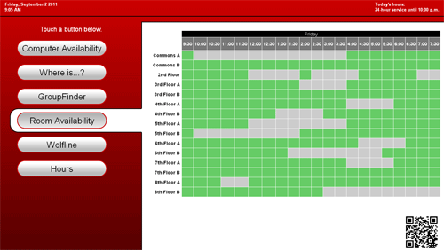
Figure 7. Group study room availability display in interactive mode. Note the visual cues on the content selector button to indicate the selected content area and the fact that the display is in interactive mode
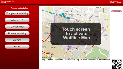
The interactive campus bus map requires special handling in attract mode due to interactions between the iframe and Flash under Firefox: there is a slight lag between displaying the iframe and initiation of the Flash application every time the iframe is displayed. This lag proved unacceptable during the content area's brief window of visibility in attract mode. Our solution was to display a static screen capture of the map interface, with a legend reading “touch to activate map” (see Figure 8), during attract mode. When a user exits attract mode to display the campus bus map, the static image is hidden and the active map application is shown. There is still a slight delay while the map initiates, but this delay is unavoidable and acceptably short in this context.
Figure 8. Campus bus map display in attract mode
Implementing Interactivity and Logging
In considering how to coordinate and control the different content areas we chose to include, we wished to ensure a responsive environment that would betray little to no lag between the user’s request and the presentation of content. For this reason, we decided to have all content rendered in a single HTML page, performing all navigation and content switching through JavaScript and performing updates to time-dependent data through background AJAX updates. The JavaScript library of choice at the NCSU Libraries is jQuery [20], and most display manipulation and AJAX requests were implemented using the appropriate jQuery methods.
Although the interface is rendered as a single HTML page, some of the content is maintained in external files in several locations, as content such as GroupFinder and room availability are more easily configured and maintained in separate documents (in some cases, in separate directories). These external files are loaded into the main page via AJAX either at page load or when the content is first displayed [21].
JavaScript/jQuery is used to manage all content display and manipulation, entering and exiting attract mode, and logging. The primary JavaScript components may be grouped as follows:
- Timer components, which manage cycling content display during attract mode, AJAX content updates, and countdown to re-enter attract mode. Attract mode is initiated on page load and terminates on any user input; to re-enter attract mode, a JavaScript page refresh is forced after 180 seconds with no user input. Content updates for library hours, computer availability, GroupFinder and group study room availability occur every ten seconds.
- Button evaluation routines, which trigger display of the appropriate content area and associated visual elements.
- Logger, which sends an AJAX request describing an event (typically a user interaction or an idle reset) to an external logging script.
- Touch-responsive components, which perform tasks such as resetting the idle timer, triggering the button evaluator to display content, and triggering the logger, in response to user input.
The logger records every touch interaction with the kiosk as a separate event, as well as idle resets and page loads. Events that cannot be captured by local JavaScript event handles, in particular touches to the iframe element containing the campus bus map, are not recorded. The information logged includes the following:
- IP address of client computer. This allows us to filter out any interactions that result from remote tests of the kiosk page.
- X and Y coordinates of user touch, relative to top-left of the display. If the logged event is a non-touch event, such as an idle reset, the coordinates are recorded as (-1,-1).
- Actions such as “exited attract mode by touching control element,” “exited attract mode by touching non-control element,” “touched a control element in interactive mode,” “idle reset,” etc.
- “Origin” and “Destination” screens: if a user moves between two content areas by touching one of the main controls, both the origin and the destination are recorded.
- Control element touched. Each control element is provided with a unique ID, which is passed to the logger if that element is touched.
Design, Development and Deployment Challenges
In the time since this project was initiated, a number of problems and challenges have been revealed, primarily stemming from the short development timeline for the project and the ad hoc implementation and integration of content areas.
Design
A number of design compromises and arbitrary decisions which arose during protoyping were never properly reconsidered later in the project. For instance, the ⅓ – ⅔ screen split between controls and content was not re-evaluated until a point had been reached where an extensive display redesign would have been impractical. We had originally selected the ⅓ – ⅔ split for two reasons: first, it was one of the available column layouts in the YUI Grids framework used for prototyping; second, such a split provided the content area with an aspect ratio close to a traditional (non-widescreen) presentation. However, once the content was selected, it became clear that the content was well-suited to a widescreen layout, due in particular to the layout of the library floorplan, the east-west layout of NCSU's Central Campus and bus routes on the campus bus map, and the dimensions of the table required for group study room availability.
In a full redesign of the interface, a better location for the main controls might be along the bottom of the screen to provide a widescreen presentation to the content area, but this is infeasible without extensive modifications to the current implementation. Even given the current general presentation with a vertical button layout on the left, a ¼ – ¾ screen split with more efficient use of space in the main navigation area would provide more room for the content display.
Development
The ad hoc approach to content selection led to coding decisions that have resulted in more difficult backend management. Existing scripts from other projects in other locations on the server were modified only to the extent needed to integrate into the kiosk display. Because these projects were created by other individuals, we were not familiar with the architectures used, and the limited timeline did not afford developing a deep understanding of the external projects’ architecture. Thus our adaptations consisted largely of duplicating and modifying existing scripts, keeping them in the same location on the server as the originals, so that we would not have to interpret and alter relative file paths in the duplicated scripts. The result is that file management for the kiosk is spread across no fewer than four directories on the server. In addition, since this project integrates components from so many other library projects and extensively reuses code from other files that are maintained separately, updates to our own code are required any time one of the referenced projects is updated, which increases the frequency of required maintenance.
Because this was our first attempt to implement a touch-based interface, and because our understanding of interface requirements and interaction patterns grew only as we built the interface and integrated content, the JavaScript driving the interactive components of the interface developed in a very organic fashion. This led to redundancies and inefficiencies in coding, as multiple event handlers were attached to certain elements to capture different aspects of interaction, multiple timers were set up to manage different timed events, etc.
During JavaScript development, many unexpected side effects were discovered as different features were implemented, due to the lack of a centralized approach to handling user interactions. A frequent problem was mismanagement of onclick events: for instance, to capture a user’s touch on (say) Button1, we might attach the following event handler to Button1 (this example uses jQuery syntax):
$("#Button1").click(function() {
executeMethodA();
executeMethodB();
executeMethodC();
});
Later, we might develop a timer which, among other things, programmatically triggers a click event on Button1:
  setInterval(function() {

  … // some code

  $("#Button1").click();

  … // more code

  }, timerInterval);
If executeMethodC()is meant only to be executed on an actual user touch on Button1, the timer code triggers a spurious execution of executeMethodC(). Similarly, we often found we had written click event handlers connected to both an element and its ancestor, sometimes serving partially redundant purposes. In an attempt to forestall unintended consequences from cascading click events, we would set the descendant's event handler to return false. We would then find that we had been unwittingly relying on the cascading click event to trigger another ancestor's click event handler to produce some effect. In our efforts to manage these issues, the JavaScript code evolved into a complex of event handlers with overlapping functionality, methods with passed callback functions, methods with flag variables to trigger or suppress behaviors, and global state variables that might charitably be described as a "morass." Because of this, code management time and effort is increased; in addition, the code is not configured as a practical platform for other touchscreen endeavors. This limits the utility of the code for other projects. The quality of the JavaScript, in my own estimation, is the weakest point in this project's infrastructure.
Deployment
Deployment of the kiosk in the public library space has not been without problems. Our original concerns about browser stability and slowdown have proven to be correct: occasionally the browser will slow down significantly, to the point where JavaScript stops responding or the page does not completely load after a triggered refresh. To remedy this problem, we periodically inspect the kiosk and manually restart the browser when its responsiveness seems lacking. It should be noted that during browser restarts, we do sometimes see that multiple tabs were open during the previous session; this suggests that users are, in fact, touching the "Terms of Use" link in the campus bus map application, triggering the opening of a new window.
We have also had problems with software updates or browser crashes revealing the underlying system components of the kiosk setup. Although we disabled automatic updates in Firefox, some software that was already installed on the machine, such as Adobe Acrobat and Apple iTunes, had automatic updates enabled. When these update processes were triggered, it led to the display of a dialog box appearing over the browser window, breaking the illusion of a dedicated kiosk system and interfering with the usability of the kiosk application. Power outages and software crashes are also problematic. In one instance, upon returning from a long weekend, I found that the kiosk was displaying its computer’s MacOS desktop rather than the kiosk interface, and nearly every application on the machine had been opened, presumably by a curious or malicious user. This circumstance was apparently the result of either Firefox crashing or the system rebooting to the desktop. Disabling double-clicks on the touchscreen would have helped to mitigate the miscreant behavior, but would not have prevented the exposed desktop. It is possible that some of the issues resulting from browser instability and/or system crashes could be mitigated by scheduled system reboots along with a boot script that automatically launches Firefox, but we have yet to explore this solution.
Analysis
As mentioned above, every user interaction and idle refresh is logged. Logging was implemented on November 4, 2010, providing over 9 months of log data comprising over 500,000 log entries. Of these entries, nearly 80,000 represent user touch interactions. An obvious question is which of the content areas is most popular, though the definition of "popular" is not necessarily clear: is it the content area that users select the most frequently? The content area that receives the most user touches? The content area that spends the most time on-screen while in interactive mode?
One approach is to examine what content users are interested in when they approach the kiosk, on the premise that the first content area the user selects is the one most relevant to their needs. If we assume that the kiosk is in attract mode when the user approaches (which, granted, will not capture every instance where a user approaches the kiosk), we can measure this notion of popularity by examining what content the user selects to begin interactive mode. The screen exits attract mode when any part of the screen is touched; if the action that exits attract mode is a touch to one of the main navigational controls, then an "attract mode exit" is credited to the selected destination. For a touch anywhere else on the screen, the current content display remains active and the screen simply switches to interactive mode. In this case, an "attract mode exit" is credited to the currently-displaying content. The number and percentage of attract-mode exits for each content area between November 4, 2010 and July 21, 2011 is shown in Table 1.
|
Content area |
Attract Mode exits |
Percent of exits |
|---|---|---|
|
Computer availability |
3515 |
26.70% |
|
Campus bus map |
2915 |
22.14% |
|
GroupFinder |
2382 |
18.09% |
|
Study room availability |
2327 |
17.68% |
|
Wayfinding |
1146 |
8.70% |
|
Library hours |
880 |
6.68% |
|
Total |
13165 |
100.00% |
Table 1. Content areas by attract mode exits, Nov. 4 2010-Jul. 21, 2011
These results are more or less in alignment with our expectations, based on our anecdotal understanding of user interaction with fixed e-boards in the library, with computer availability and campus bus map dominating. However, it is possible that this data is skewed towards the campus bus map — during attract mode, the campus bus map displays the kiosk's largest explicit instruction to the user to touch the screen. It may be that the campus bus map may be capturing a higher percentage of attract mode exits than it would otherwise receive.
We can consider another approach to identifying popular content: simply count the number of times a user touches one of the main navigation buttons. Such touches represent a deliberate act on the part of a user to view a content area; while some acts of viewing particular content might not be captured by counting button presses, we can be reasonably certain that each button press represents specific user intent. The number and percentage of main navigation button touches for each content area between November 4, 2010 and July 21, 2011 is shown in Table 2.
|
Content area |
Button touches |
Percent of touches |
|---|---|---|
|
Campus bus map |
10532 |
26.55% |
|
Computer availability |
10084 |
25.42% |
|
GroupFinder |
5900 |
14.87% |
|
Study room availability |
5621 |
14.17% |
|
Wayfinding |
4144 |
10.45% |
|
Library hours |
3392 |
8.55% |
|
Total |
39673 |
100.00% |
Table 2. Content areas by main navigation button touches, Nov. 4 2010-Jul. 21, 2011
During this time period, there were nearly 40,000 touches on the main navigation buttons, which includes attract mode exits that result from a touch to these buttons (about 84.5% of attract mode exits). Since each touch on such a control corresponds to a specific user intent to view that content, and since the space of such touches captures the vast majority of attract mode exits, this analysis should provide us with a more reliable measure of user interest in the content areas. Note that, contrary to our hypothesis that the campus bus map was receiving more than its due credit for attract mode exits, in the button-touched analysis the percentage of campus bus map selection is higher than in the attract mode exit analysis. Otherwise, the relative ranking of each content area is the same.
It is interesting to note that despite our having identified a need for publicly accessible, non-intermediated wayfinding assistance, the wayfinding feature of the kiosk sees relatively little use. It is unclear whether this suggests that our perception of a need is incorrect; it may be that a need does indeed exist but some particular aspect of the wayfinding implementation is not meeting the existing need [22]. The apparent lack of usage of the library hours function may indicate that users' need for library hours information is largely met by the static display of today's building hours that appears in the header bar of the kiosk interface, or that detailed service hours are of limited utility in a building that is open 24 hours a day.
Heatmap analysis
Recording the location of each touch interaction allows us to examine users' interaction patterns with on-screen content [23]. A standard approach for this sort of analysis is the heatmap. A heatmap visually represents clustering of two-dimensional data points: regions with many tightly clustered data points have a high value, whereas regions with no points have a zero value. Value is typically represented by intensity of color. By feeding the (x,y) coordinates of touch interactions into heatmap generating software, we can create a heatmap that correlates frequency of touch interactions to the region of the interface where those touches occurred.
ClickHeat [24] by Labsmedia is an open source click-tracking and heatmap generation package for web servers, intended to track user clicks on websites and generate corresponding heatmaps. It consists of JavaScript components for click tracking and a PHP heatmap class for generation of heatmaps from the logs recorded by the tracking component. The heatmap package is designed to work directly with the logging methods provided by the click-tracking component, but a minor modification allows the generation of heatmaps from arbitrary data provided as a PHP array. The modified code, based on the file HeatmapFromDatabase.class.php in ClickHeat 1.1, is available as an appendix to this article. The modification was straightforward: the standard version of HeatmapFromDatabase.class.php reads coordinate data from a database connection in chunks, and renders it as a two-dimensional PHP array. We modified the class to remove the database connections and associated chunking, and added a public property $inputArray to the class so that an array could be generated externally and passed to the class via the property. We then modified the heatmap generation method to read $inputArray rather than read from the excised database connection.
We configured the heatmap package to generate heatmaps using the default parameters (with the exception of suppressing a default "copyleft" logo on outputted images) and at the same dimensions as the resolution of the kiosk display. The source data for the heatmaps consisted of the (x,y) coordinates of user touches as derived from the kiosk logfile. In the GIMP photo manipulation program [25], we transformed each image's color data to RGB format and then used GIMP's "Color to Alpha" feature to generate a transparent heatmap image that could be manually overlaid onto screen captures of the kiosk interface. The images below were generated in this manner.
For this heatmap analysis, we will examine all touches between January 20, 2011 and July 21, 2011. This is a shorter log period than the numerical analysis above; due to a minor interface redesign that included moving some control elements that occurred on January 20, log entries prior to that date do not reflect the current layout of the interface and cannot be applied to this analysis.
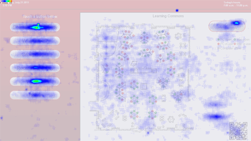
A natural first investigation in our analysis is to examine all touches that occured during the log period. Figure 9 below represents the heatmap of all touches overlaid on a "typical" kiosk display (in this case, the computer availability display).
Figure 9. Heatmap of all touches between Jan. 20, 2011 and July 21, 2011
As expected, there are many areas of high touch activity on the main navigational controls on the left. However, there is evidence of touch activity across the interface, which can lead to analysis difficulties. One approach is to concentrate only on touches that occurred on control elements, which includes both the main navigational elements and controls associated with specific content areas, which are not visible on all content screens. In Figure 10, which includes all touches on control elements during the log date range, we see a concentration of touches on the left corresponding to the main navigational elements, as well as several clusters of touches elsewhere that are associated with specific content areas (such as the cluster in the upper right, which corresponds to a control that switches between two computer availability views).
Figure 10. Heatmap of all control-element touches between Jan. 20, 2011 and July 21, 2011
The most notable behavior in this view is the portion of the heatmap associated with the main navigational controls. We see a majority of touches on the first and fifth button, which correspond to computer availability and the campus bus map, respectively. This is informative, but this knowledge can be gleaned more precisely from numerical analysis.
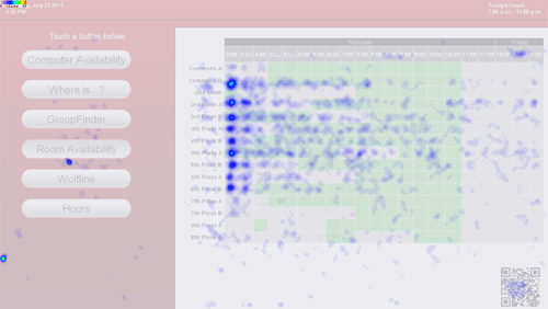
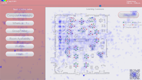
A more interesting approach is to examine only the touches not on control elements, which we will refer to as "random" touches. Such touches can reveal information about user expectations, error patterns, and more. This analysis is most telling if we consider only the touches that occur during the display of particular content areas. For instance, Figure 11 is a heatmap of all random touches during the log period that occured while group study room availability was displaying.
Figure 11. Heatmap of random touches to group study room availability display between Jan. 20, 2011 and July 21, 2011
User expectations and discovery
The telling pattern in Figure 11 above is the array of touches on room labels and on the room availability grid itself. It is clear that users are expecting that (or hoping that, or curious whether) some sort of action will occur when they touch the availability matrix; perhaps they expect some contextual method to make a reservation or to see what is booked at a given time.
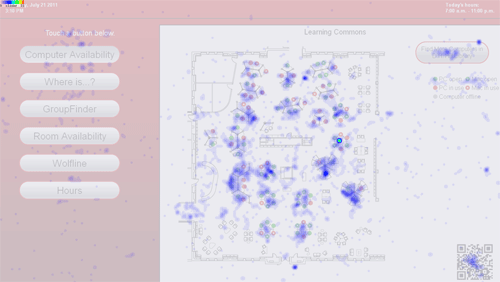
A similar pattern of behavior can be seen in the random touches on the computer availability display (see Figure 12):
Figure 12. Heatmap of random touches to computer availability display between Jan. 20, 2011 and July 21, 2011
Here, we see patterns indicating that users are touching the dots that represent computer locations. It is unclear to me what kind of actions they may be expecting as a result.
It seems that, despite efforts to make control elements have a uniform appearance, the distinction between control and non-control is not clear to users. Fault may in part lie with our own design, as there are some control elements, particularly in the wayfinding content area, that do not have the "button" styling we created for other controls. It may also be the case that users simply don't understand the distinction between controls and non-controls regardless of how deliberately the controls are designed; since there is no cursor and none of its associated affordances, users experiment with the interface to discover which features act as controls and which elements are inert. In this sense, touches to both inactive and active elements serve as discovery tools for understanding the environment of the kiosk.
Implementation errors
Referring back to Figure 12, there are a number of touches recorded on the control in the upper right. These touches are a cause for concern, as this button is considered a control element and this heatmap is meant to capture only touches to non-control elements. This suggests the possibility of a coding error — a control element not correctly identified as such when touches on it are logged — or an error in input capturing, where touches are logged but do not correctly trigger an event on the control. In either case, this is a phenomenon worthy of closer investigation. That the heatmap analysis reveals this information is of interest, since it is unlikely that the existence of these errors would have been otherwise revealed.
Design errors
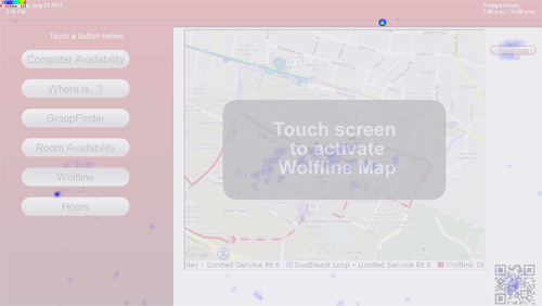
Heatmap analysis can also reveal design flaws. Consider the heatmap of random touches on the campus bus map (Figure 13). Note that touches on the "Touch screen" instruction are counted as random touches, and that touches on the active campus bus map are not captured by the logger.
Figure 13. Heatmap of random touches to campus bus map display between Jan. 20, 2011 and July 21, 2011
Notice the map reset button in the upper right. It is surrounded by a halo of touches, particularly on the upper and lower edges, that only just fail to hit the button. It is clear from the touch patterns that the button is too small. This fundamental design error's significance is amplified by three factors that are endemic to touchscreen inputs:
- The "fat fingers" problem (Leung 2005, 25; Meredith 2008): a user's finger is typically considerably larger than a single logical location on a touch input device. The touch input must use some form of averaging to reduce the contact area to correspond to a single location in hardware (see, e.g., Ball et al. 1980 [26]); since this introduces ambiguity in the correspondence between the location of physical touch and the location of the touch as interpreted by the interface, controls in a touchscreen context should be made oversize to account for this ambiguity.
- Parallax (Leung 2005, 25): In practice, the touch-sensitive layer of a touchscreen and the image produced by the display are at different distances from the user. The resulting parallax effects can lead to user touches that are not in alignment with the intended target, despite appearing aligned to the user. It should be noted that users of different heights or standing before the screen in different left-right orientations will experience different parallax effects.
- Manual calibration between touch-sensitive space and pixel space (Leung 2005, 26): Touchscreens, including the one used in this project, typically require calibration software that uses sample touches to map the touch input's touch-sensitive region to the pixel space on the system's display. Calibration is typically performed only infrequently. Combined with the above effects, the process of calibration can introduce systemic error into the mapping between touch interface locations and corresponding screen locations.
The conclusion to be drawn is that this button — and controls on touch interfaces in general — should be made as large as feasible. This conclusion is supported by Fitts' Law (Heim 2007, 260), which suggests that the larger the control, the more quickly a user will be able to successfully interact with it. One possible solution is to make the active area of the control slightly larger than the control's image (St. Amant 1999, 339). This provides the control with a "buffer" or margin that allows for slight alignment failures in any direction, which can help to alleviate some of the additional challenges associated with fat fingers, parallax and calibration errors, all of which come down to a lack of alignment between the touch as actuated by the user and that touch as interpreted by the device.
Curiosity
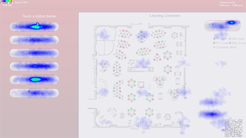
Consider Figure 14, a heatmap of all random touches in the logging period.
Figure 14. Heatmap of all random touches between Jan. 20, 2011 and July 21, 2011
Note the touch activity on the QR code in the lower right. This suggests that users are curious about the QR code, perhaps expecting to receive additional information if they touch it. Users familiar with QR codes may be interested in learning where the code points; unfamiliar users may simply want to learn what it is. The density of touches on the QR code may also tell us something about our user population: although we can't know what information users are expecting to learn when they touch the code, it is a reasonable assumption that at least some of the touches arise from certain users' complete lack of familiarity with the object. This provides some anecdotal evidence to suggest that our user population may not be as savvy to mobile technologies as we sometimes assume.
In general, touches on non-control elements, such as QR codes, the room availability matrix, and the computer availability map, reveal valuable information: users are interested in interacting with these elements, and may expect to be able to gain more information by interacting with them. This realization can help to guide future development efforts: if a user touches a QR code, we may want to provide a popup describing QR code technology and the code destination. We may wish to provide some detailed information on a particular room's availability, or instructions on making a room reservation, when users touch the room availability matrix. There may be information we can provide to users in the computer availability context that users would find informative. Although determining the exact nature of these improvements is probably best left to user studies, the very presence of touches on non-control elements reveals an interest among users in engaging in more in-depth interaction with these components.
Conclusions
Development of a public, touchscreen kiosk is possible at low cost, using standard, nonspecialty hardware and free software, and requiring only standard web development skills. Such a kiosk can be robust enough for continuous operation with 24-hour user access, though regular manual inspection and occasional software resetting may be necessary to ensure responsiveness.
Interface design for a touch kiosk interface must take into account the unique context. Design considerations must include an awareness of the limitations of the touch-interactive environment, including the relative imprecision of user interactions and the reduced contextual feedback available to users. Users adapt to the lack of contextual feedback by experimenting with the interface through touch, the only input available to them.
Traditional web development practices are adequate to create an effective user interface for touch kiosk applications. This project has seen some difficulties resulting from a short project timeline and a prototype implementation that was not sufficiently revisited before being put into production; more rigorous software engineering practices would have produced more versatile and maintainable code, which would have in turn made it easier to update the interface in response to usage data.
Numerical analysis can provide a basic level of usage information for a touch-based kiosk, including exposing usage patterns and user demand for available content areas. In the context of touch interfaces, heatmap analysis has great potential value: as user input is limited to touch, touch logging is able to capture the entire body of user input to the device. Heatmaps associated with this input, particularly heatmaps focused on non-control components of the interface, can reveal user expectations, design and coding errors, and interface components in need of added functionality.
There is much room for improvement of this project, and for exploration of touchscreen kiosk design in general. Heatmap analysis has revealed several avenues for investigation and improvement of the kiosk interface. Developing a more robust and flexible version of the software driving the kiosk interface is a priority. We hope to identify a set of browser plugins, or an alternative to Mozilla Firefox, that will permit a secure kiosk mode on a current-generation web browser. On a larger scale, task testing on a large-format, wall-mounted touchscreen is in order to help identify the ideal size and layout for user interface controls in a public kiosk context. We feel that there is more to be learned from heatmap analysis of touchscreens, possibly through examining other slices of data. The techniques used in heatmap analysis in this investigation are easily adaptable to touch-sensitive displays of any size, and we are curious to see what discoveries will be made using this technique to analyze mobile-scale touch applications.
Acknowledgements
My thanks go to colleagues and project collaborators Keith Morgan and Jason Walsh, without whom this project would not have been possible. Keith, our resident expert on e-boards, brought extensive knowledge of e-board hardware management to the project and is largely responsible for making hardware selection and configuration go as smoothly as it did. Jason maintains and wrangles many of the library data services that were integrated into this project, and is responsible for adapting most of the previously existing content displays for use in the kiosk interface. The three of us were equal partners in determining the concept, direction, and design of the kiosk, and without Jason and Keith's extensive contributions and many hours of collaboration, this project would not have been a success.
Thanks to Jason Casden, Digital Technologies Development Librarian, and Troy Hurteau, Technology Support Specialist, for their invaluable advice and assistance in JavaScript, jQuery, and PHP development. Thanks to Emily Struthers for her contributions to the wayfinding components of the interface.
Thanks to Bohyun Kim, Jonathan Rochkind, and others who provided feedback and encouragement in response to my Code4Lib 2011 lightning talk on heatmap analysis.
Thanks to Kim Duckett, Gillian Speace, Markus Wust, Carolyn Argentati and Anne Burke for their feedback and editing assistance. Thanks to Andrew Darby and the Code4Lib Journal editorial staff for their careful attention and extensive editorial input.
About the Author
Andreas K. Orphanides is Librarian for Digital Technologies and Learning in the Research and Information Services department at the NCSU Libraries. His work focuses on the intersections between technology, instruction, and public services. He holds a BA in mathematics from Oberlin College and an MSLS from the School of Information and Library Science at the University of North Carolina at Chapel Hill
Appendix A: Code
Due to technical limitations, the file linked below is named “HeatmapFromArray.phps” on the server. After saving, rename it to “HeatmapFromArray.class.php” to ensure proper execution.
Notes
[1] Hours: NCSU Libraries http://www.lib.ncsu.edu/hours
[2] Keith Morgan: NCSU Libraries http://www.lib.ncsu.edu/staff/kamorgan/index.php
[3] Jason Walsh: NCSU Libraries http://www.lib.ncsu.edu/staff/jdwalsh/index.php
[4] Computer Availability Display: DLI: NCSU Libraries http://www.lib.ncsu.edu/dli/projects/compavailability/
[5] The NCSU Wolfline – Transit Visualization System http://ncsu.transloc.com/
[6] GroupFinder: DLI: NCSU Libraries http://www.lib.ncsu.edu/dli/projects/groupfinder/
[7] 4420L 42" Desktop/Wall-Mount Touchmonitor http://www.elotouch.com/products/LCDs/4220L/
[8] Mac mini (Mid 2007) – Technical Specifications https://support.apple.com/kb/sp7
[9] Touch-Base Ltd – Universal Touch Screen and Controller Drivers http://www.touch-base.com/
[10] Doomlaser » » Cursorcerer: Hide Your Cursor at Will http://doomlaser.com/cursorcerer-hide-your-cursor-at-will/
[11] Get More From Your Firefox — Mobile, Add-ons & Other Stuff http://www.mozilla.org/en-US/firefox/new/
[12] R-Kiosk :: Add-ons for Firefox https://addons.mozilla.org/en-US/firefox/addon/r-kiosk/
[13] ProCon Latte Content Filter :: Add-ons for Firefox https://addons.mozilla.org/en-US/firefox/addon/procon-latte/
[14] Mozilla Firefox 3.6 http://www.mozilla.org/en-US/firefox/all-older.html
[15] Opera browser | Faster & safer internet | Free download http://www.opera.com/
[16] YUI 2: Grids CSS http://developer.yahoo.com/yui/grids/
[17] TransLoc Inc: Transit Visualization http://transloc.com/
[18] LiveDisplay Configuration http://ncsu.transloc.com/livedisplay/livedisplay_configuration.php
[19] jQuery TOOLS – The missing UI library for the Web http://flowplayer.org/tools/
[20] jQuery: The Write Less, Do More, JavaScript Library http://jquery.com/
[21] Originally we had used a combination of SSI and PHP includes to bring this content into the main PHP file, but we found that database requests in external PHP files sometimes behaved in an unpredictable manner if they were included via the SSI “include” directive. Because of this, we preferred PHP include statements over SSI directives early in the development lifecycle. Eventually, when we recognized the need for regular and frequent AJAX updates of time-dependent data, we elected to eliminate in-script include statements, preferring dynamic AJAX content loads to pull in the external data even on initial display.
[22] Code4Lib editor Tod Olson points out that low usage of the wayfinding feature does not necessarily imply failure of the feature. He remarks that “…specific wayfinding tasks tend to be easily learned, [thus] even when the wayfinding aid is successful the person will rarely come back for the same task,” as they will not need to refer to the wayfinding information again. By contrast, the ever-changing nature of bus locations means that the campus bus map will be revisited again and again by those who consult it.
[23] The ability to analyze user interactions "remotely" is of particular value here; since the kiosk is unique in the library and is located in a very high-traffic area, direct user observation and usability testing is impractical.
[24] Labsmedia's ClickHeat – clicks' heatmap http://www.labsmedia.com/clickheat/index.html
[25] GIMP – The GNU Image Manipulation Program http://www.gimp.org/
[26] Ball et al. 1980, 204, referring to an early trackpad: "A rigid epoxy glass base has a series of 128 conductors printed on it and a flexible membrane with 128 orthogonal conductors is separated by about half a millimetre from the base by a slight air pressure. A small downward pressure by the finger causes a number of the flexible conductors to make contact with those on the base…. A scanning process, to calculate the centroid of the contact patch, is controlled by an Intel 8080 microprocessor."
References
Ball, R.G., R.S. Newton, and D. Whitfield. (1980). Development of an off-display, high resolution, direct touch input device: the RSRE touchpad. Displays 1(4), 203-207. doi:10.1016/0141-9382(80)90137-7 (COinS)
Heim, S. (2007). The Resonant Interface: HCI Foundations for Interaction Design. Boston: Pearson Addison Wesley.
Leung, C.K. (2005). Handling ambiguous user input on touchscreen kiosks [thesis]. Cambridge, MA: Massachusetts Institute of Technology. 94p. <http://hdl.handle.net/1721.1/34461>
Meredith, W. (2008 May 16) [cited 2011 Sept 1]. Best practices of touch screen interface design [blog post]. Voltage Creative: 360angles. <http://voltagecreative.com/articles/best-practices-of-touch-screen-interface-design/>
Morgan, K. and T. Mori. (2008). Digital signage in the library. 11th Annual LITA National Forum, Cinncinatti, Ohio, October 16-19, 2008. <http://www.ala.org/ala/mgrps/divs/lita/conferences/forum/2008/21_Digital_Displays.pdf>
Ryan, J. and J. Boyer. (2011). GroupFinder: a hyper-local group study coordination system. The Code4Lib Journal 13. <http://journal.code4lib.org/articles/5001>
Sierra, T. (2009). Patterns in academic library computer use. Triangle Research Libraries Network (TRLN) Annual Meeting 2009, Chapel Hill, NC, July 24, 2009. <http://www.lib.ncsu.edu/dli/projects/compavailability/trln-annual-2009.ppt>
St. Amant, R. (1999). User interface affordances in a planning representation. Human-Computer Interaction 14(3): 317-354. doi:10.1207/S15327051HCI1403_3 (COinS)


Marius, 2011-10-31
Hi Andreas,
Interesting article, congratulations! I was wondering whether you (and the team) considered Flash as a potential platform to develop the entire interface, without using a browser. And if so, what were the pro/cons?
Thanks,
Marius
Andreas Orphanides (author), 2011-11-01
Hi Marius,
Thanks for commenting, and for the compliments!
When we were choosing a development environment, the question we asked ourselves was really more like, “Do we want to use HTML/Javascript for this project, or something else?” Choosing HTML was an easy way to leverage our existing strengths while keeping the project unknowns bounded — which was important given the relatively short turnaround time for the project.
Setting aside the above, I am not sure whether we would have taken a Flash approach. There’s not a strong domain knowledge of Flash in general at our institution, so implementing the application in Flash would have incurred a significant cost in terms of developer training. In addition, since almost all of the content in the application already existed as PHP applications rendering HTML, keeping the main interface HTML-based allowed us to do all of our work in a single (very familiar) development environment. Developing the main application in Flash would involve either rebuilding existing content in Flash, or a lot of negotiating between the Flash components and the HTML components to get everything looking and behaving correctly.
I think that if we already had significant Flash expertise and we weren’t repurposing existing HTML content, there would be an argument for building a freestanding Flash application — but in our context the choice of HTML/Javascript was clear.
-Andreas
Andreas Orphanides (author), 2012-03-27
Here’s a quick update since the article came out. Although we’ve been working on a new interface design that addresses some of the problems I uncovered in this article, we haven’t implemented any major changes to the interface yet. I’ll probably spend some time this summer working towards an all-new interface with an improved codebase.
The most significant change that we’ve recently implemented is at the back-end: we switched from Firefox (which somehow forced itself to upgrade to FF10 even though I’d deliberately installed a legacy version and thought I’d disabled auto-updates) to Opera. Once Firefox was on version 10, the entire interface became phenomenally unresponsive to the point of being almost useless, so the change was quite warranted.
Switching to Opera was pretty easy: there were almost no changes to page rendering other than a couple of acceptable alignment issues, and the whole interface was more responsive and stable than even Firefox 3.6 was. Opera also has really robust built-in kiosk and URL whitelist functionality, as I alluded to in the article. However, now that we’ve spent a few months on Opera, we’ve uncovered a few issues.
After Opera has been running for a long time (read: a couple of weeks), the Flash application that runs the campus bus map starts loading very slowly, and sometimes stops loading altogether. In addition, shutting down and restarting the browser seems to take longer and longer. This came to a head last week when the browser simply wouldn’t restart. A bit of log analysis and some online research suggested a problem with the cache; and lo, when I manually deleted the Opera cache I found that it contained over 5.5 million files. This is despite default caching policies in Opera limiting cache size to 20 megabytes (by my calculations, just the index tables for 5.5 million files is somewhere in the gigabytes in HPFS).
Deleting the cache files fixed the issue and brought back Opera’s zippiness. I also set Opera’s cache limits a little lower, though I don’t think this is the problem. I suspect that what’s happening is related to the Flash application running the campus bus map: my guess is that it uses Opera’s cache directory but maintains its own caching policy; it probably also isn’t so smart about reusing cache files with the same content. I can just imagine an entire new image of all the Flash application’s contents being cached every time someone uses the bus map application. After a few hundred renderings, the cache would be ridiculously bloated.
I haven’t put a permanent fix in place yet, but the solution is pretty simple: regularly delete Opera’s cache manually. I should actually be able to integrate this into the browser restart procedure, since I’m using a script to ensure that Opera starts in kiosk mode. I’ll just prepend a couple of carefully crafted “rm -rf *” commands, and then every time Opera starts it’ll have a squeaky clean cache.
If anyone has questions about Opera kiosk mode or the configuration files I’m using, let me know and I’ll be happy to share them.
GSLIS Jobs and Opportunities Blog » Systems Librarian Internship, Paul Smith’s College, Paul Smiths, NY, 2012-06-27
[…] – Implement a touch screen interface for a public Kiosk (similar to NCSU – for context, see here: http://journal.code4lib.org/articles/5832) – Develop a room reservation system for group study rooms that interact with hardware screens – […]
GSLIS Jobs and Opportunities Blog » Systems Librarian Internship, Paul Smith’s College, Brighton, NY, 2012-07-09
[…] – Implement a touch screen interface for a public Kiosk (similar to NCSU – for context, see here: http://journal.code4lib.org/articles/5832) – Develop a room reservation system for group study rooms that interact with hardware screens – […]
Miriam, 2015-10-29
Hello!
Thank you for this insightful walk through your process. It is magnanimous of you to put out this document for the rest of us to learn from.
I’m curious: did the question of Universal Design or accessibility come up?
Thank you for your time.
Andreas Orphanides (author), 2015-11-20
Ooh, great question.
Accessibility was a definite concern, though it was also a point of failure for the prototype. The main failure from my perspective of the prototype is: even though the actual touchscreen is installed at an accessible height, not all of the controls are within side-reach height. This is something I remedied in the second version of the touchscreen, where I deliberately put all the interactive controls beneath the side-reach height.
Other accessibility concerns I attempted to address in the second version were things like contrast ratios and color selection (also potential points of failure on the prototype). For instance, study room availability used to just be gray (occupied) vs green (available), but in the second version the occupied gray has a diagonal pinstripe effect to give it more textural variation from the available blocks and make the difference more apparent to colorblind users.
One really nice thing about this particular touchscreen is that the touch sensing is piezo-acoustic and not capacitative. That means that you can touch it with a pen or a cane or a prosthetic limb and the touches will register. I think this is a really important consideration when choosing a touch technology for a public kiosk that often gets overlooked.
I’m not sure how much more I could realistically do to make things better for blind/low-vision users. The text could be larger in some parts (though there’s the inevitable balance to be struck between text size and information density). The system is about due for another redesign, so I’ll be thinking about how to make the interface even more universal in the future.
One grace (read: cop-out) is that all of the content available on the touchscreen is also available on our website. Of course, this just pushes the accessibility question from me to the web team, which isn’t really fair, and it’s also not really in the spirit of universal design.
If someone happens to know of a good set of accessibility practices specifically for a setting like this, I’d love to see it.